How to Make Sunburst Chart in JavaScript
June 19th, 2023 by Awan Shrestha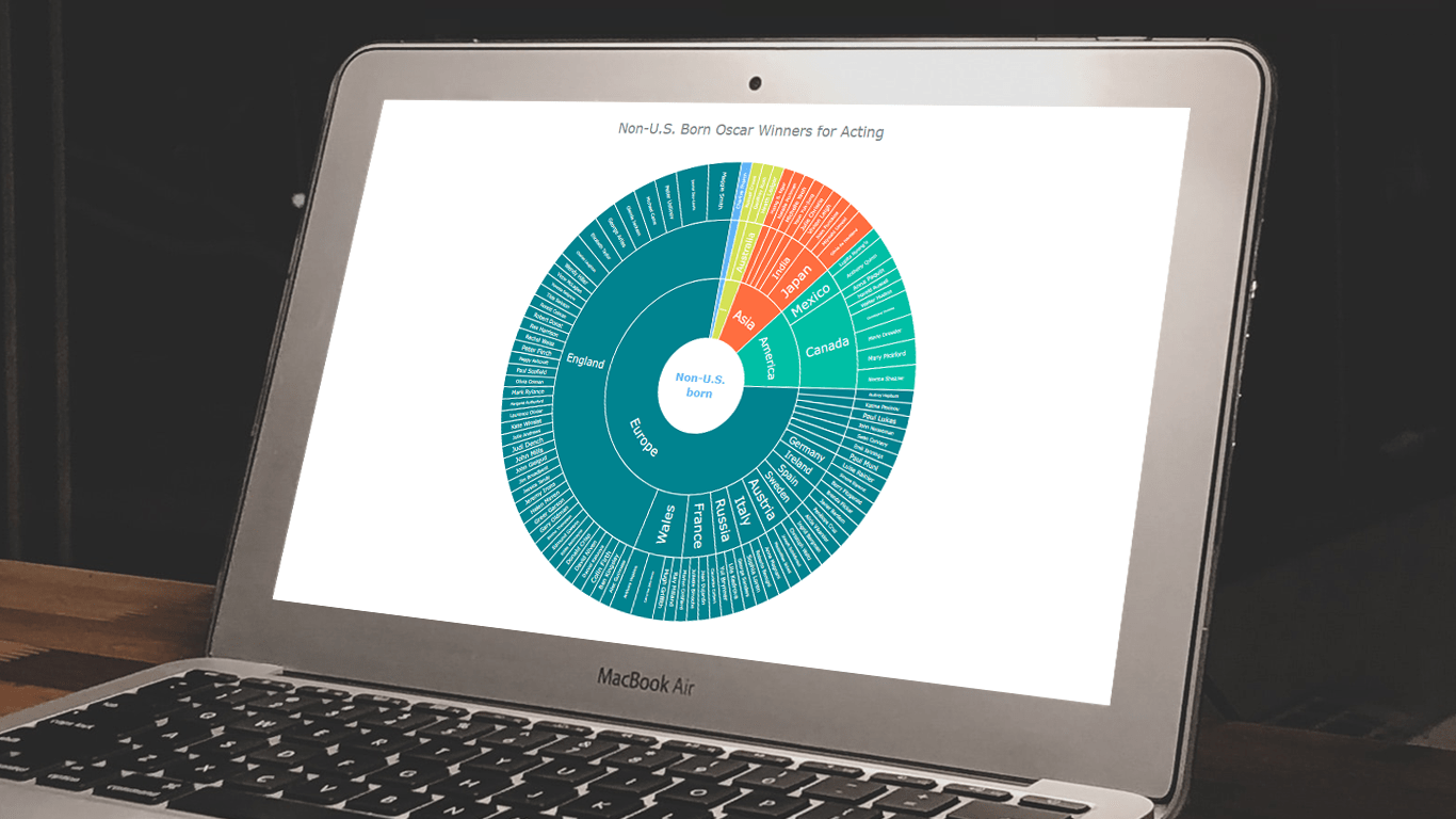 In the world of data all around us, charts play a crucial role in helping us explore and understand data more effectively. One powerful visualization technique is the sunburst chart, which allows us to represent hierarchical datasets, providing insights into complex compositions visually. In this tutorial, I’ll show you how to create your own stunning interactive sunburst charts using JavaScript effortlessly.
We’ll embark on an exciting journey using data about Oscar-winning actors and actresses from countries around the world as an example. Our JS-based sunburst chart will shine a spotlight on the achievements of those born outside the United States, representing the rich diversity of their origins.
Get ready to unlock the secrets of JavaScript sunburst chart development as I’ll guide you step-by-step. Together, we’ll learn how to effortlessly bring data to life, creating this mesmerizing visualization that engages and informs. Let’s dive in and discover the fascinating world of the sunburst chart!
Read the JS charting tutorial »
- Categories: AnyChart Charting Component, Big Data, HTML5, JavaScript, JavaScript Chart Tutorials, Tips and Tricks
- No Comments »
How to Build Circle Packing Chart in JavaScript
March 15th, 2022 by Shachee Swadia A clear step-by-step guide for building an interactive JS Circle Packing Chart to visualize the top 100 most streamed songs on Spotify.
Want to learn to visualize hierarchical data in stunning circle packing charts that can be added to a web page or app in a hassle-free manner? Don’t feel overwhelmed and just follow my stepwise data visualization tutorial! Using a cool example of data on the top 100 most streamed songs on Spotify, I will show you how to easily create and customize a great-looking interactive circle packing chart with JavaScript.
Read the JS charting tutorial »
- Categories: AnyChart Charting Component, Big Data, HTML5, JavaScript, JavaScript Chart Tutorials, Tips and Tricks
- No Comments »
Best Data Visualizations of 2021 — DataViz Weekly
January 7th, 2022 by AnyChart Team In 2021, there were 53 Fridays. It means a total of 53 DataViz Weekly roundups came out during the year, putting a spotlight on some of the most interesting charts, maps, and infographics from around the web. Today, on the first Friday of 2022, we invite you to remember — or get to know in case you missed something — the very best data visualizations of 2021.
As in previous “best of year” collections (2020, 2019, 2018), we decided not to reinvent the wheel but to take a quick look at renowned experts’ picks. Now, check out four lists of the best projects — from Nathan Yau, Kenneth Field, Terence Shin, and DataJournalism.com.
- Categories: Data Visualization Weekly
- No Comments »
Canadian Elections, Germany Under Merkel, Caracas Sounds, Night Temperatures in U.S. Cities — DataViz Weekly
September 17th, 2021 by AnyChart Team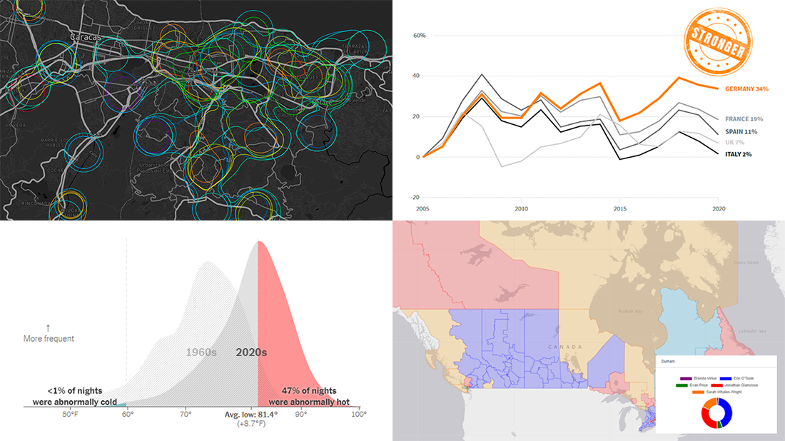 We continue to choose the most interesting out of all the newest data visualizations published here and there and show you them in weekly roundups. It’s time to look at our fresh selection! This time, the following projects are featured in DataViz Weekly:
- Canadian federal elections since 2000 — Stephen Taylor
- Germany under the 16-year leadership of Angela Merkel — Reuters
- Sounds of Caracas — Valeria Escobar
- Abnormally hot summer nights in American cities — The Upshot
- Categories: Data Visualization Weekly
- No Comments »
Visualizing Codebase Structure, Climate Data, Time Use Patterns, and Census Stats — DataViz Weekly
August 13th, 2021 by AnyChart Team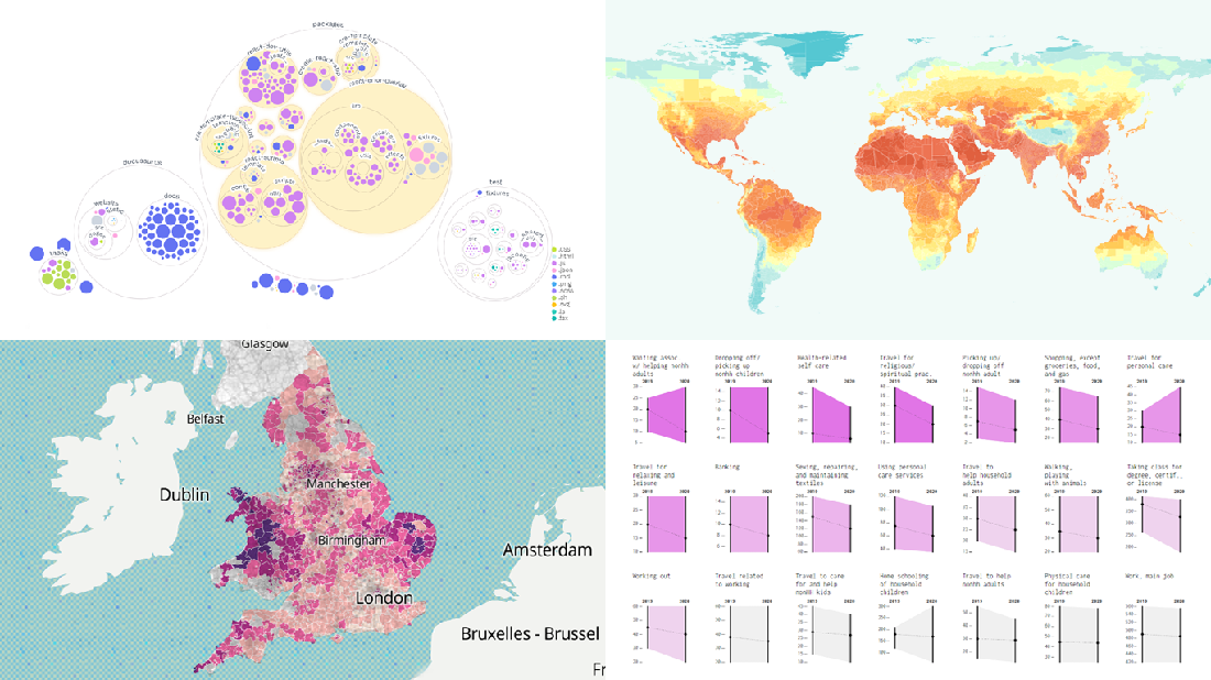 It is Friday the 13th. But don’t worry about the irrational! Check out the four really cool data visualization projects we have discovered around the web these days and you will be fine, entertained, and inspired.
Today on DataViz Weekly:
- Codebase visualization in packed bubble charts — GitHub OCTO
- Climate change impacts through 2099 — Climate Impact Lab
- Shifts in U.S. time use patterns during the pandemic — Nathan Yau
- 50 years of social change in England and Wales — ONS
- Categories: Data Visualization Weekly
- No Comments »
Tokyo Olympics Medal Trackers — DataViz Weekly
August 6th, 2021 by AnyChart Team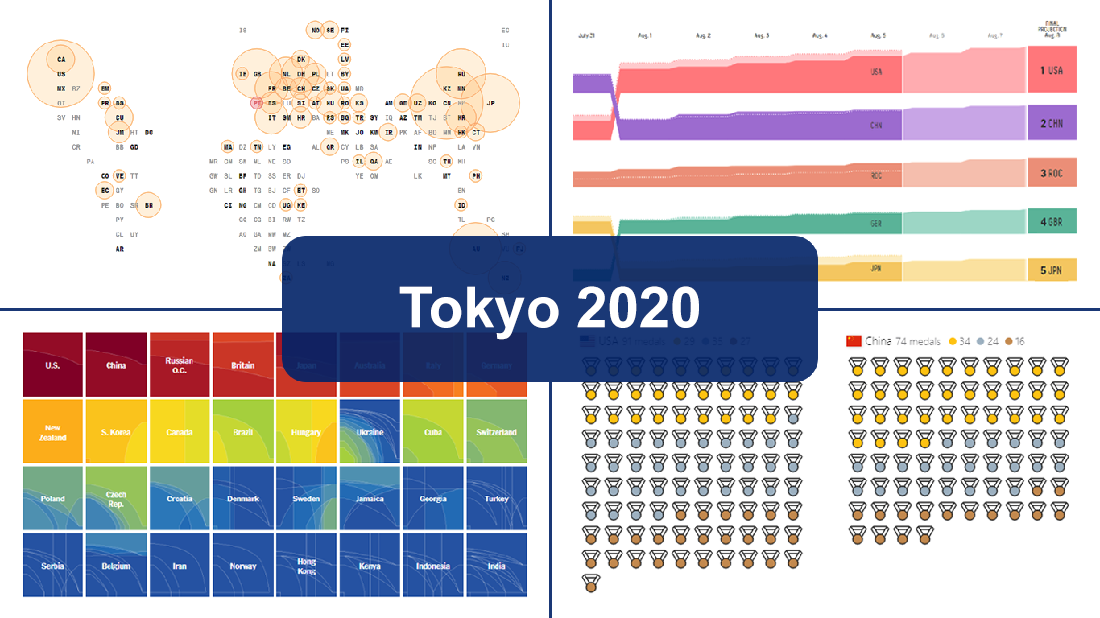 Delayed one year due to the COVID-19 pandemic, the 2020 Summer Olympics officially known as the Games of the XXXII Olympiad and commonly referred to simply as Tokyo 2020 have been underway for two weeks and are already coming to a close, with under 50 medal sets yet to be distributed over the remaining two days.
In this special edition of DataViz Weekly, we are happy to showcase four wonderful Olympic medal trackers providing an insightful view of medal counts and country standings with the help of telling visualizations — from Bloomberg News, The New York Times’s The Upshot, FiveThirtyEight, and Axios.
- Categories: Data Visualization Weekly
- 1 Comment »
AnyChart JS Charts Used to Visualize Data on Ancient French Riddles
June 30th, 2021 by AnyChart Team As global leaders in data visualization solutions, we feel it is part of our mission to support educational and research projects by granting their authors a free license to use our products. Les Énigmes de Mercure (The Riddles of Mercury) by Timothée Léchot from the University of Neuchâtel (UniNE) is one such initiative we are proud to back on non-commercial terms.
Recently, we had a quick talk with Timothée and asked him a few questions to learn more about his project and experience visualizing data with the AnyChart JS charting library. Read our quick interview below. (Stack: PHP/MySQL.)
- Categories: AnyChart Charting Component, Big Data, Charts and Art, HTML5, JavaScript, Success Stories
- No Comments »
How to Create Diverging Bar Chart with JavaScript
March 2nd, 2021 by Shachee Swadia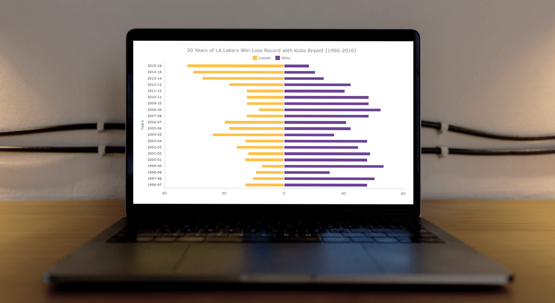 This article is a step-by-step guide that’ll show you how to build an interactive JavaScript range chart that visualizes 20 years of the LA Lakers’ performance with Kobe Bryant.
The year 2020 was pretty poignant for obvious reasons. But even before the pandemic, the year started on a sad note with the death of basketball legend Kobe Bryant. He was a star NBA athlete who had played for 20 years with one and only one team — the Los Angeles Lakers.
Remembering Kobe one year after that horrible crash, I wondered how the Lakers had performed in his two-decade era. So, I visualized that in an interactive Diverging Bar Chart with the help of pure JavaScript.
Thinking that this project might be helpful for those new to web charting, I also logged the entire process and made a tutorial. Check it out!
Read the JS charting tutorial »
- Categories: AnyChart Charting Component, HTML5, JavaScript, JavaScript Chart Tutorials, Tips and Tricks
- No Comments »
How I Created Sunburst Chart Using JavaScript to Visualize COVID-19 Data
December 8th, 2020 by Shachee Swadia Almost recovered from COVID-19 myself these days, I decided to explore how the world is currently doing, during the pandemic. So I created a sunburst chart to see at a glance what continents and countries are more (and less) affected by the coronavirus than others. The process was quick and I thought someone could be interested to learn about how such data visualizations can be built in a pretty straightforward way, even with very little technical skills. So I also made a tutorial. And here I am — (1) sharing my interactive sunburst chart of COVID cases and (2) describing how I created it using JavaScript in a matter of minutes, step by step!
My JS sunburst chart provides an overview of the situation as of November 24, 2020, and also shows the global count, continent-wide data, and country-wise proportions for the current active COVID-19 cases and deaths. Scroll down to explore it by yourself and check out the tutorial along the way. Here is a sneak peek of the final chart to get you excited:
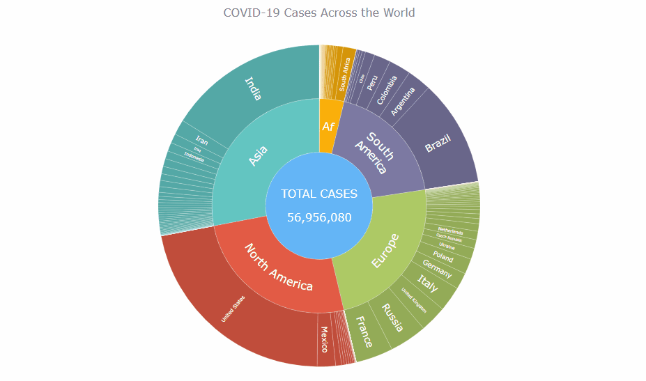
This sunburst charting tutorial is mainly for beginners to data science. So before we get to business, let’s make sure we’re on the same page. I’ll explain what a sunburst chart is and how it works, to start with. Then I’ll show you how to create a cool and colorful interactive visualization like that with JavaScript (and you can do it even if you don’t know it too well). That’s the plan!
Read the JS charting tutorial »
- Categories: AnyChart Charting Component, Big Data, Business Intelligence, HTML5, JavaScript, JavaScript Chart Tutorials, Tips and Tricks
- No Comments »
How to Create Venn Diagram with JavaScript
November 11th, 2020 by Shachee Swadia A Venn diagram is a form of data visualization that uses shapes, generally circles, to show the relationships among groups of things. In this chart type, overlapping areas show commonalities while circles that do not overlap show the traits that are not shared.
Introduced by John Venn, an English mathematician, logician, and philosopher, Venn diagrams are also called set diagrams or logic diagrams since they show possible logical relations between elements of different sets. When drawing such charts, we will most probably be dealing with two or three overlapping circles, since having only one circle would be boring, and having four or more circles quickly becomes really complicated.
Not only are these diagrams good visualizations as a concept, but they also provide a great opportunity to represent qualitative data and a bit of graphic humor. Basically, they are easy and fun to build and use. I’ll show you right now!
Read this tutorial to learn how to easily create a visually appealing and informative Venn diagram for your website or app with the help of JavaScript. All the code used and demonstrated along the tutorial will be freely available for you to play with.
During the ongoing coronavirus pandemic, with working from home and avoiding food from outside, many of us have become amateur chefs. So, let us use a JS-based Venn diagram to find out what kind of recipe would be the best to try out on a working day — this is going to be a delightful use case to explore!
Read the JS charting tutorial »
- Categories: AnyChart Charting Component, HTML5, JavaScript, JavaScript Chart Tutorials, Tips and Tricks
- 2 Comments »