 Each week throughout the 2020 year, we curated the most interesting data visualizations from around the Web and introduced them to you in the DataViz Weekly roundup. Now is the time to look at the best of the best! We will hand you over to distinguished experts — Nathan Yau, Alli Torban, Lea Pica, Kenneth Field, and the GIJN team — who have already made their (brilliant) choices. Meet their picks for the best data visualizations of 2020!
Best Charts of 2020 — Nathan Yau

Data visualization expert Nathan Yau made a list of his favorite projects of the year in the form of awards. For each item, he explained what it is best for. In some categories, Nathan also included honorable mentions. Take a look:
1. Best Chart Loosely Based on Data to Demonstrate an Idea:
- Flatten the curve — works by Rosamund Pearce (The Economist) and Alexander Radtke
Honorable mention:
- What does ‘level two’ mean and why does it matter — by Toby Morris (The Spinoff)
2. Best Demonstration of Virus Spreading with Simulation:
- Why outbreaks like coronavirus spread exponentially, and how to “flatten the curve” — by Harry Stevens (The Washington Post)
3. Best Visualization of Masks Working:
- Masks work. Really. We’ll show you how — by Or Fleisher, Gabriel Gianordoli, Yuliya Parshina-Kottas, Karthik Patanjali, Miles Peyton, and Bedel Saget (The New York Times)
Honorable mentions:
- Why masks work better than you’d think — by Minute Physics and Aatish Bhatia
- A room, a bar and a classroom: how the coronavirus is spread through the air — by Mariano Zafra and Javier Salas (El País)
4. Best Close-to-Real-Life Visualization of the Virus Spreading:
- How the virus got out — by Jin Wu, Weiyi Cai, Derek Watkins, and James Glanz (The New York Times)
Honorable mention:
- Anatomy of Singapore’s outbreak — by Manas Sharma and Simon Scarr (Reuters)
5. Best Compilation of Livestreams:
- Reconstructing seven days of protests in Minneapolis after George Floyd’s death — by Holly Bailey (The Washington Post) and Matt Daniels and Amelia Wattenberger (The Pudding)
6. Best Traditional Chart Recurring Over and Over and Over and Over Again:
- Line chart — in works by John Burn-Murdoch (The Financial Times), Our World in Data, The New York Times, Lena Groeger (ProPublica), The Washington Post and the Yale School of Public Health, National Geographic, and many more
Honorable mention:
- Variable-width bar chart
7. Best Generated Map that Looks Like a Real Map:
- Meander — by Robert Hodgin
8. Best Use of Physical Object to Show Data:
- The California pint — by North Drinkware
Honorable mention:
- A million dollars vs a billion dollars, visualized: A road trip — by Tom Scott
9. Best Abstraction of a Traditional Chart:
- Stoxart — by Gladys Estolas
10. Best Customizable, Single-task Map Tool Thing:
- Peak map (and then street maps) — by Andrei Kashcha
In addition, because data is a critical part of any chart or dashboard, Nathan gave an honorable mention to reliable COVID-19 data as such, from sources like The COVID Tracking Project, the Johns Hopkins Coronavirus Resource Center, and Our World in Data.
Best Data Visualizations of 2020 — Alli Torban and Lea Pica

In episode 60 of Data Viz Today and episode 63 of Present Beyond Measure, their hosts Alli Torban and Lea Pica, both known as amazing data visualization and storytelling professionals, had what Alli called “a little data viz tennis match.” In that crossover conversation, they recapped the 2020 year and found (and discussed) their favorite visualizations in 4 topical categories: the pandemic, climate change, racial injustice, and the U.S. election. Check out their picks:
1. Best COVID-19 Data Visualizations:
- How to flatten the curve — by Harry Stevens (The Washington Post)
- How the virus got out — by Jin Wu, Weiyi Cai, Derek Watkins, and James Glanz (The New York Times)
2. Best Climate Change Data Visualizations:
- Warming stripes — by Ed Hawkins
- Temperature anomalies by country — by Antti Lipponen
3. Best Racial Injustice Visualizations:
- Duration of protests that create change — by Mona Chalabi
- The most sobering thing about the racial dot map — by Libby Anne
4. Best U.S. Presidential Election 2020 Visualizations:
- Electoral College decision tree — by Observable
- The winding path to victory — by FiveThirtyEight
Best Data Journalism Projects of 2020 — Global Investigative Journalism Network
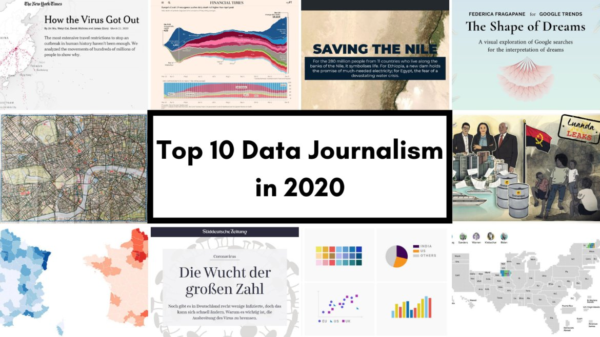
Eunice Au, Program Manager at the Global Investigative Journalism Network, presented GIJN’s selection of the top, most popular and compelling data journalism projects of the year. See what items succeeded to get highlighted in the Data Journalism Top 10 for 2020 roundup:
1. The New York Times:
- How the virus got out — by Jin Wu, Weiyi Cai, Derek Watkins, and James Glanz
Also from NYT:
- Here’s where Australia’s destructive wildfires are burning — by Nadja Popovich, Denise Lu, and Blacki Migliozzi
2. The Financial Times:
- Coronavirus tracker
3. Al Jazeera:
- Saving the Nile
Also from AJ:
- Mapping India and China’s disputed borders
- Trump’s Middle East plan and a century of failed deals
4. Federica Fragapane:
- The shape of dreams
5. Davis Vilums:
- Cycling every street in London
6. The International Consortium of Investigative Journalists:
- Massive cross-border investigations: Luanda Leaks and FinCEN Files
7. Süddeutsche Zeitung:
- Flattening the COVID-19 curve
Also from SZ:
- Tracking major political debates in the Bundestag
- Evolution of climate change discussions in the Bundestag
8. Mediapart:
- Which COVID-19 figures are trustworthy?
Also from Mediapart:
- Impunity for police wrongdoing
9. Lisa Charlotte Rost:
- Visualizing data for colorblind readers
10. Alberto Cairo:
Last but not least, data visualization expert Alberto Cairo is featured in GIJN’s Data Journalism Top 10 for 2020 list for his commentaries on many interesting works. His quick piece on how visualization puts stories in perspective resonated particularly well — it’s where he took the following project as an example:
- Cartogram of the Democratic primaries — by WSJ’s Brian McGill
More highlights:
- How Britons spend their time at weekends vs weekdays — by The Financial Times
- No epicentro — by Agência Lupa
Best Maps of 2020 — Kenneth Field

As far as maps are concerned, prominent cartographer Kenneth Field curated a list of his favorites from 2020 and we strongly believe you should check it out as well. If we were to choose the year’s most important map, the COVID-19 Global Cases map by the Johns Hopkins University’s Center for Systems Science and Engineering would certainly win. So there is no surprise it is featured first. However, there is no particular order (just like in the other lists of the best visualizations we’ve just shared):
- COVID-19 dashboard — by JHU CSSE
- A sky map of the Hubble Space Telescope’s observations — by Nadieh Bremer
- COVID-19 experiment — by Mathieu Rajerison
- World map of night trains — by Jug Cerovic
- How the coronavirus spread in Hong Kong — by Adolfo Arranz
- The United Fonts of America — by Andy Murdock
- Deaths involving COVID-19 — by James Cheshire
- The highlands of Scotland — by Alasdair Rae
- Mapping London’s ethnic diversity — by Niko Kommenda
- How web-connected is China — by Chinapower
- Geological map of Iran — by Sean Conway
- Painting by numbers — by Elana Schtulberg
- How decades of racist housing policy left neighborhoods sweltering — by Brad Plumer and Nadja Popovich (The New York Times)
- Manhattan — by Alex Bailey
- Panoramic map of the Alps — by Eric Knight
- Covid-19: The global crisis, in data — by The Financial Times
- Grave Smoky Mountains national park — by Aaron Koelker
- 2020 election map — by Randall Munroe (xkcd)
- Carrot production in France — by Romain Lacroix
- Commuting in corona times — by Kera Till
- Naismith International Park — by Kirk Goldsberry
***
2020 was very fruitful in terms of the number of great data visualizations. We are sure 2021 will be better even in that. Stay tuned for the Data Visualization Weekly series on the AnyChart blog to not miss a thing!
Here are the best data viz projects from previous years in case you are interested: 2019, 2018, 2017.
Again, we wish you all the very best in 2021!
- Categories: Data Visualization Weekly
- 1 Comment »