Every week brings more charts, maps, and visual stories into view. In DataViz Weekly, we pick out recent data visualization work that feels worth a closer look, whether for the subject, the design choices, or the way the data is brought into focus. Here is what we are featuring this time:
70 years of Eurovision lyrics — Giuseppe Sollazzo
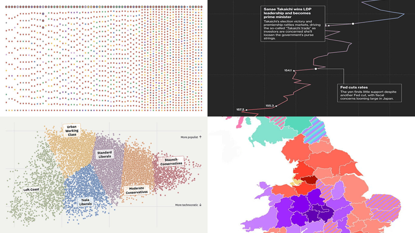
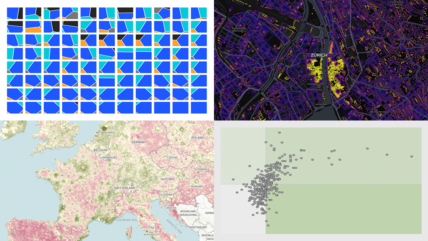
California politics beyond left and right — San Francisco Chronicle
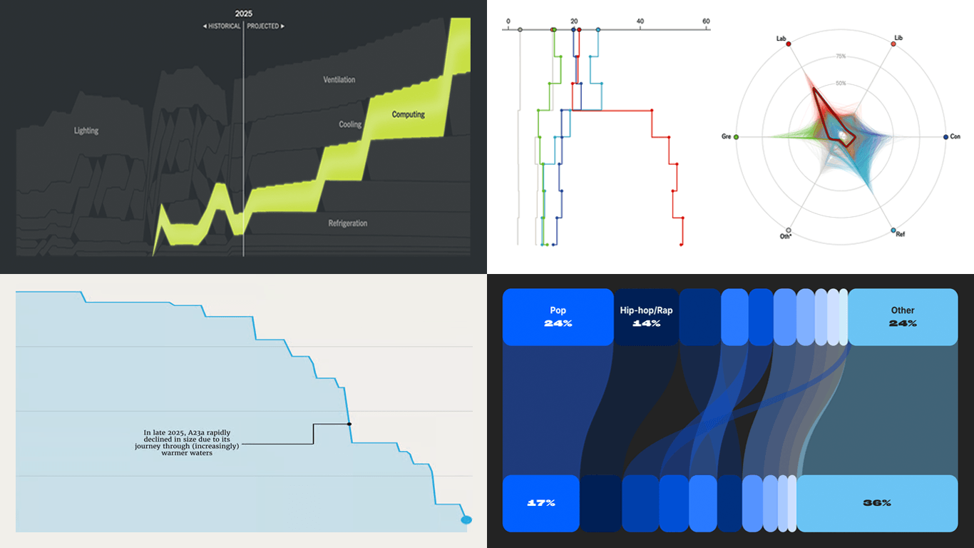
There’s a chart we’ve been wanting to add to the Qlik toolkit for a while. The one that shows you what a hierarchy actually looks like — not packed by value like a treemap, not stacked in rings like a sunburst, but as the parent-child tree it really is. Meet the Circular Dendrogram extension for Qlik Sense.
We have come across several interesting data maps over the past few days, so this edition of DataViz Weekly leans spatial. The four projects we selected show how maps can make location, scale, and geographic patterns easier to explore. Today’s selection:
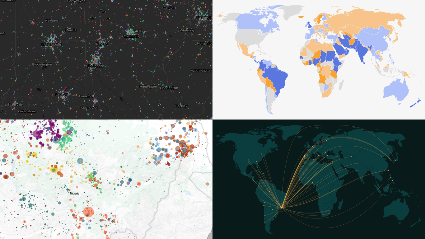
146 million U.S. jobs by sector — Kyle Walker
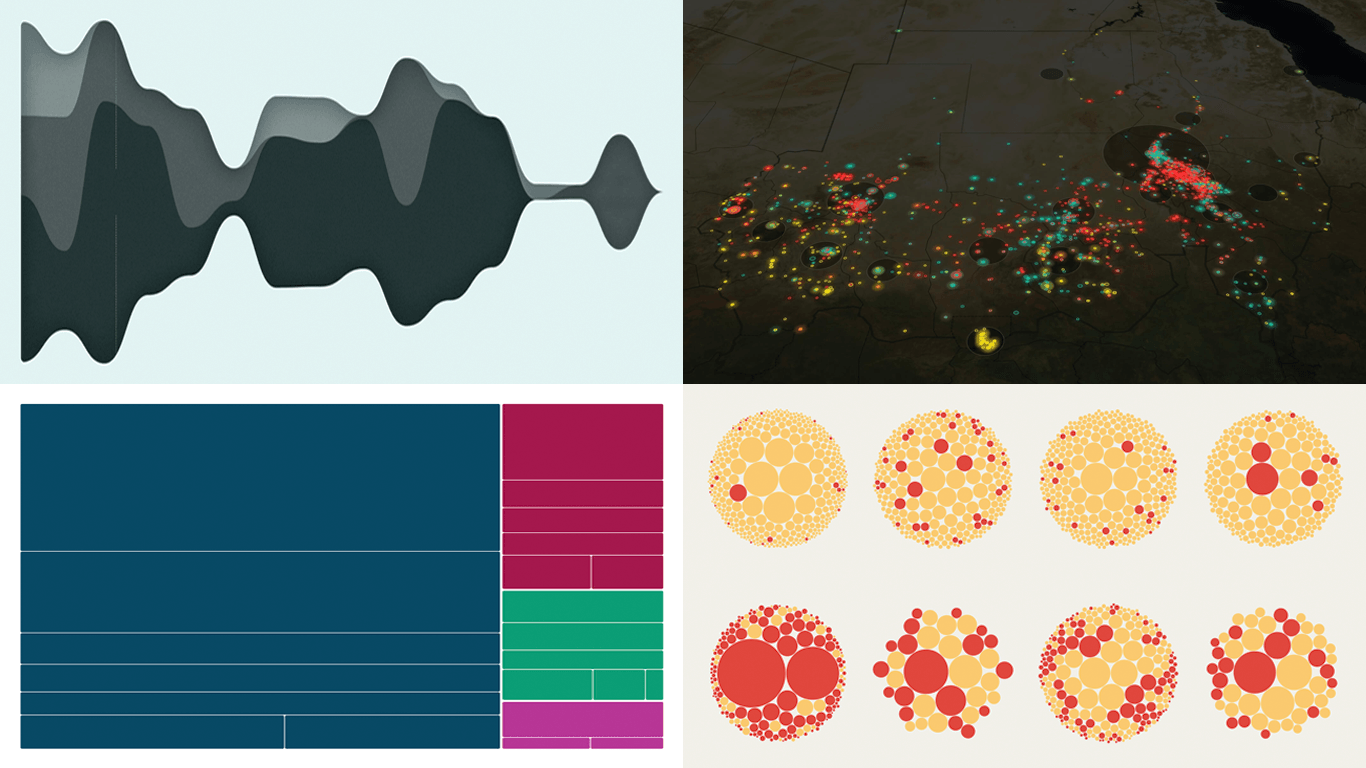
Sahel violence and Nigeria as its hotspot — The Guardian
Rio de Janeiro’s sister cities — Georgios Karamanis
A step line chart displays data as a continuous staircase, making it ideal for visualizing values that change at specific moments and hold constant in between. This tutorial walks through building one with JavaScript using ten years of U.S. Federal Funds Rate data, from a blank HTML page to a fully interactive step line chart ready to embed in any web page or application.
A new Friday, a new round of DataViz Weekly. We are here to share a small selection of data visualization projects that pulled us in lately and we believe will do the same for you. See what is in this edition:
Winners and losers on Polymarket — The Washington Post
Patterns in English similes — The Pudding
Big Tech lobbying in Germany — Zentrum für Digitalrechte und Demokratie
Data visualization does not take weeks off. We track charts and maps as they appear across the web and bring the most compelling finds together in DataViz Weekly. Our picks for this edition:
AI-generated content on the web — Jonas Dolezal, Sawood Alam, Mark Graham, and Maty Bohacek
Divorce rates by job — Nathan Yau
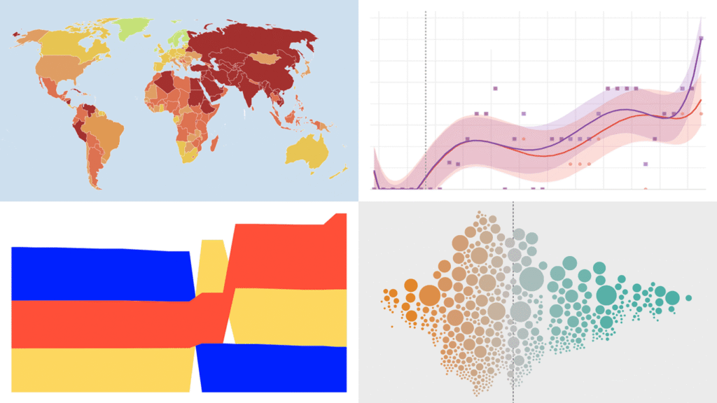
Global press freedom at a 25-year low — Reporters Without Borders
Every week, countless data visuals appear across all domains and formats. Every Friday, we curate those we found most interesting, sharing them as examples of data visualization work in practice. Glad to feature today in DataViz Weekly:
British voter intent by demographic — The Economist
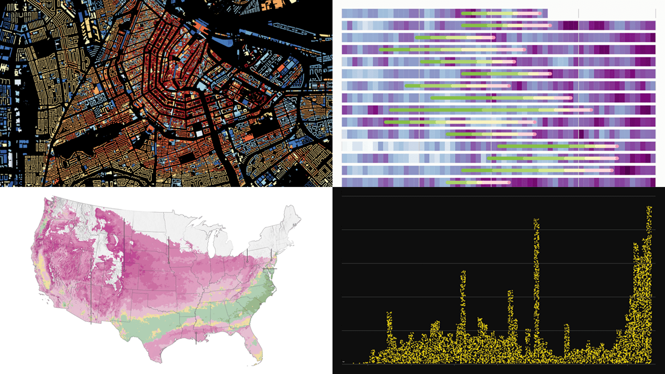
America’s electrical grid under strain — The New York Times
Disappearance of iceberg A23a — The European Correspondent
There is always more to see when it comes to great charts and maps. Welcome to DataViz Weekly, where we put a spotlight on notable data visualizations as they come out around the web. Here are the projects that made the cut this time:
Tehran strike damage by land use — Bloomberg
Six decades of population change in Europe — Correctiv
Job stability across occupations in the United States — Nathan Yau
Robust data visualization makes complex subjects easier to see and understand. DataViz Weekly is our ongoing series collecting the best examples we come across most recently. Check out what stood out to us this week:
Causes of death across countries — Our World in Data
Good data graphics keep turning up online, and we never stop looking. DataViz Weekly is our regular roundup of the latest examples we think are worth your attention. Take a look at our new picks:
Early leaves and blooms across the United States — The Washington Post
D.C. cherry blossom shifts — Sara Staedicke
Satellites crowding Earth’s orbit — The Guardian
Every building in the Netherlands by year built — Bert Spaan