New Cool Data Visualization Works in Recap – DataViz Weekly
January 26th, 2018 by AnyChart Team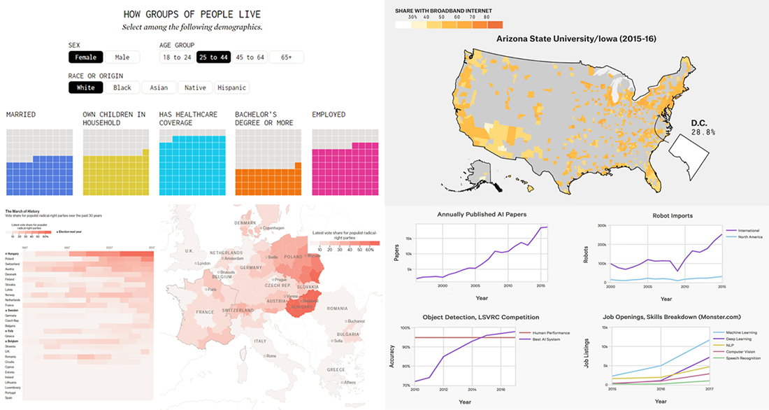 Check out another recap of new cool data visualization examples within the framework of our DataViz Weekly feature!
As always, let’s start with a quick list of what we’ve prepared for your review this time:
- how different groups of Americans live;
- analyzing broadband data (and what can go wrong);
- support for populist right parties in European countries;
- 10 charts showing the rapid growth of AI.
- Categories: Data Visualization Weekly
- No Comments »
Interactive Visualization and Chart Projects Nicely Presenting Interesting Data – DataViz Weekly
January 19th, 2018 by AnyChart Team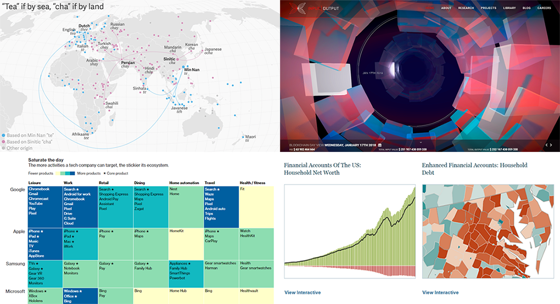 Dataviz is a wonderful, powerful tool that helps us perceive the information better. From simple static charts to impressive complex interactive visualization projects, various solutions can be useful to communicate and study trends and big pictures as well as to drill down to specific details, depending on the situation and objectives.
Follow Data Visualization Weekly on our blog to see some good examples of dataviz and how it assists in revealing something hidden and telling interesting stories.
Here’s what we are featuring this time:
- 2 words for tea in the world (tea if by sea, cha if by land);
- how technology companies own your typical day;
- US Federal Reserve’s new data visualization tools;
- interactive visualization of the blockchain technology.
- Categories: Data Visualization Weekly
- No Comments »
Data Story and Visualization Examples Worth Seeing – DataViz Weekly
January 12th, 2018 by AnyChart Team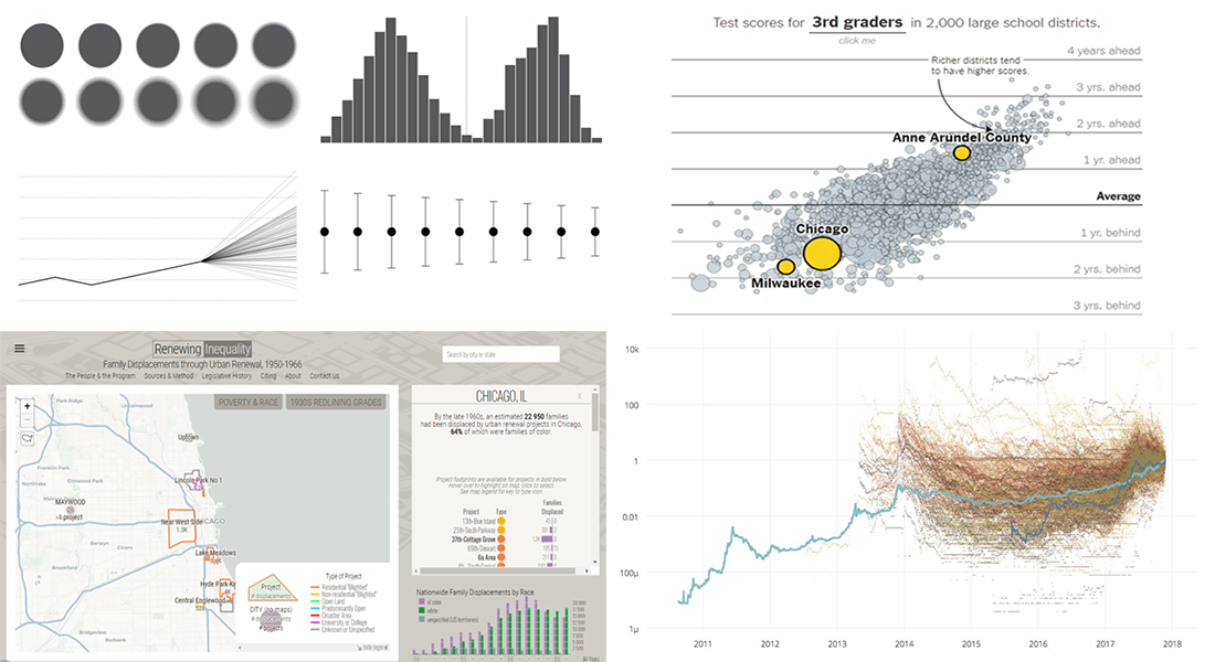 Hi there! Welcome to the new Data Visualization Weekly post! We’ve gathered another four interesting visualizations and data story examples that we hope you’ll like.
Today in DataViz Weekly:
- Options to Visualize Uncertainty in Data
- Renewing Inequality: Data Story, 1950s-1960s
- More and Less Effective US School Districts
- Investing in Bitcoin and Other Cryptocurrencies
- Categories: Data Visualization Weekly
- No Comments »
New 2018 Year Is Here! Take Another Look Back at 2017 in Charts – DataViz Weekly
January 5th, 2018 by AnyChart Team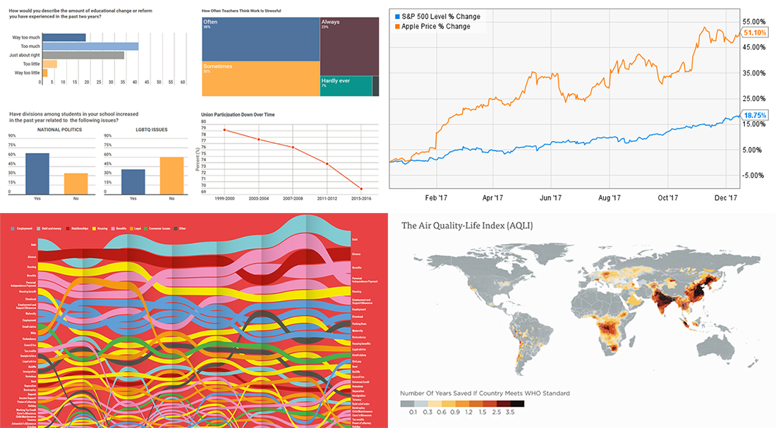 Yay! We are already living in the new 2018 year! And may it bring you plenty of success, joy and happiness!
In the meantime, we at AnyChart continue our Data Visualization Weekly series of articles devoted to some of the interesting data visualization projects and standalone charts and infographics we’ve recently come across. This time, let’s recall the last year once again and see how it looked for:
- the teaching profession,
- UK citizens,
- energy and
- Apple.
- Categories: Data Visualization Weekly
- No Comments »