 Hi there! Welcome to the new Data Visualization Weekly post! We’ve gathered another four interesting visualizations and data story examples that we hope you’ll like.
Today in DataViz Weekly:
- Options to Visualize Uncertainty in Data
- Renewing Inequality: Data Story, 1950s-1960s
- More and Less Effective US School Districts
- Investing in Bitcoin and Other Cryptocurrencies
Data Visualization Weekly: January 5, 2018 – January 12, 2018
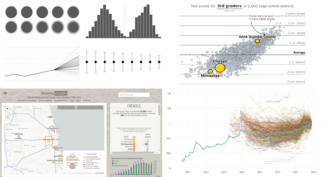
Options to Visualize Uncertainty in Data
Nathan Yau dives into the essence of the uncertainty in data. He points out that statistics is actually sort of game in which you identify the uncertainties and make (mostly) estimated conclusions based on what you’ve calculated. So when it comes to visualizing data and take into account what’s uncertain in it, there are several ways of how to not miss out on something really important. Nathan lists, illustrates and discusses the options. Read the article on FlowingData to follow the point and learn about each.
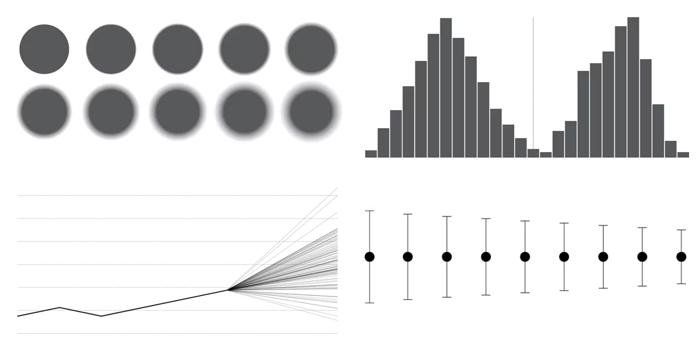
Renewing Inequality: Data Story, 1950s-1960s
Renewing Inequality is an interesting data story and visualization project created by a team from the Digital Scholarship Lab of the Univerity of Richmond. It allows everyone to learn about family displacements in the 1950s and then the 1960s, during the urban renewal within the framework of projects financed by the US federal government.
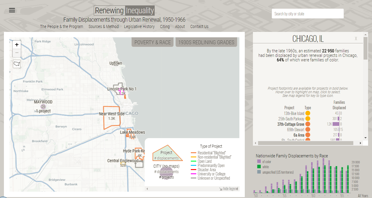
More and Less Effective US School Districts
Living in the United States and wondering how effective schools in your district are? Check out the SEDA (Stanford Education Data Archive) information-based data story on The Upshot (NYT). It features two interactive visualizations that nicely display where students do learn the most (and the least).
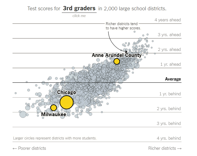
Investing in Bitcoin and Other Cryptocurrencies
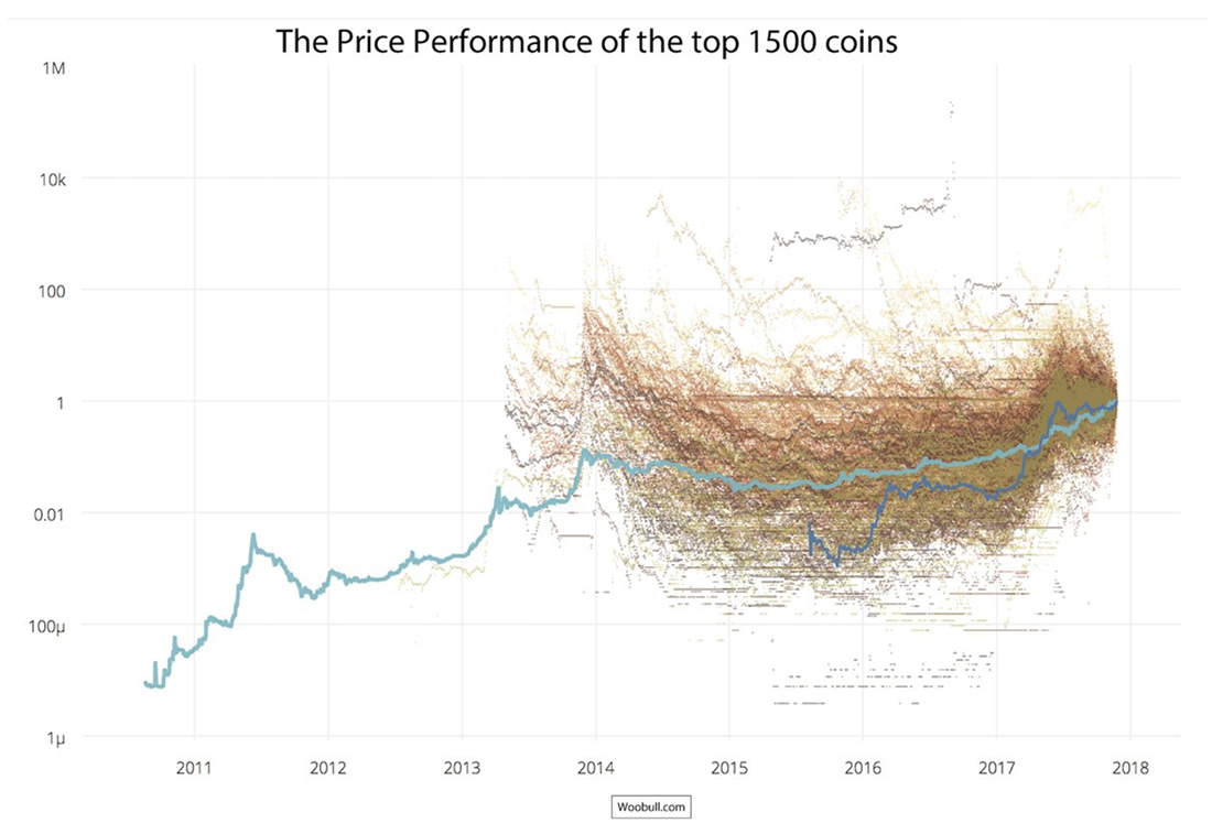
Cryptocurrency investor, trader and blogger Willy Woo shares with CoinDesk readers an overview of his presentation at the Consensus: Invest 2017 conference that took place in New York in late November. In the article, he speaks about investing in Bitcoin and alternate cryptocurrencies and displays several interesting charts like the one above to prove his optimistic point of view.
***
That’s all for now, folks! Stay tuned and next week we’ll show you another four cool charts and infographics that’ll have been popular on the Web recently. In the meantime, you are welcome to check out other articles within the framework of our DataViz Weekly feature.
- Categories: Data Visualization Weekly
- No Comments »