How to Import Excel Templates into Qlik Sense
February 10th, 2026 by AnyChart Team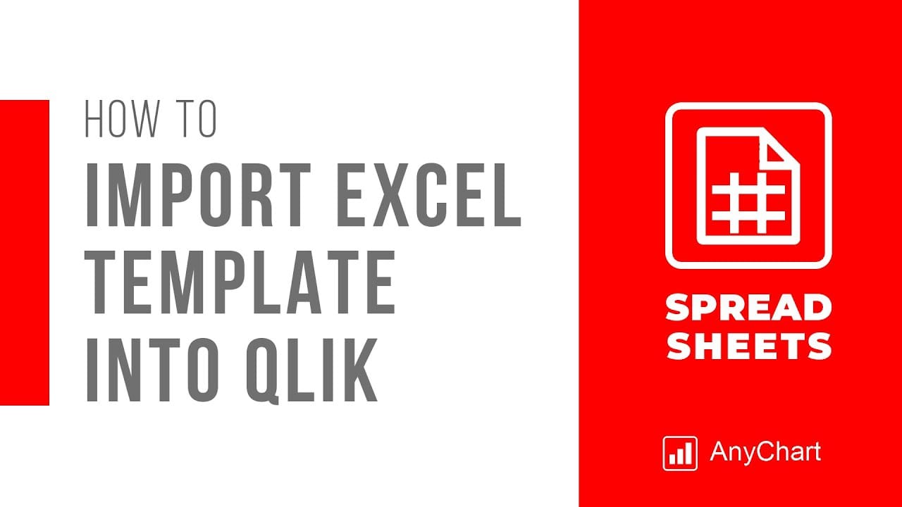 Many teams already have Excel templates that work: budgets, trackers, reporting sheets, and layouts that took time to get right. The friction starts when those templates live outside the Qlik analytics platform, which often means manual exports, multiple file versions, and results that can drift away from what dashboards show.
While you can build an Excel-style spreadsheet in Qlik Sense from scratch, a faster path is to add an entire template right away.
This tutorial shows how to import an existing Excel template into Qlik Sense using the Spreadsheets extension, so it works inside the Qlik app and stays in sync with live data and selections.
See the tutorial at qlik.anychart.com »
- Categories: AnyChart Charting Component, Big Data, Business Intelligence, Dashboards, Qlik, Tips and Tricks
- No Comments »
How to Use Excel with Qlik Sense: Comprehensive Guide
January 21st, 2026 by AnyChart Team Microsoft Excel has been declared obsolete countless times. Yet even with the rise of modern BI platforms like Qlik Sense by Qlik, spreadsheets remain central in enterprise analytics. And that is unlikely to change anytime soon.
These two worlds are not rivals; they complement each other. Qlik Sense delivers trusted data, scale, and interactive dashboards. Excel gives formulas, quick checks, and everyday collaboration in an interface everyone knows. Together, they bring a single source of truth plus the familiar flexibility of spreadsheets.
This article provides a comprehensive guide to using Excel with Qlik Sense. We will cover methods from simple exports and imports to advanced integrations such as automated reporting, live connectors, and embedding fully functional spreadsheets directly into Qlik dashboards.
Continue reading at qlik.anychart.com »
- Categories: AnyChart Charting Component, Big Data, Business Intelligence, Dashboards, Qlik, Third-Party Developers, Tips and Tricks
- No Comments »
Happy Holidays and Year-End Note for 2025
December 23rd, 2025 by AnyChart Team As 2025 winds down, we want to say thank you to our customers, partners, and everyone who builds and uses analytics every day. Merry Christmas and Happy New Year from all of us at AnyChart!
Closing out 2025, we are sharing this holiday sweater as a small nod to a theme we focused on this year ?
- Categories: AnyChart Charting Component, Big Data, Blogroll, Business Intelligence, Dashboards, Humor, JavaScript, News, Qlik
- No Comments »
How to Create Excel-Style Spreadsheets in Qlik Sense
December 17th, 2025 by AnyChart Team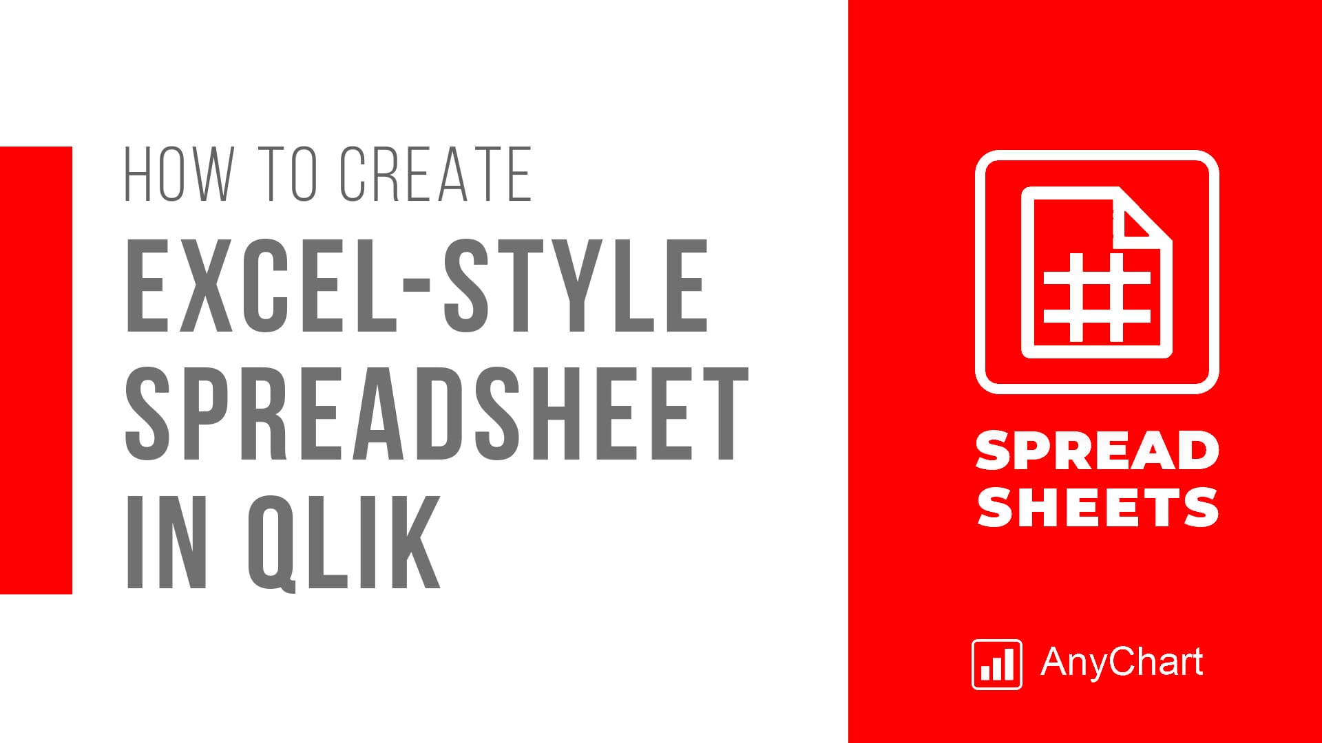 Many teams still rely on Excel because it is familiar, flexible, and fast for ad-hoc analysis. But when spreadsheet work happens outside Qlik, it often means extra exports, duplicate files, and numbers that can drift away from what your dashboards show.
This tutorial shows how to create an Excel-style spreadsheet directly inside Qlik Sense using the Spreadsheets extension, so users can work in a familiar spreadsheet interface without leaving the app.
See the tutorial at qlik.anychart.com »
- Categories: AnyChart Charting Component, Big Data, Business Intelligence, Dashboards, Financial Charts, Qlik, Third-Party Developers, Tips and Tricks
- No Comments »
Enhancing AI-Assisted JavaScript Chart Development with Context7 MCP and Claude
November 26th, 2025 by AnyChart Team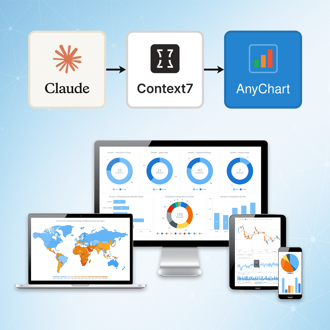 At AnyChart, we are constantly exploring tools and workflows that help developers work more efficiently, stay up to date, and minimize friction when integrating data visualization into their projects.
One approach we’ve recently tested — and found highly effective — is connecting Claude to Context7 via the Model Context Protocol (MCP). This integration gives Claude access to a continuously updated, extensive database of technical documentation across libraries, packages, and APIs.
This means you can rely on Claude not just for reasoning, but also for live, accurate, and authoritative documentation retrieval, dramatically reducing the chances of outdated suggestions or hallucinated methods.
- Categories: AnyChart Charting Component, AnyGantt, AnyMap, AnyStock, Big Data, Business Intelligence, Charts and Art, Dashboards, Financial Charts, Gantt Chart, GraphicsJS, HTML5, JavaScript, JS Chart Tips, News, Stock Charts, Third-Party Developers, Tips and Tricks
- No Comments »
Best JavaScript Gantt Chart Libraries in 2025–2026
November 5th, 2025 by Jay Stevenson Gantt charts are among the most effective ways to visualize tasks, timelines, and dependencies, making them a core component of modern project management practices. For developers building web applications, the right JavaScript Gantt chart library can dramatically save development time and deliver a professional, interactive experience directly in the browser.
The ecosystem in 2025–2026 includes a wide range of solutions — from free open-source libraries for simple timelines to enterprise-grade components with advanced scheduling engines and resource management features. Some prioritize speed and simplicity, while others focus on deep functionality and seamless integration into broader charting or UI stacks.
This article reviews the most notable JavaScript Gantt chart libraries available today. Each library is presented with its functionality, performance and scalability, integration options, licensing, and support. Whether you are building an internal tool, a SaaS application, or a full-scale enterprise system, this guide will help you quickly identify the Gantt solution that best fits your needs.
- Categories: AnyChart Charting Component, AnyGantt, Big Data, Business Intelligence, Dashboards, Gantt Chart, HTML5, JavaScript, Tips and Tricks
- No Comments »
AnyChart カイゼン:Qlik 拡張機能の最新イノベーションを発見しよう(東京・8月6日|CEO自ら進行)|Meet AnyChart CEO in Tokyo
July 29th, 2025 by AnyChart Team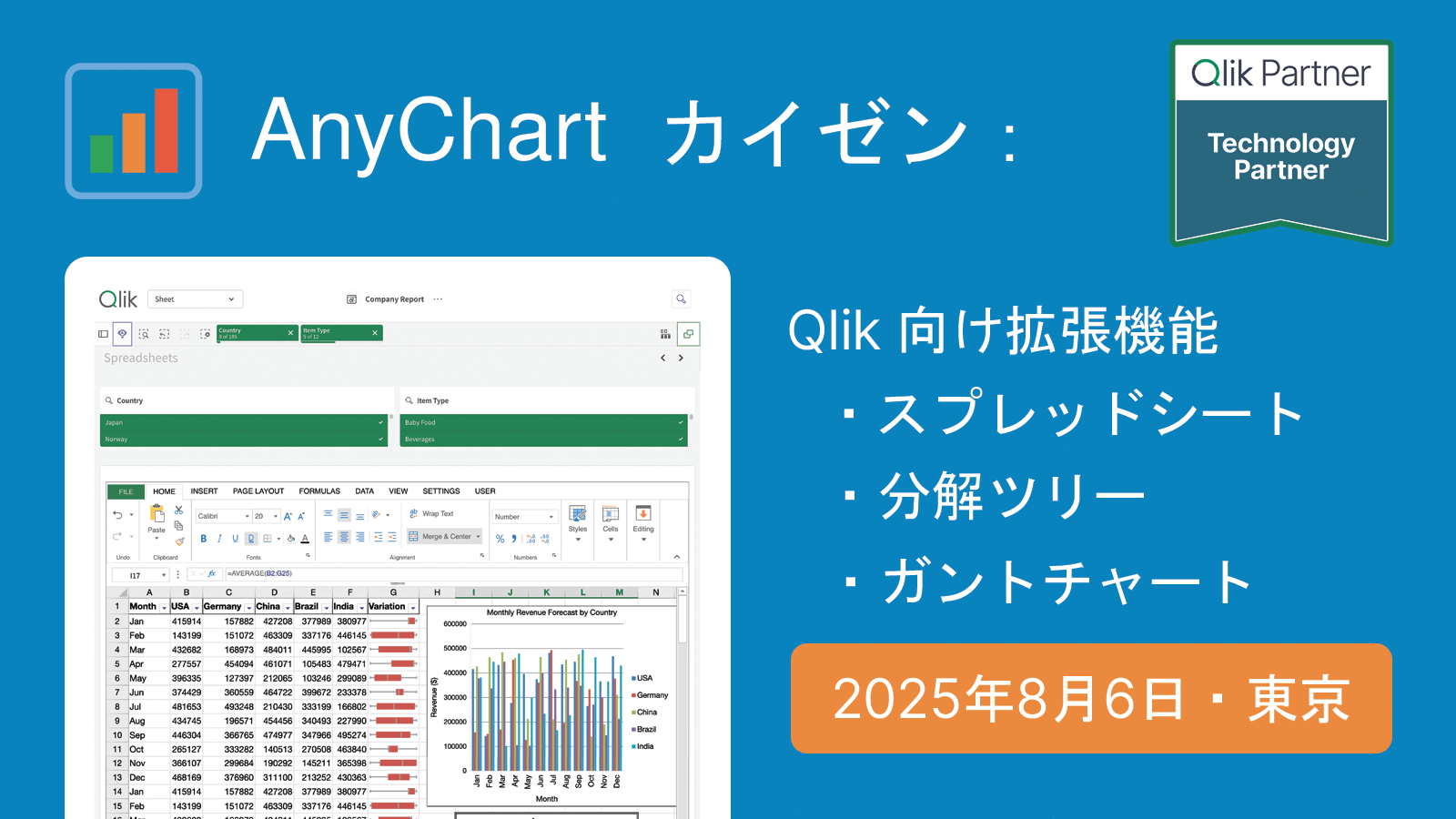 2025年8月6日(水)、私たちは東京にて、Qlik の分析環境を強化するための実用的なツールをご紹介する対面セッションを開催いたします。
本セッションでは、AnyChart 社 CEO の Anton Baranchuk が自ら進行を務め、Qlik Sense 拡張機能における最新のイノベーションを紹介し、それらが分析ワークフローをどのように改善し、より的確なデータドリブンな意思決定を支援できるかを実演を交えてご説明します。
We are pleased to invite you to an in-person session in Tokyo introducing practical tools to enhance your Qlik analytics environment.
During the session, AnyChart‘s CEO Anton Baranchuk will present the latest in Qlik Sense extensions, demonstrating how they can improve analysis workflows and support more informed, data-driven decision-making.
詳しく見る | Read more at qlik.anychart.com »
- Categories: AnyChart Charting Component, Big Data, Business Intelligence, Dashboards, News, Qlik
- No Comments »
Qlik Connect 2025 Recap: Incredible Ride for Excel-lence
June 19th, 2025 by AnyChart Team Qlik Connect 2025 is now in the books, and it was everything we hoped for — and more. Building on last year’s success, we returned to Orlando to find even more connections, deeper engagement, and a truly electric atmosphere around our booth. Our brand-new Excel-style Spreadsheets for Qlik Sense turned heads, and our chance-to-win activities became a real magnet on the show floor.
The buzz was real — just take a look below, then read on for a recap of our time at Qlik Connect:
Read more at qlik.anychart.com »
- Categories: AnyChart Charting Component, Big Data, Business Intelligence, Dashboards, News, Qlik
- No Comments »
Meet AnyChart at Qlik Connect 2025: Booth #1007 — Plus Chances to Win Apple Prizes!
April 30th, 2025 by AnyChart Team Qlik Connect 2025 is coming up fast, and we at AnyChart are excited to return as a sponsor and exhibitor after last year’s success! Mark your calendar for May 13–15 and join us at Disney’s Coronado Springs Resort in Lake Buena Vista, Florida.
Be sure to stop by Booth #1007 to explore the latest in our suite of Qlik Sense extensions. Discover Excel-like Spreadsheets for Qlik, see what’s new and upcoming in other tools, and enter our contests for a chance to win premium Apple prizes — including a MacBook, Apple Watch, iPad, and more!
Read more at qlik.anychart.com »
- Categories: AnyChart Charting Component, Big Data, Business Intelligence, Dashboards, News, Qlik
- No Comments »
Explore U.S. Presidential Elections in Our New Qlik App — Feedback Welcome in Qlik Gallery!
April 3rd, 2025 by AnyChart Team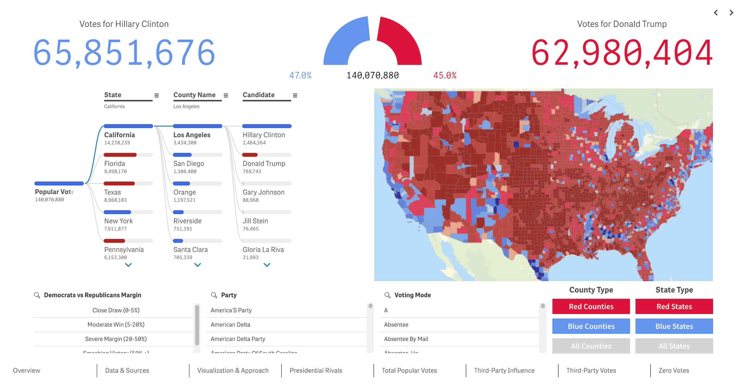 We recently released a new public Qlik Sense application that offers an interactive deep dive into U.S. presidential elections from 2016 through 2024 — our first step toward building the ultimate tool for exploring every presidential election in American history. We’re glad to see it’s already been well-received in the Qlik community and attracted significant attention, especially after being featured in the Qlik Gallery. The app is fully accessible in the browser, even if you do not have Qlik.
Read more at qlik.anychart.com »
- Categories: AnyChart Charting Component, Big Data, Business Intelligence, Dashboards, Qlik
- No Comments »