Building Scatter Chart in JavaScript
June 17th, 2022 by Shachee Swadia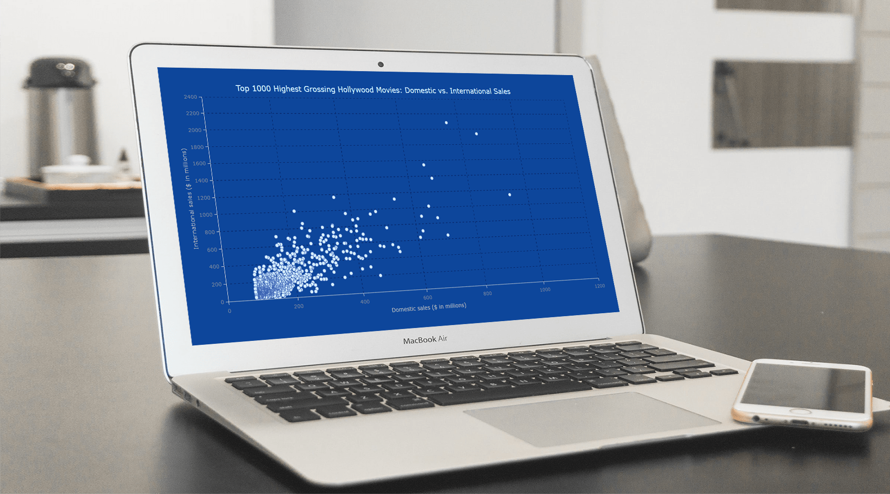 With data everywhere around us, it is imperative to know how to quickly create visualizations that help reveal trends and patterns in it. Today, let’s learn how to build a scatter chart in just a few lines of simple JavaScript code!
Scatter charts, or scatter plots, are designed to identify a correlation between typically two variables. In such graphics, the data is visualized as a set of points usually displayed as markers. The position of each marker indicates the values of the variables along the horizontal and vertical axes.
In this tutorial, we will be visualizing international and domestic sales of the 1000 highest-grossing Hollywood movies as of January 2022. So, get your popcorn and start watching the JS scatter chart development!
Read the JS charting tutorial »
- Categories: AnyChart Charting Component, Big Data, HTML5, JavaScript, JavaScript Chart Tutorials, Tips and Tricks
- No Comments »
Eye-Catching Visual Data Stories on World Media — DataViz Weekly
June 17th, 2022 by AnyChart Team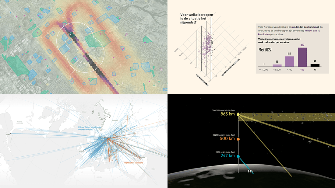 Good visual graphics are helpful in telling good stories based on data. Want to see some fantastic examples? Check out the best visual data stories of all we’ve recently come across, in a brand new issue of DataViz Weekly!
- Lead emissions around small airports in America — Quartz
- Labor shortage in Belgium — De Tijd
- Geography of Russian private jet flights — NYT
- Space debris and its danger — FT
- Categories: Data Visualization Weekly
- No Comments »
Fresh Collection of Interesting Charts & Maps — DataViz Weekly
June 10th, 2022 by AnyChart Team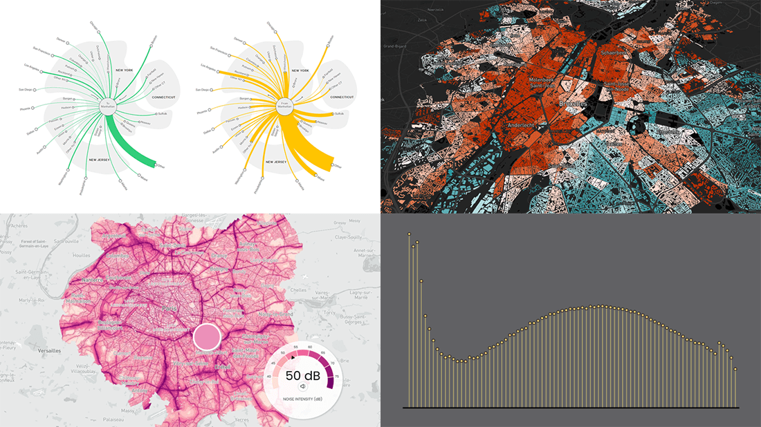 A lot of visualizations appear every day all over the web. On DataViz Weekly, we share with you those that we’ve found especially noteworthy. Check out our fresh collection of interesting charts and maps!
- Inequality and health in Brussels — Médor
- Noise pollution in Paris, London, and New York City — Possible
- Manhattan migration patterns — Bloomberg
- Commonness of divorce in the United States — FlowingData
- Categories: Data Visualization Weekly
- No Comments »
How to Make Treemap Using JS
June 8th, 2022 by Awan Shrestha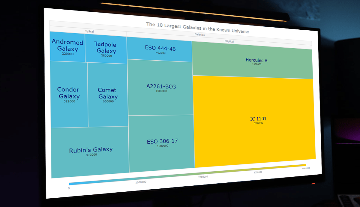 Treemap visualizations are widely used in hierarchical data analysis. If you need to build one but have never done that before, you might think the process is somewhat complicated. Well, not necessarily. I decided to make a step-by-step tutorial explaining how to create awesome interactive treemap charts with ease using JavaScript. And you’re gonna love the illustrations!
Are we alone in the universe? A question every one of us has asked ourselves at some point. While we are thinking about the odds of the Earth being the only habitable planet in the universe, or not, one of the things we might consider is how big the universe is. Let’s look at that with the help of treemaps! In this tutorial, we will be visualizing the scale of the 10 largest galaxies in the known universe using the treemapping technique.
So, would you like to know how to quickly build a JS-based treemap chart? Follow me in this stepwise tutorial and learn in an easy, fun way!
Read the JS charting tutorial »
- Categories: AnyChart Charting Component, HTML5, JavaScript, JavaScript Chart Tutorials, Tips and Tricks
- No Comments »
New Examples of Powerful Data Visualization in Action — DataViz Weekly
June 3rd, 2022 by AnyChart Team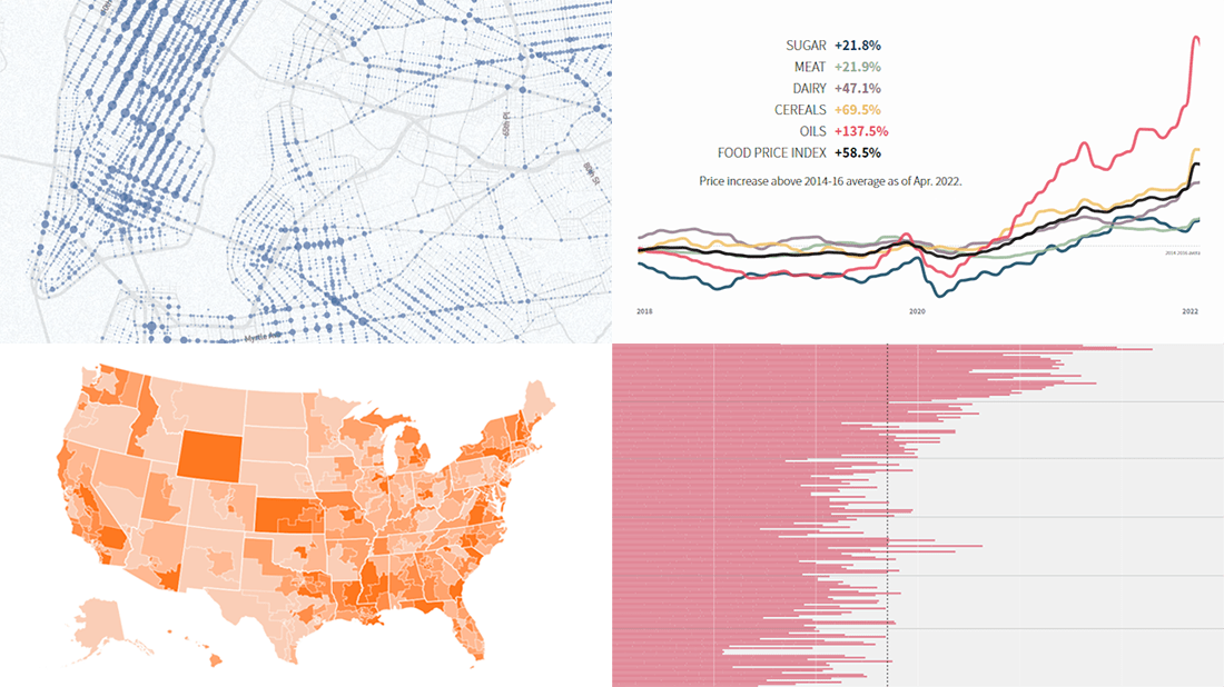 It’s Friday, and we are glad to show you four new examples demonstrating the power of data visualization in action! See what’s on DataViz Weekly today!
- Real costs of breastfeeding — The Washington Post
- Traffic violence across NYC in 2013–2021 — The New Yorker
- Global food crisis — Reuters
- Topical political issues across the U.S. in the run-up to the midterm elections — Axios
- Categories: Data Visualization Weekly
- No Comments »