 It’s Friday, and we are glad to show you four new examples demonstrating the power of data visualization in action! See what’s on DataViz Weekly today!
- Real costs of breastfeeding — The Washington Post
- Traffic violence across NYC in 2013–2021 — The New Yorker
- Global food crisis — Reuters
- Topical political issues across the U.S. in the run-up to the midterm elections — Axios
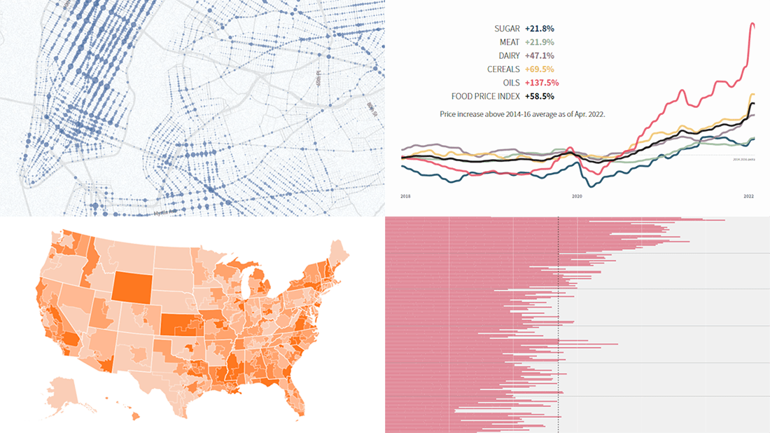
Data Visualization Weekly: May 27, 2022 — June 3, 2022
Real Cost of Breastfeeding
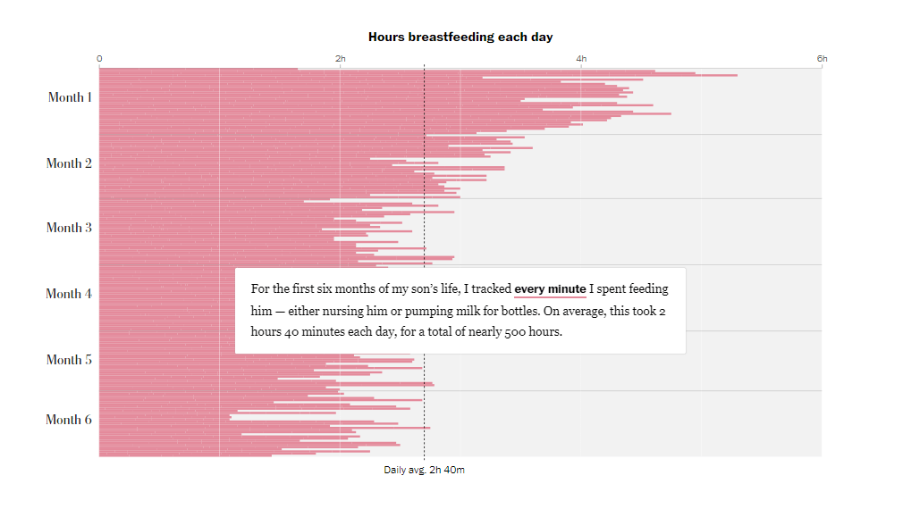
Supply chain issues and the recall of several products caused an acute shortage of infant formula in the United States. Some people say those affected should just breastfeed as “it’s free and available on demand.” But actually, even when a mother is physiologically able to produce enough milk, breastfeeding costs time and money.
Alyssa Rosenberg of The Washington Post used the Baby Tracker app to record every minute spent nursing (and pumping) over the first half a year of her kid’s life. Then she wrote an article sharing the insights with the help of charts created by Yan Wu. The visualizations greatly represent, for each day, the number of hours spent breastfeeding (two hours and forty minutes on average) and the exact time and duration of every single nursing or pumping session. Finally, all this is translated into money costs.
Learn about the price of breastfeeding, on The Post.
Traffic Violence Across NYC in 2013–2021
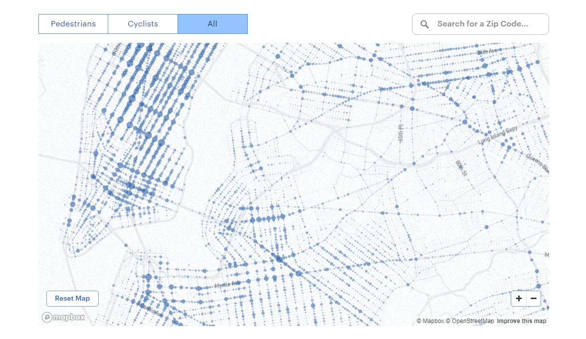
New York City is far from safe for pedestrians and cyclists. Thousands of them are killed or injured on its streets every year.
The New Yorker published an interactive map that shows the scale of the issue. Visualizing the New York Police Department’s data, it displays where cars injured (and killed) cyclists and pedestrians from 2013 to 2021. You can see the locations of all such accidents (with exact numbers in the tooltip) and identify the most dangerous spots all over the city. Enter a zip code to see the aggregate statistics for that area.
Look where cars injured or killed pedestrians or cyclists in NYC in 2013–2021 and find out more about the situation and what could be done to improve road safety, in the article by Danyoung Kim with illustrations by Josie Norton on The New Yorker.
Global Food Crisis
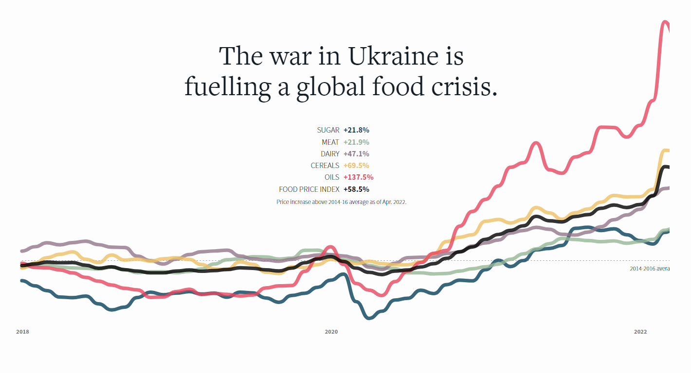
The ongoing conflict in Ukraine is fueling the global food crisis. Already affected by the pandemic and climate change, food prices have seen a sharp rise around the world over the last months.
Reuters — namely Dea Bankova, Prasanta Kumar Dutta, and Michael Ovaska — dug into what has been going on with the food market and why. The line chart you see above shows how the price increase for several food commodities based on data from the Food and Agriculture Organization of the United Nations (FAO). The story also includes a lot of other telling visualizations shedding light on the situation, including which parts of the globe are to be affected the worst by the crisis.
Check out how the food crisis has unfolded and been reinforced, on Reuters.
Topical Political Issues Across U.S. in Run-Up to Midterm Elections
I'm so proud of this project we just launched for @axios showing what issues matter in congressional districts for the midterms. @jnschrag @StefWKight have been my partners in crime on this for months, we put so much work into it, I hope you like it
? https://t.co/XJYKLaGfNZ pic.twitter.com/XZAuccN027
— Will Chase (@W_R_Chase) May 31, 2022
The U.S. midterm elections scheduled for November 8th will determine the fate of all 435 seats in the House of Representatives, 35 of the Senate’s 100 seats, and 39 state and territorial governorships.
Several months ahead of the voting, Axios used search data from Google Trends to find out which topics American people care about and mapped that by congressional district. In the special Midterm Elections 2022 project, designed and developed by Will Chase and Jacque Schrag, you can switch between multiple political issues to explore the relative interest in them across the United States using a choropleth map (or a cartogram) and a barcode chart.
See the top topics of concern in your district and how that compares with other areas, on Axios.
***
May these great data visualization examples serve as an inspiration for your own works! Stay tuned for more on DataViz Weekly!
- Categories: Data Visualization Weekly
- No Comments »