 A lot of visualizations appear every day all over the web. On DataViz Weekly, we share with you those that we’ve found especially noteworthy. Check out our fresh collection of interesting charts and maps!
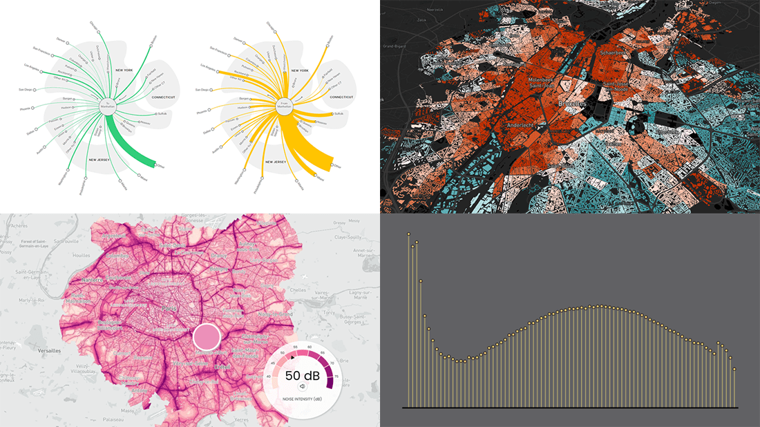
- Inequality and health in Brussels — Médor
- Noise pollution in Paris, London, and New York City — Possible
- Manhattan migration patterns — Bloomberg
- Commonness of divorce in the United States — FlowingData
Data Visualization Weekly: June 3, 2022 — June 10, 2022
Inequality and Health in Brussels
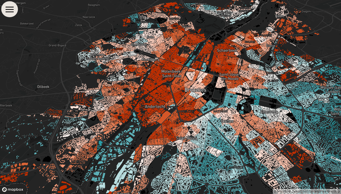
Megalopolises are known to be fractured by inequalities. Brussels, the capital of Belgium, is not an exception.
Médor, a Belgian magazine focusing on investigative journalism, published an impressive visual story with an analysis of the situation with health in Brussels. Titled Bruxelles Malade (Brussels Sick), the project uses many charts and maps representing various open data to shed light on the major forms of socio-economic inequality and how they impact people’s state of health across the city.
The data designer behind this piece is Karim Douïeb of Jetpack.ai. Check it out on Médor.
Noise Pollution in Paris, London, NYC
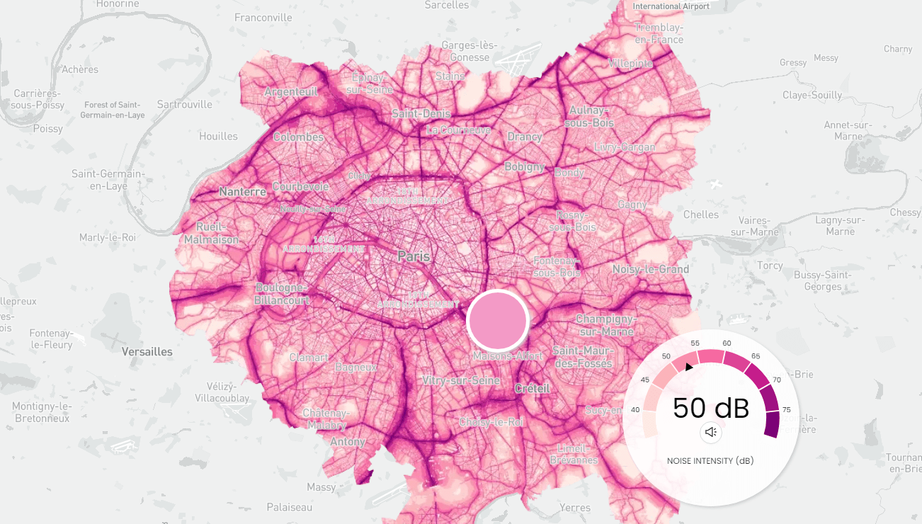
It happens extremely rarely that two projects of the same author make it to a single DataViz Weekly roundup. But here you go! Just a couple of days after Bruxelles Malade, another fascinating data visualization work by Karim Douïeb went live on the website of Possible, a charity for climate action.
The Noisy Cities project is an adaptation of one of Karim’s previous experiments with city sounds and data. These are audible maps representing noise pollution all over Paris, London, and New York City — using data from Bruitparif, the U.K. Department for Environment, Food and Rural Affairs (DEFRA), and the U.S. Department of Transportation (DOT), respectively. Move the mouse to explore street noise levels. The animated meter displays the number of decibels at a currently hovered spot.
Look at the maps on the Possible website.
Manhattan Migration Patterns
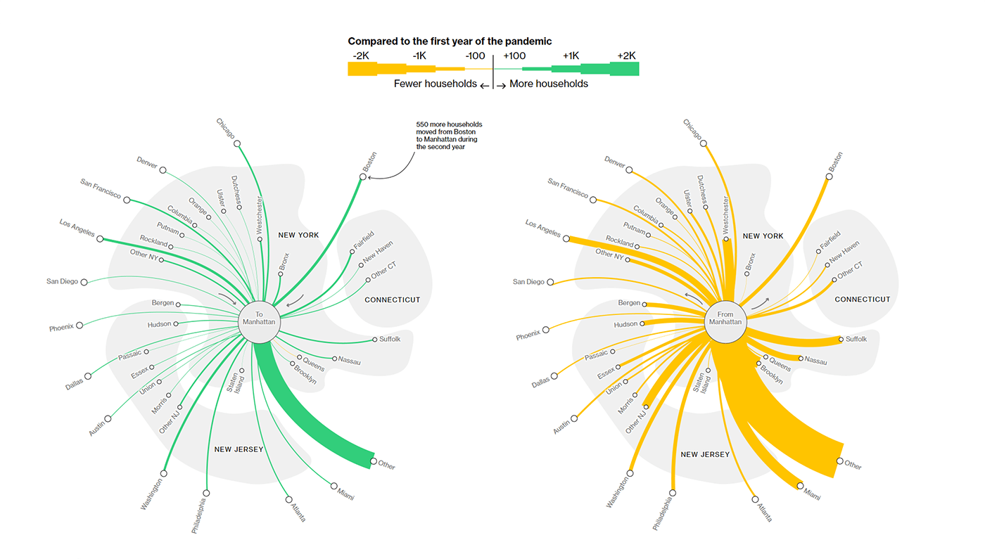
In the first pandemic year, NYC saw more outbound migration than any other metropolitan area in the United States, with Manhattan losing its population at the highest rates. But the migration pattern has already started to reverse. Currently, more people are moving to Manhattan than before Covid-19.
Marie Patino made cool visualizations for a Bloomberg article on New York City’s comeback, which show migration flows at a glance based on data from Melissa, a global contact data intelligence firm. For example, the graphics pictured above display how much more or fewer households moved to (and from) Manhattan from (and to) other places. In the story, you will also find interesting graphs visualizing Zillow’s data on home prices in and around New York and home inventory in NYC vs. nationwide, from March 2018 to March 2022.
See the article on Bloomberg.
Commonness of Divorce in U.S.
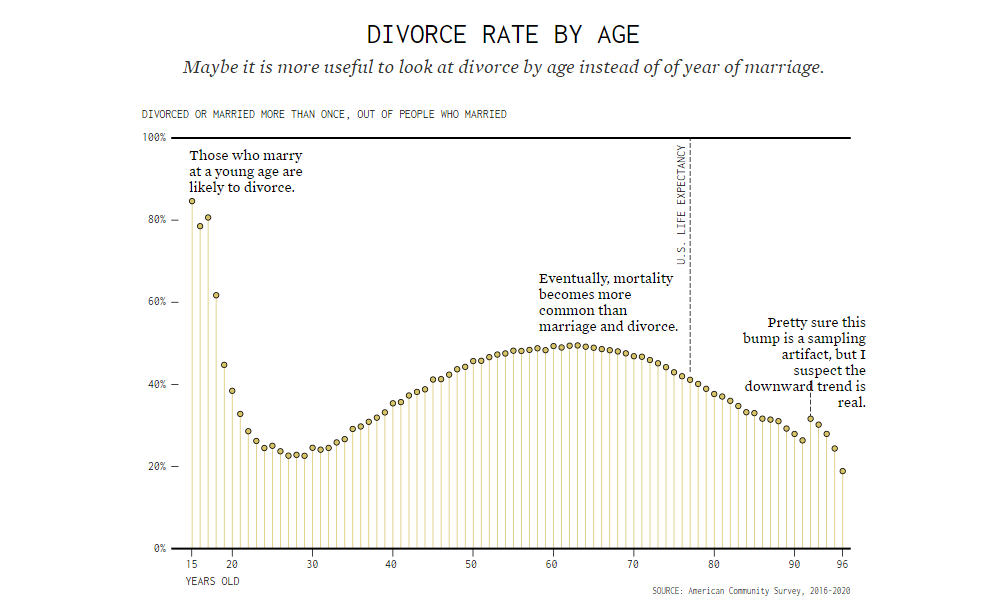
In the United States, divorces are quite common. If you are wondering how much, head to the FlowingData blog to find out what data says on that.
Nathan Yau dug into five years of the American Community Survey data from 2016 to 2020 and made three telling charts. The first visualization plots the percentage of married people by the year of marriage. A second one adds the breakdown by status among the non-married. The final graph — it’s shown above — displays the divorce rate by age.
You can find the charts along with Nathan’s analysis on FlowingData.
***
Thanks for your attention to Data Visualization Weekly! Stay tuned for our roundups of the most interesting charts, maps, and infographics!
- Categories: Data Visualization Weekly
- No Comments »