New Data Visualization Project Examples to Check out – DataViz Weekly
February 23rd, 2018 by AnyChart Team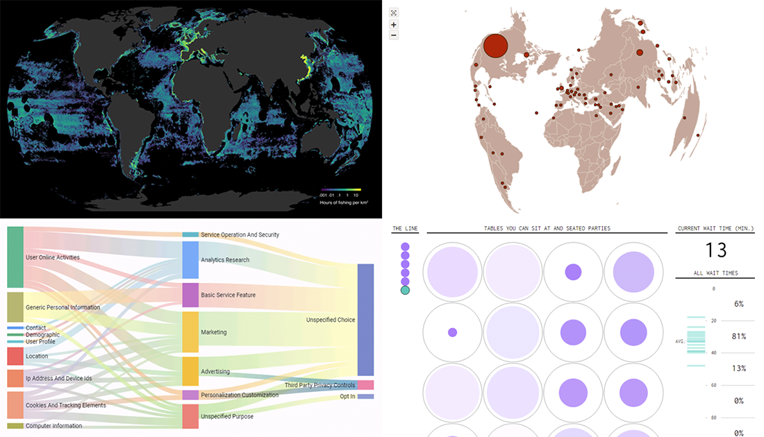 A lot of new charts and infographics on various subjects appear every day, and we are keen to keep sharing some interesting new data visualization project examples in DataViz Weekly. In fact, such things can really serve well for inspiration, to learn more about the world around us or just for fun, which is all good.
Here’s a quick list of what we are glad to spotlight now:
- privacy policies explained through data visualization;
- fishing activities globally;
- waiting for an open table at a restaurant;
- Starbucks restaurant locations worldwide.
- Categories: Data Visualization Weekly
- No Comments »
Data-Driven Storytelling Practices – DataViz Weekly
February 16th, 2018 by AnyChart Team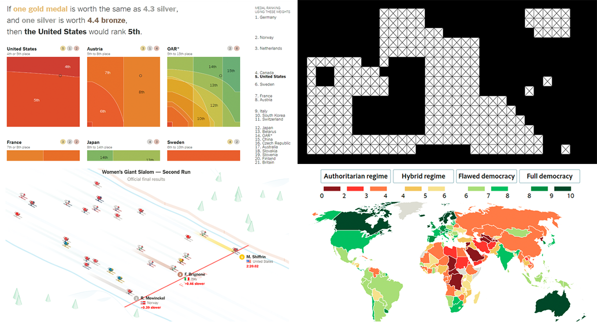 “Numbers have an important story to tell. They rely on you to give them a clear and convincing voice,” Stephen Few once said. We are glad to share with you several new cool data-driven storytelling examples that nicely demonstrate how the appropriate visualization can make data speak.
Today in Data Visualization Weekly:
- Winter Olympics medal count from different angles;
- democracy at risk, globally;
- visualizing missing and incomplete data (tips and examples);
- women’s giant slalom race at the 2018 Olympics.
- Categories: Data Visualization Weekly
- No Comments »
Data Visualization Based Story Examples Worth Checking Out – DataViz Weekly
February 9th, 2018 by AnyChart Team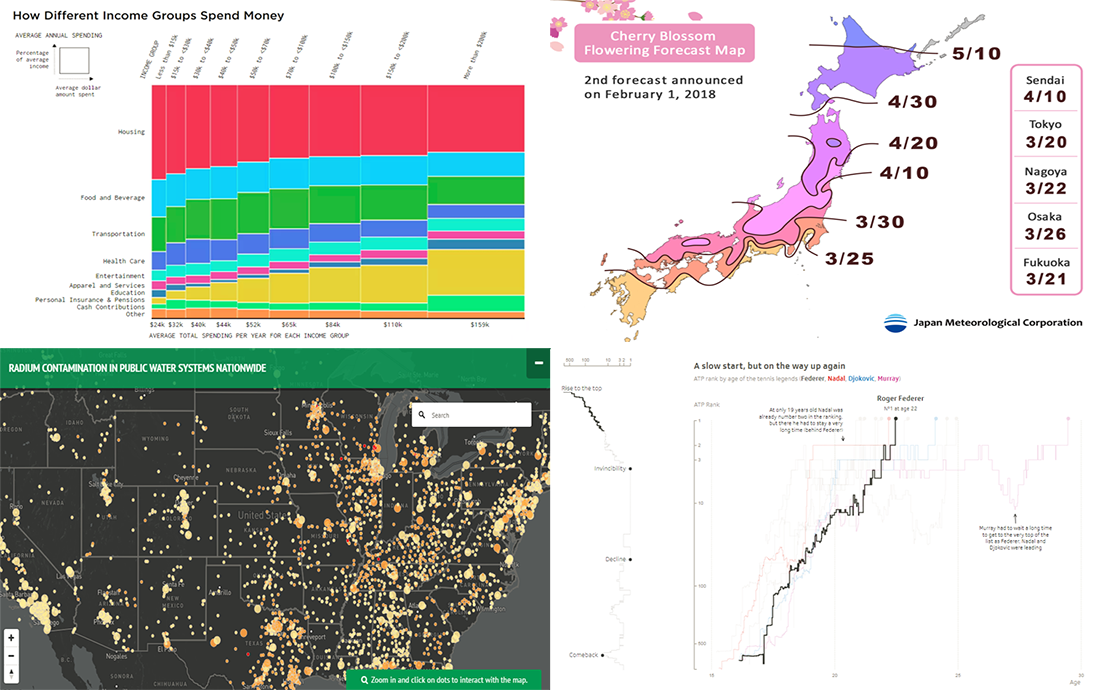 Another week is about to end, and another four interesting data visualization based story examples are waiting for your attention. Data Visualization Weekly is back to the AnyChart blog!
Check out what we’ve featured today:
- what Americans spend money on, by income level;
- when sakura blossom season starts where in Japan;
- radioactive drinking water across the US;
- Roger Federer’s tennis career and success.
- Categories: Data Visualization Weekly
- No Comments »
Best JavaScript Technology: AnyChart JS Charts Library Wins 2018 DEVIES Award!
February 6th, 2018 by AnyChart Team It’s happened! Our AnyChart JS Charts library has just been officially named the best in JavaScript Technology for innovation and received a prestigious DEVIES award in California! (See all the 2018 DEVIES winners — one for each of the 15 categories.)
2018 DEVIES is reported to be the world’s leading DevTech Awards event, taking place these days during DeveloperWeek in Oakland, CA, the largest developer expo and conference series globally.
- Categories: AnyChart Charting Component, AnyGantt, AnyMap, AnyStock, HTML5, JavaScript, News, Qlik, Success Stories
- 6 Comments »
More Data Visualizations That Should Be Seen – DataViz Weekly
February 2nd, 2018 by AnyChart Team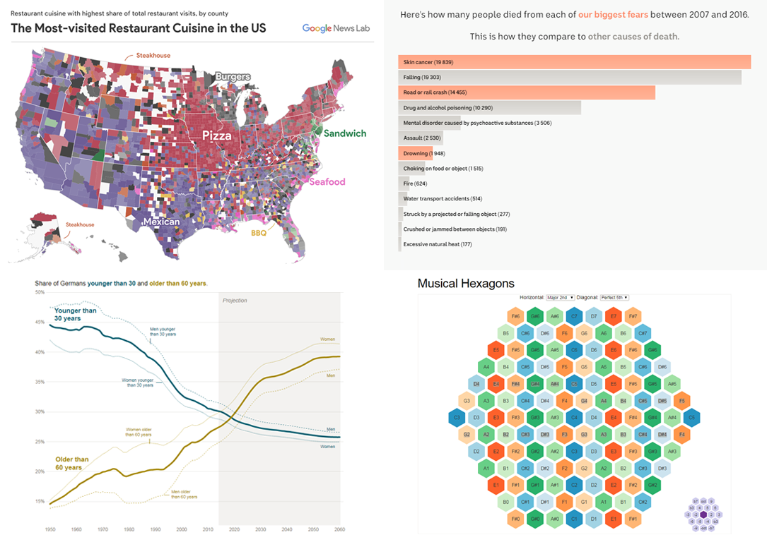 More, more data visualizations now! We’ve made up a new collection of interesting charts and infographics of the latest time. Take a look at this new issue of Data Visualization Weekly!
Here’s what data stories and visualizations we are showcasing in the article:
- America’s restaurant preferences and cuisine capitals;
- Europe’s oldest population: Germany is about to reach a scary milestone in 2019;
- deadliness of our worst fears;
- musical hexagons.
- Categories: Data Visualization Weekly
- No Comments »