 More, more data visualizations now! We’ve made up a new collection of interesting charts and infographics of the latest time. Take a look at this new issue of Data Visualization Weekly!
Here’s what data stories and visualizations we are showcasing in the article:
- America’s restaurant preferences and cuisine capitals;
- Europe’s oldest population: Germany is about to reach a scary milestone in 2019;
- deadliness of our worst fears;
- musical hexagons.
Data Visualization Weekly: January 26, 2018 – February 2, 2018
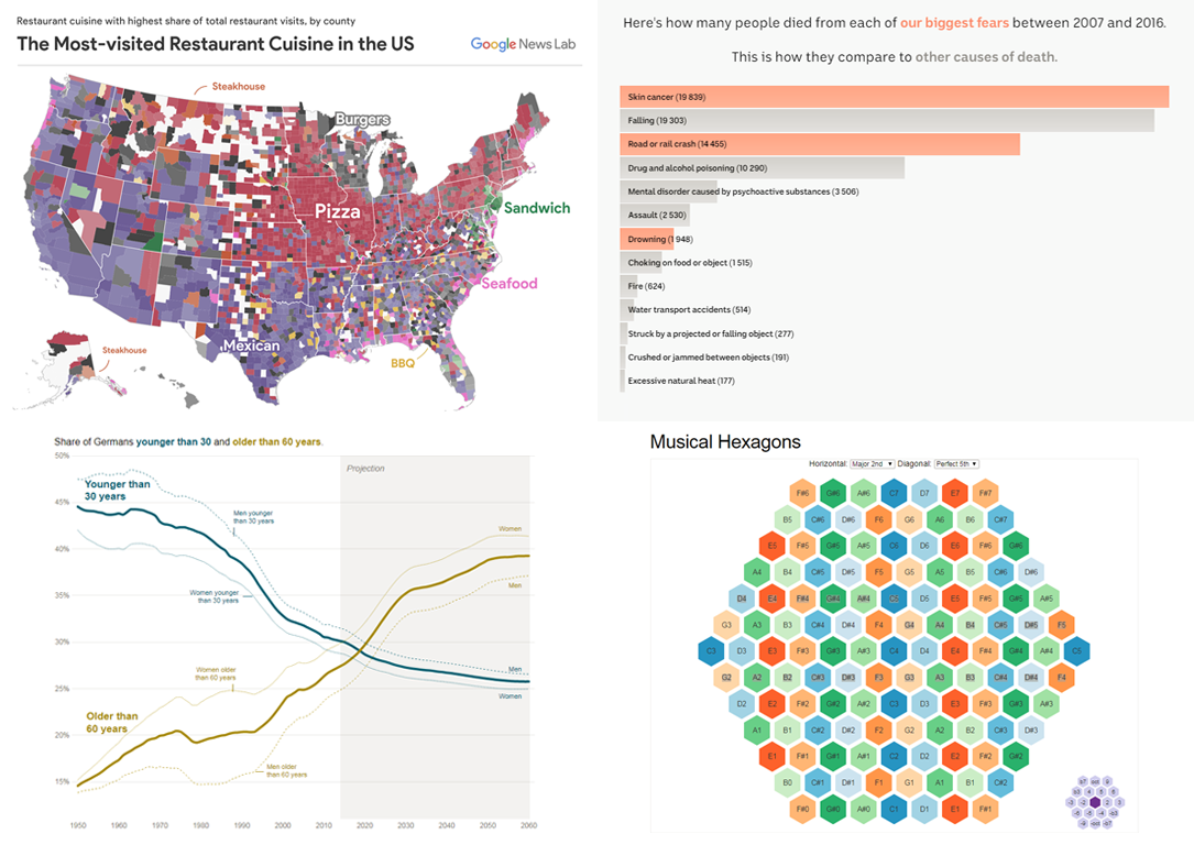
America’s Restaurant Preferences and Cuisine Capitals
Google News Lab in collaboration with Polygraph, a design studio, created nice visualizations to look into restaurant preferences of people across the US. Based on data from Google, their maps show the popularity of restaurants of one cuisine or another, by county, and allow comparisons. There are also more data visualizations in the article that will, for example, allow you to find out what cities are pizza, BBQ, burger, sandwich, steak, seafood, as well as Mexican and Chinese food capitals in terms of the share of people’s visits to the corresponding restaurants. The map visualization at the end of the article will let you to explore the most visited restaurant types in large US cities, by neighborhood.
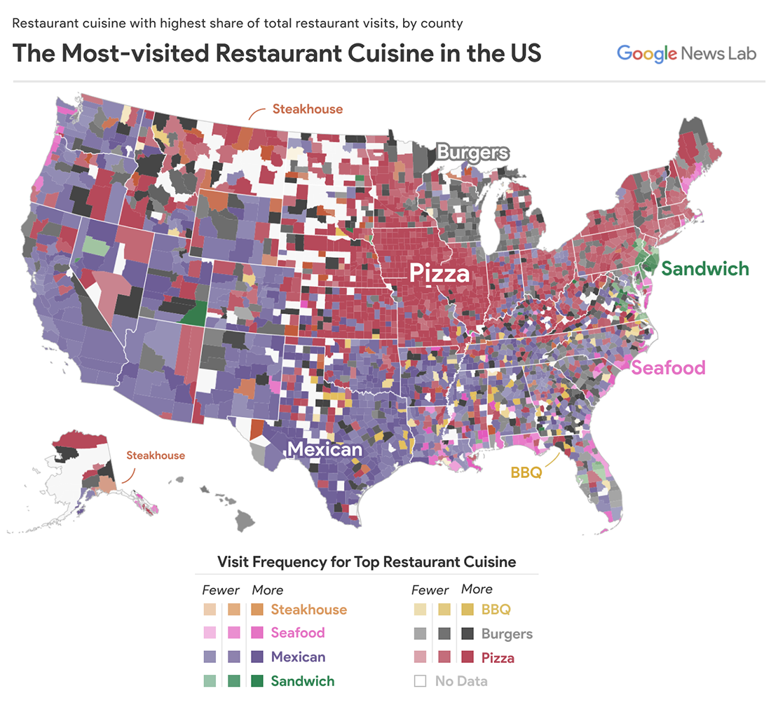
Europe’s Oldest Population: Germany Is to Reach Scary Milestone in 2019
Experts expect Germany to reach a frightening demographic milestone. In fact, data and trends show that the country will soon be home to fewer people under 30 than those of 60+ years old. To be more precise, this is very likely to become a reality already in 2019. Learn more from this Visual Capitalist’s story featuring several interesting charts that reveal some further details. There you’ll find, for example, an interactive population pyramid for Germany, greatly communicating how the distribution of age groups has been and will be changing between 1950 and 2060.
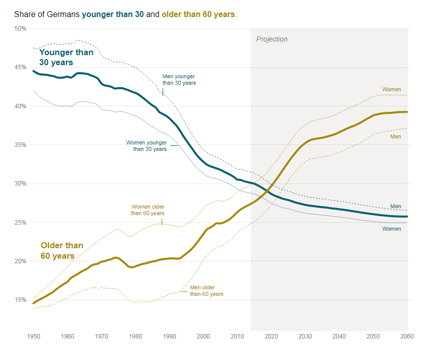
Deadliness of Your Worst Fears
What are you strongest fears? Are you sure they are so deadly as it seems? Check out this visualization project by Australia’s ABC News. Choose your worst fears and you’ll learn how many people in Australia died from them in 2007-2016. It is also worth noting here that the country’s top fears are road (rail) crash, skin cancer, drowning, fire, falling and shark attacks.
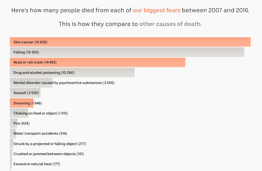
Musical Hexagons
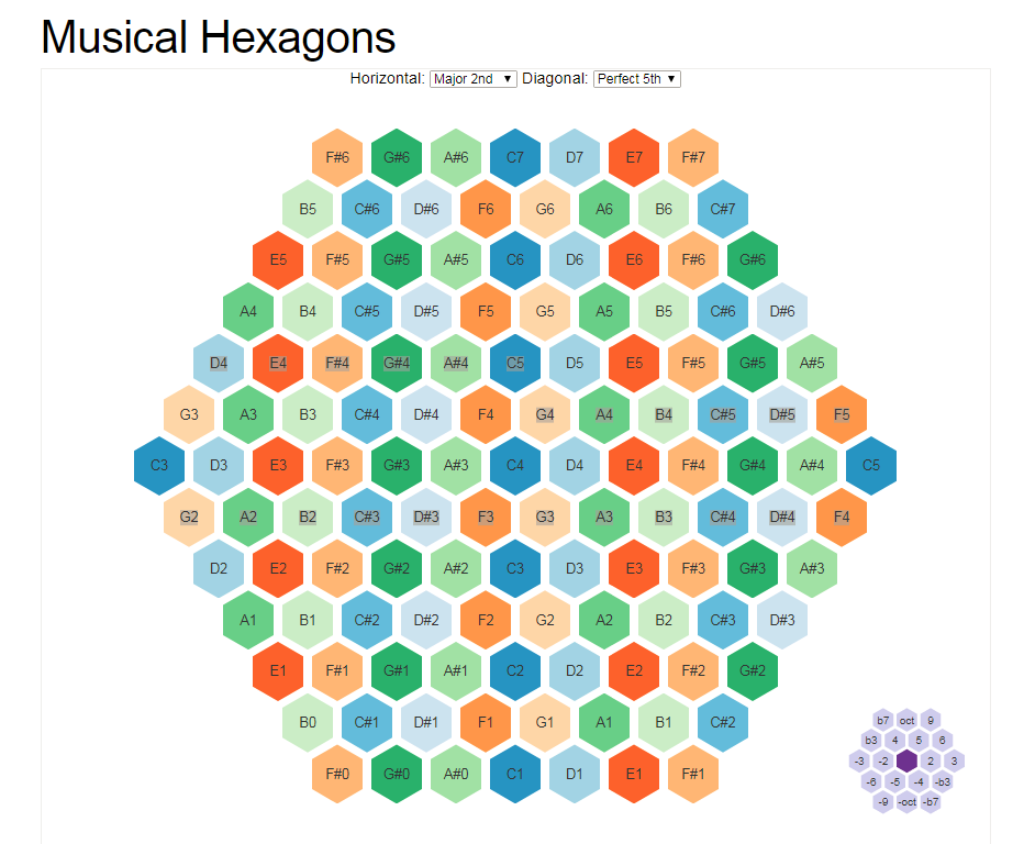
Vasco Asturiano made an awesome visual 2D spatial arrangement of the chromatic musical notes in a fully relative layout (which is quite far from how they are arranged in the traditional piano keyboard, for example). It is all interactive, so you can hover over the keys to hear each corresponding note sound, and you can switch between various patterns.
***
Look forward to more data visualizations that are worth checking out! The next DataViz Weekly post will see the light shortly, in just seven days.
- Categories: Data Visualization Weekly
- No Comments »