 A lot of new charts and infographics on various subjects appear every day, and we are keen to keep sharing some interesting new data visualization project examples in DataViz Weekly. In fact, such things can really serve well for inspiration, to learn more about the world around us or just for fun, which is all good.
Here’s a quick list of what we are glad to spotlight now:
- privacy policies explained through data visualization;
- fishing activities globally;
- waiting for an open table at a restaurant;
- Starbucks restaurant locations worldwide.
Data Visualization Weekly: February 16, 2018 – February 23, 2018
Privacy Policies Explained Through Data Visualization
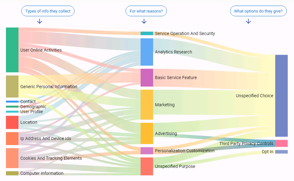
Do you read privacy policies of the websites you visit? If your answer is yes, you are definitely in the minority. Check out a new data visualization project named Polisis. Created by EPFL’s Hamza Harkous, Rémi Lebret and Karl Aberer, UWisc’s Kassem Fawaz, and UMich’s Florian Schaub and Kang G. Shin, it greatly shows how companies (can) actually use your data, what part of it they share with third parties and why, whether you can edit your data, what exactly you can do about it, etc. Just enter an address of a website and see the details about its privacy policy.
Fishing Activities Globally
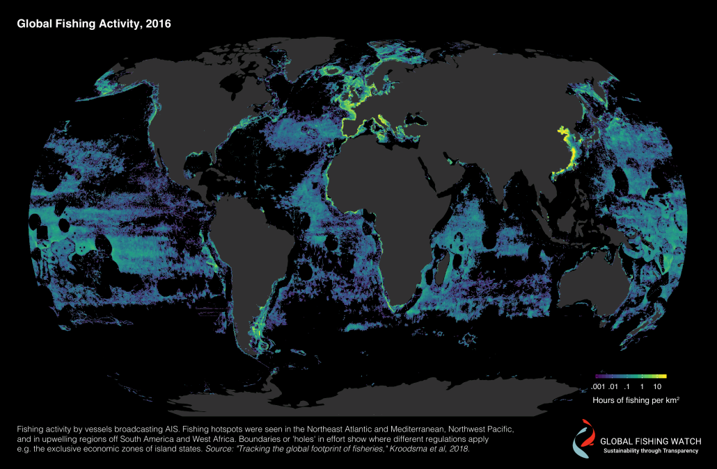
Science published a report that is helpful in understanding a global footprint of fishing. In particular, it features new geo data visualizations, showing fishing vessels on a map and where they were active in 2016. To learn more about this work, you are welcome to read a dedicated article in The Washington Post. Also check out the Global Fishing Watch website where you’ll find, for example, an interactive map of the global commercial fishing activity, time series charts and other interesting data, visualizations and publications on the subject.
Waiting for Open Table at Restaurant
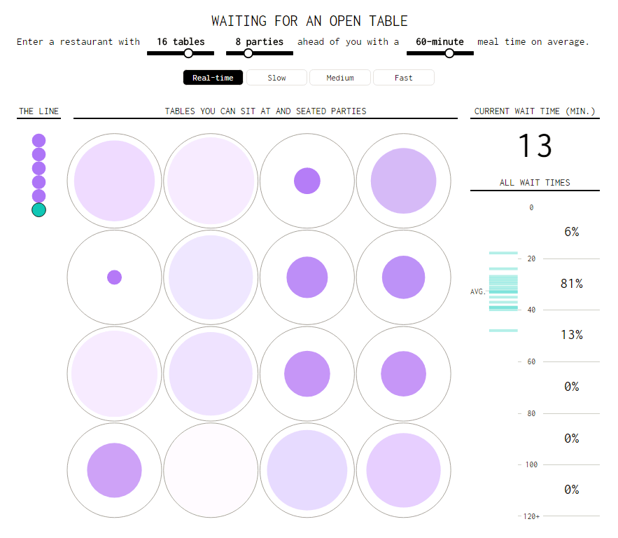
When you come into a restaurant, you may well find yourself in a waiting line before you are actually seated. But how long is it going to take to get a spare table? Take a look at this new beautiful visual simulation from Nathan Yau, counting and displaying a waiting time based on the number of tables in a restaurant, how many parties are ahead of you and what’s the average meal time there. If you are in the line at a food venue right now, it can help you decide whether to stay there and wait or head to some other place nearby.
Starbucks Restaurants Worldwide
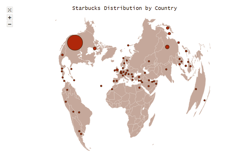
Starbucks is one of the world’s largest F&B chains, operating more than 27,000 locations in various countries all over the globe. To display the distribution of its restaurants, we took open data from Socrata and used a bubble map with the Bonne projection to visualize it. This interactive map currently serves as a JavaScript (HTML5) charting example in the gallery of geo charts of our JS maps library AnyMap. Check it out with the Coffee theme or easily switch to any other one with a different color palette if you would like.
***
Ok, that’s all new data visualization project examples we wanted to share with you this time. The next week will bring another cool charts and infographics, for sure. Stay tuned for Data Visualization Weekly!
- Categories: Data Visualization Weekly
- No Comments »