Mills College Uses AnyChart JS Charts for Student Success Data Visualization
April 29th, 2020 by AnyChart Team Myriads of enterprise-level software developers rely on our award-winning JavaScript data visualization library to build comprehensive reporting and analytics applications. However, AnyChart is also widely chosen to operate basic charts. One example of such a use case is a visualization of student success metrics at Mills College, a famous American higher education institution attended at different times by filmmaker Sofia Coppola, musician Dave Brubeck, and Congresswoman Barbara Lee among other great people.
We interviewed Angelique Felgentreff from Mills College to get you first-hand information about their experience using charts powered by AnyChart. (Stack: OmniUpdate OU Campus/PHP.)
- Categories: AnyChart Charting Component, HTML5, JavaScript, Success Stories
- No Comments »
Qlik Sense Timeline Chart and More New Features in AnyGantt Extension V 4.1.244
April 24th, 2020 by AnyChart Team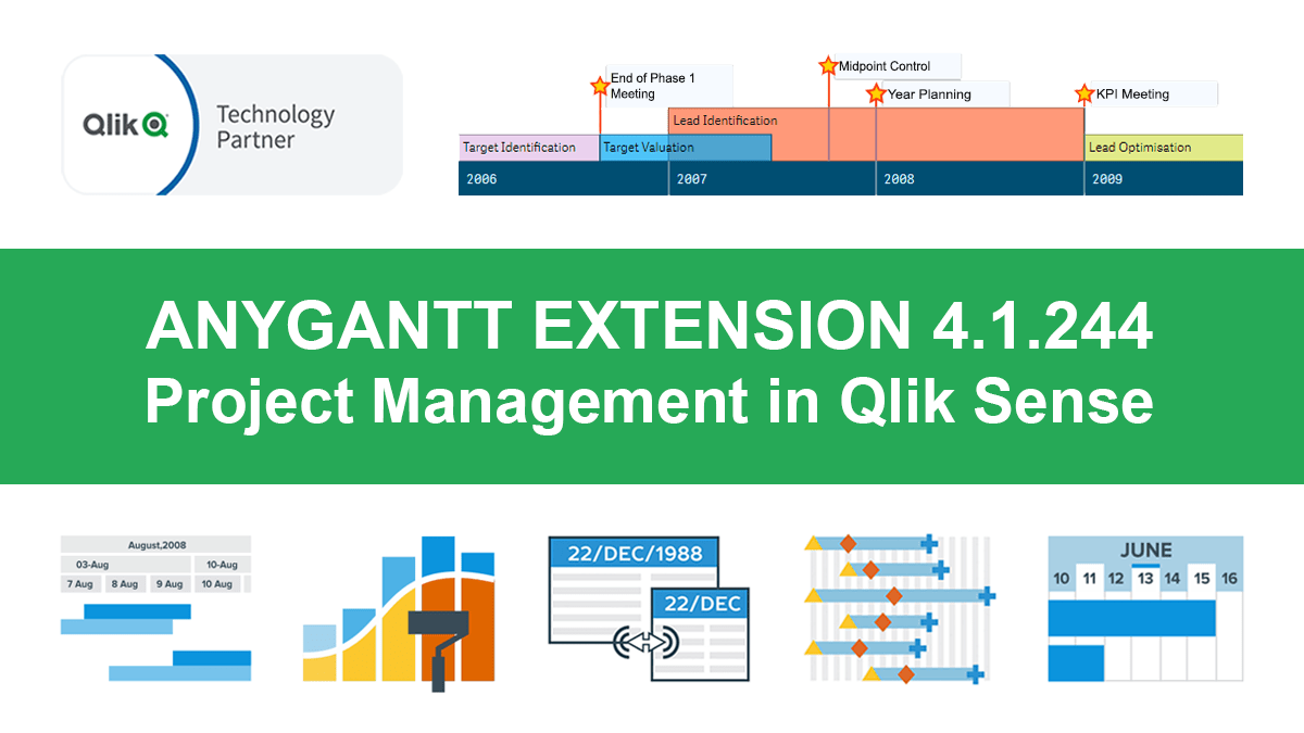 Hey Qlikkies, meet the awesome Qlik Sense Timeline Chart from AnyChart! We are excited to deliver it in the new, just-released version of our AnyGantt extension.
Hence the Timeline Chart has become — wait for it — the 40th chart type available in our data visualization extensions for Qlik Sense overall! For AnyGantt specifically it is the 3rd one, making AnyGantt a unique, cutting-edge Project Management Bundle for Qlik now comprising the Project Gantt Chart, Resource Chart, and Timeline Chart in a single intuitive extension.
However, it is not all great news. Release 4.1.244 also brings a bunch of other awesome features and improvements to the AnyGantt extension.
Read more at qlik.anychart.com »
- Categories: AnyChart Charting Component, AnyGantt, Big Data, Business Intelligence, Gantt Chart, News, Qlik
- No Comments »
New Interesting Graphics on Climate Change, Media Credibility, Hospital Occupancy, and Job Losses — DataViz Weekly
April 24th, 2020 by AnyChart Team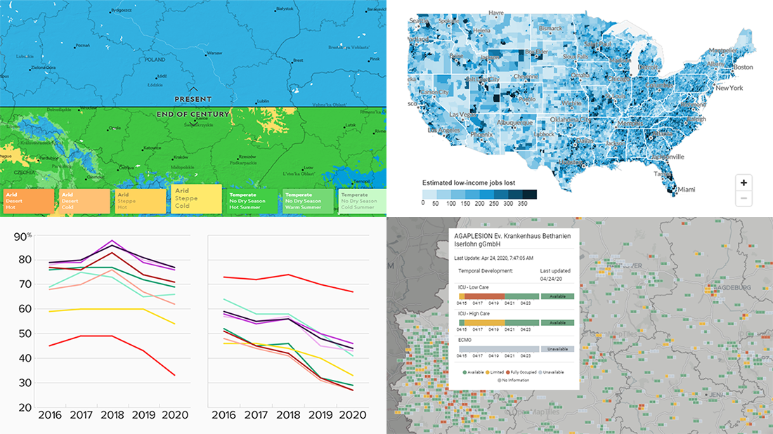 Continuing our series of regular DataViz Weekly articles highlighting new interesting graphics from all over the web, here’s what data visualization projects we picked to show you this time:
- Climate change in your city by 2070 — National Geographic
- New American media credibility ratings — Morning Consult
- Hospital bed occupancy in Germany — University of Konstanz
- Low-income job losses across the United States — Urban Institute
- Categories: Data Visualization Weekly
- No Comments »
1918 Spanish Flu Pandemic in Data and Charts — DataViz Weekly
April 17th, 2020 by AnyChart Team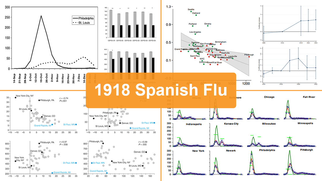 While the world keeps fighting the coronavirus disease outbreak, we have seen a number of attempts to draw analogies between the COVID-19 and previous influenza pandemics. Inspired by a recent National Geographic article by Nina Strochlic with graphics from Riley D. Champine, today we invite you to find out (or remember) what the 1918 Spanish flu pandemic looked like and what lessons it may offer to cope with the current crisis.
For this new DataViz Weekly, we have curated four researches on the 1918 flu pandemic in the United States. Focusing on an analysis of nonpharmaceutical interventions (NPIs) such as social distancing measures and their role, these studies contain a lot of diverse data and charts. They are worth checking out if you’re interested in the subject of epidemics or in data science, analytics, and visualizations as such.
- Categories: Data Visualization Weekly
- No Comments »
How to Color Qlik Gantt Chart Powered by AnyGantt Extension for Qlik Sense
April 15th, 2020 by AnyChart Team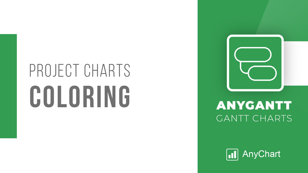 Within the framework of our series of tutorials explaining in detail different aspects of building a Gantt chart in Qlik Sense, we are glad to share a new quick visual manual. This one describes how to color a Project Gantt chart in the AnyGantt extension for Qlik Gantt charts.
Join us as in this tutorial we are going to make it completely clear how to color all main parts of Project Gantt charts: elements, chart area, table cells, table header, and timeline levels. In addition, you can see tutorials about labels, tooltips, and reference lines and ranges — they can also be colored. (Those about tooltips and reference lines and ranges are coming soon. Meanwhile, check out the AnyGantt extension’s documentation or ask our support engineers for assistance.)
For your convenience, this tutorial is available in two versions. Check it out as a video with a voice over or keep reading the alternative, text+pictures version.
Read more at qlik.anychart.com »
- Categories: AnyGantt, Big Data, Business Intelligence, Gantt Chart, Qlik
- No Comments »
Visualizing Hubble Observations, Census Evolution, Conflicts, and Media Consumption — DataViz Weekly
April 10th, 2020 by AnyChart Team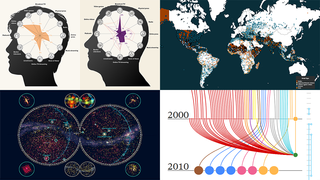 In the new DataViz Weekly post, we are glad to tell you about new compelling visualizations we have come across these days. Here’s what projects made it to our today’s selection, from people’s activities to Hubble observations:
- 30 years of the Hubble Space Telescope’s observations — Physics Today
- Evolution of the U.S. census from 1790 to 2020 — The Pudding
- 10 conflicts to worry about in 2020 — ACLED
- Media consumption during the COVID-19 pandemic — Visual Capitalist
- Categories: Data Visualization Weekly
- No Comments »
Creating JavaScript Column and Bar Charts on COVID-19 Data
April 6th, 2020 by Jay Stevenson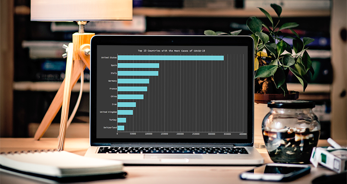 Need compelling JS charts for your website or app? Start with the basics! Complete this quick data visualization tutorial and you’ll learn how to easily create JavaScript column and bar charts that will look great in any HTML5-based project, allowing for easy comparisons.
Chart examples to be built and demonstrated in this tutorial will be visualizing the latest novel coronavirus cases data from JHU CSSE as COVID-19 is the most topical issue nowadays.
Keep reading and you’ll see JS charting is actually very simple. Especially if you have at least a very basic understanding of programming (more than that is awesome but far from necessary).
Read the JS charting tutorial »
- Categories: AnyChart Charting Component, HTML5, JavaScript, JavaScript Chart Tutorials, Tips and Tricks
- No Comments »
Social Distancing in Data Visualizations — DataViz Weekly
April 3rd, 2020 by AnyChart Team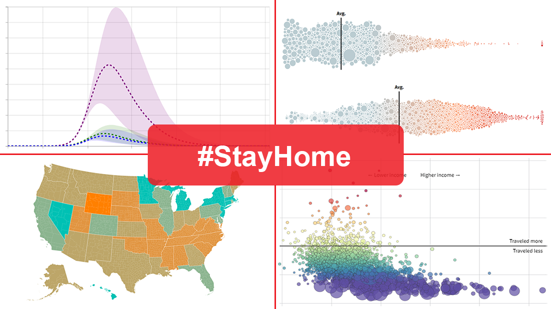 Many health and epidemiology experts consider social distancing to be the most effective way to slow the spread of COVID-19 at the current stage. But does it really work and help?
In today’s DataViz Weekly, we put a focus on data visualizations — charts and maps — on where we, in the United States, have been on social distancing. The following projects deserved to get featured in this special “#StayHome” edition:
- “The Social Distancing of America” — Reuters
- “Where America Didn’t Stay Home Even as the Virus Spread” — NYT
- “Social Distancing Scoreboard” — Unacast
- “COVID-19 Projections Assuming Full Social Distancing Through May 2020” — IHME, UW Medicine
- Categories: Data Visualization Weekly
- 1 Comment »
How to Configure Project Gantt Chart Labels in Qlik Sense
April 1st, 2020 by AnyChart Team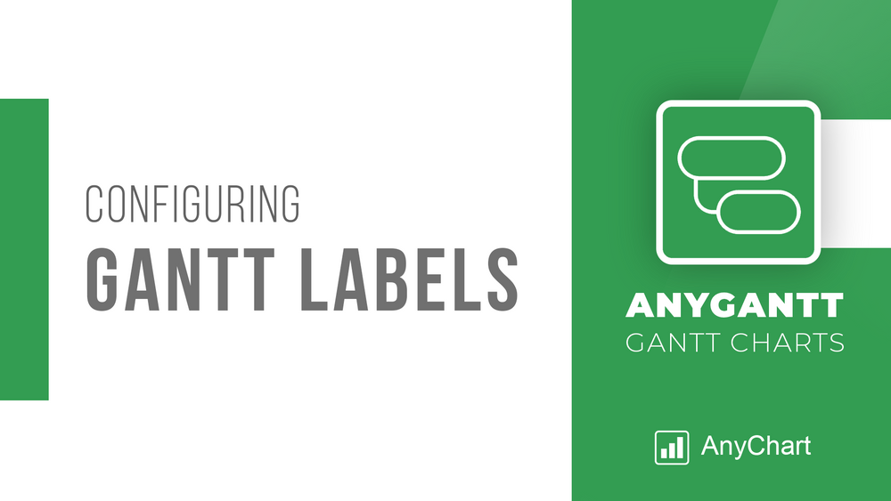 We continue a series of tutorials delving into the details of how to create Gantt charts in Qlik Sense and customize them using our intuitive AnyGantt Extension. This time, let’s look at configuring Gantt chart labels.
You can watch the video version of this tutorial or keep reading to see it in the text and pictures.
Read more at qlik.anychart.com »
- Categories: AnyGantt, Big Data, Business Intelligence, Gantt Chart, Qlik
- 1 Comment »