 Continuing our series of regular DataViz Weekly articles highlighting new interesting graphics from all over the web, here’s what data visualization projects we picked to show you this time:
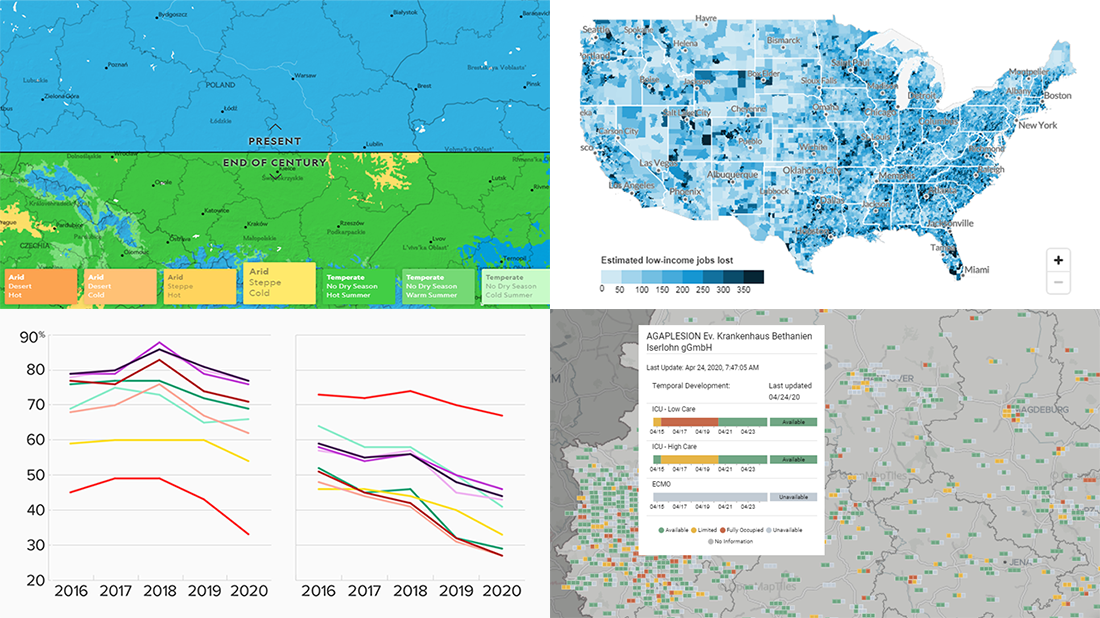
- Climate change in your city by 2070 — National Geographic
- New American media credibility ratings — Morning Consult
- Hospital bed occupancy in Germany — University of Konstanz
- Low-income job losses across the United States — Urban Institute
Data Visualization Weekly with New Interesting Graphics: April 17, 2020 — April 24, 2020
Climate Change in Your City by 2070
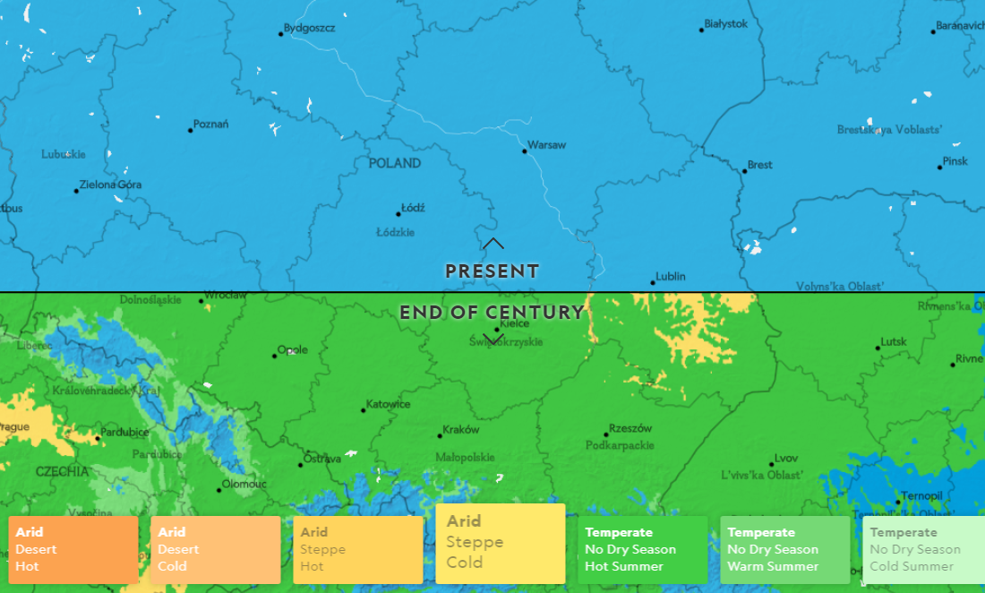
National Geographic created an impressive visual story showing at a glance what the world with the changed climate can be expected to feel like in fifty years from now. The project is based on data modeled in accordance with the assumptions of the worst-case of the future climate scenarios identified by the Intergovernmental Panel on Climate Change.
Most of us can already witness that weather patterns are shifting. But here, you can see where this is actually going to bring us. Enter a city and see exactly how its climate could be transformed if greenhouse emissions keep increasing.
New U.S. Media Credibility Ratings
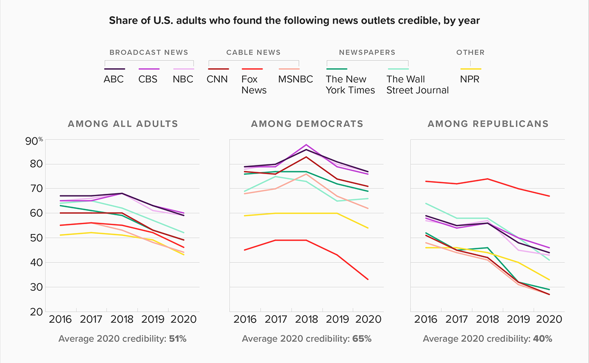
New Morning Consult data reveals record lows for the American news media credibility levels in the United States. These findings are derived from a survey the company fielded last week in partnership with The Hollywood Reporter. According to the new data, the decline is largely driven by increasingly negative opinions among Republicans.
The average credibility rating now sits at 51.2% which is the share of U.S. adults who found nine leading media credible. See the line charts in the picture to find out how credibility has changed for every news outlet since 2016, overall and depending on party preferences. In the article, you’ll find a cool percent stacked bar chart displaying what registered voters said on how well CNN, Fox News and MSNBC are handling the coronavirus subject — also very interesting.
Hospital Bed Occupancy in Germany
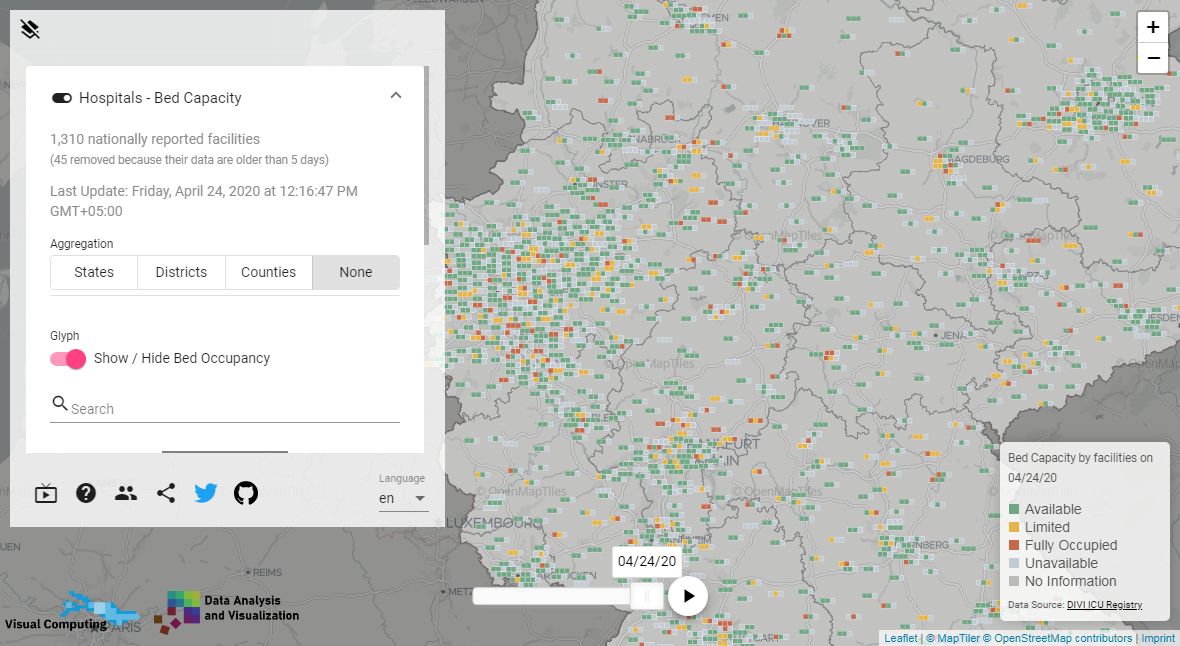
The Data Analysis and Visualization Group (DBVIS) at the University of Konstanz launched a tool for exploring the availability of hospital and ICU beds across Germany. The visualization is based on data from the German Interdisciplinary Association for Intensive Care and Emergency Medicine (DIVI). The authors also included the opportunity to add supplementary overlays such as COVID-19 cases and helicopter pads.
The project is expected to be helpful in effectively routing and re-routing patients along with optimizing the occupancy of bed facilities in Germany. Check out how it looks and works in reality.
Low-Income Job Losses in America
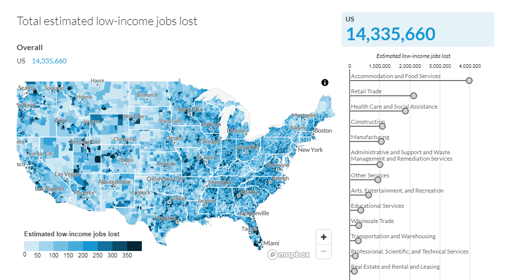
Urban Institute created a data visualization project that shows at a glance what places across the United States are hit the hardest by low-income job losses due to the coronavirus crisis. It includes a map displaying the situation in each neighborhood according to the researchers’ estimates taking into account weekly unemployment figures from New York State and Washington State along with data from the Bureau of Labor Statistics (BLS). There is also a chart representing jobs lost by industry.
Look at the dashboard to find out what areas in America are experiencing the worst impact of stay-at-home orders in terms of low-income job losses. Note that when you hover over a place on the map, the chart changes to show data for the corresponding territory, and vice versa.
***
We appreciate your attention. Stay tuned for new interesting graphics in Data Visualization Weekly on AnyChart Blog.
- Categories: Data Visualization Weekly
- No Comments »