 Many health and epidemiology experts consider social distancing to be the most effective way to slow the spread of COVID-19 at the current stage. But does it really work and help?
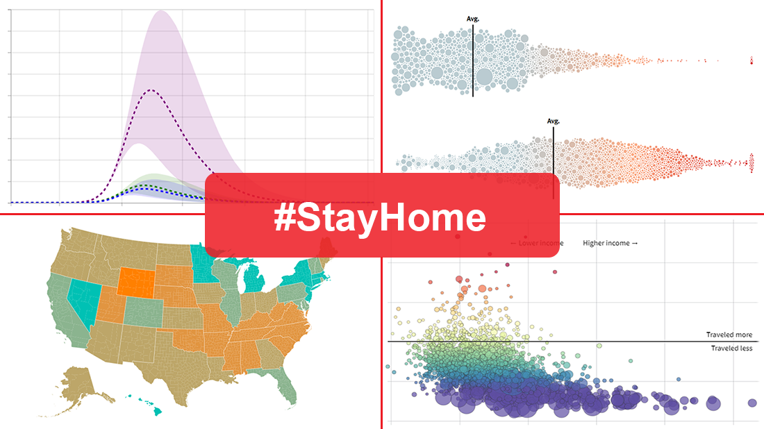
In today’s DataViz Weekly, we put a focus on data visualizations — charts and maps — on where we, in the United States, have been on social distancing. The following projects deserved to get featured in this special “#StayHome” edition:
- “The Social Distancing of America” — Reuters
- “Where America Didn’t Stay Home Even as the Virus Spread” — NYT
- “Social Distancing Scoreboard” — Unacast
- “COVID-19 Projections Assuming Full Social Distancing Through May 2020” — IHME, UW Medicine
Data Visualization Weekly: March 27, 2020 — April 3, 2020
“The Social Distancing of America” by Reuters
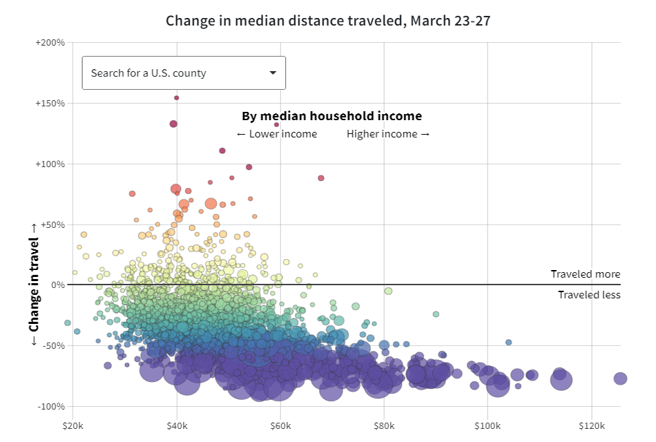
Reuters offers a look at social distancing in the United States through the prism of anonymized smartphone location data. This data, shared with Reuters by the Kochava Collective, a mobile data marketplace, shows some interesting trends in how travel habits of Americans changed in March.
In particular, when visualized in interactive bubble charts, smartphone data tells us that people in the most populated urban counties decreased travel the most dramatically. Americans in lower median household income counties and in counties that voted for Donald Trump at the 2016 presidential election were more likely to continue traveling. Many counties with higher concentrations of people aged 65+ were quite slower to change their travel habits.
Look at the charts and find out how your county performed. Also, there are countrywide map visualizations of the same data displaying at a glance how median travel distances changed in each full week of March, county by county.
“Where America Didn’t Stay Home Even as the Virus Spread” by NYT
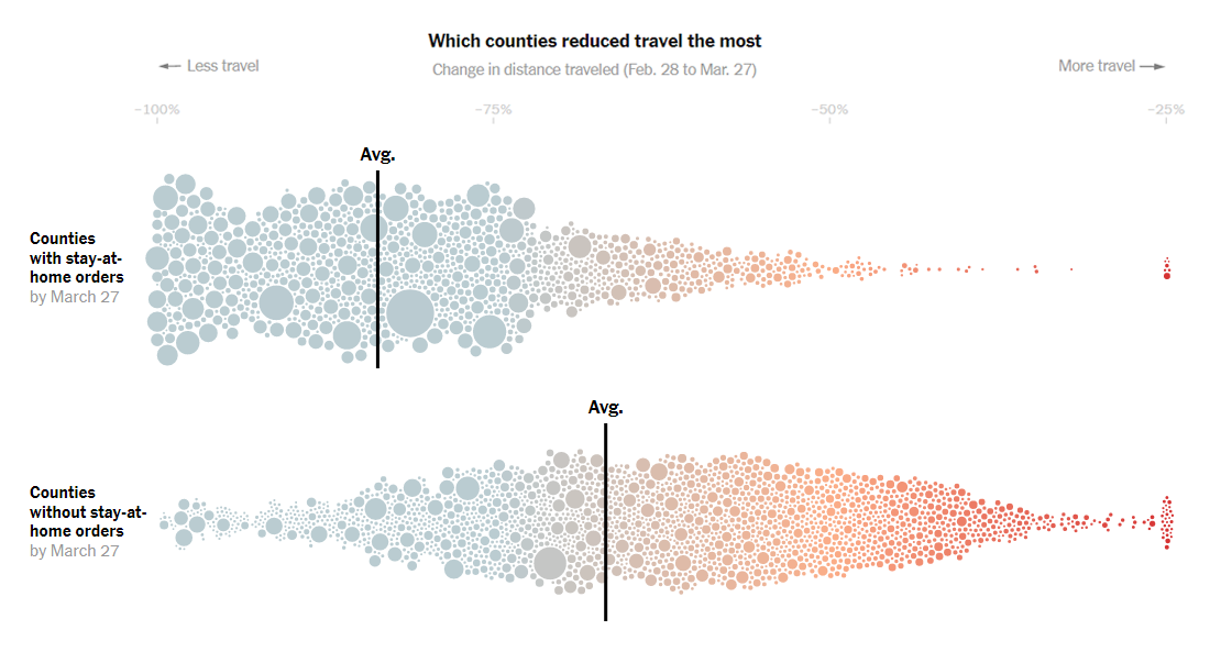
The New York Times also provides a look at how social distancing works in the United States, but based on location data from data intelligence company Cuebiq. The newspaper nicely mapped the company’s data to reveal in which counties across the U.S. people were still traveling last week. Obviously, not everybody was staying at home, and moreover, Americans in quite many areas continued to travel kind of normally.
In the piece, you will also find interesting charts. Looking into them, first, you can explore which counties reduced travel the most and the least between late February and late March — separately among those with and without stay-at-home orders by March 27. Second, look where Americans were still traveling the most on Friday and how travel distances looked there day by day.
Scroll down the piece to check out when average daily distance traveled first went under two miles, in each county across the U.S. This gives a clue on how promptly different parts of America reacted to the spread of the coronavirus threat.
“Social Distancing Scoreboard” by Unacast
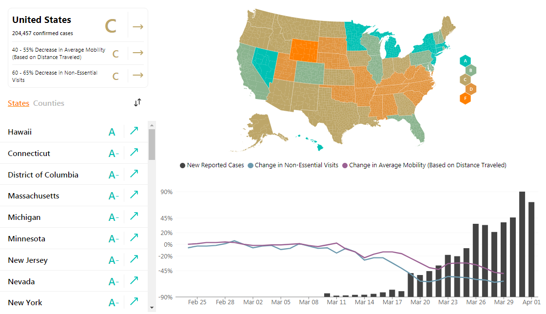
Unacast, another human mobility data company, launched its own interactive social distancing scoreboard. It allows us to easily understand the efficacy of social distancing initiatives at the local level across the United States.
In this project, each state and county is given a score based on comparisons in travel data before and after the unfolding of the coronavirus outbreak in the U.S. In particular, Unacast claims to take into account the following relevant underlying metrics of the social distancing behavior (combined, they make up that generalized grade for each area):
- “People dwelling at home vs dwelling outside their homes (a proxy for how good an area is at “shelter-in-place” behavior)
- Changes in average time spent in and around home, aggregated over time (a proxy for how much time people spend at home versus other venues)
- Change in dispersion of activity clusters, or how many people no longer gathered in the same location at the same time (a proxy for change in number of encounters)
- Change in average distance traveled“
An interactive drill-down map shows the social distancing grades at a glance. Line and column charts display changes in the number of non-essential visits and in average mobility as well as visualize new reported COVID-19 cases statistics for each territory.
The scoreboard is updated on a daily basis. As of today, the only state granted grade A is Hawaii.
“COVID-19 Projections Assuming Full Social Distancing Through May 2020” by IHME, UW Medicine
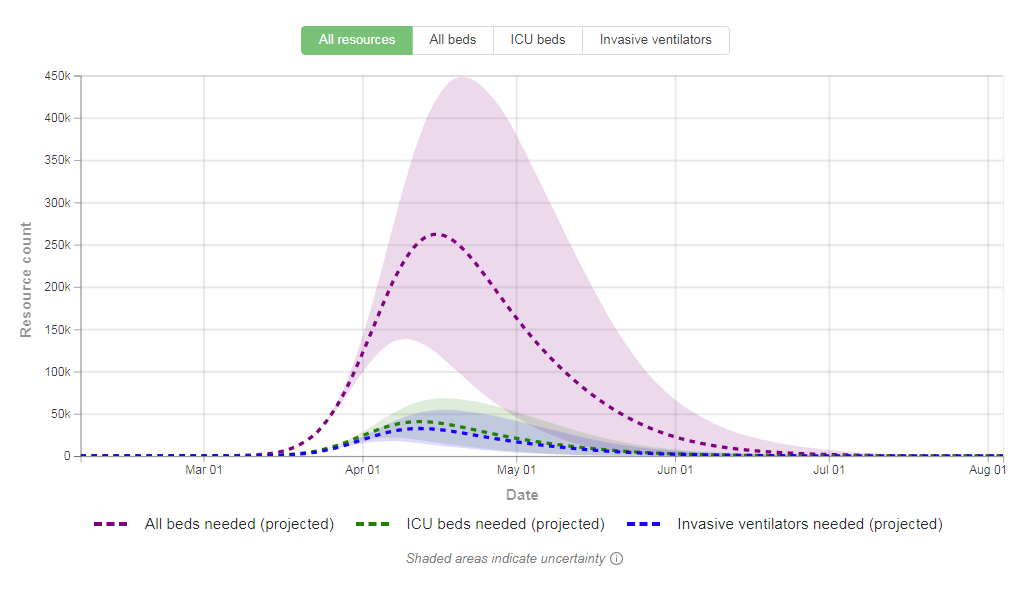
The Institute for Health Metrics and Evaluation (IHME), a health research center at the University of Washington School of Medicine (UW Medicine), developed a statistical model that forecasts the impact of COVID-19 on the U.S. hospital system in the next four months, assuming full social distancing through May 2020.
IHME’s projections show estimates on the use of hospital resources such as normal beds, ICU beds, and invasive ventilators, as well as deaths per day and total deaths. “With each model update, the assumption of full implementation of social distancing measures is reset; any delay will be reflected in the number of deaths and burden on hospital systems that the model estimates,” IHME explains.
Nationwide projections are available along with those for each state. See how the coronavirus situation in the United States is expected to play out with social distancing in action.
***
May you all be healthy. May you all be safe. Let’s make the effort together.
- Categories: Data Visualization Weekly
- 1 Comment »