 In the new DataViz Weekly post, we are glad to tell you about new compelling visualizations we have come across these days. Here’s what projects made it to our today’s selection, from people’s activities to Hubble observations:
- 30 years of the Hubble Space Telescope’s observations — Physics Today
- Evolution of the U.S. census from 1790 to 2020 — The Pudding
- 10 conflicts to worry about in 2020 — ACLED
- Media consumption during the COVID-19 pandemic — Visual Capitalist
Data Visualization Weekly: April 3, 2020 — April 10, 2020
30 Years of Hubble Observations
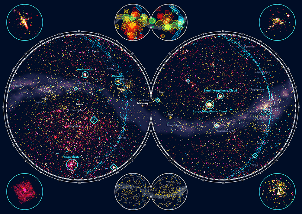
Nadieh Bremer, an award-winning data visualization designer and a graduated astronomer, completed another truly fascinating project that we cannot not help but put a spotlight on this time. In celebration of the Hubble Space Telescope’s 30th anniversary, she made a visualization of a total of about 550,000 Hubble observations in the form of a map of the sky, taking data from the Mikulski Archive for Space Telescopes (MAST) managed by the Space Telescope Science Institute (STScI) in Baltimore, MD.
Check out this extensive visualization in Physics Today to explore the positions of the Hubble’s plethora of cosmic targets. In addition, you may well be interested to visit Nadieh’s website Visual Cinnamon to learn about how the project was produced, from data preparation to design, and see some extra graphics not available in the magazine.
Evolution of U.S. Census in 1790-2020
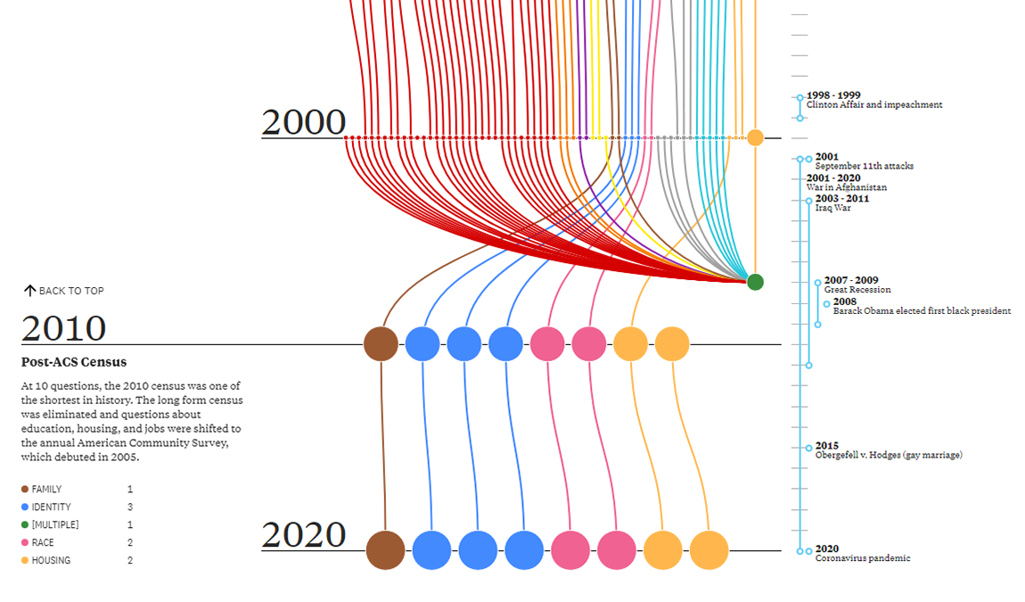
Alec Barrett, the lead developer at boutique data visualization agency TWO-N, created an amazing data visualization that shows the evolution of the United States census through the prism of census questions. For the purpose of this project, he looked at every one of more than 600 questions from the 1790-2020 census questionnaires and drew links between the same and similar instances.
The visualization is available on The Pudding. There, you can search for themes and reveal trends over time. Hover over the points to see how the corresponding questions looked on the paper — an awesome asset for archive and history lovers.
10 Conflicts to Worry About in 2020
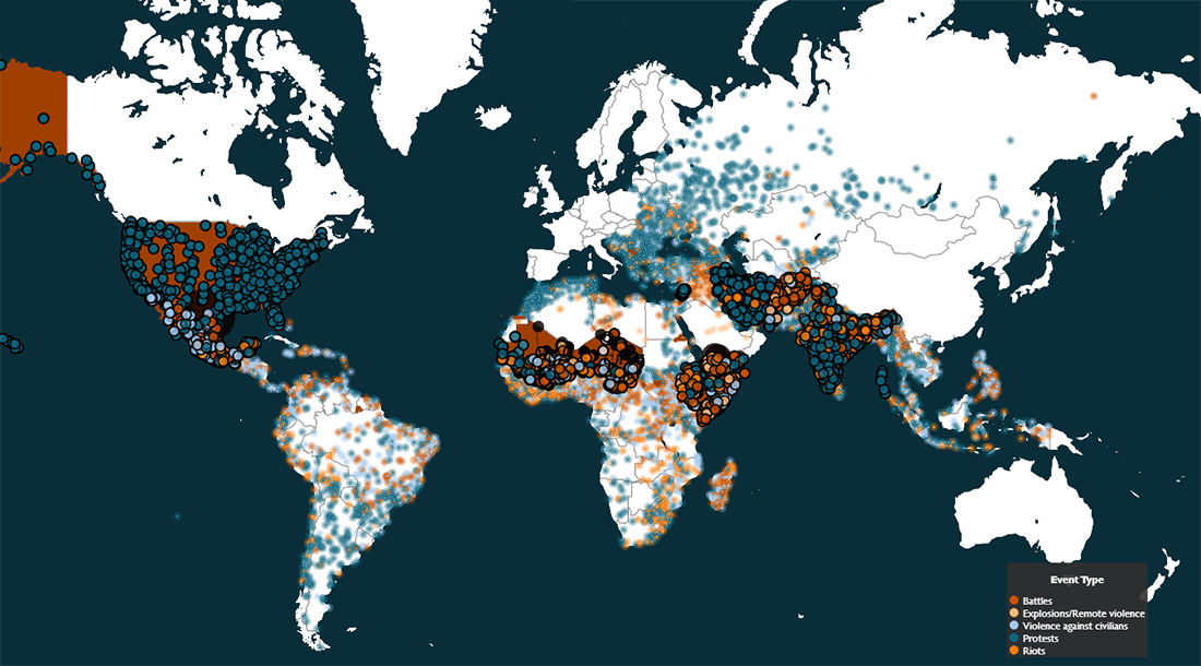
The Armed Conflict Location and Event Data Project (ACLED), a non-profit organization that specializes in collecting and analyzing data about conflicts and protests around the world, issued a new report. It reviews ten situations “to worry about in 2020.” As political violence continues to erupt worldwide, according to ACLED, these conflicts are expected to worsen this year, generating new challenging dilemmas for citizens and governments.
Learn what these ten conflicts are and where they are located in a stunning visual story created by Mel Pavlik, ACLED’s research analyst. The events described and shown on the map are battles, explosions, violence against civilians, protests, and riots.
Media Consumption During COVID-19 Pandemic
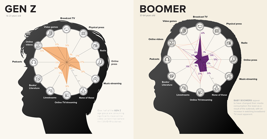
The coronavirus topic appears hard to avoid these days. No wonder, though, as there is actually a huge number of COVID-19 and related data visualizations getting published and updated around the web each day. This one, however, is quite different from what we’ve seen most of the time. Visual Capitalist represented data from the just-published GlobalWebIndex Coronavirus Research report exploring consumers’ media consumption habits during the present pandemic, by generation.
Check out what impact the outbreak has had on what people are doing and how they are staying informed. Start with cool radar charts greatly visualizing the change in media consumption of Gen Z, Millennials, Gen X, and Boomers. Then scroll down to see other interesting data visualizations — those display what online activities and paid services are getting the biggest attention during the quarantine, as well as what sources are considered trustworthy, for each generation.
***
We appreciate your attention and hope you like the data visualization projects highlighted this time in DataViz Weekly. Stay tuned for more cool charts, maps, and infographics.
- Categories: Data Visualization Weekly
- No Comments »