Visualizing Statistics About Greenhouse Gases, Carbon Footprints, Movie Franchises, and Coal Production — DataViz Weekly
February 22nd, 2019 by AnyChart Team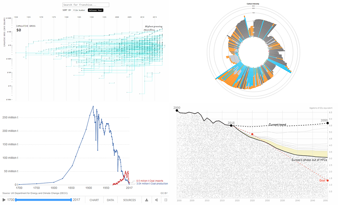 Don’t miss out on a new serving of interesting online projects visualizing statistics as we continue the DataViz Weekly series on the AnyChart blog! This time, we are glad to feature data graphics on the following subjects:
- scenarios of the greenhouse gas emissions reduction for the United States;
- carbon footprints of consumer products;
- box office revenue of movie franchises;
- rise and fall of coal production in the United Kingdom.
- Categories: Data Visualization Weekly
- No Comments »
Analyzing Trump Speech, Green Infrastructure in London, GE’s Rise and Downfall, NYC Traffic Collisions — DataViz Weekly
February 15th, 2019 by AnyChart Team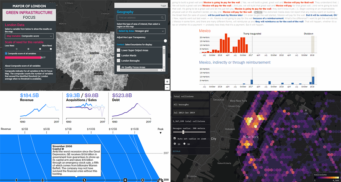 The new cool interesting data visualization projects we praise today on DataViz Weekly are helpful in analyzing Trump speech regarding the U.S.-Mexico wall, green infrastructure in London, rise and downfall of General Electrics, and traffic collisions in New York City. Take a quick look.
- Categories: Data Visualization Weekly
- No Comments »
Data Analytics and Visualization Examples Worth Seeing: High Street, Neighborhoods, Trains, Climate — DataViz Weekly
February 8th, 2019 by AnyChart Team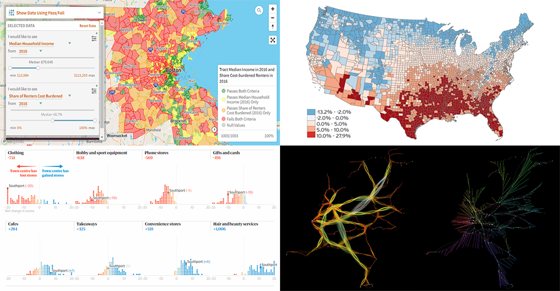 Check out new interesting data analytics and visualization examples from around the web. Here are the topics in the focus of today’s DataViz Weekly:
- high-street crisis in town centers across England and Wales;
- interactive maps of changes in Greater Boston’s neighborhoods;
- connectivity between train stations in the Netherlands;
- economic costs of climate change vs election results in the United States.
- Categories: Data Visualization Weekly
- No Comments »
Interesting Visualizations on Russia’s Borders, Paths to Congress, Child Time, News Lifespan — DataViz Weekly
February 1st, 2019 by AnyChart Team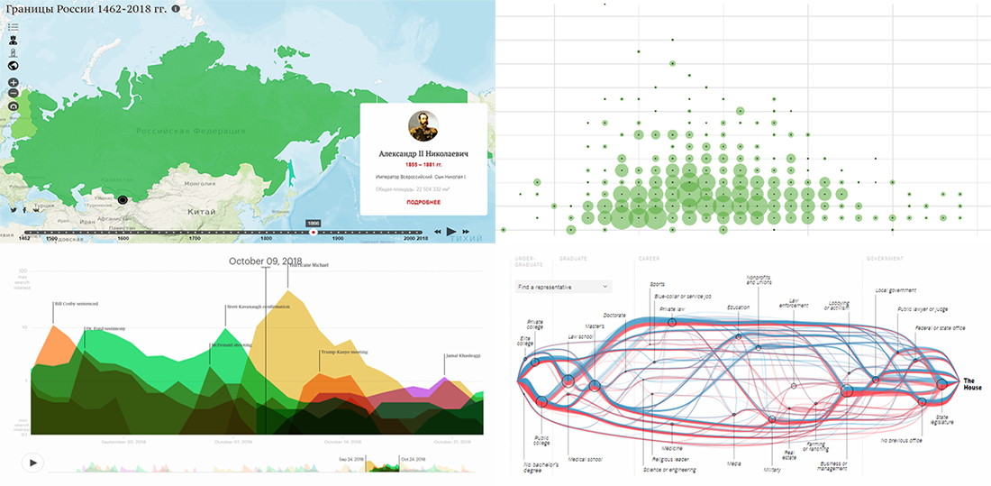 DataViz Weekly is here to meet you with some of the interesting visualizations we’ve come across these days. The new selection includes data-based projects worth seeing, with charts and infographics on the following topics:
- Russian borders from 1462 through 2018;
- career paths to the U.S. Congress;
- time to have the first child;
- lifespan of news stories.
- Categories: Data Visualization Weekly
- No Comments »