 Don’t miss out on a new serving of interesting online projects visualizing statistics as we continue the DataViz Weekly series on the AnyChart blog! This time, we are glad to feature data graphics on the following subjects:
- scenarios of the greenhouse gas emissions reduction for the United States;
- carbon footprints of consumer products;
- box office revenue of movie franchises;
- rise and fall of coal production in the United Kingdom.
Interesting Projects Visualizing Statistics: February 15, 2019 — February 22, 2019
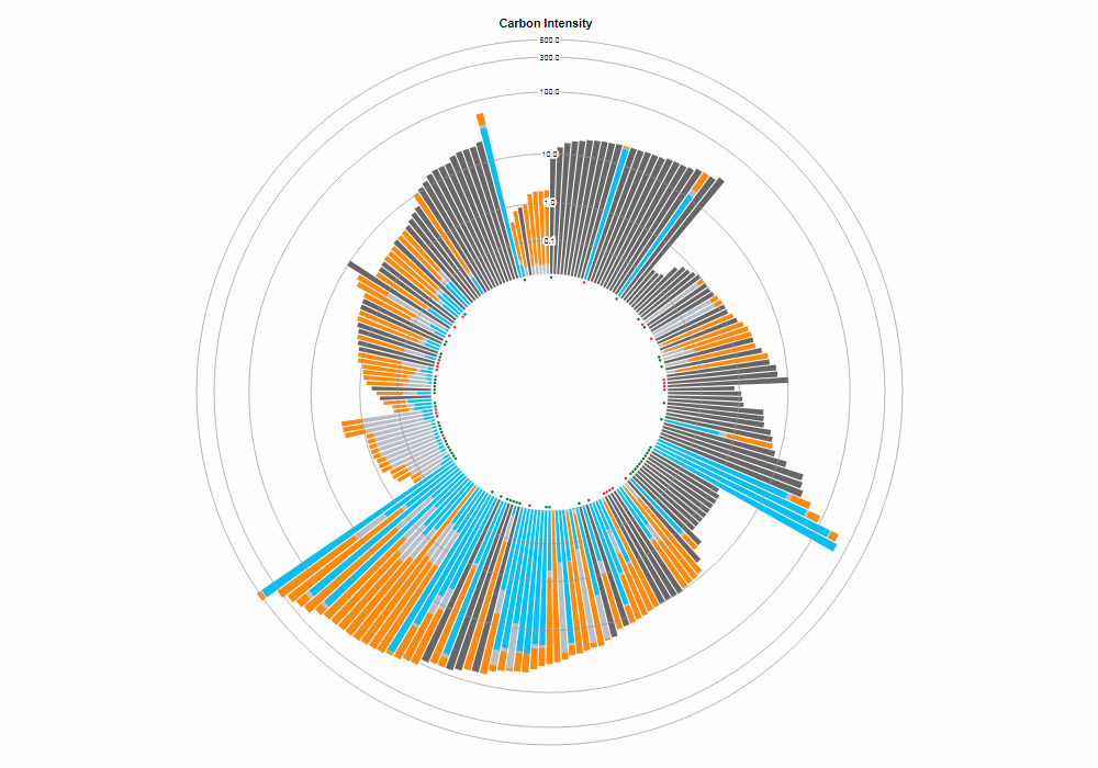
Scenarios of Greenhouse Gas Emissions Reduction for United States
The New York Times published an interesting visual story by Brad Plumer and Blacki Migliozzi, which shows the United States could reduce the country’s greenhouse gas emissions faster after adopting at least one of the seven “most ambitious” climate policies already in action across the globe. However, even if all of them were applied together, emission cuts still would be much less than the goal stated within the framework of the Paris agreement on mitigating climate change, from which U.S. President Donald Trump had pledged to withdraw.
See what effect could be brought in by introducing a carbon tax like in British Columbia, clean electricity standard like in New York, electric vehicle tax incentives like in Norway, industrial efficiency standards like in China, building codes like in California, methane rules like in Canada, and phase-out of hydrofluorocarbons (HFC) like in Europe.
The research is based on the open-source energy models from Energy Innovation, experts in the field of energy policy analysis. To play with more scenarios and learn about their potential impacts, check the Energy Policy Simulator.
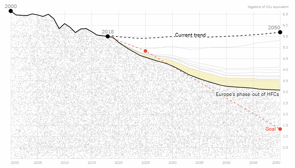
Carbon Footprints of Consumer Products
Here’s another graphics project dedicated to climate change and global warming issues. CoClear, specializing in analysis of life cycle and impact of products, launched an interactive data visualization tool that displays the carbon footprints of over 800 consumer products made by more than 140 companies all over the world.
Hover over a column to see what product it represents and learn about its emissions. You can pick a certain sector or company (for a more focused look), choose a year (or all the available years), as well as change the sort order (by carbon intensity, name, or industry).
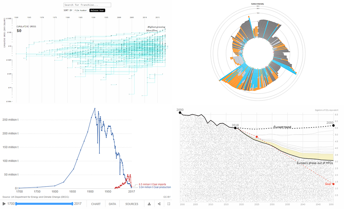
Box Office Revenue of Movie Franchises
Nathan Yau decided to take a look at movie franchises and see how much money they have made. For an interactive visualization on this topic, he took data from Box Office Mojo and charted the cumulative gross of each franchise over time, by number of films and by release year.
Find out where James Bond, Star Wars, Marvel Cinematic Universe, Star Trek, and other famous movie franchises are in these terms. Check out the project and learn more — on Nathan Yau’s blog FlowingData.
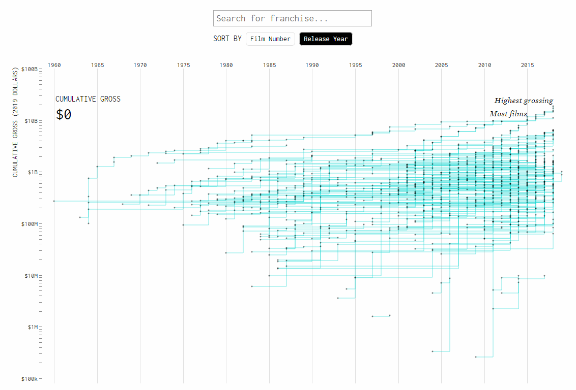
Rise and Fall of Coal Production in United Kingdom
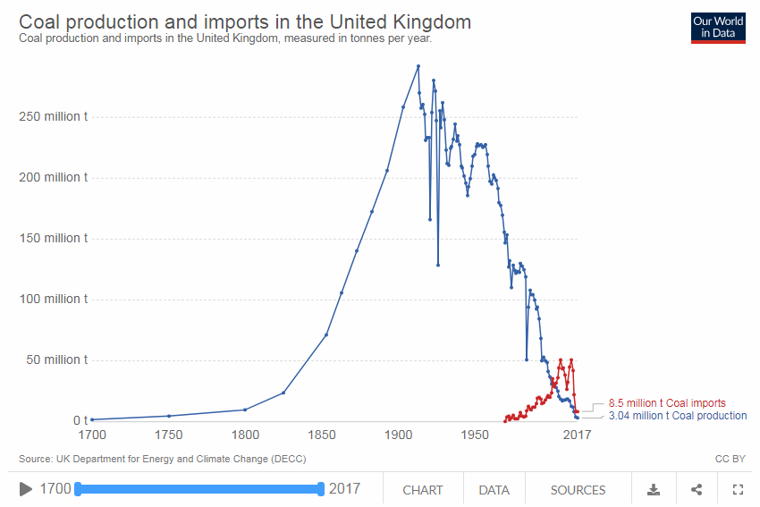
The United Kingdom used to be one of the earliest coal adopters worldwide and a long-time global leader in its production. But in recent decades, this has changed drastically, marking a significant shift away from coal in the U.K. Explore the rise and fall of the country’s coal industry with the help of five charts from Hanna Ritchie, a researcher at Oxford University and Our World in Data.
The charts are visualizing statistics about the overall coal production and imports in the U.K., output from deepmines and opencast, employment in the coal industry, coal use by end-user, and primary energy mix by source. Don’t miss out on this piece.
***
Thanks for your attention! Stay tuned for Data Visualization Weekly!
- Categories: Data Visualization Weekly
- No Comments »