Welcome back to DataViz Weekly! We’re thrilled to restart our series, presenting each Friday a carefully curated selection of recent data visualizations that have caught our eye from around the web. These charts and maps serve as excellent examples of how data can be transformed into insightful and engaging graphical representations for understanding complex issues.
This time, we feature:
- Eclipse traffic and movements — The New York Times
- America’s access to natural spaces — The Washington Post
- Marital age patterns — FlowingData
- Profiling independent voters — Reuters
Join us as we take a closer look at these visualizations and check them out for a dose of inspiration.
Data Visualization Weekly: April 5, 2024 — April 12, 2024
Eclipse Traffic and Movements — Charlie Smart, The New York Times
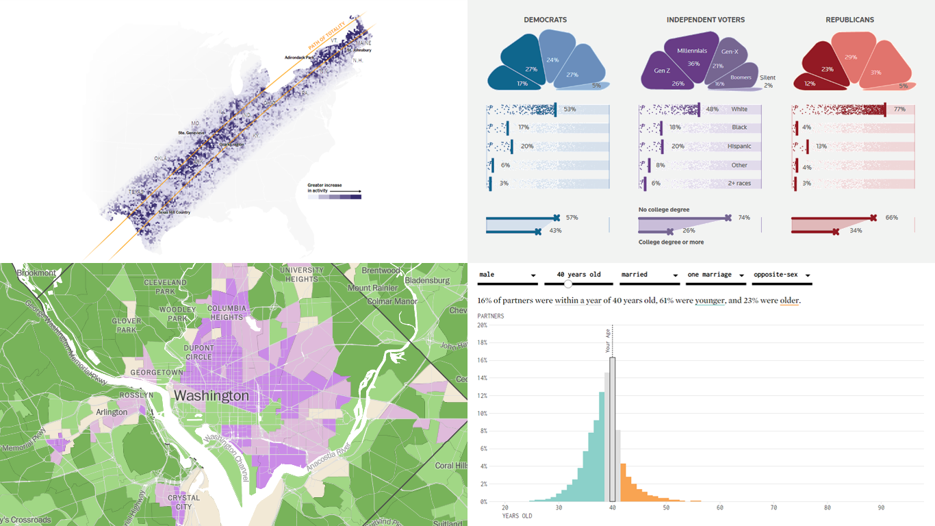
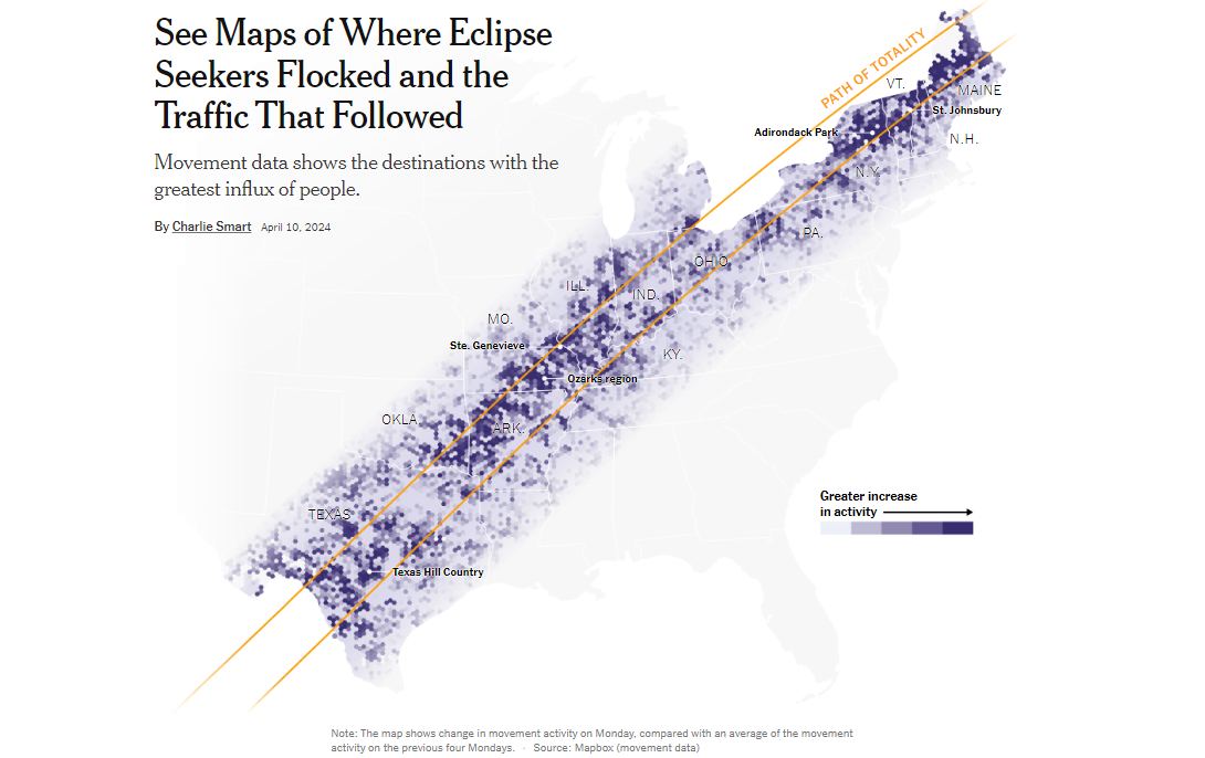 The recent solar eclipse captivated millions and led to significant human migration across North America, spotlighting the intersections of celestial events and human behavior. Charlie Smart used movement data from Mapbox and traffic data from TomTom to create detailed visualizations of the influx of people to key viewing areas along the path of totality.
These visualizations vividly illustrate increases in local populations and subsequent traffic congestions. For instance, small towns expected, and in many cases experienced, population increases of over 100%, with notable congestion lasting well into the night.
This project provides a visual narrative of the eclipse’s impact, reflecting on the broader implications of such rare events on local infrastructures and economies. Delve deeper into this interesting blend of astronomy and human activity, on the NYT.
America’s Access to Natural Spaces — Harry Stevens, The Washington Post
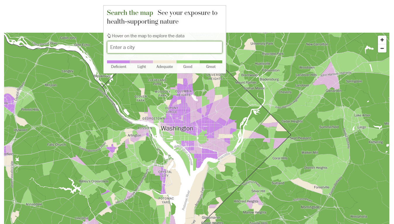 In urban environments, access to nature is not just a luxury but a vital aspect of public health, which varies dramatically across different neighborhoods. Utilizing NatureScore data from NatureQuant, an Oregon-based startup exploring the intersection of nature and human health, Harry Stevens maps access to nature across the United States and uses charts to show how it correlates with socio-economic factors.
The story reveals that neighborhoods with higher NatureScores often come along with higher income and education levels, suggesting a significant disparity in the availability of natural spaces. This analysis prompts critical questions about urban planning and equity in public health resources.
Explore how your neighborhood fares and engage with the data to understand the critical role of nature in urban health, on The Washington Post.
Marital Age Patterns — Nathan Yau, FlowingData
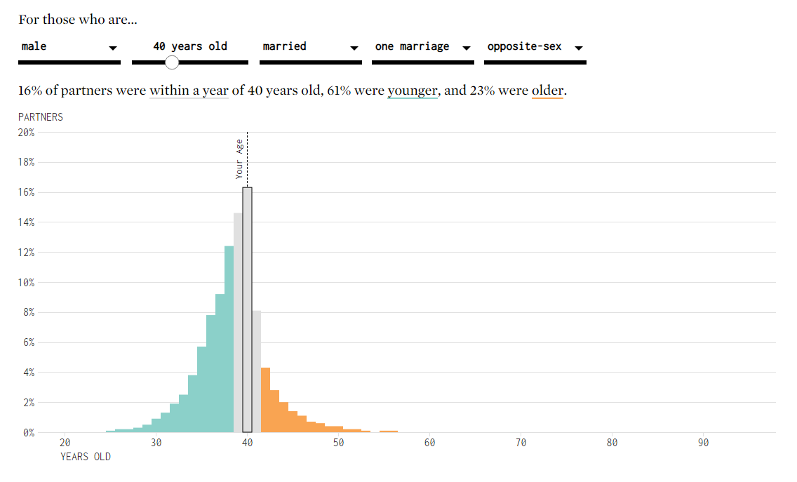 The decision of whom to marry and at what age reflects a complex interplay of personal choices and societal norms, which evolve over a lifetime. Nathan Yau uses data from the American Community Survey to explore how these dynamics change through various life stages and relationship types.
The interactive visualization provides a detailed look at age distributions in marriages, highlighting how marital age preferences shift significantly, particularly in later life stages or among different types of relationships.
Investigate how marital age preferences change over time and what this might say about societal norms and personal choices, on FlowingData.
Profiling Independents Voters — Sarah Slobin, Reuters
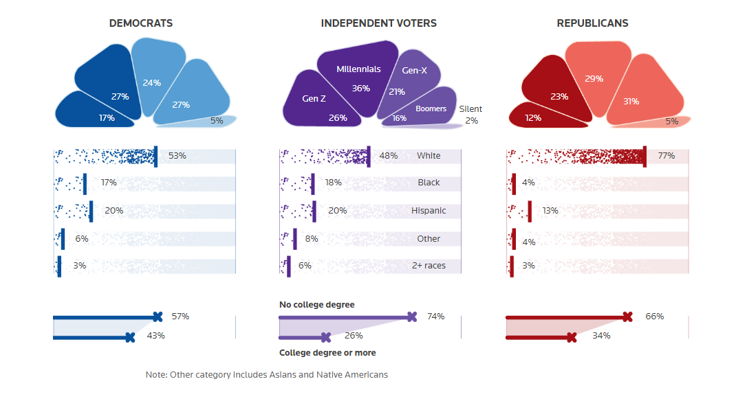 In a polarized political environment, the influence of independent voters is both significant and underexplored. Sarah Slobin’s analysis, based on data from Reuters/Ipsos polls, provides a comprehensive view of the independent electorate in the United States.
The visuals in this article delve into demographics, political concerns, and geographical distributions, offering insights into the preferences and potential impact of this diverse voter group. This timely analysis helps illuminate the critical role independents could play in upcoming U.S. elections, particularly in battleground states, providing a crucial understanding for strategists and voters alike.
Engage with the visual graphics to better understand the independent voters’ profiles and their potential to sway future elections, on Reuters.
Conclusion
That wraps up this week’s edition of DataViz Weekly. We hope these selections inspire you by demonstrating the power of professional data visualization. Each featured project is a testament to how effectively data can be organized, analyzed, and presented to shed light on complex issues with clarity and creativity.
Continue exploring with us every Friday to discover more outstanding examples of data visualization excellence. Have a great time!
- Categories: Data Visualization Weekly
- No Comments »