Interactive Graphics Visualizing Skills, Crop Fields, Midterms, and Space Launches — DataViz Weekly
October 26th, 2018 by AnyChart Team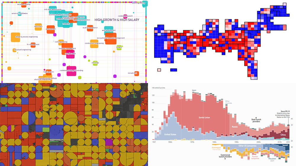 Presenting data in the form of interactive graphics helps to make its exploration more convenient and insightful. In our new DataViz Weekly post, we’ll tell you about another four interesting visualization examples illustrating this.
Today on DataViz Weekly:
- visual taxonomy of skills;
- map of AI-detected fields and crops in the U.S. and Europe;
- ORACLE of Blair — a midterms prediction model from high school students;
- chart of all space launches since 1957.
- Categories: Data Visualization Weekly
- No Comments »
Charting Projects About Population, Voting, Traffic, and Buildings — DataViz Weekly
October 19th, 2018 by AnyChart Team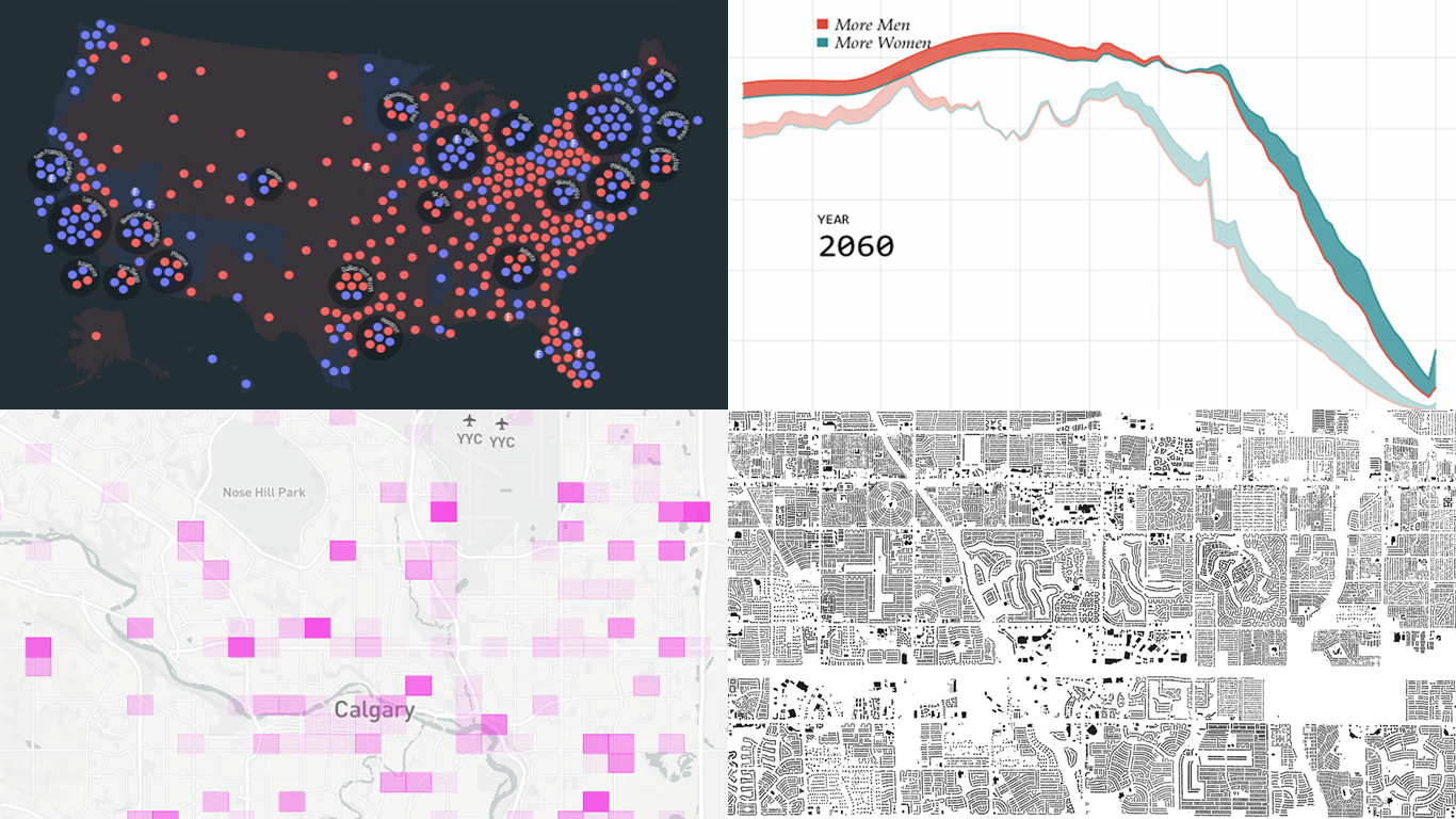 Another seven-day wait is over, and a new DataViz Weekly issue is here! This time, we offer you to look at the following interesting charting projects:
- U.S. population projections through 2060;
- House of Representatives elections from 1840;
- Calgary traffic incident prediction;
- every building in America.
- Categories: Data Visualization Weekly
- No Comments »
Interesting Data Visualization Examples About Elections, Diversity, and Words — DataViz Weekly
October 12th, 2018 by AnyChart Team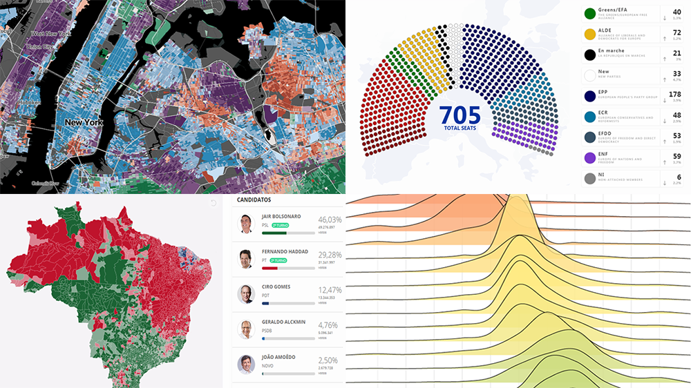 Check out some of the new interesting data visualization examples on a range of topics from all over the web.
Today in DataViz Weekly:
- European Parliament elections;
- racial diversity in the United States, block by block;
- good and bad words;
- Brazilian general elections.
- Categories: Data Visualization Weekly
- No Comments »
JS Sankey Diagram and Other Improvements in AnyChart 8.4.0 Released Just Now
October 8th, 2018 by AnyChart Team The year’s third major update for AnyChart is out, featuring the JS Sankey Diagram chart type as the ultimate centerpiece of the new release.
Learn more about AnyChart 8.4.0 and start making use of our updated JavaScript (HTML5) libraries for interactive data visualization right away.
- Categories: AnyChart Charting Component, AnyGantt, AnyMap, AnyStock, HTML5, JavaScript
- 1 Comment »
DataViz Projects About Cities, Opportunity, Mortality, and Migration — DataViz Weekly
October 5th, 2018 by AnyChart Team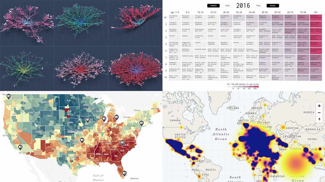 Read the first October issue of Data Visualization Weekly to learn about four interesting dataviz projects that have recently come to light:
- city road networks visualized as corals;
- U.S. Opportunity Atlas;
- top 10 causes of death over years;
- human migration routes that are most dangerous.
- Categories: Data Visualization Weekly
- No Comments »