 Check out some of the new interesting data visualization examples on a range of topics from all over the web.
Today in DataViz Weekly:
- European Parliament elections;
- racial diversity in the United States, block by block;
- good and bad words;
- Brazilian general elections.
Data Visualization Weekly: October 5, 2018 — October 12, 2018
European Parliament Elections
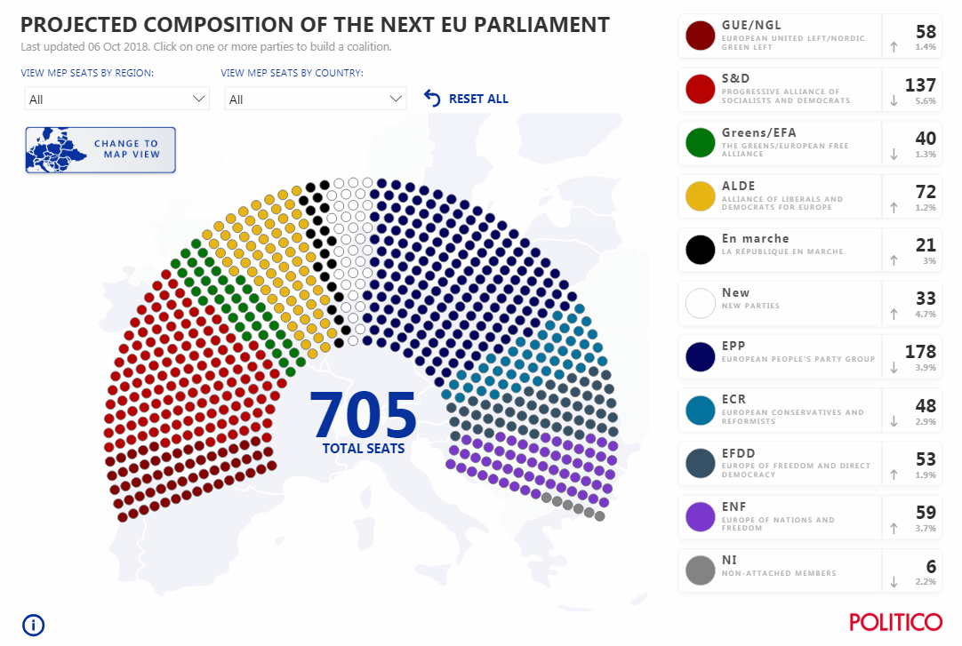
POLITICO launched the European Elections hub, aiming to provide a comprehensive and insightful look at the 2019 European Parliament elections. In addition to editorial content like news and articles, the YouVote EU quiz designed to help citizens make their choice, and some other features, the project already includes interesting data visualizations. For example, here you can find out what to expect in terms of the next EU Parliament’s composition according to the latest polling data, at the top of the page.
Ethnic and Racial Diversity in United States, Block by Block
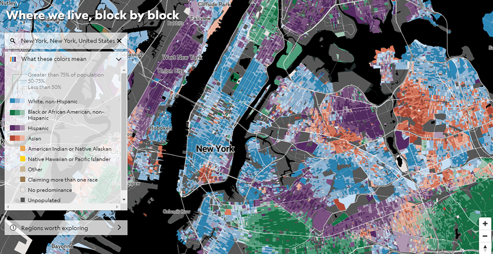
National Geographic created an interactive map of ethnic and racial diversity in the United States on a block-by-block basis. “Mapping this diversity reveals not just a snapshot of today but the imprint of two and a half centuries of migration, conflict, and prosperity,” the authors say. Find your city and see where you live from this perspective.
Good and Bad Words
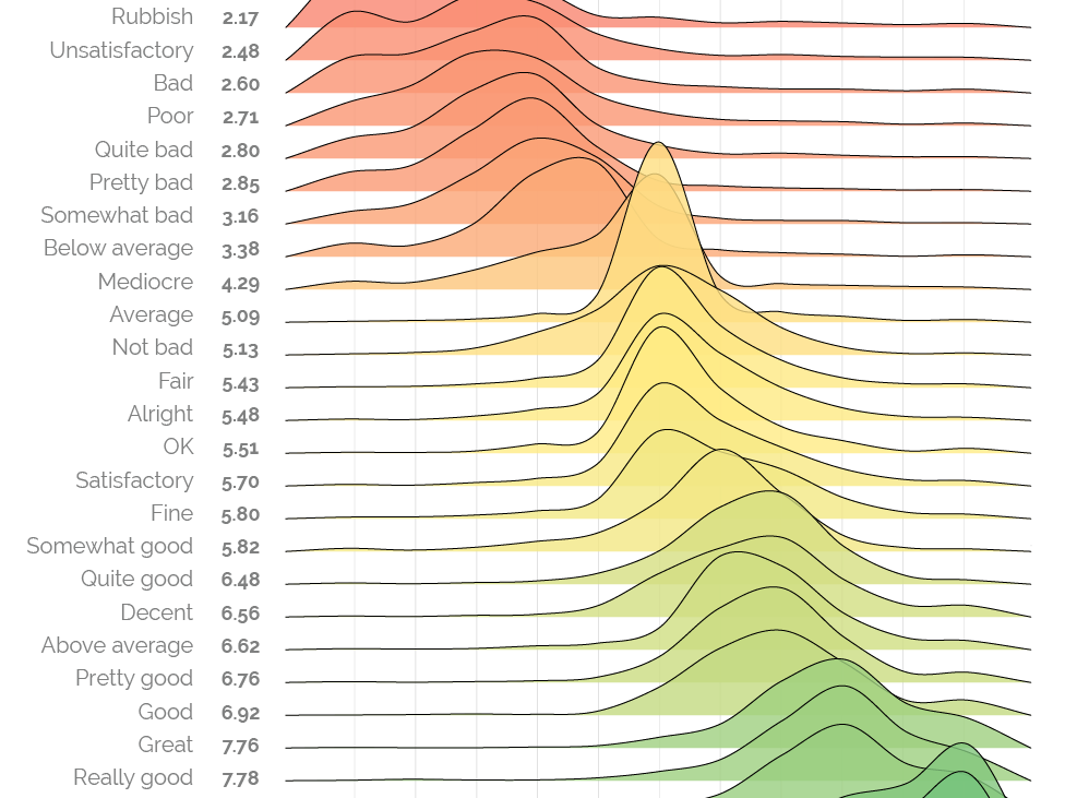
Market research and data analytics company YouGov conducted a study to find out exactly how negatively or positively people are used to perceiving various descriptions. Respondents were shown 24 descriptive adjectives and asked to decide how bad or good they see each as being based on a 0 to 10 scale where “very negative” is 0 and “very positive” is 10. Take a look at the chart visualizing the results, and do not miss out on another visualization in the same article that shows the difference in the interpretation of these words between Americans and Britons.
Brazil Elections
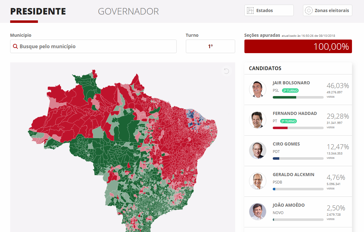
In DataViz Weekly, we feature various election maps quite frequently as they are always interesting to look at. This time, let’s take a look at the voting results of the 2018 Brazilian general election, visualized by G1. See how each electoral area voted and how presidential and gubernatorial candidates did across the country on October 7, 2018.
***
We continue following various media and experts to keep up with the latest data visualization practices. This helps us better understand (and predict) our customers’ dataviz needs and align our solution features (and roadmaps) with them. By the way, in case you missed it, we’ve just launched AnyChart JS Charts 8.4.0 with Sankey Diagram and more great improvements. Check it out. And stay tuned for DataViz Weekly as next week we’ll share another selection of new interesting data visualization examples.
- Categories: Data Visualization Weekly
- No Comments »