 Today’s DataViz Weekly article highlights new beautiful map visualizations, demonstrating how mapping data can help to get geographical insights such as spatial trends, clusters, and so on:
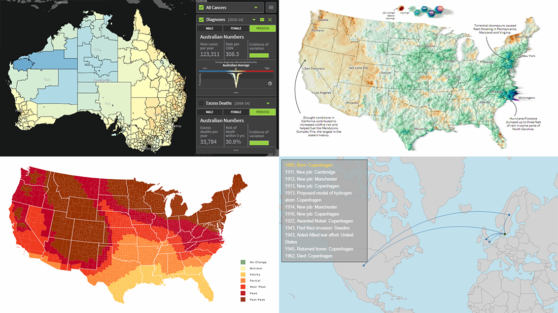
- Australian Cancer Atlas;
- lifetime movements of Nobel Prize laureates in physics;
- U.S. summer rain levels;
- fall foliage prediction across the U.S.
Data Visualization Weekly: September 21, 2018 — September 28, 2018
Australian Cancer Atlas
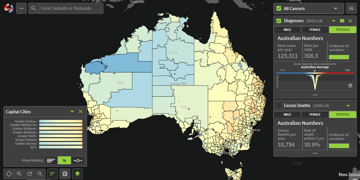
Anti-cancer organization Cancer Council Queensland in collaboration with Queensland University of Technology and FrontierSI developed the Australian Cancer Atlas, an impressive interactive data visualization project that shows patterns in incidence — along with survival rates — for the most common cancer types across Australia. Take a look at geographic disparities and find out more about what statistics have to say.
Lifetime Movements of Nobel Prize Laureates in Physics
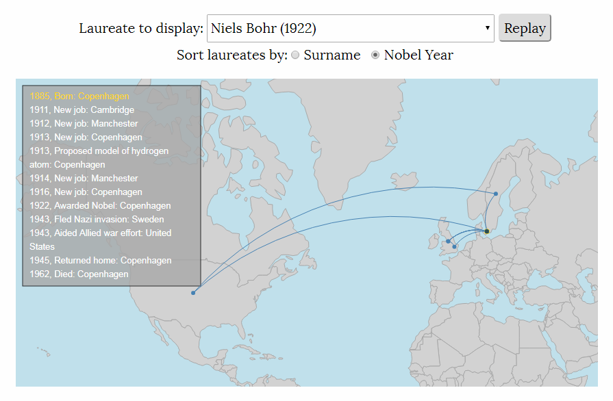
Physics Today‘s Greg Stasiewicz created an interactive visualization tool that allows you to see the lifetime movements of every Nobel Prize laureate in physics, including places where they worked and lived. Select an individual — you can sort them by surname or by year of winning — and look at an animated map of places where they worked and lived.
U.S. Summer Rain Levels
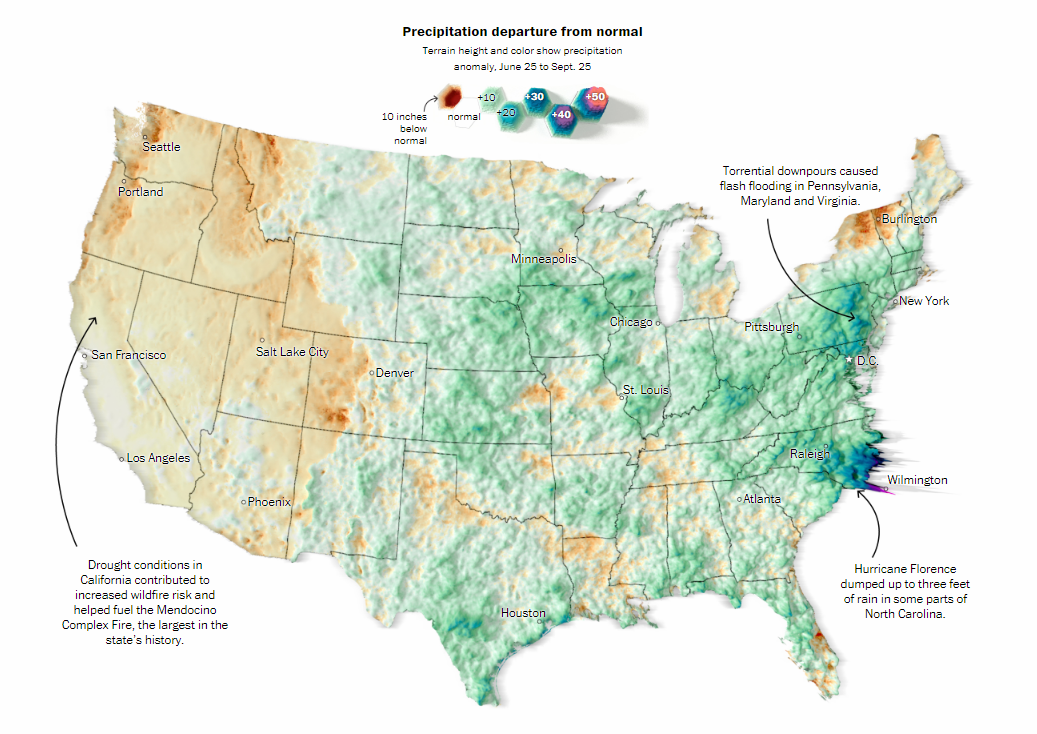
The Washington Post‘s Aaron Steckelberg and Tim Meko offered a look at this summer’s precipitation in the United States from the perspective of how it compares with what is considered to be normal for each location. Check out their map to find out which parts of the country received more rain than usual — mostly to the east from the Continental Divide — and what areas are below average. Further down the article on The Post, you can also look closer at some particular locations.
U.S. Fall Foliage Prediction Map
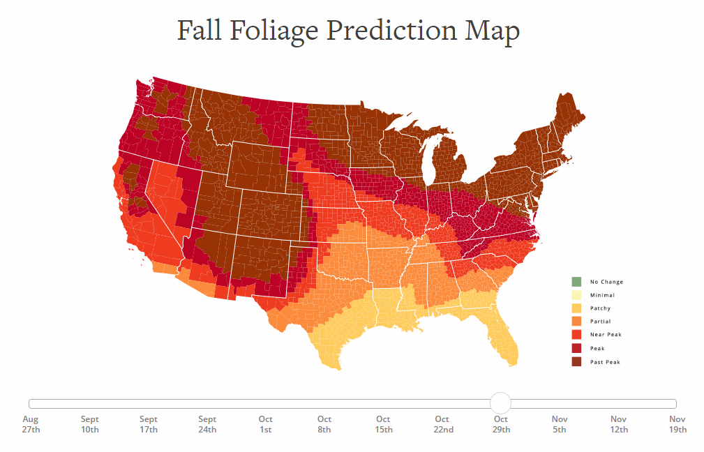
SmokyMountains.com created a visualization that displays how the foliage all over the United States of America is predicted to progressively change with the advent of fall this year. Although a forecast like this can hardly be 100% accurate, such a map can still be a useful tool for travelers seeking to catch peak color, helping them better plan their trips. According to this visualization, for example, peak fall foliage in the Great Smoky Mountains National Park itself — reported to be the most visited national park in the country — can be expected around October 29. Right below the map, you’ll also find an interactive chart showing the average U.S. temperatures since 1900, nationally and by region.
***
Follow Data Visualization Weekly to stay updated on new cool examples of charting and mapping data.
- Categories: Data Visualization Weekly
- 1 Comment »