 Presenting data in the form of interactive graphics helps to make its exploration more convenient and insightful. In our new DataViz Weekly post, we’ll tell you about another four interesting visualization examples illustrating this.
Today on DataViz Weekly:
- visual taxonomy of skills;
- map of AI-detected fields and crops in the U.S. and Europe;
- ORACLE of Blair — a midterms prediction model from high school students;
- chart of all space launches since 1957.
Interactive Graphics in Data Visualization Weekly: October 19, 2018 — October 26, 2018
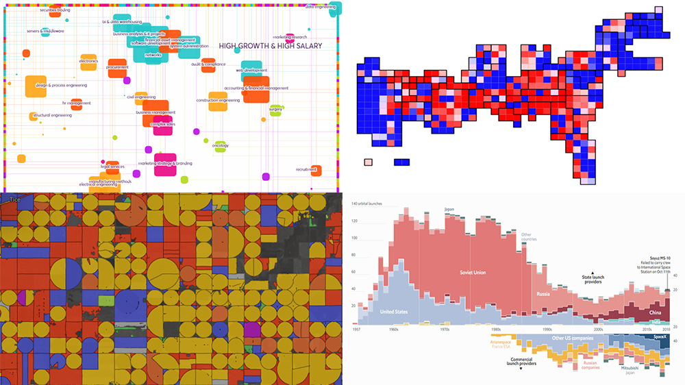
Visual Taxonomy of Skills
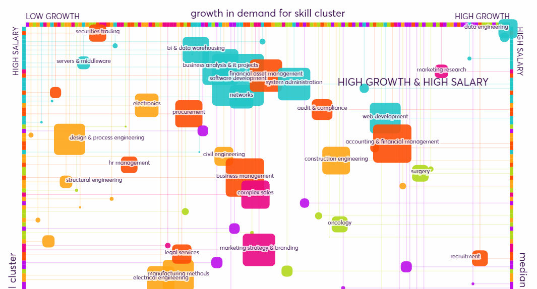
London-based innovation foundation Nesta developed what they call “the first data-driven skills taxonomy for the UK that is publicly available.” It starts with a visualization where jobs are connected to skills they usually require, allowing the viewer to find out what skills are needed for one occupation or another. The next two pieces of colorful interactive graphics represents the value of skills in terms of salary and growth in their demand.
Map of AI Detected Fields and Crops in Europe and U.S.
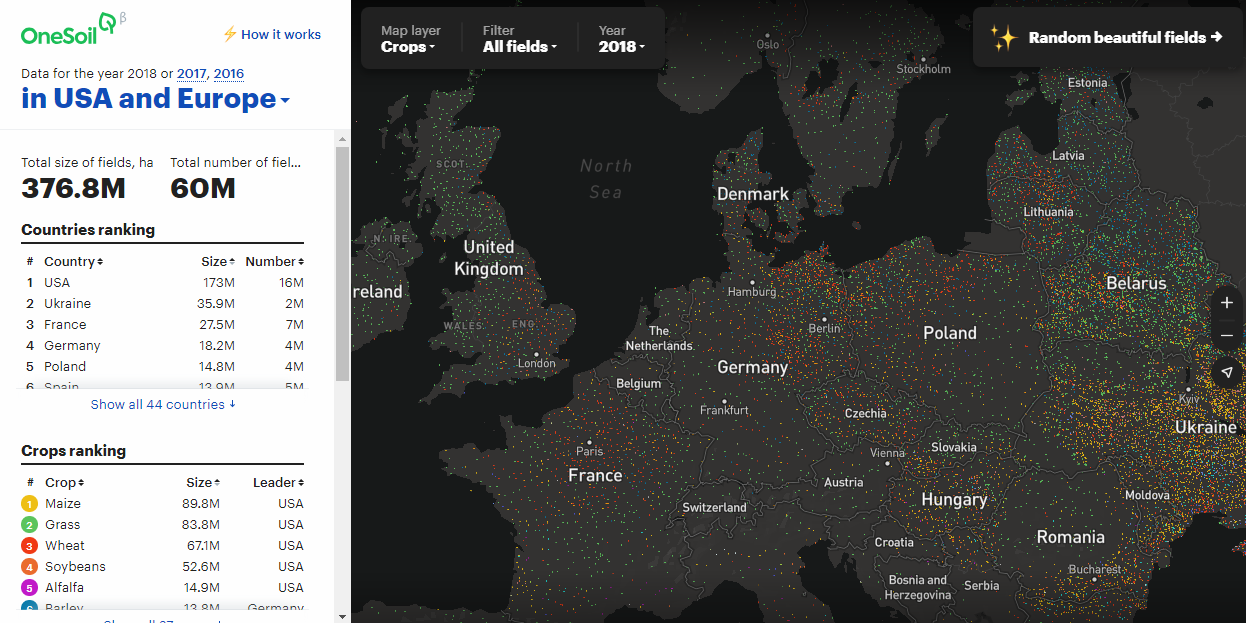
OneSoil, developing an innovative AI-driven platform for agricultural data analysis, created an interactive map that displays more than 50 million fields across the United States and Europe, providing insights into crop production. Based on data from the open Copernicus Sentinel data processed by special machine learning algorithms, the visualization shows details about each field: size, score, crop, and how it has changed. When zoomed out, the map offers a big picture to understand geographical trends in production of crops.
Oracle of Blair: Midterms Prediction Model from High School Students
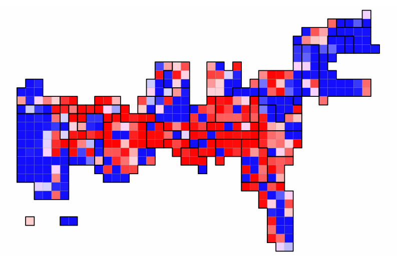
Senior students of the Montgomery Blair High School — under the guidance of statistics teacher David Stein — launched an awesome election prediction model for the upcoming midterms in the United States. They called it ORACLE of Blair, meaning ORACLE stands for Overall Results of an Analytical Consideration of the Looming Elections. In addition to the interactive graphics itself, don’t miss out on the About Our Model section that contains a detailed description of the methodology the authors applied. “Unlike professionals, we need not have any secrets in regards to how our predictions are generated,” they explain.
Charting Space Launches Since 1957
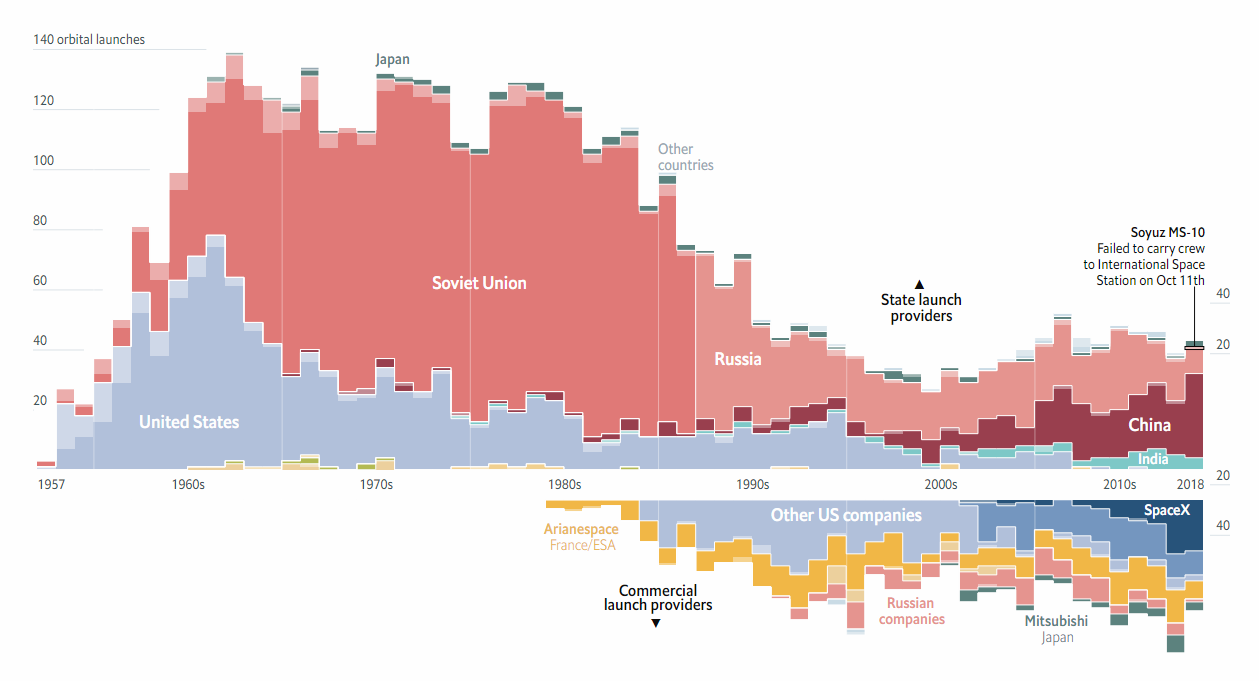
The Economist Data Team visualized the number of orbital space launches by year since Sputnik in 1957, adding a breakdown by launch provider, state and commercial. And the chart provided the basis for a nice visual story that shows how rising powers and private companies are replacing the duopoly of the Cold War time.
***
Follow DataViz Weekly to learn about new interesting data visualization examples from all over the web every week.
- Categories: Data Visualization Weekly
- No Comments »