 Read the first October issue of Data Visualization Weekly to learn about four interesting dataviz projects that have recently come to light:
- city road networks visualized as corals;
- U.S. Opportunity Atlas;
- top 10 causes of death over years;
- human migration routes that are most dangerous.
Data Visualization Weekly: September 27, 2018 — October 4, 2018
City Streets Visualized as Corals

City streets often serve as a source of inspiration for data visualization enthusiasts from all over the world. As recently as July, we mentioned several dataviz projects dedicated to the road network orientation. Now, we suggest that you take a look at another interesting attempt in this field. Craig Taylor from Ito World visualized street networks in many world cities as corals and is likely to be one of the favorites in this year’s Kantar Information is Beautiful Awards.
U.S. Opportunity Atlas

Known as the land of opportunity for each according to their ability and achievement, regardless of social class and circumstances of birth, America is not ideal in this respect. The Opportunity Atlas — a new dataviz tool, launched by Opportunity Insights in collaboration with the Census Bureau and developed by Darkhorse Analytics — shows this at a glance, providing a picture of what locations in the United States offer children the best (and worst) chance to rise out of poverty. Check it out and see how the neighborhood you grow up in can actually shape your future.
How Top 10 Causes of Death Changed
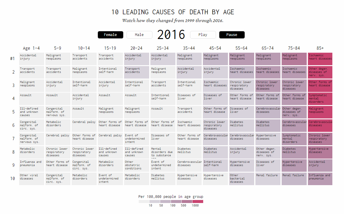
Nathan Yau published another interesting visualization, now looking into mortality trends in the United States. Based on data from the Centers for Disease Control and Prevention (CDC) — the National Center for Health Statistics (NCHS), housed within the agency, released the new annual report on the health of the nation two weeks ago — he displayed how the 10 most common causes of death changed for 18 years, from the year 1999 through 2016, across sex and age groups. Watch rises and falls along with how mortality rates grow over the lifetime.
Deadliest Migrant Routes

According to data from IOM’s Missing Migrants Project, the Central Mediterranean remains the deadliest route for asylum seekers despite the efforts of European governments. A new interactive map published by SBS Life clearly shows this region stands apart from the rest of the world — just zoom in a little bit for a more local view. Explore the visualization to find the other most perilous routes of international migrants around the globe. Zoom levels 8 to 12 will allow you to switch from a general overview to a look at precise locations and numbers.
***
Check out these interesting dataviz projects and stay tuned for the next issue of DataViz Weekly on the AnyChart blog.
- Categories: Data Visualization Weekly
- No Comments »