Latest Best Data Visualizations Worth Checking Out — DataViz Weekly
December 25th, 2020 by AnyChart Team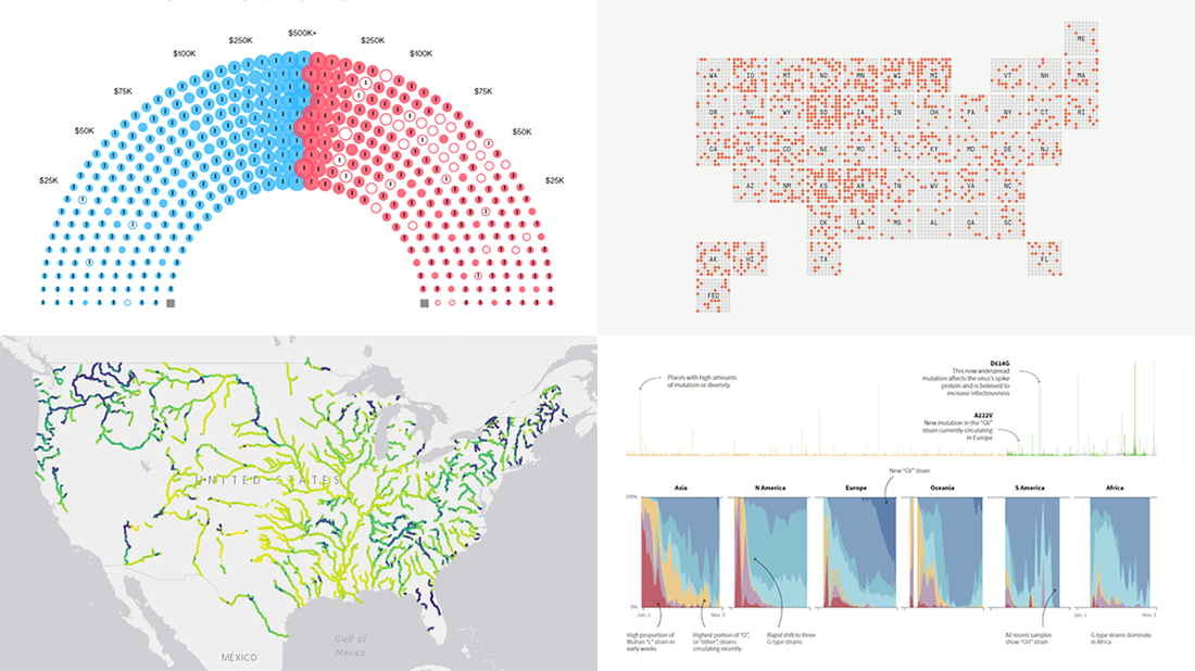 Merry Christmas everyone (who’s celebrating)! ? Meanwhile: COVID, election, and environment — the topics quite symbolic for this year are in the spotlight of today’s, the year’s last DataViz Weekly. Don’t miss out on some of the latest best data visualizations!
Look at the list of projects featured on DataViz Weekly this time and keep reading to learn more about each:
- Winners of the 2020 U.S. election by funding from Wall Street — Bloomberg
- COVID-19 infection rates in prisons by state — The Marshall Project
- Novel coronavirus strains in evolution worldwide — Reuters
- River colors across the United States — Gardner Hydrology Lab at Pitt
- Categories: Data Visualization Weekly
- 1 Comment »
Building Marimekko Chart with JavaScript
December 22nd, 2020 by Dilhani Withanage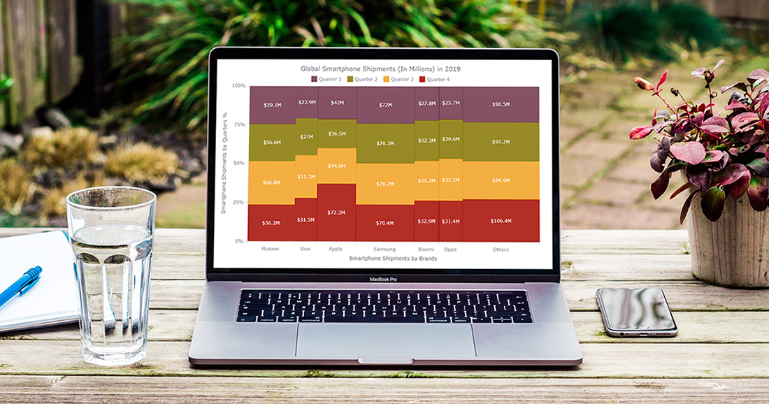 Would you like to know how to easily create an interactive Marimekko chart for HTML5 based apps and Web pages using JavaScript? If yes, you are on the best path to learning this.
Also known as Mekko charts and market maps, Marimekko charts display numerical values that vary from 0% to 100% in its Y-axis. The most exciting part lies in their X-axis, which indicates the sum of values within categories. Each category’s width along the X-axis portraits the whole category’s contribution to a total of all data. In simple words, this is a type of a stacked chart that visualizes categorical data. Still, both the Y and X axes vary in a percentage scale by determining each segment’s width and height.
Are you a smartphone enthusiast and interested to look at the global smartphone shipments in 2019 by quarter and by vendor? Then especially follow the present tutorial as we are to visualize this market data in an elegant Marimekko diagram using simple JS chart coding techniques.
Read the JS charting tutorial »
- Categories: AnyChart Charting Component, Business Intelligence, HTML5, JavaScript, JavaScript Chart Tutorials, Tips and Tricks
- No Comments »
New Graphics That Make Data Talk — DataViz Weekly
December 18th, 2020 by AnyChart Team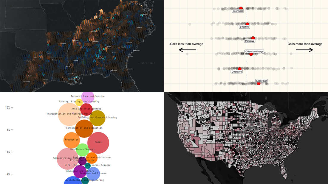 Get ready for another dose of amazing charts and maps! DataViz Weekly‘s here to show you a set of new projects featuring graphics that make data talk — excellent examples of data visualization in action!
Here are this week’s picks:
- Over 200 years of migrations in the American South — Edward Ayers, Nathaniel Ayers & Justin Madron
- NBA fouls and violations, by referee — Owen Phillips
- U.S. unemployment change, by occupation — Nathan Yau
- U.S. hospital COVID-19 bed occupancy — Carlson School of Management at UMN
- Categories: Data Visualization Weekly
- No Comments »
Best New Data Visualizations in Overview — DataViz Weekly
December 11th, 2020 by AnyChart Team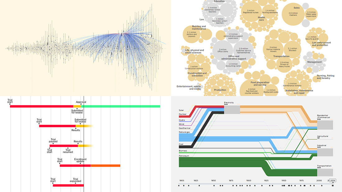 Welcome back to DataViz Weekly, where we overview the best new data visualizations created by professionals. As always, let’s begin with a list of the projects we’re excited to put a spotlight on, and then take a closer look at each:
- Exploring letter communication networks of the Tudor government in the 16th century — Kim Albrecht, Ruth Ahnert & Sebastian Ahnert
- Tracking the most promising coronavirus vaccines — Bloomberg
- Defining “essential” and “frontline” workers for vaccination — NYT
- Understanding the U.S. energy use evolution since 1800 — RDCEP, UChicago
- Categories: Data Visualization Weekly
- No Comments »
How I Created Sunburst Chart Using JavaScript to Visualize COVID-19 Data
December 8th, 2020 by Shachee Swadia Almost recovered from COVID-19 myself these days, I decided to explore how the world is currently doing, during the pandemic. So I created a sunburst chart to see at a glance what continents and countries are more (and less) affected by the coronavirus than others. The process was quick and I thought someone could be interested to learn about how such data visualizations can be built in a pretty straightforward way, even with very little technical skills. So I also made a tutorial. And here I am — (1) sharing my interactive sunburst chart of COVID cases and (2) describing how I created it using JavaScript in a matter of minutes, step by step!
My JS sunburst chart provides an overview of the situation as of November 24, 2020, and also shows the global count, continent-wide data, and country-wise proportions for the current active COVID-19 cases and deaths. Scroll down to explore it by yourself and check out the tutorial along the way. Here is a sneak peek of the final chart to get you excited:
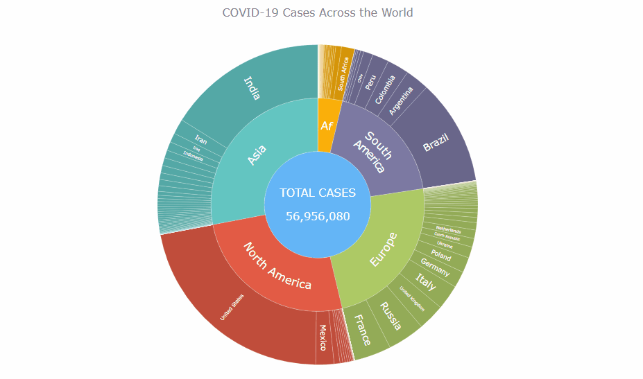
This sunburst charting tutorial is mainly for beginners to data science. So before we get to business, let’s make sure we’re on the same page. I’ll explain what a sunburst chart is and how it works, to start with. Then I’ll show you how to create a cool and colorful interactive visualization like that with JavaScript (and you can do it even if you don’t know it too well). That’s the plan!
Read the JS charting tutorial »
- Categories: AnyChart Charting Component, Big Data, Business Intelligence, HTML5, JavaScript, JavaScript Chart Tutorials, Tips and Tricks
- No Comments »
Fresh Great Data Visualization Projects on Thanksgiving, COVID, and Tree Equity — DataViz Weekly
December 4th, 2020 by AnyChart Team Hey everyone! Continuing to curate the best charts, maps, and infographics from around the Internet, we invite you to meet four fresh great data visualization projects worth checking out.
Today on DataViz Weekly:
- Visualizing the ways the Thanksgiving turkey leftovers were used — Nathan Yau
- Understanding the scale of 250,000 deaths from the coronavirus — The Washington Post
- Finding a correlation between scented candle reviews on Amazon and COVID-19 — Kate Petrova
- Evaluating tree equity in American city neighborhoods — American Forests
- Categories: Data Visualization Weekly
- No Comments »