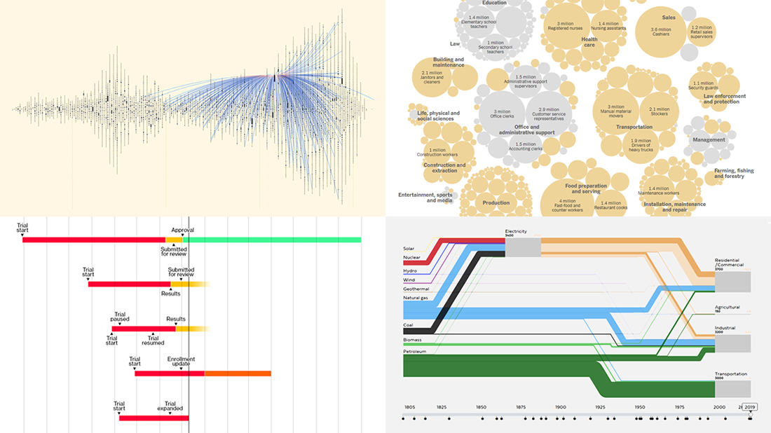
 Welcome back to DataViz Weekly, where we overview the best new data visualizations created by professionals. As always, let’s begin with a list of the projects we’re excited to put a spotlight on, and then take a closer look at each:
- Exploring letter communication networks of the Tudor government in the 16th century — Kim Albrecht, Ruth Ahnert & Sebastian Ahnert
- Tracking the most promising coronavirus vaccines — Bloomberg
- Defining “essential” and “frontline” workers for vaccination — NYT
- Understanding the U.S. energy use evolution since 1800 — RDCEP, UChicago
Data Visualization Weekly: December 4, 2020 — December 11, 2020
Exploring Tudor Government’s Letter Communication Networks, 1509-1603
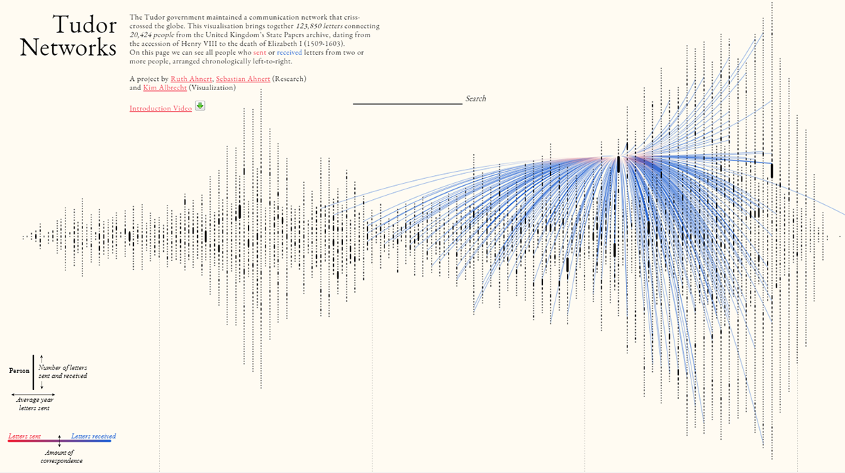
Network graphs can be really beautiful and informative when treated the right way. Here’s one fresh example of their great use. Kim Albrecht, Ruth Ahnert, and Sebastian Ahnert created an impressive interactive data visualization project, Tudor Networks. It provides insight into what letter correspondence of the Tudor government looked like, from Henry VIII’s accession to the throne of England in 1509 to Elizabeth I’s death in 1603.
The project represents data about more than 120,000 letters from the United Kingdom’s State Papers archive, including political missives, intelligence reports, and other types of correspondence. To start with, there is a general overview that displays everyone who received or sent letters — over 20,000 people in total. Click on someone to see their communication lines. Then you can drill down to explore this person’s correspondence networks by time, in another chart, and by location, in a map. From those zoomed-in views, you are allowed to navigate down to individual letters and even read them or their synopses.
It took over a year to prepare this data, and a brilliant visualization made it all so meaningful and convenient to explore. Enjoy diving into Tudor Networks.
Tracking Coronavirus Vaccines
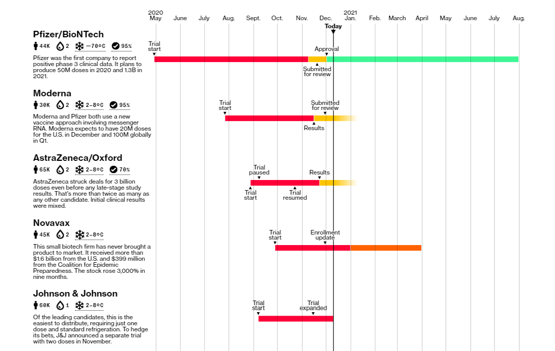
Optimists say the end of the pandemic is just around the corner as vaccines are ready. But where are we, really, when it comes to inoculation? Bloomberg is now tracking the rollout of what they call the most promising COVID-19 vaccines currently numbering nine — from Pfizer/BioNTech, Moderna, AstraZeneca/Oxford, Novavax, Johnson & Johnson, Sinovac Biotech, Gamaleya (Sputnik V), CanSino Biologics, and Sinopharm.
First, there are timelines showing progress for each vaccine, from the beginning of trials to public availability. The same visualization also includes their basic descriptions along with, in numbers, trial size, doses needed, storage temperature, and efficacy. The second graphic visualizes vaccine distribution deals across the world. Finally, vaccine contracts are represented in a map, allowing you to see at a glance what share of the population of each country is currently covered by those pre-purchase agreements.
Check out the visualizations and stay tuned. Bloomberg is going to keep this coronavirus vaccine tracker updated as new data arrives.
Defining Essential and Frontline Workers for Vaccination
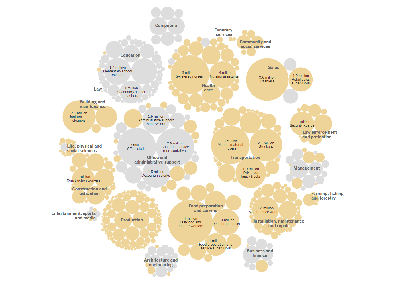
Countries have already started announcing mass vaccination campaigns. However, vaccine supply will be limited at the beginning due to certain production and distribution issues. So a hard decision on who to inoculate first can hardly be avoided. In the United States, medical workers and the most vulnerable elderly people will likely go first. But what groups should follow?
Generally speaking, the decision boils down to defining priority goals. If you want to focus on preventing further (numerous) deaths, it is necessary to prioritize the elderly as well as people with medical conditions. If your goal is to lower infection rates, then so-called “essential workers” should be next in line. But in the latter case, another big problem is that this group includes about 70% of the entire labor force in America as it is defined by officials. So a narrower category of “frontline workers” was suggested, comprising only those who must work in close personal contact with others.
To understand what workers are considered essential and frontline, look at two telling visualizations on The New York Times. The first one shows exactly what jobs belong to these categories, by industry. The second one charts the share of essential and frontline occupations in each state.
Understanding U.S. Energy Use Evolution in 1800-2019
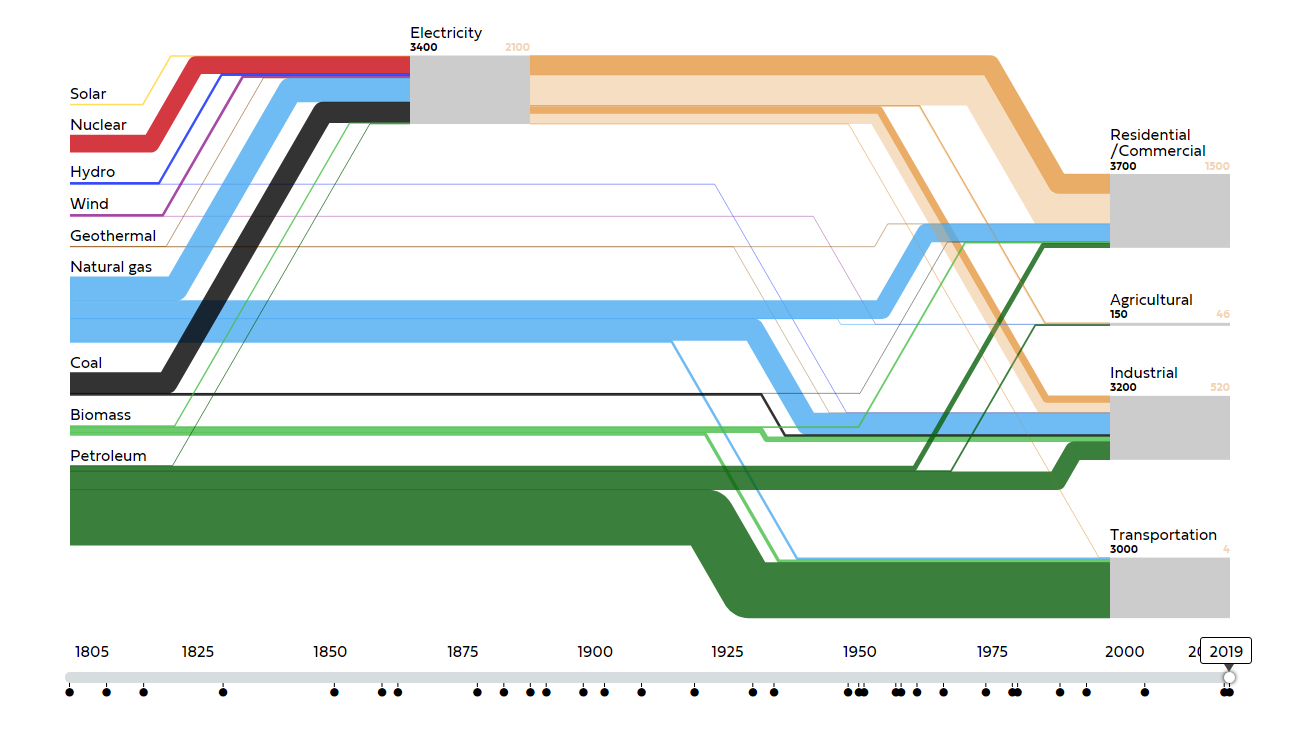
Sankey diagrams are often used to visualize energy flows. Look at another interesting example of such a graphic published this week. The Center for Robust Decision Making on Climate and Energy Policy (RDCEP) at the University of Chicago represented energy use in the U.S. over the past 220 years in a stunning Sankey chart, interactive and animated.
The visualization displays the inputs (sources, such as petroleum, natural gas, coal, hydro, wind, geothermal, nuclear, solar, and biomass) and outputs (final uses, such as residential/commercial, agricultural, industrial, and transportation) for the energy system of the United States in each year from 1800 to 2019. Flows are measured in Watts per capita.
Follow two centuries of energy transitions — the animation and the option to control it using the timeline slider make the exploration really easy (and fun). In addition, don’t miss out on stacked area charts right below the Sankey diagram, which provide several other interesting views of the evolution of the U.S. energy use since 1800.
***
Have a pleasant time exploring these new data visualizations!
Found or made an awesome chart or map? Let us know and we’ll be glad to consider featuring it on Data Visualization Weekly.
- Categories: Data Visualization Weekly
- No Comments »