 Merry Christmas everyone (who’s celebrating)! 🎄 Meanwhile: COVID, election, and environment — the topics quite symbolic for this year are in the spotlight of today’s, the year’s last DataViz Weekly. Don’t miss out on some of the latest best data visualizations!
Look at the list of projects featured on DataViz Weekly this time and keep reading to learn more about each:
- Winners of the 2020 U.S. election by funding from Wall Street — Bloomberg
- COVID-19 infection rates in prisons by state — The Marshall Project
- Novel coronavirus strains in evolution worldwide — Reuters
- River colors across the United States — Gardner Hydrology Lab at Pitt
Data Visualization Weekly: December 18, 2020 — December 25, 2020
2020 U.S. Election Winners by Wall Street Funding
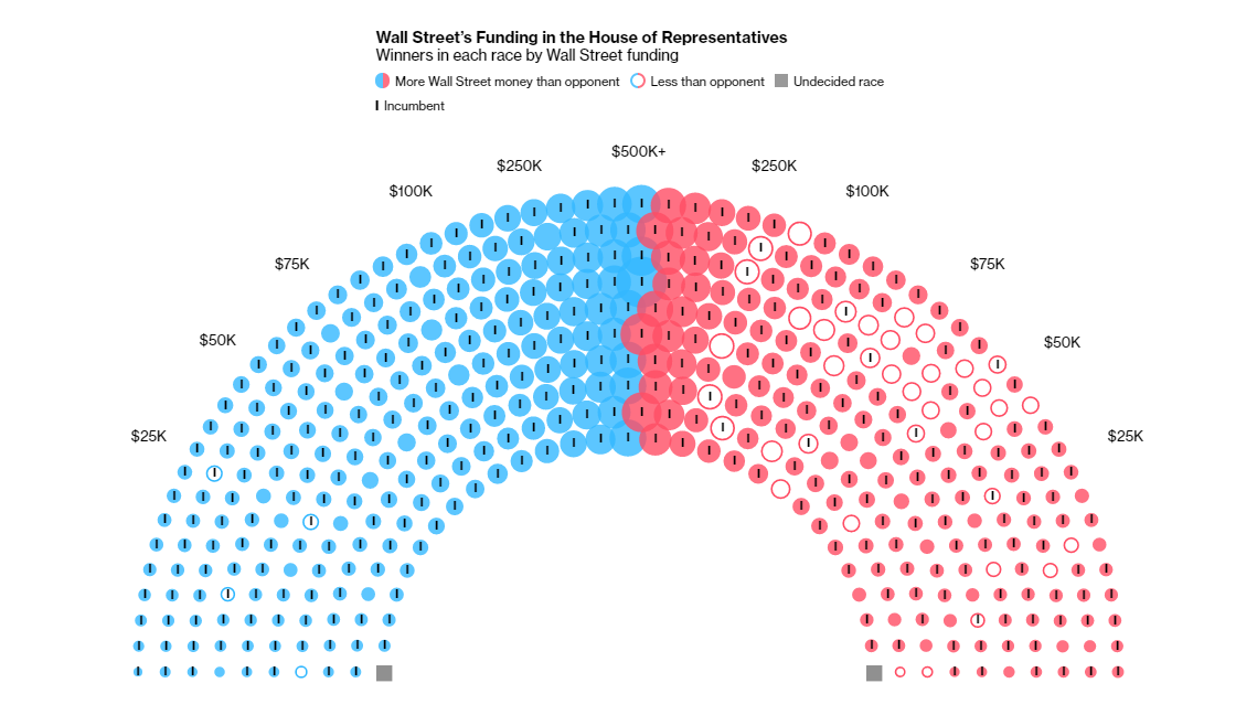
Do you know who won the 2020 election in the United States? Wall Street. That’s the answer of Bloomberg analysts who looked into data provided by the Center for Responsive Politics (CRP), which included donations from employees of organizations in the commercial banking, investment, and securities industries.
According to the data, Wall Street donors not only poured more money into Joe Biden’s presidential campaign than into one of Donald Trump. Moreover, they made larger contributions to the winner in 389 of the (total) 435 House races and in 27 of all the (completed so far) 33 Senate races.
Bloomberg plotted Wall Street’s money given to candidates in individual interactive seating charts for the U.S. House and the U.S. Senate. Check out the winners in each race by Wall Street funding.
COVID-19 Infection Rates in Prisons by State
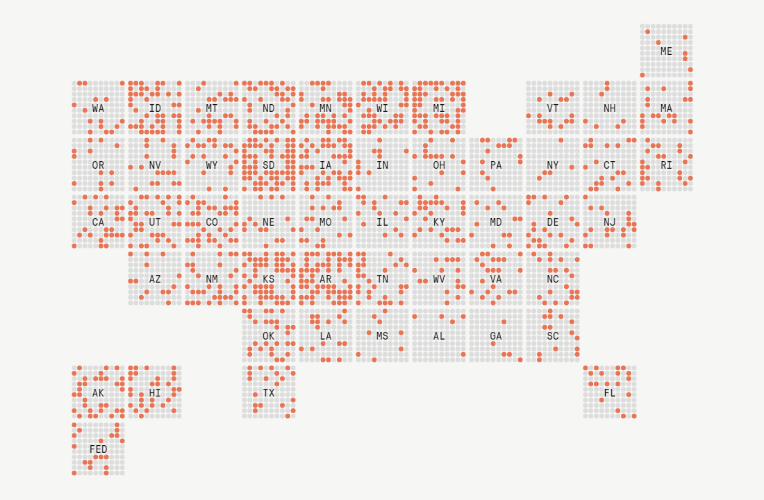
New data collected by The Marshall Project and The Associated Press shows that 20.7% of all prisoners in the United States have tested positive for COVID-19. That is four times more than the share of the coronavirus-infected people in the general population of the country.
In several states, over 50% of all prisoners are reported to have been infected. South Dacota has seen 3 out of 5 prisoners test positive. To find out more, you can explore the COVID-19 infection rates in an interactive visualization on the website of The Marshall Project, a combination of grid and dot-density maps.
While you are there, don’t miss out on looking at the other visualization featured in the report. It’s an interactive chart that will allow you to compare the nationwide rates among prisoners and in the general U.S. population with those in individual states.
Novel Coronavirus Strains in Evolution Worldwide
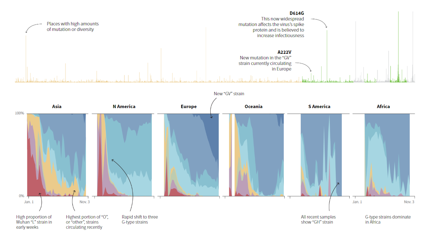
SARS-CoV-2, the novel coronavirus which causes COVID-19, is changing and has already mutated to at least seven major strains. Patterns in its evolution are not uniform across the globe, though.
Reuters analysts dived into the genome sequences database from the Global Initiative on Sharing All Influenza Data (GISAID) to understand how the virus has evolved during the pandemic through the lens of shifts in the major strains’ proportions over time. Now you can track the key mutations, too, thanks to a bunch of percentage stacked area charts they made.
Explore the changing proportions of L (the original strain from Wuhan), S, O, V, and then G, GR, GH, and GV strains worldwide and in individual countries and regions over the course of the pandemic. In the same article on Reuters, there are also two other interesting visualizations revealing more details about how the virus has mutated so far.
Color of Rivers Across U.S.
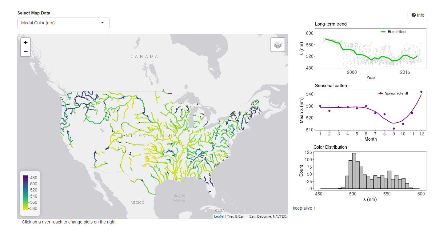
Water color is known to be a water quality indicator. So, technically, we humans are given the power to analyze how suitable for use this or that water is, with the help of our eyes. That is why new research from the Gardner Hydrology Lab at the University of Pittsburgh looks especially interesting.
A group of researchers led by John Gardner used more than 230,000 Landsat satellite images of all large rivers across the contiguous United States taken during 35 years, from 1984 to 2018, to create a database of their waters’ colors. Then, the data was visualized in an interactive dashboard that has become public just lately.
The dashboard includes an interactive map that displays the color of rivers over space. Click on a river to view more details about its color such as change over time.
***
We wish all of you good health, happiness, and prosperity. Take care and stay tuned.
- Categories: Data Visualization Weekly
- 1 Comment »