Worth Seeing Visualizations of Data – DataViz Weekly
July 28th, 2017 by AnyChart Team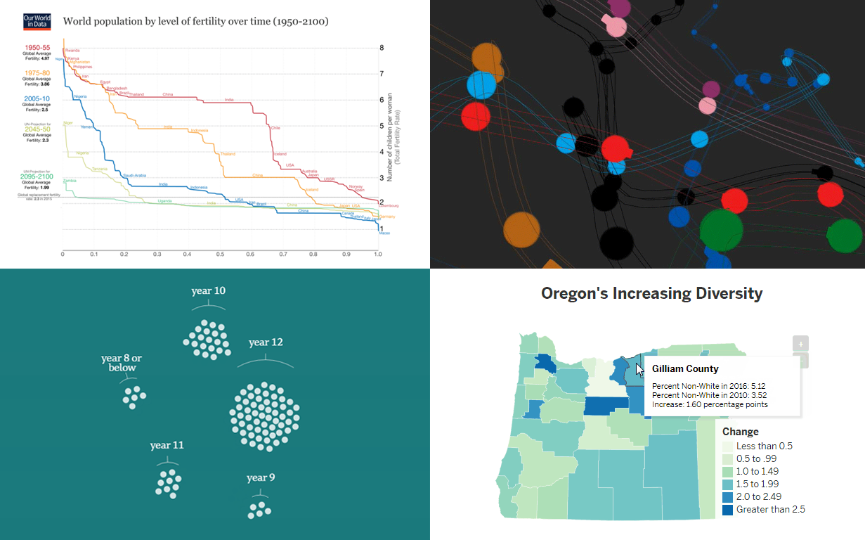 Data visualization quickly evolves as an industry. The wider variety of information emerges on the Internet, the higher quality and more extraordinary visualizations of data it demands. New chart types and features appear, technologies get improved, and all in all, data visualization companies to meet the growing needs of their customers.
As a result, there are more and more interesting data research and visualizations we can find out there, and we are glad to keep sharing some of them in our weekly digest of worth seeing data visualization examples.
This article will show you several interesting and outstanding visualizations of data on the following topics:
- fertility worldwide over time;
- Oregon’s increasing diversity;
- Australian population as 100 people;
- animated visualization of the London Tube.
- Categories: Data Visualization Weekly
- No Comments »
Visualizing Information That Matters: Data Visualization Weekly
July 21st, 2017 by AnyChart Team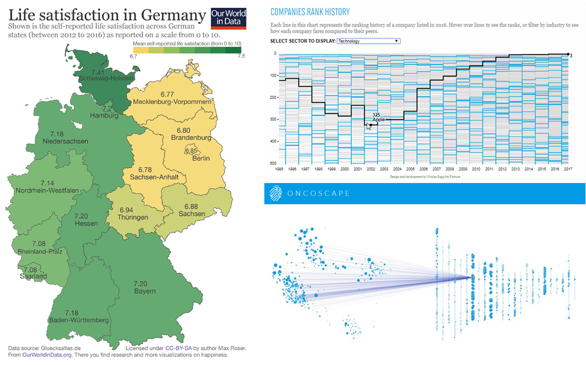 Visualizing information is a complicated matter. But as you are becoming more experienced it gets easier to successfully handle it. All the data visualization examples presented in this issue of DataViz Weekly were created by long-time professionals and made public just lately, but they have already become widely recognized.
So, today’s article is bringing to another light the following data visualization masterpieces:
- map of life satisfaction in Germany by region;
- visualizations of the information from the Fortune 500 list;
- Oncoscape, visualizing clinical and molecular cancer data.
- Categories: Data Visualization Weekly
- No Comments »
Good Data Visualization Examples Worth Checking Out: DataViz Weekly
July 14th, 2017 by AnyChart Team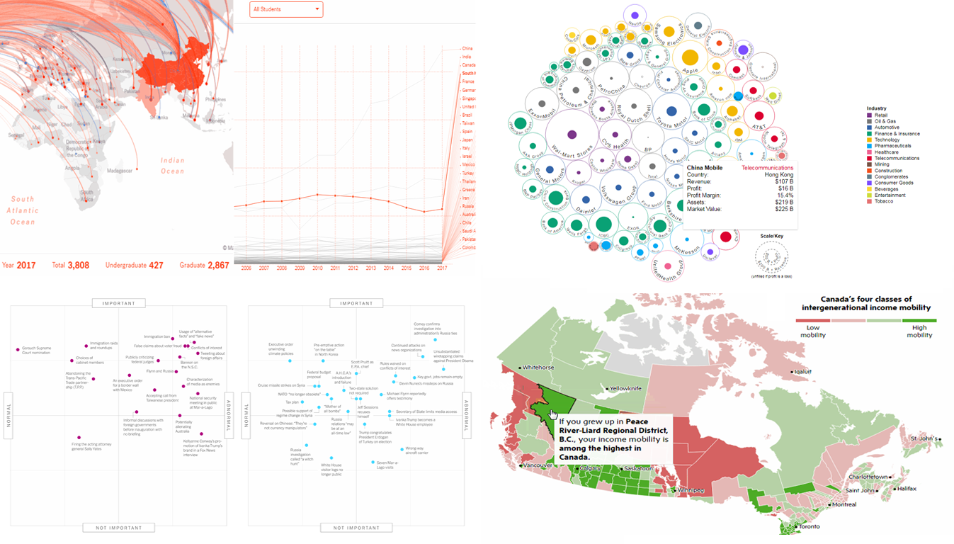 Now it’s time for another cool set of good data visualization examples that became known and even well-known lately. Today’s DataViz Weekly collection consists of the following charts and maps:
- flows of foreign students and researchers to MIT;
- top 100 companies by profit and revenue;
- change in “normality” of Trump’s presidency;
- income mobility in Canada by region.
- Categories: Data Visualization Weekly
- No Comments »
Data Stories Becoming Famous: Data Visualization Weekly
July 7th, 2017 by AnyChart Team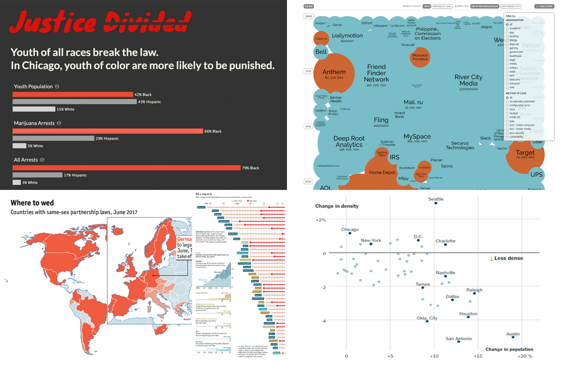 Data stories are all around us, and we are glad to present the most interesting pieces to you on a regular basis, within the framework of the Data Visualization Weekly series of articles on AnyChart JS Charts‘ blog.
Without more ado, let’s take a look at another four eye and mind catching data visualizations of the recent times and the stories they reveal.
- Categories: Data Visualization Weekly
- No Comments »