 Visualizing information is a complicated matter. But as you are becoming more experienced it gets easier to successfully handle it. All the data visualization examples presented in this issue of DataViz Weekly were created by long-time professionals and made public just lately, but they have already become widely recognized.
So, today’s article is bringing to another light the following data visualization masterpieces:
- map of life satisfaction in Germany by region;
- visualizations of the information from the Fortune 500 list;
- Oncoscape, visualizing clinical and molecular cancer data.
DataViz Weekly: July 14, 2017 – July 21, 2017
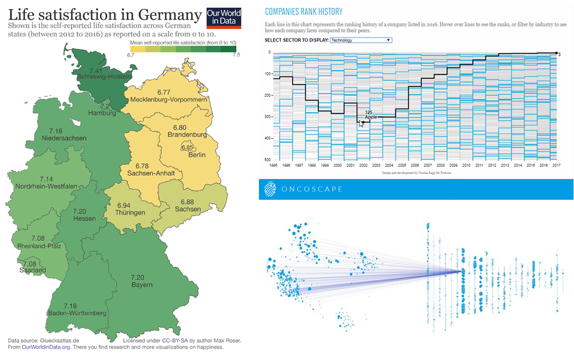
Visualizing Information on Life Satisfaction in Germany
Self-reported life satisfaction in #Germany mapped, revealing a clear divide between #East and #West: https://t.co/J6xu6Axj3C #dataviz #map pic.twitter.com/5w1gUWdcM4
— AnyChart (@AnyChart) July 19, 2017
Online publication Our World in Data found what they called a “happiness gap” between West Germany and East Germany. Survey information about self-reported satisfaction with life was graphically represented on the country map, and then the regional differences seemed to be quite clearly evident.
Basically, those differences profoundly correspond to the political division of Germany that existed till the country’s reunification back in 1990. But you decide whether the gap is really meaningful or not. Check out this map that many people around found interesting: When we shared it on Twitter a couple of days ago, the tweet literally took off and raised a discussion.
Visually Exploring Fortune 500 Companies’ Data
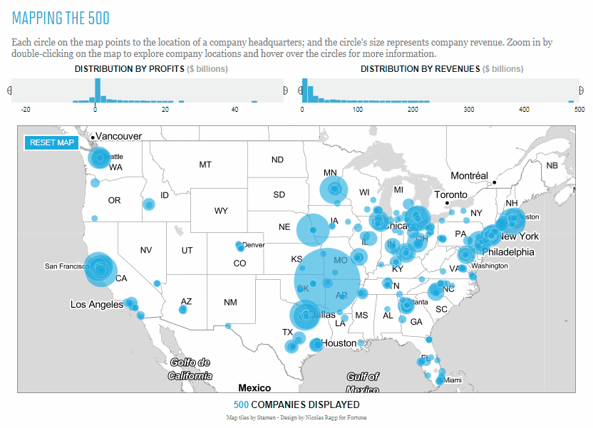
Just like any other major, prominent list of that kind, Fortune 500 is a very interesting and for many people useful reading. However, visualizing information always helps facilitate exploration of data and making the analysis all the more insightful. Nicolas Rapp, Information Graphics Director at Fortune Magazine, did an awesome job to deliver a different, visual experience to those willing to dig into the Fortune 500 list. Check out the Visualize The Fortune 500 dataviz project.
The interactive map he created displays information on where exactly each company’s U.S. headquarters is located; the view can be filtered by distribution by profits and distribution by revenue. The interactive chart – the second data visualization here that also matters much – shows the ranking history of companies over the course of the last two decades.
Oncoscape, Visualizing Cancer Data, Both Molecular and Clinical
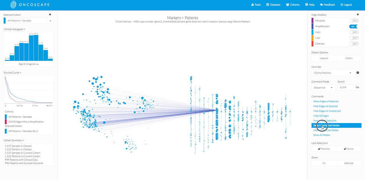
Fred Hutchinson Cancer Research Center presented a project that had been worked on for three years – Oncoscape. It is a data visualization platform for in-depth research of clinical and molecular data and – most important here – revealing relationships and patterns. Information can be explored in timeline, spreadsheet, PCA, and Markers+Patients based visual matters. The developers also plan to introduce 3D visualizations, speed up computation, and add other important functional improvements in a few months, with the release of the version 3.0 of Oncoscape.
The articles in the Data Visualization Weekly series contain a lot of examples on visualizing information and data in an interesting way, so you are more than welcome to read earlier issues if that’s what you want now. If you’ve already got enough inspiration to start making some dataviz by yourself, check out our JavaScript charting libraries‘ galleries (like these interactive chart examples and map examples) and get your project on visualizing information up and running very quickly.
Stay tuned.
- Categories: Data Visualization Weekly
- No Comments »