New JavaScript Chart Features in AnyChart 8.9.0
September 29th, 2020 by AnyChart Team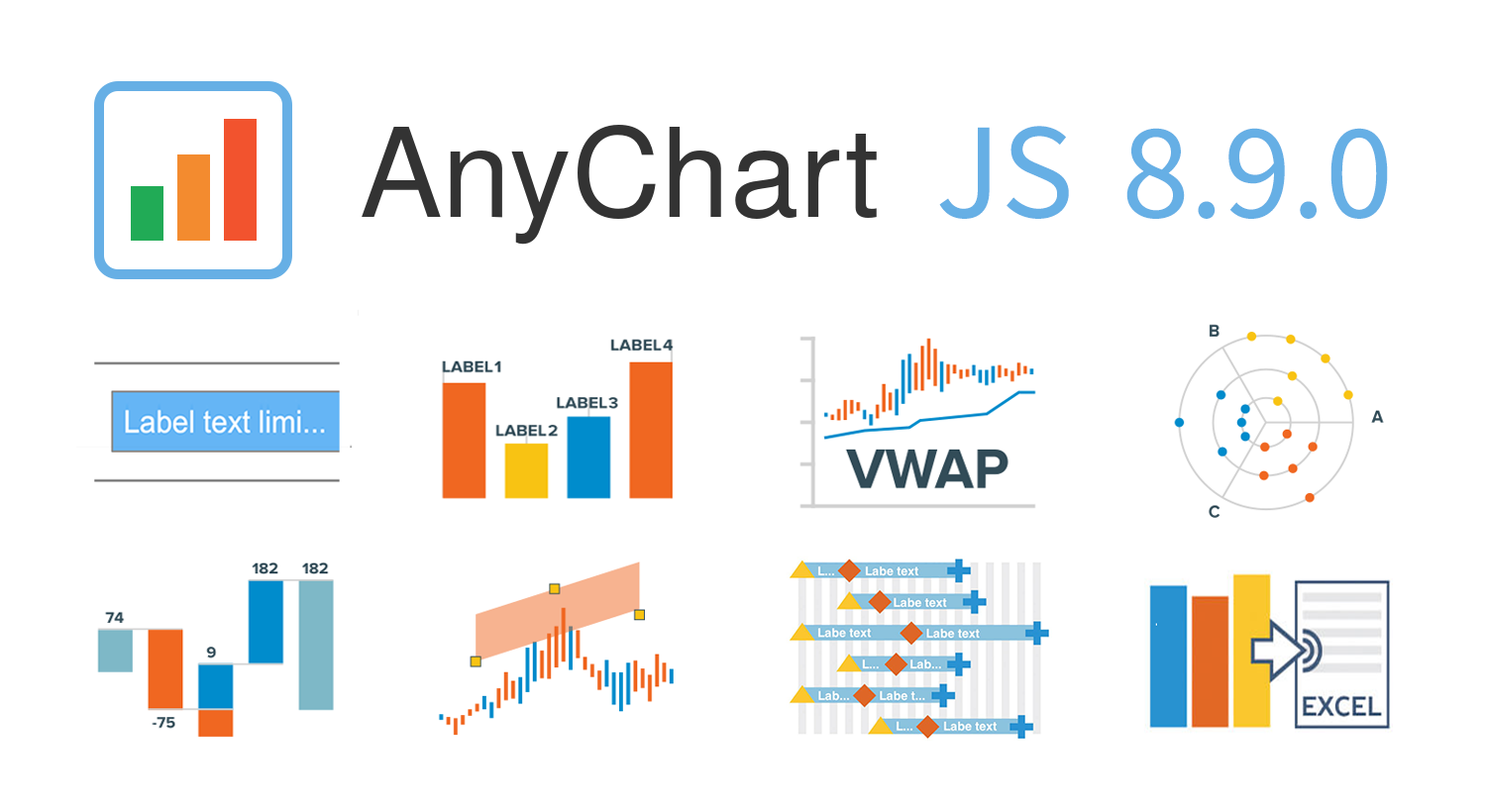 AnyChart 8.9.0 is out! The latest major update brings new exciting out-of-the-box features to our award-winning JavaScript charting library product family — AnyChart, AnyStock, AnyGantt, and AnyMap. Enjoy the improved functionality and build even more compelling data visualizations for your web sites and apps in less time!
»»» See What’s New in AnyChart 8.9.0! «««
- Categories: AnyChart Charting Component, AnyGantt, AnyMap, AnyStock, Big Data, Business Intelligence, Dashboards, Financial Charts, Gantt Chart, HTML5, JavaScript, News, Stock Charts
- 2 Comments »
Visualizing Noise, Census, COVID-19, and Happiness Data — DataViz Weekly
September 25th, 2020 by AnyChart Team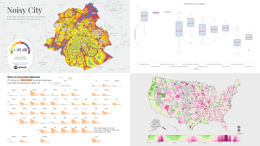 We have put together a roundup of new awesome data visualizations from around the web. Look what we’ve got for you to check out this Friday on DataViz Weekly:
- Noise pollution in Brussels — Karim Douïeb
- Census 2020 undercounts and their consequences — NYT Opinion
- COVID-19 symptoms search trends — Google People + AI Research (PAIR)
- World happiness by region — Wayde Herman
- Categories: Data Visualization Weekly
- No Comments »
How to Build Box Plot Using JavaScript: Visualizing World Happiness
September 22nd, 2020 by Wayde Herman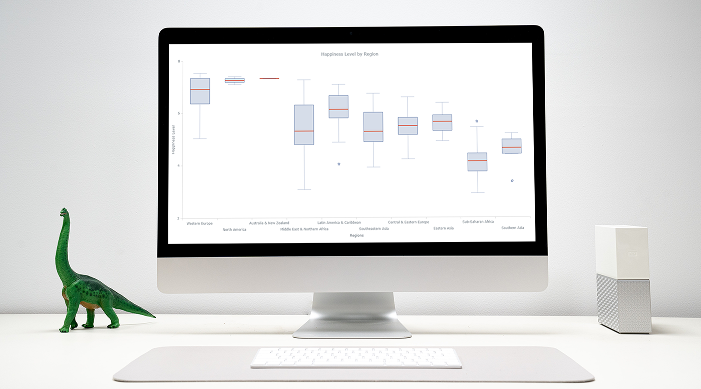 Data visualization is an important and sometimes undervalued tool in a data scientist’s toolkit. It allows us to gain an understanding and intuition about the data, through exploratory data analysis, which influences preprocessing, feature engineering, and the correct machine learning algorithm choice. It also helps to better evaluate models and even allows you to spot areas in the data where models could have poor performance.
Taking data visualization one step further by adding interactivity is even more advantageous. By adding interactive elements to your visualizations you create a more engaging experience. This in turn makes a user ‘explore’ visualizations instead of just reading them!
In this tutorial, I will be covering how to build an interactive data visualization, specifically a box plot as an example, using JavaScript and a charting library. I will begin by first briefly covering the basics of box plots before going through the steps of building one and then finally using the technique in a fun example to investigate the distribution of happiness between the different regions of the planet in an attempt to answer the question: ‘Where should you live to be happier?’.
Read the JS charting tutorial »
- Categories: AnyChart Charting Component, Big Data, Business Intelligence, HTML5, JavaScript, JavaScript Chart Tutorials, Tips and Tricks
- 1 Comment »
New Environmental Maps Worth Checking Out — DataViz Weekly
September 18th, 2020 by AnyChart Team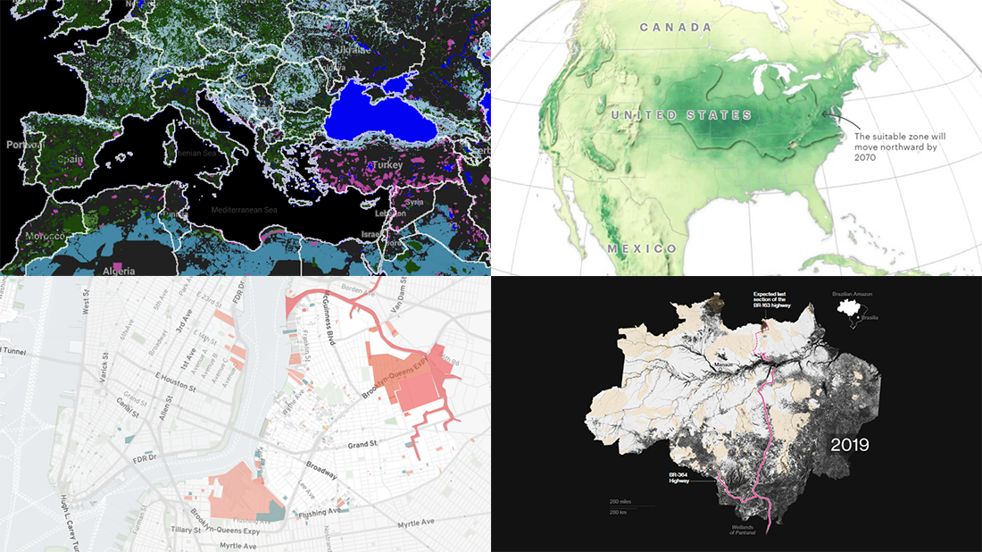 Lately, we’ve seen a bunch of cool geovisualizations on the topics of climate, pollution, and human impact. Here are some of the most interesting fresh ones. Check out the new DataViz Weekly post which is entirely dedicated to great examples of environmental maps:
- American climate shifts — ProPublica
- Earth’s most biologically important lands — RESOLVE
- Rainforest loss — Bloomberg Green
- Toxicity in North Brooklyn — North Brooklyn Neighbors
- Categories: Data Visualization Weekly
- No Comments »
Meet September 2020 Releases of AnyChart and AnyGantt Extensions for Qlik
September 16th, 2020 by AnyChart Team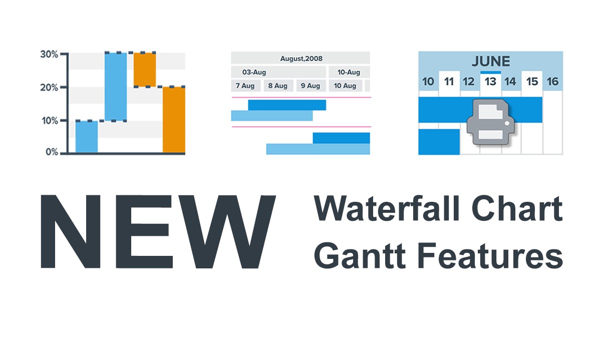 We’ve just updated the AnyChart and AnyGantt extensions for Qlik Sense to further facilitate the path to enhanced data-driven insights for you! Keep reading to learn about the new amazing Waterfall Chart and Gantt Chart features delivered in the 4.3.249 releases. Then check out the latest versions to see them all in action!
Read more at qlik.anychart.com »
- Categories: AnyChart Charting Component, AnyGantt, Big Data, Business Intelligence, Gantt Chart, News, Qlik
- No Comments »
New Maps and Charts Showing Power of Data Visualization — DataViz Weekly
September 11th, 2020 by AnyChart Team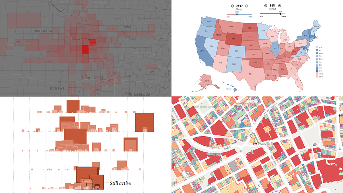 The long wait is over! DataViz Weekly is here bringing some of the best new maps and charts from all over the web to the spotlight! Look at these amazing examples that show the power of smart data visualization:
- College football fan movement and COVID-19 risk — ESPN
- California wildfires over the past 17 years — FlowingData
- London solar opportunities — UCL Energy
- Voter scenarios for the U.S. presidential election — The Washington Post
- Categories: Data Visualization Weekly
- No Comments »
Awesome Fresh Data Visualization Projects for Inspiration — DataViz Weekly
September 4th, 2020 by AnyChart Team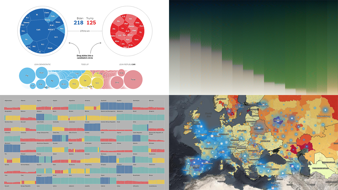 Celebrating the first Friday of September, don’t miss these awesome fresh data visualization projects for inspiration! We have recently met them around the web and are glad to introduce you to them in a quick overview. So our new picks for DataViz Weekly include:
- COVID-19 situation in Europe, a subnational view — WHO/Europe
- Potential outcomes of the U.S. presidential election — The New York Times
- State of democracy worldwide since 2006 — Preity Lodha
- Colors of the American landscape vs electoral map colors — The Upshot
- Categories: Data Visualization Weekly
- 1 Comment »