 Celebrating the first Friday of September, don’t miss these awesome fresh data visualization projects for inspiration! We have recently met them around the web and are glad to introduce you to them in a quick overview. So our new picks for DataViz Weekly include:
- COVID-19 situation in Europe, a subnational view — WHO/Europe
- Potential outcomes of the U.S. presidential election — The New York Times
- State of democracy worldwide since 2006 — Preity Lodha
- Colors of the American landscape vs electoral map colors — The Upshot
Data Visualization Weekly: August 28, 2020 — September 4, 2020
Subnational View of COVID-19 Situation in Europe
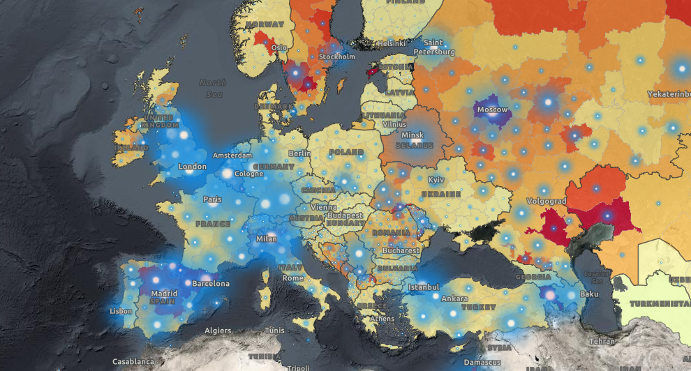
The WHO Regional Office for Europe (WHO/Europe) launched an interactive map that provides a detailed, subnational view of the coronavirus statistics within the European region. Officially announced in late August, the project graphically represents open data from a number of official sources including regional, national, and international authorities.
The map is choropleth, showing the scale of the COVID-19 outbreak in each individual region. It is possible to switch between three views based on what kind of incidence per 100,000 people you would like to explore: seven-day, fourteen-day, or cumulative (i.e. over the entire period of the pandemic). Additionally, total case counts in absolute values are displayed as bubbles shining in blue. You can click on a region to see the exact numbers.
On the left side, there is a list of all regions represented on the map. It can be sorted by seven-day, fourteen-day, and cumulative incidence, from high to low.
Potential Outcomes of U.S. Presidential Election
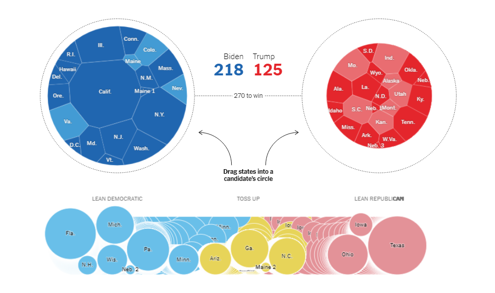
A total of 270 electoral votes are needed for one candidate to become the President of the United States of America. As always, the final results are to be largely decided by what swing (battleground) states’ voters will do. To see all potential scenarios, you can make use of the cool interactive tool by Josh Holder and Alexander Burns published this week on The New York Times.
There, you can throw states into the baskets of Joe Biden (to the left) and Donald Trump (to the right) and see how the potential outcome changes with your every move. It is also interesting to check out the following four pre-built scenarios and go from there: Biden dominates, or he wins the leans, or Trump ekes it out, or he wins repeating the 2016 result.
Data for this interactive tool is taken from the Cook Political Report’s ratings. You can see them right there for better understanding.
State of Democracy Worldwide Since 2006
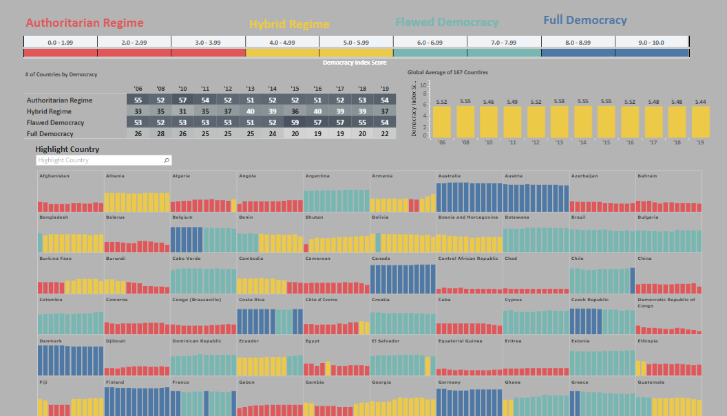
Preity Lodha made a cool visualization of data from the Democracy Index published by the Economist Intelligence Unit on a regular basis.
First released in 2006, updated in 2008, and then released annually since 2010, the index takes into account several dozens of indicators, providing each country with a numeric score and one of four regime categories according to it: authoritarian (up to 3.99), hybrid (4-5.99), flawed democracy (6-7.99), or full democracy (8-10). This new visualization represents all these scores for each of the 167 countries studied by the EIU analysts within the framework of this project, from all issues of the Democracy Index. As a result, we can see at a glance how the level of democracy in each country — and on average in the world — have changed over time since 2006.
There is a clear downward trend in the global average taking place after 2015, which means democracy is likely to be in decline. Check what has been going on in individual countries. The visualization is interactive, so feel free to hover and click around for better insight.
True Colors of American Political Spectrum
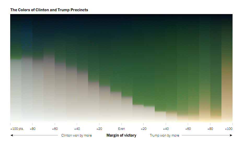
If we look at the United States from above, we will notice a wide variety of natural colors. What would you say if we told you these colors could give us a hint about the political preferences of people living in the corresponding area? Well, that’s actually true!
Tim Wallace and Krishna Karra made an interesting experiment with computer processing of aerial images, sorting pixels by color and brightness. And they found a real-world relationship between landscape colors and election results, which you can now see on the picture. Red and blue on electoral maps appear to be quite related to green and gray on aerial images.
A brief explanation of the entire thing can hardly do it justice. So we just invite you to see this awesome piece with a lot of illustrations on The Upshot by The New York Times right away, starting to look carefully from the very beginning. Don’t miss out on each state’s landscape color grids and a closer view of a few areas at the end.
***
Thanks for your attention. Stay tuned for DataViz Weekly where we curate the most awesome data visualization projects for inspiration of chart makers every Friday.
Please stay safe and take care.
- Categories: Data Visualization Weekly
- 1 Comment »