 We have put together a roundup of new awesome data visualizations from around the web. Look what we’ve got for you to check out this Friday on DataViz Weekly:
- Noise pollution in Brussels — Karim Douïeb
- Census 2020 undercounts and their consequences — NYT Opinion
- COVID-19 symptoms search trends — Google People + AI Research (PAIR)
- World happiness by region — Wayde Herman
Data Visualization Weekly: September 18, 2020 — September 25, 2020
Noise Pollution in Brussels
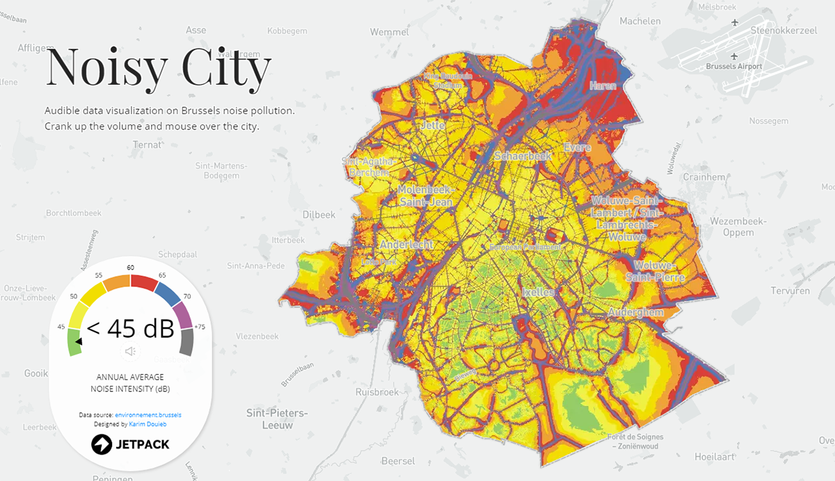
Karim Douïeb from Jetpack.AI, a data science company, made a fascinating interactive data visualization under the title “Noise City.” Embracing a map and a gauge, this project allows everyone to explore noise pollution in Brussels, the capital of Belgium. What makes this presentation especially interesting — in addition to a beautiful, neat view of the data — is audibility.
Turn the sound on, volume up, and click on the “With sound” button once you’ve opened the visualization. Then hover over the map and you’ll hear the noise which is usual for the respective place. The circular gauge on the left displays the annual average noise intensity in decibels as you mouse around.
Census 2020 Undercounts and Their Consequences
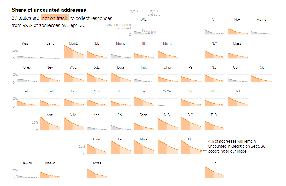
The 2020 Census is ongoing in the United States, and its mission is more than simple enumeration for statistical purposes. It is a very important official procedure. The census results will determine, for example, how seats in the U.S. Congress and federal payments will be apportioned among the states.
This year, when the Census Bureau first had troubles due to the lockdown and is currently pushed by the Trump administration to end the count on September 30, some states can be expected to experience significant undercounts. And a low completion rate may result in reduced representation and funding.
Gus Wezerek and Andrew Whitby looked into the available data to find out how many Americans across the country, according to the currently recorded response rate, will remain uncounted next Wednesday and to understand the way the congressional makeup and federal funding figures can therefore change for some states. Look at the interesting charts on The New York Times Opinion section.
COVID-19 Symptoms Search Trends
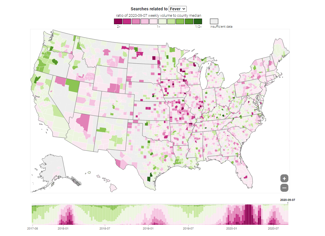
In the meantime, as the pandemic persists, COVID-19 remains one of the hottest subjects among data visualization experts and enthusiasts all over the world. Google’s People + AI Research (PAIR) team charted aggregated search trends for over four hundred signs and symptoms from the COVID-19 Search Trends database shared by Google in early September.
Choose a symptom — like “Fever” on the picture — and you’ll be able to explore the relative volume of the respective searches across the United States along with its nationwide change over the past three years. Then you can focus on some of the most frequent symptoms by looking at the additional charts. Reveal seasonal patterns, investigate geographic distributions, and understand the coronavirus impact.
World Happiness by Region
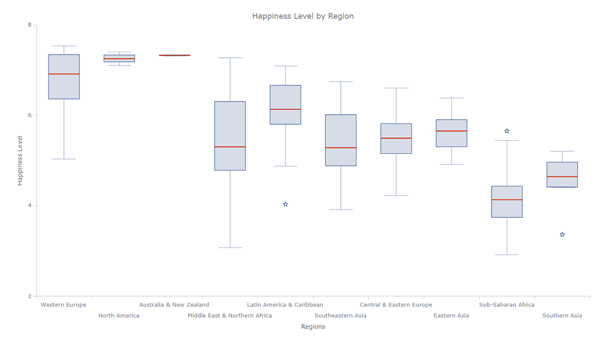
Noise, elections, viruses — regardless of or taking into account all that and much more, people are happier in some places than others. Wayde Herman, a data visualization developer, decided to find out the details. He took data from the World Happiness Report, a survey of the state of happiness around the world, and made a cool interactive box plot that nicely shows how happy people are in ten macroregions: Western Europe, North America, Australia and New Zealand, Middle East and Northern Africa, Latin America and Caribbean, Southeastern Asia, Central and Eastern Europe, Eastern Asia, Sub-Saharan Africa, and Southern Asia.
The box-and-whisker chart does a great job here. Look what conclusions you can draw from such a visualization. If you deal with creating charts for sites or apps, you might also like to study Wayde’s entire article in which he provides a clear step-by-step explanation of how he created this chart from scratch (with the help of the AnyChart JavaScript charting library, by the way). We’ve reposted his marvellous box plot tutorial from Towards Data Science this week, with his permission.
***
Thanks for your attention. Stay tuned for cool charts and infographics!
- Categories: Data Visualization Weekly
- No Comments »