 Data visualization is an important and sometimes undervalued tool in a data scientist’s toolkit. It allows us to gain an understanding and intuition about the data, through exploratory data analysis, which influences preprocessing, feature engineering, and the correct machine learning algorithm choice. It also helps to better evaluate models and even allows you to spot areas in the data where models could have poor performance.
Taking data visualization one step further by adding interactivity is even more advantageous. By adding interactive elements to your visualizations you create a more engaging experience. This in turn makes a user ‘explore’ visualizations instead of just reading them!
In this tutorial, I will be covering how to build an interactive data visualization, specifically a box plot as an example, using JavaScript and a charting library. I will begin by first briefly covering the basics of box plots before going through the steps of building one and then finally using the technique in a fun example to investigate the distribution of happiness between the different regions of the planet in an attempt to answer the question: ‘Where should you live to be happier?’.
What is a box plot?
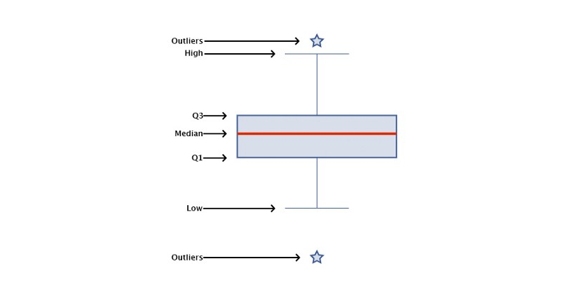
A box plot, also widely called a box-and-whisker plot, is a data visualization technique used to visualize descriptive statistics of datasets. While this chart type is not as useful as a histogram at understanding a single datasets distribution, these visualizations do well at allowing a user to compare different datasets.
Box plots visualize the following summary statistics: The median, the first and third quartile (Q1 and Q3), the low and the high as well as the outliers. These are displayed as follows:
Creating a JavaScript box plot
To build an interactive data visualization there are a quite a few options. If you want to learn about JavaScript alternatives, you can have a look here. In this example I will be using a JS charting library and specifically AnyChart. I’m going with AnyChart as it supports box-and-whisker plots (among multiple other chart types), and I think both its documentation and API are really great for beginners and advanced users alike but alternatives which better suit your needs can work too and will follow similar steps.
Step 1: Set up the page
The first step is to set up a page for the box plot visualization. This includes adding the HTML elements, loading the required scripts and setting up the CSS for our chart. Which looks like:
<html>
  <head>
    <script src="https://cdn.anychart.com/releases/8.8.0/js/anychart-base.min.js"></script>
    <style type="text/css">
      html, body, #container {
        width: 100%;
        height: 100%;
        margin: 0;
        padding: 0;
      }
     </style>
  </head>
  <body>
    <div id="container"></div>
  </body>
  <script>
    anychart.onDocumentReady(function () {
      // code goes here.
    });
  </script>
</html>
When using a charting library you will need to import the correct script in order to use that library and in some cases different modules for different chart types. For access to AnyChart’s box-and-whisker chart, for example, I will need to use the base module.
Once that is sorted I will then need to set the CSS properties for my chart element. Here I have set the box chart to have a width and height of 100%. You can change this depending on your own use case. CSS width and height properties accept percentages (of the parent element), and various length units (most commonly pixels).
Finally, I have a script tag with the JavaScript function anychart.onDocumentReady() which is simply a function triggered when the document is loaded. Placing the JavaScript charting code within this function ensures that the code does not trigger before the page is ready which can lead to bad results (read up on asynchronous JavaScript to learn more about this).
Step 2: Load the data
I will be using data sourced from the World Happiness Report which is the results compiled from a global survey that attempts to quantify happiness of each country’s citizens to a value between 0 and 10. I obtained this data from Kaggle, a great place to find fun and interesting datasets. Admittedly most of them are geared towards machine learning applications but a few work well for data visualization purposes.
In preparation for drawing box plots, I need to provide the data in a format and form that is accepted by our chosen charting library. For example, AnyChart JS accepts box plot data in the following form:
{x:"Name", low: value, q1: value, median: value, q3: value, high: value, outliers: array}Where x is the label, q1 and q3 are the first and third quartile values, low and high are the 1.5 x the interquartile range below q1 and 1.5 x the interquartile range above q3 respectively, and the outliers is an array containing all the outlier values.
I have conveniently preprocessed the data from the world happiness report to produce the following array:
var data = [
  {x:"Western Europe", low: 5.03, q1: 6.36, median: 6.91, q3: 7.34, high: 7.53},
  {x:"North America", low: 7.10, q1: 7.18, median: 7.25, q3: 7.33, high: 7.40},
  {x:"Australia and New Zealand", low: 7.31, q1: 7.32, median: 7.32, q3: 7.33, high: 7.33},
  {x:"Middle East and Northern Africa", low: 3.07, q1: 4.78, median: 5.30, q3: 6.30, high: 7.27},
  {x:"Latin America and Caribbean", low: 4.87, q1: 5.80, median: 6.13, q3: 6.66, high: 7.09, outliers: [4.03]},
  {x:"Southeastern Asia", low: 3.91, q1: 4.88, median: 5.28, q3: 6.01, high: 6.74},
  {x:"Central and Eastern Europe", low: 4.22, q1: 5.15, median: 5.49, q3: 5.81, high: 6.60},
  {x:"Eastern Asia", low: 4.91, q1: 5.30, median: 5.65, q3: 5.90, high: 6.38},
  {x:"Sub-Saharan Africa", low: 2.91, q1: 3.74, median: 4.13, q3: 4.43, high: 5.44, outliers: [5.648]},
  {x:"Southern Asia", low: 4.40, q1: 4.41, median: 4.64, q3: 4.96, high: 5.20, outliers: [3.36]}
]
Step 3: Draw the box chart
With only these few lines of code I can draw my box plots:
// create a chart
chart = anychart.box();

// create a box series and set the data
series = chart.box(data);

// set the container id
chart.container("container");

// initiate drawing the chart
chart.draw();
And putting this all together, you will get the following:
<html>
  <head>
    <script src="https://cdn.anychart.com/releases/8.8.0/js/anychart-base.min.js"></script>
    <style type="text/css">
      html, body, #container {
        width: 100%;
        height: 100%;
        margin: 0;
        padding: 0;
      }
    </style>
  </head>
  <body>
    <div id="container"></div>
  </body>
  <script>
    anychart.onDocumentReady(function () {
      var data = [
        {x:"Western Europe", low: 5.03, q1: 6.36, median: 6.91, q3: 7.34, high: 7.53},
        {x:"North America", low: 7.10, q1: 7.18, median: 7.25, q3: 7.33, high: 7.40},
        {x:"Australia and New Zealand", low: 7.31, q1: 7.32, median: 7.32, q3: 7.33, high: 7.33},
        {x:"Middle East and Northern Africa", low: 3.07, q1: 4.78, median: 5.30, q3: 6.30, high: 7.27},
        {x:"Latin America and Caribbean", low: 4.87, q1: 5.80, median: 6.13, q3: 6.66, high: 7.09, outliers: [4.03]},
        {x:"Southeastern Asia", low: 3.91, q1: 4.88, median: 5.28, q3: 6.01, high: 6.74},
        {x:"Central and Eastern Europe", low: 4.22, q1: 5.15, median: 5.49, q3: 5.81, high: 6.60},
        {x:"Eastern Asia", low: 4.91, q1: 5.30, median: 5.65, q3: 5.90, high: 6.38},
        {x:"Sub-Saharan Africa", low: 2.91, q1: 3.74, median: 4.13, q3: 4.43, high: 5.44, outliers: [5.648]},
        {x:"Southern Asia", low: 4.40, q1: 4.41, median: 4.64, q3: 4.96, high: 5.20, outliers: [3.36]}
      ]

      // create a chart
      chart = anychart.box();

      // create a box series and set the data
      series = chart.box(data);

      // set the container id
      chart.container("container");

      // initiate drawing the chart
      chart.draw();

    });

  </script>
</html>
Which results in:
With these simple steps, I have quickly produced a very functional interactive box-and-whisker plot that I can now easily embed in any web site or app!
While not bad, I think I can do better. Just keep reading.
Step 4: Customize the box-and-whisker plot
Data visualization isn’t just processing some data and putting it into a chart. It is about storytelling. It is about making adjustments in order to highlight an insight or making a visualization more engaging.
All decent charting libraries will provide many ways to do this. They will provide this through their API and you can generally find these options by looking through their documentation. As I am using the AnyChart JS charting library in this example I will go through a few of its customization options that are available for box plots.
Customize the chart design
It is possible to change many cosmetic and functional aspects of the visualization. To start with, I’ll add a custom title, change the individual axis labels, and stagger the x-axis labels to prevent them from overlapping:
// set the chart title
var title = chart.title("Happiness Level by Region");

// label axis
chart.xAxis().title("Regions");
chart.yAxis().title("Happiness Level");

// stagger the x-axis labels
chart.xAxis().staggerMode(true);
For the boxes themselves, for example, I can change details for when they are in their default state, their state when hovered over and their state when selected. I can make similar changes to the median line, the stem, the whiskers as well as the outliers. Typically, I would take advantage of these customization options to make my visualization better fit in with the layout/theme of where I will be hosting my viz or to better suit the data being displayed (eg using greens when visualizing environmental data).
For the outliers I can even change the shape by setting the marker type. (AnyChart has a variety of options which can be seen in the API reference).
These changes can be made easily with the following code:
// configure visual appearance of series
series.normal().fill("#36558F", 0.2);
series.hovered().fill("#36558F", 0.2);
series.selected().fill("#36558F", 0.6);
series.normal().stroke("#36558F", 1);
series.hovered().stroke("#36558F", 2);
series.selected().stroke("#36558F", 4);

// configure medians
series.normal().medianStroke("#dd2c00", 1);
series.hovered().medianStroke("#dd2c00", 2);
series.selected().medianStroke("#dd2c00", 2);

// configure outliers
series.normal().outlierMarkers({
  fill: "#36558F 0.2",
  stroke: { color: "#36558F", thickness: 1 },
  size: 5,
  type: "star5",
});
series.hovered().outlierMarkers({
  fill: "#36558F 0.2",
  stroke: { color: "#36558F", thickness: 2 },
  size: 5,
  type: "star5",
});
series.selected().outlierMarkers({
  fill: "#36558F 0.6",
  stroke: { color: "#36558F", thickness: 4 },
  size: 7.5,
  type: "star5",
});

// configure stems
series.normal().stemStroke("#36558F", 0.5);
series.hovered().stemStroke("#36558F", 1);
series.selected().stemStroke("#36558F", 2);

// configure whiskers
series.whiskerWidth(50);
series.normal().whiskerStroke("#36558F", 0.5);
series.hovered().whiskerStroke("#36558F", 1);
series.selected().whiskerStroke("#36558F", 2);
Here I input the color and opacity and the color and width of the fill and stroke respectively. Color arguments can be given in many accepted formats. Here I’ve gone with the more widely used hex codes.
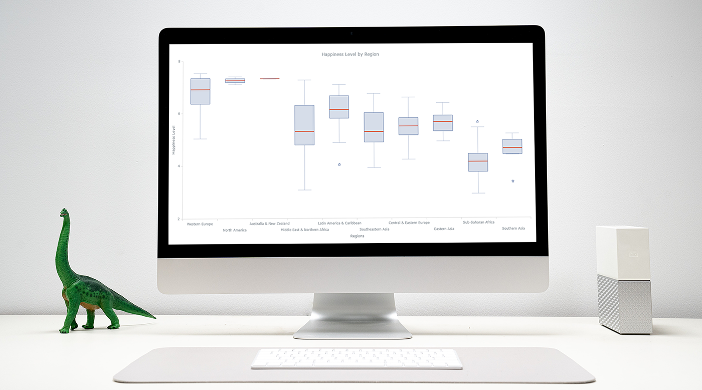
Incorporating all of this results in:
Improve the box plot tooltip
As you may have noticed, when hovering over a box you can see all of the summary statistics used to draw these plots… except for the outliers. I’ll fix that and add the outlier data to the box plot tooltip as well.
// configure tooltip
chart.tooltip().titleFormat("Region: {%x}")
chart.tooltip().format("Low: {%low} \n High: {%high} \n Quantile 1: {%q1} \n Quantile 3: {%q3} \n Median: {%median} \n Outliers: {%outliers}");
And if you add that to the previous code you get the following interactive box-and-whisker chart:
Awesome! We’ve just visualized happiness (sort-of)! From the above plot I can clearly see that Sub Saharan Africa isn’t the happiest of places, while Western Europeans and North Americans smile a ton the happiest place to be is clearly Australia and New Zealand!
*I am from Sub Saharan Africa and am not too confident of these results from my anecdotal experiences!
Conclusion
As you can see, making an interactive data visualization is very easy. It doesn’t require much knowledge of JavaScript to get started (depending on the charting library you use) and the results are great! Here I created a box plot but the process is very similar for other chart types and by consulting the documentation it can be very easy to change.
This is only the tip of the iceberg with regards to what you can do, whether it be more interesting customizations or using different data sources. I hope that this tutorial on box and whisker plots can be a great springboard for learning further!
Published with permission of Wayde Herman. Originally appeared on Towards Data Science under the title “Building Box Plots Using JavaScript: Visualizing World Happiness” on September 4, 2020.
- Categories: AnyChart Charting Component, Big Data, Business Intelligence, HTML5, JavaScript, JavaScript Chart Tutorials, Tips and Tricks
- 1 Comment »