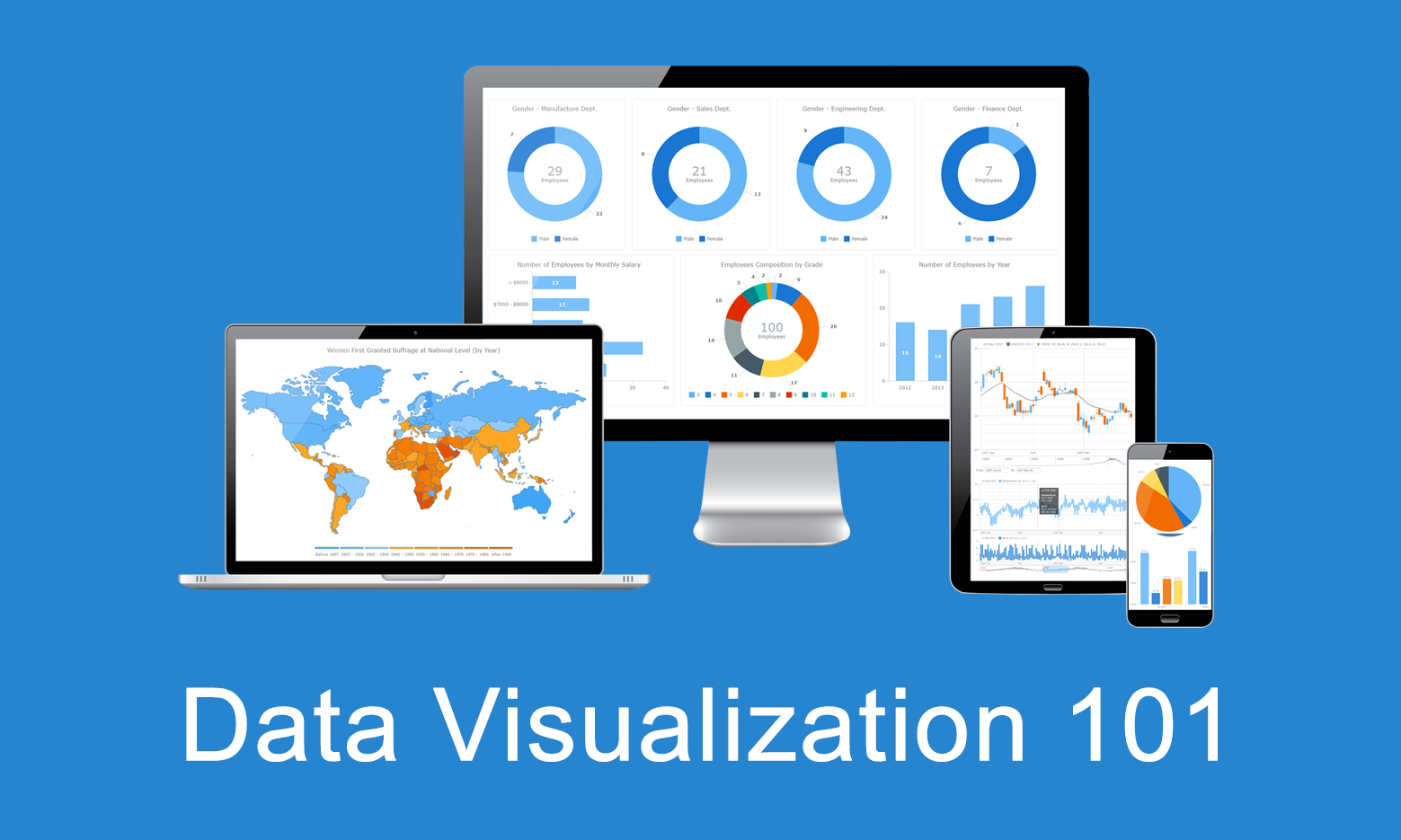
 Data visualization is the practice of converting data from raw figures into a graphical representation such as graphs, maps, charts, and complex dashboards. Let’s see what makes it important (meaning), how it has developed (history), and exactly how it can work in real life (examples). Join us on Data Visualization 101, an introduction to dataviz and its power.
Significance of Data Visualization
To understand how meaningful data visualization is, here’s a simple fact: Human brains have a much harder time understanding complex data when it is encoded in numbers and text compared to graphics. Dataviz techniques take advantage of that quality, helping to present massive amounts of information in the most efficient, visual form.
In fact, visually displayed data is easier to grasp and analyze, making it faster for decision makers to find patterns, including new and hidden, and to understand even difficult concepts. Charts, graphs, maps, dashboards — data visualization can be helpful in identifying issues and deficits, choosing the best product and business operation strategy, forecasting sales volume and stock prices, fine-tuning project management and resource administration, and so on and so forth.
History of Data Visualization
 The concept of data visualization is not new. Moreover, it has been around for centuries. The earliest and most obvious examples of dataviz projects are maps. Then you have the pie chart which first showed up in the early 19th century. A few decades later, Charles Joseph Minard used statistical graphs in order to map Napoleon Bonaparte’s Russian campaign of 1812, combining multiple metrics: the number of troops, temperature, distance, directions, and more.
Other notable milestones in the history of data visualization include but are not limited to works of Nicole Oresme, Joseph Priestly, and William Playfair. All of them greatly contributed to the dataviz progress. Oresme was one of the greatest thinkers of the Middle Ages, and it could be said that he invented bar charts in the 14th century, although it was Playfair who later gave the bar chart the form we know today. Priestley, in his chart of biography, used a timeline with bars to compare multiple persons’ life spans. Playfair is also credited with the first use of area charts.
To learn more about the data visualization history, explore the biggest known milestones Michael Friendly and Daniel J. Denis from York University featured in their book “Milestones in the History of Thematic Cartography, Statistical Graphics, and Data Visualization: An Illustrated Chronology of Innovations.”
The idea of visualizing data kept evolving over time, and with the advent of computers and rapid growth of technologies, the discipline definitely took a quantum leap forward. Nowadays, even massive amounts of data — and big data itself — can be processed by dataviz software at a very high speed, opening up new exciting opportunities in the field of data analytics and business intelligence.
Data Visualization Approaches and Examples
Visualization is ultimately a great way to let your data speak.
Over the course of time, a variety of data visualization techniques have emerged, opening up opportunities to solve literally any dataviz task. Depending on what data you have to explore (or explain) and what analytical questions you want it to answer, you can pick one approach or another.
With dozens of chart types available, each known to suit one particular purpose or another, it is extremely important to choose the right chart type. In fact, picking a wrong form is one of the most common — and critical — visualization mistakes.
Let’s look at seven common examples of data visualization tasks and see what chart types are typically the best fits. Click the corresponding links to learn more and check out interactive chart examples.
1. Compare Data
To compare data, the following chart types are commonly helpful:
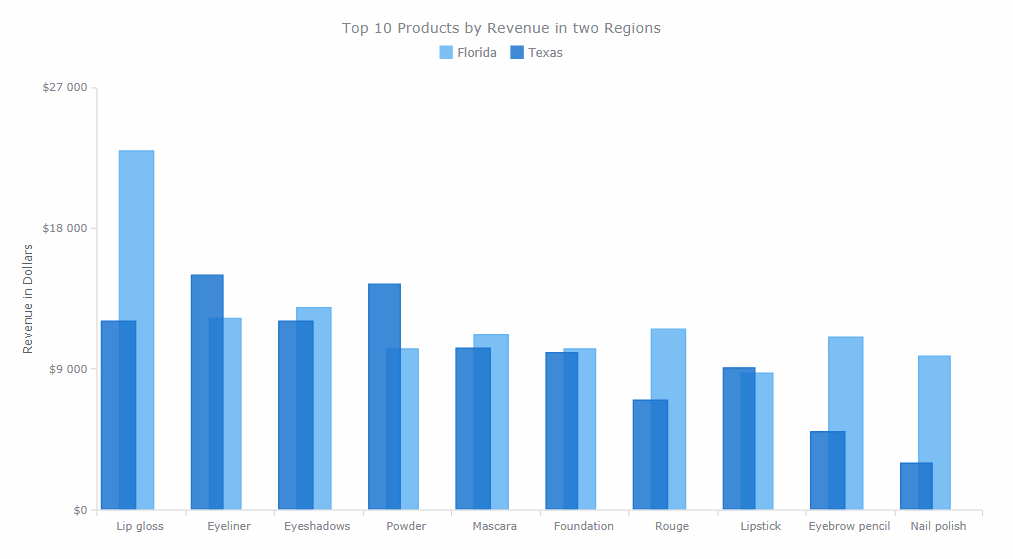
- Bar charts (and column charts) — for a straightforward comparison of quantitative values by category.
- Stacked charts (and 100% stacked charts) — to add a look at the composition.
- Radar charts — for a comparison of cyclic data.
For example, you can use bar charts to visualize products by revenue and referral sources by user traffic; stacked charts — sales figures by product and by region; radar charts — air temperature by month; etc.
2. Explore Composition and Part-to-Whole Relationships in Data
To explore the composition and part-to-whole relationships, the following chart types are commonly helpful:
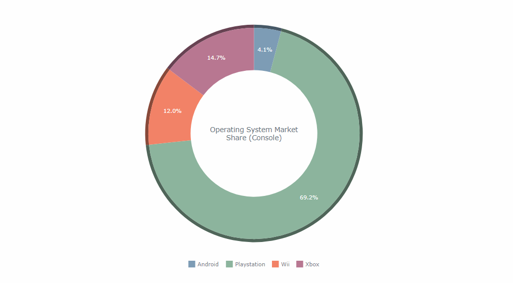
- Pie charts (and donut charts) — for a basic look at the percentage composition of a value.
- Pyramid charts — to explore the composition of hierarchical data.
- Treemap charts — to look into complex hierarchical data.
- Funnel charts — to measure stages of processes and discover bottlenecks.
For example, you can use pie or donut charts to visualize a breakdown of the overall sales by retail channel or one of the total website traffic by user age; pyramid charts — OSI model or employee salary by management level; treemap charts — web traffic by source category (and by flow amount) or export directions by country of destination; funnel charts — sales funnels; etc.
3. Track Data Over Time
To track data over time, the following chart types are commonly helpful:
- Line charts (and spline charts) — for a basic view revealing trends, peaks, and so on.
- Area charts — as another option, e.g. for cumulative data.
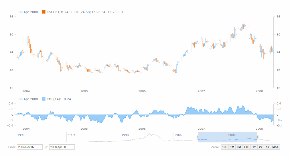
- Stock charts — for big data sets such as financial and stock market data.
- Candlestick charts (and OHLC charts) — to add a look at the distribution of values within each period of time.
- Sparkline charts — for a quick representation of the big picture, with no axes.
For example, you can use line, spline or area charts to visualize sales or web traffic over time; stock charts — stock price change (also along with technical indicators); OHLC and candlestick charts — stock price with a look into value fluctuation ranges within each of the numerous time periods; sparkline charts — overview of the sales performance within the last 12 months or football season win/loss results; etc.
4. Analyze Data Distribution
To analyze data distribution and relationship between data sets, the following chart types are commonly helpful:
- Dot (scatter) charts — to examine trends in distribution and correlation between two variables.
- Bubble charts — to consider three dimensions of data.
- Box-and-whisker charts — for a look at main distribution ranges and median values.
- Error charts — to inspect error distribution.
- Heat map charts — for a colored matrix-based view of multiple subcategories.
- Range charts — to mind range between the maximum and minimum values.
- Polar charts — for multivariate data with a spatial perspective.
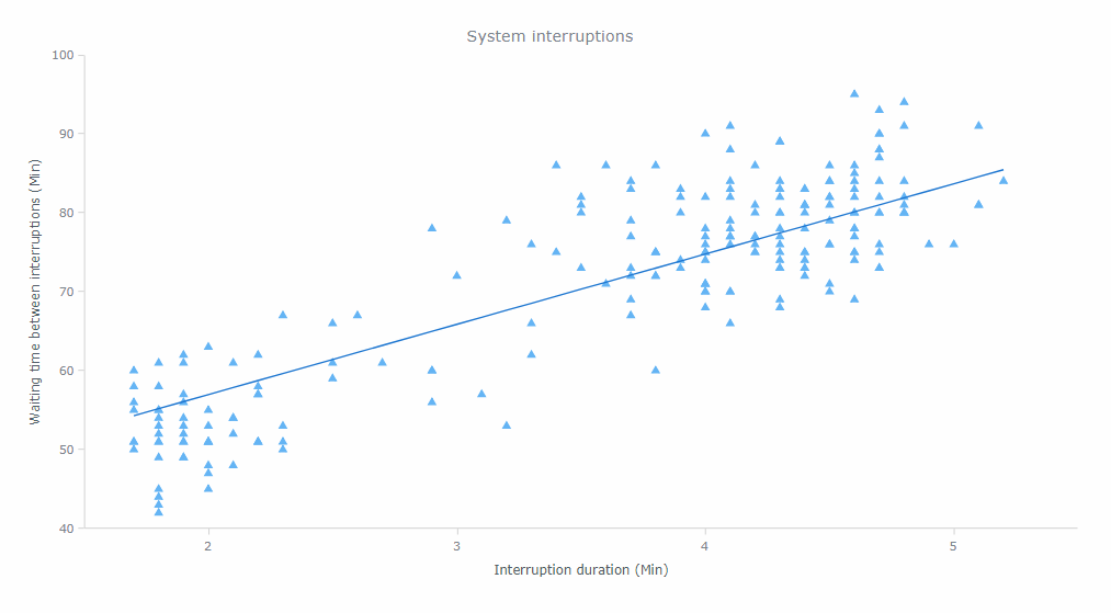
For example, you can use dot/scatter charts to visualize system interruptions by waiting time and by duration, or results of an experiment; bubble charts — training data by sportsman, power, and pulse; box-and-whisker charts — destinations by flight delay duration; error charts — variability of product sales; heat map charts — risk matrix; range charts — air temperature or processor downtime; polar charts — radio signal distribution; etc.
5. Evaluate Current Performance Data
To evaluate performance and compare the actual value against KPI values or qualitative ranges — and basically, to visualize single-value data as indicators — the following chart types are commonly helpful:
- Circular gauges — for a radial scale.
- Linear gauges — for a linear scale.
- Bullet charts — for a more space-efficient visualization on a linear scale.
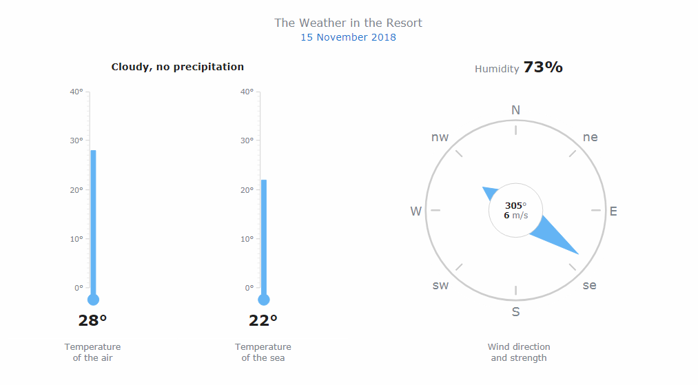
For example, you can use circular gauges to visualize speed (like a speedometer) or wind direction (employing a compass-based look); linear gauges — air temperature (thermometer) or tank volume; bullet charts — current vs. planned sales or system availability figures; etc.
6. Examine Project Data
To examine project data, the following chart types are commonly helpful:
- Gantt chart — to keep an eye on activities on a project schedule.
- Resource chart — to review resource occupancy.
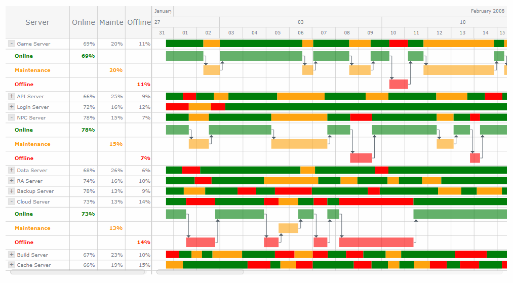
For example, you can use Gantt charts to visualize project activities on a schedule or planned vs. actual progress; resource charts — server status; etc.
7. Make Sense of Geographical Data
To make sense of geographical data, the following geovisualization chart types are commonly helpful:
- Choropleth maps — to identify differences across geographical areas.
- Dot maps — to understand geographical distribution trends.
- Bubble maps — to add a size variable into a visual.
- Connector maps — for a look at geographical connections.
- Flow maps — to explore how objects move between locations when direction is important.
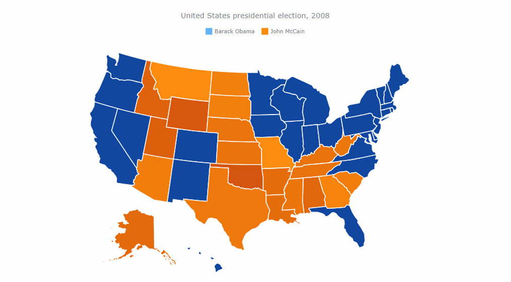
For example, you can use choropleth maps to visualize systems of government across the globe; dot maps — points of sale or airplane crash locations; bubble maps — sales offices by revenue or earthquakes by magnitude; connector map — airline routes or supply chains; flow maps — export directions or military tactics; etc.
Head to Chartopedia to learn about 60+ chart types, including how to use them right, data visualization examples, and more. Check the DataViz Weekly blog for even more examples of cool charts and infographics-based stories and projects, from all over the web. Read books to delve further into data visualization and charting, under the guidance of famous experts.
Conclusion
We’ve provided a definition of data visualization, explained what makes this discipline important, mentioned some milestones from its history of evolution, and outlined examples of how data visualization works in practice.
By combining data visualization best practices with modern digital technology, many companies that have to deal with massive amounts of information can quickly analyze it and get data-driven insights in order to streamline various aspects of their operation. All industries, and all companies regardless of size and scope of work can benefit from dataviz and business intelligence it brings to life.