 Illustrating part-to-whole relationships for further analysis is a very popular objective in data visualization. Basically, it is one of the most widespread ones, e.g. along with data comparison. With that in mind, the second part of the Choose Right Chart Type for Data Visualization series on our blog focuses on how to display Data Composition properly.
In particular, this article will show you the best ways to present the share percentages of simple values, compositional patterns in large data sets and hierarchical data (also with subordination), and stages in a process.
List of Chart Types for Visualizing Composition of Data
First things first. Below is a basic list of chart types that explicitly serve the purpose of displaying compositional patterns in data:
- Pie and Donut charts;
- TreeMap charts;
- Funnel and Pyramid charts.
We’ll proceed to describe and explain these right away.
Choosing Charts to Display Data Composition
Pie Chart, Donut Chart
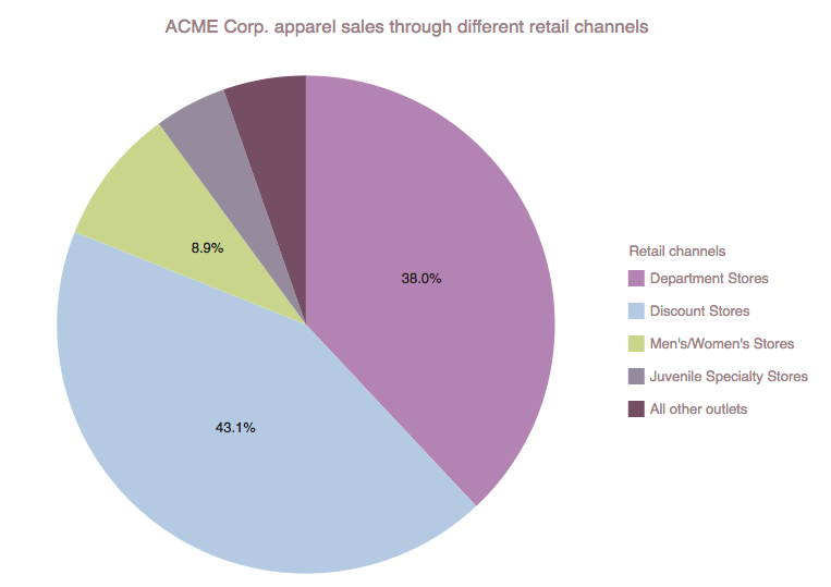
When you are trying to figure out the percentage composition of a value, the first chart type that often comes to mind is the Pie chart. These charts visualize the whole value as a circle (100%) and its parts as “slices” relative to their magnitude. The main issues you should keep in mind when using the pie chart is keep the number of parts small, 7 max, and avoid too large and too small differences between magnitudes as these can make the chart hard to read.
AnyChart Warning: Pie Chart War!
Some critics of the Pie chart such as data visualization expert Stephen Few have argued that this chart type is the worst possible way to communicate data (“Save the Pies for Dessert”). While we recognize the shortcomings of these charts, it is plain to see that the Pie chart still lives and breathes in communication of information. So if you plan to use them, do so with certain constraints in mind.
For example: sales by channel.
Additional examples include: website traffic breakdown by gender of visitors, etc.
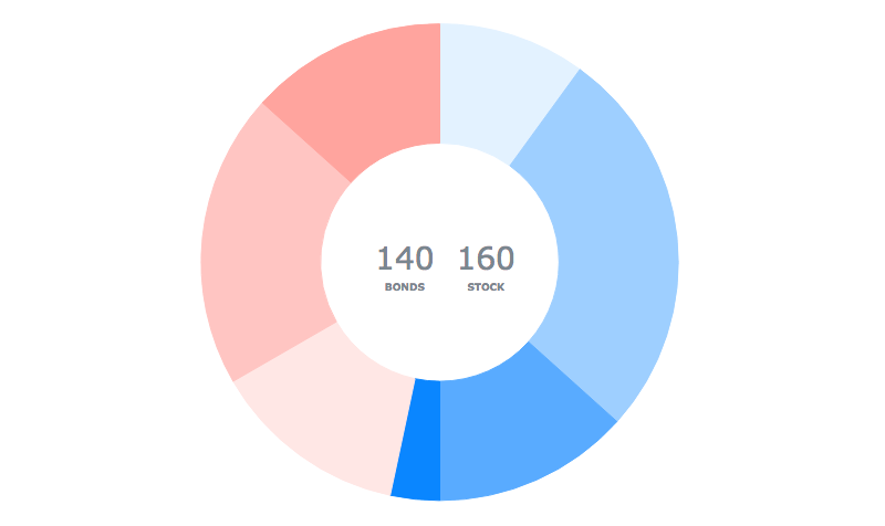
To display data composition and better use the space at the same time, you can consider the Donut chart, a Pie chart with the hole in the center. This allows you room to add a title to the chart or any other important information without wasting the space outside the chart. Recommendations for Donut chart applications are basically the same as for Pie charts.
You can find more Pie and Donut chart samples in this gallery.
TreeMap Chart
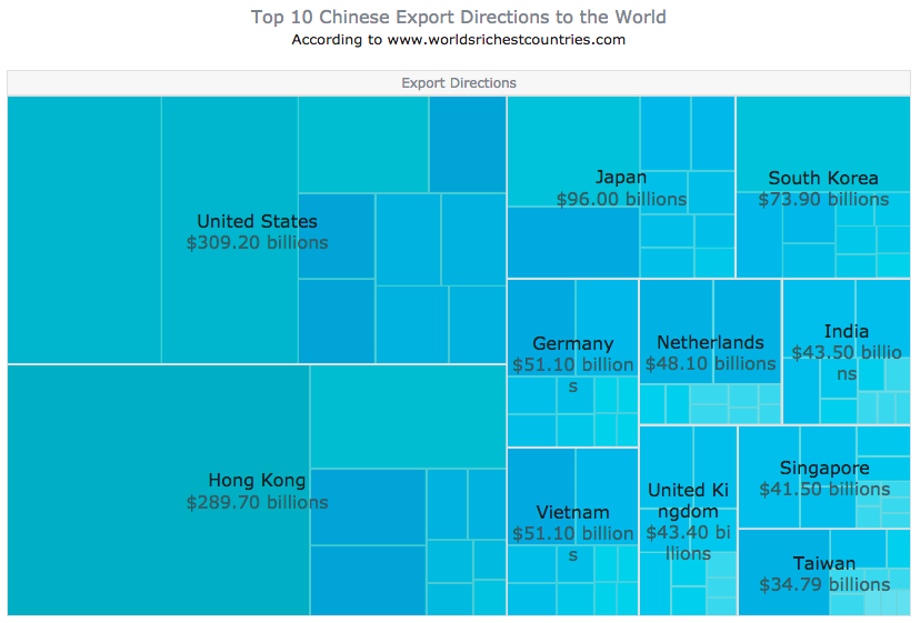
To observe hierarchical data, when the composition is rather complex and tree-structured, a TreeMap chart is a great solution. With this chart type, the whole (the “tree”) is visualized as a rectangle tiled with smaller rectangles depicting branches and sub-branches proportionally, which makes it easier to grasp the structure and compare the shares.
In fact, while Pie and Donut charts work with a small number of points, TreeMap charts are suitable for large datasets.
For example: export by country of destination.
Additional examples include: products by group and revenue, website traffic by category of referral sources and number of visitors, etc. Take a look at more TreeMap chart samples in this gallery.
Funnel Chart, Pyramid Chart
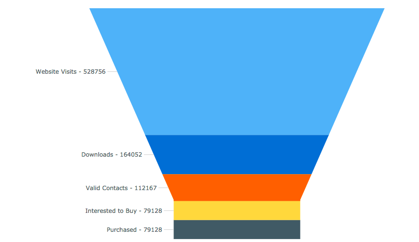
When evaluating the stages of a process starting with 100% and ending with a smaller percentage, to see steps, and for revealing bottlenecks (at what stages the decrease happened and at what rate), you might like the Funnel chart type.
For example: conversion of website visitors into paying customers.
Additional examples include: sales funnels, etc.
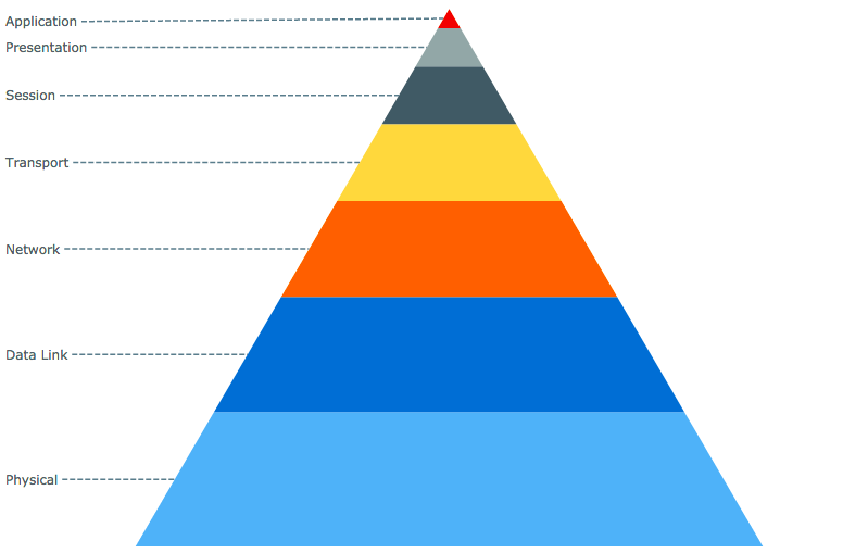
To understand the structure of hierarchical data (and its size) or simple subordination, use the Pyramid chart for your data visualization.
For example: Open Systems Interconnection (OSI) model.
Additional examples include: salary of employees at different managerial levels, categories of top referral sources by their weight in website traffic, risks in advertising, etc.
You can find more Funnel chart and Pyramid chart samples in this gallery.
Conclusion
Whenever your purpose is to visualize data composition, in most cases you can move along with a Pie (Donut) chart, a TreeMap chart, or a Funnel (Pyramid) chart. Keep in mind that every situation is special. So, you should never forget that blindly following these or absolutely any other instructions might be too risky. Before making a final decision on which chart type to choose, think of exactly what kind of data (and questions to it) you have. Then double-check if your first idea has been right or if you should pick some other form of visualization.
For complex solutions or when you are simply unsure, refer to Chartopedia. It describes and provides illustrations for many dozens of chart types grouped by purpose of use. Here, you’ll find even more options for displaying part-to-whole data composition (or proportion, etc.). In addition, AnyChart’s API Reference and Chart Documentation will help you create charts of any type you want with easy JavaScript/HTML5.
- Categories: Choosing Chart Type, Tips and Tricks
- 1 Comment »
