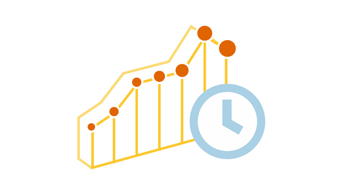
 We are continuing the effort to better familiarize you with the world of chart types. This time let’s talk about good ways to visualize and explore Data Over Time.
Watching the change in data over time helps identify trends and dynamics in diverse timeline-based sets of values. Needless to say, choosing a right chart type is very important here. When applying an inappropriate form of visualization to your data, you might end up with an inaccurate idea of what happened in the past, what’s taking place now, and/or what will occur in the future. But we’ll do our best to help you avoid any mistakes in this field so you always make only right decisions based on your date/time data.
So, let’s get to the gist now.
List of Chart Types to Observe Trends in Data Over Time
As we did in the previous parts of the Choose Right Chart Type for Data Visualization series, let’s begin with a list. The following types of charts are intended for viewing timeline (date/time) based data, revealing trends, etc.:
- Line, Spline, Step Line, and Area charts;
- Candlestick and OHLC charts;
- Stock charts;
- Sparkline charts – Line (Area), Column, and Win/Loss Sparklines.
For more details on each, please read the information below.
Choosing Charts for Displaying Data Over Time
Line, Spline, Step Line, and Area Chart
To observe data over time, the most common solution is the Line chart. Line charts help identify trends, speed-ups / slow-downs, global / local peaks and valleys.
For example: sales over time.

Additional examples include: traffic over time, etc.
Spline charts can also be used to help identify trends. Points in this type of chart are connected with each other by approximating the mean values between points using curved lines instead of straight ones.

When it is important to show not only dynamics but mainly the leap in transition from one value to another, the Step Line chart type is very useful.

You can find more Line chart, Spline chart and Step Line chart samples in this gallery.
For trends in cumulative data such as trading volumes and revenue, you can use Area charts. These are basically Line charts with the area between the series and the X-axis filled with some color:

Take a look at more Area chart samples in this gallery.
Candlestick and OHLC Chart
When Line, Spline and Area charts are not enough because you also need to see the distribution of each value in each time period, use Candlestick charts or Open-High-Low-Close (OHLC) charts. The most common application for these charts types is “market watch” trading.
Examples include: stock price, server response time, etc.
For dynamic analysis in real time, the Candlestick chart is usually more helpful:

Sometimes OHLC charts look better than Candlestick ones. For example, the OHLC type is often used for historical data-based, mostly static charts:

You can find more Candlestick chart and OHLC chart samples in this gallery.
Stock Chart
When your data set is too big (e.g. financial data over a long time period with small intervals), the Stock chart type often is the best choice.
Stock charts are specifically designed for efficient work with large amounts of data. Moreover, they are ideal for analyzing data with the help of internal tools such as technical indicators.

You can find more Stock chart samples in this gallery.
Sparkline Chart
To quickly identify trend variability only, not the values themselves, Sparkline charts are a great option. They have no coordinates or axes and are very minimalist. As a result, you can conveniently place multiple Sparklines side-by-side for determining trends in various data sets at once or even insert charts like these into a text.
For working with continuous data, the most common solutions are line and area series-based Sparklines. In some situations, Column Sparkline charts look better, e.g. for a stronger focus on the difference between values.
For example: sales performance monitoring.

Additional examples include: trends in stock price movements over a time period, etc.
To understand a binary assessment of data, e.g. positive/negative evaluations, the most appropriate type of chart is Win/Loss Sparklines.
For example: sports teams’ season results.

Additional examples include: increases and decreases in stock market price, etc. Take a look at more Sparkline chart examples in this gallery.
Conclusion
Revealing trends in data over time gets quite easy when you have chosen the right chart type. As you see, there are many forms that you can resort to. It would be safe to assume that the majority of situations will require a Line chart (with variations such as Spline, Step Line, or Area charts), a Candlestick or an OHLC chart, a Stock chart, or a Sparkline chart.
Nevertheless, please always pay attention to your data first and consider your goals. There might be situations that require a different approach. But you can go to the free Chartopedia resource at any time. It can provide more suggestions depending on exactly what you want from your data visualization. There you will find chart types that nicely work to display data over time (or, for example, specifically financial data), with comprehensive descriptions, usage examples, and so on. After that, we invite you to visit our JS charting libraries’ Documentation and API Reference to see how to make a necessary HTML5 chart.
In the meantime, we will continue sharing helpful tips within the framework of the Choose Right Chart Type for Data Visualization series on our blog.
- Categories: Choosing Chart Type, Tips and Tricks
- No Comments »