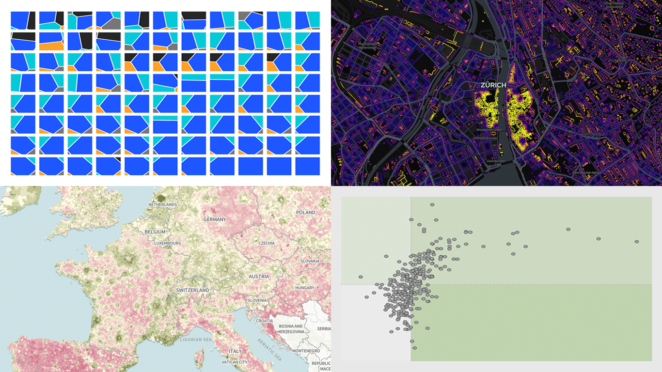
There is always more to see when it comes to great charts and maps. Welcome to DataViz Weekly, where we put a spotlight on notable data visualizations as they come out around the web. Here are the projects that made the cut this time:
- Tehran strike damage by land use — Bloomberg
- Six decades of population change in Europe — Correctiv
- Job stability across occupations in the United States — Nathan Yau
- Buildings by proximity to roads — Benjamin Lozes

Data Visualization Weekly: April 17–24, 2026
Tehran Strike Damage by Land Use
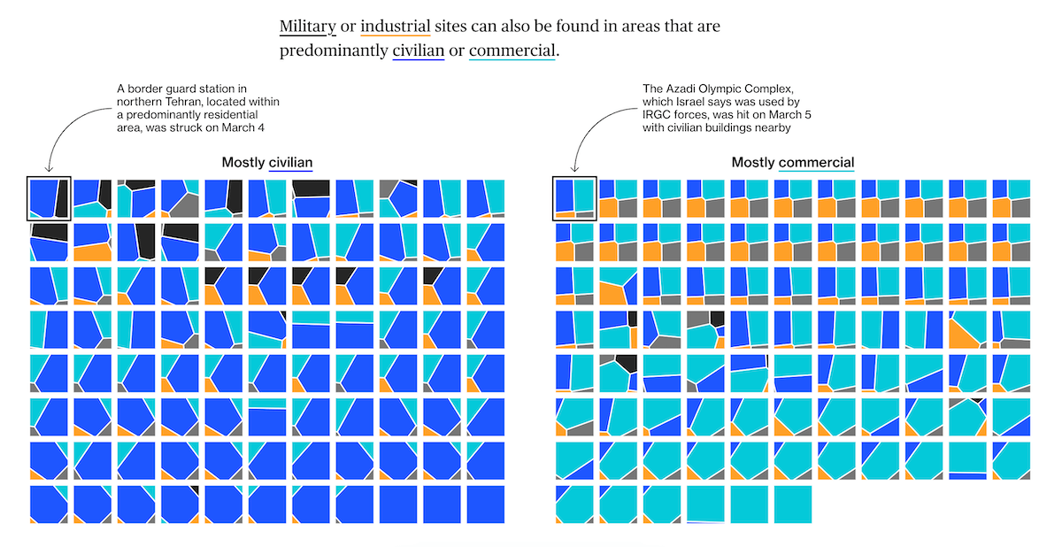
U.S. and Israeli air strikes on Iran began in late February 2026, leaving significant damage across Tehran before a ceasefire took hold in early April. Military installations, government buildings, and residential and commercial areas sit side by side in the city’s dense urban fabric.
Bloomberg analyzed strike damage across Tehran through the lens of land use, cross-referencing damage analysis by Oregon State University researchers with land-use data from OpenStreetMap and Overture Maps. The piece opens with a choropleth map of the city coloring damage clusters by predominant category: civilian, commercial, industrial, military, and government. Grids of Voronoi treemaps then show the actual land-use mix within every cluster, making visible how sites classified as predominantly military or industrial typically contain civilian and commercial areas as well. Further on, a bubble map of Iran shows cumulative damaged area by location, with Tehran and Isfahan standing out as the most heavily affected.
See the piece on Bloomberg, by Golnar Motevalli, Krishna Karra, Tom Fevrier, and Raeedah Wahid.
Six Decades of Population Change in Europe
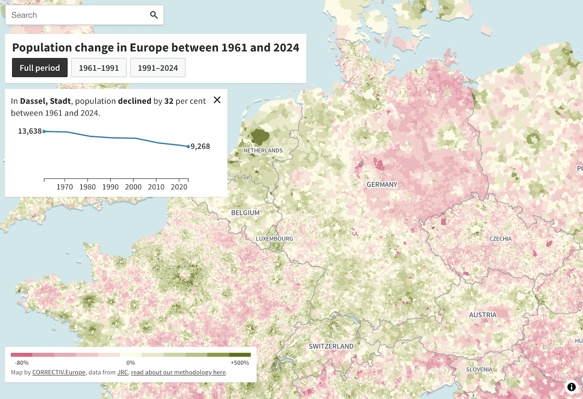
Europe’s total population has grown steadily over recent decades. But that overall growth conceals sharp differences from place to place.
Correctiv built a scroll-driven visual story around a choropleth map drawn from new EU Joint Research Centre data covering population change at the local level since 1961. Municipalities across 32 European countries are colored green for growth and red for decline. The narrative steps through regional patterns in Spain, Greece, Germany, Bulgaria, and Lithuania, showing how rural depopulation and post-communist emigration played out differently across the continent. At the end, the map opens as a fully interactive tool — search for any town or village and see its population trajectory as a line chart spanning six decades.
Check out the story on Corrective, by Lilith Grull and Frida Thurm, with data and visualisation by Ada Homolova and Luc Martinon.
Job Stability Across Occupations
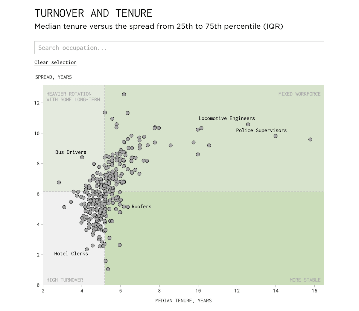
Not all jobs are equal when it comes to how long people stick around. Some occupations hold workers for years. Others see a constant stream of new faces.
Nathan Yau provides a look at job tenure and turnover across occupations in the United States based on data from the Current Population Survey. A dumbbell chart lists occupations sorted from longest median tenure to shortest, with the 25th and 75th percentile ranges flanking each median point. A scatter plot then positions each occupation by median tenure against its interquartile range, grouping jobs into four zones: high turnover, heavier rotation with some long-term workers, more stable, and mixed workforce. Both charts are interactive: you can search for a specific occupation and see details on hover.
Explore the post on FlowingData.
Buildings by Proximity to Roads
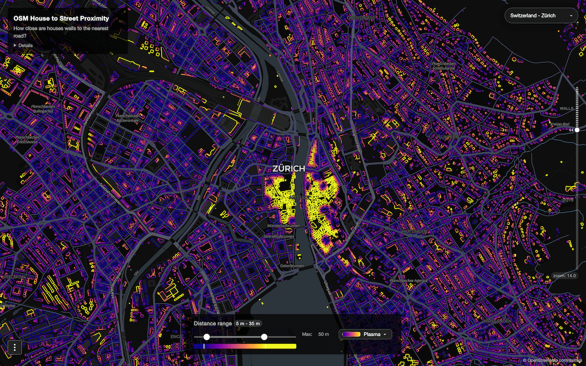
Buildings in dense cities can sit just a few feet from passing traffic. That proximity shapes the noise, air quality, and safety residents experience every day.
Benjamin Lozes built an interactive map using OpenStreetMap data that calculates the distance from every wall vertex of every building to the nearest road segment. Buildings are colored by a continuous gradient encoding that distance. At lower zoom levels, each structure appears as a single dot. Zoom in further and the map switches to full wall-segment rendering, coloring individual wall sections by their specific proximity. Currently available regions include Zurich, New York City, California, Colorado, Greece, Monaco, and Vietnam.
Explore the map here.
Wrapping Up
Good data visualization keeps showing up across the web. We track it down and bring it together every Friday. So, more great charts and maps are coming next time in DataViz Weekly — stay tuned.
- Categories: Data Visualization Weekly
- No Comments »