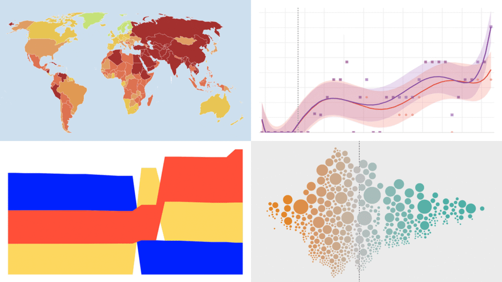
Data visualization does not take weeks off. We track charts and maps as they appear across the web and bring the most compelling finds together in DataViz Weekly. Our picks for this edition:
- AI-generated content on the web — Jonas Dolezal, Sawood Alam, Mark Graham, and Maty Bohacek
- Divorce rates by job — Nathan Yau
- Global press freedom at a 25-year low — Reporters Without Borders
- Italy’s pet boom — Il Sole 24 Ore
Data Visualization Weekly: May 1–8, 2026
Rise of AI-Generated Content
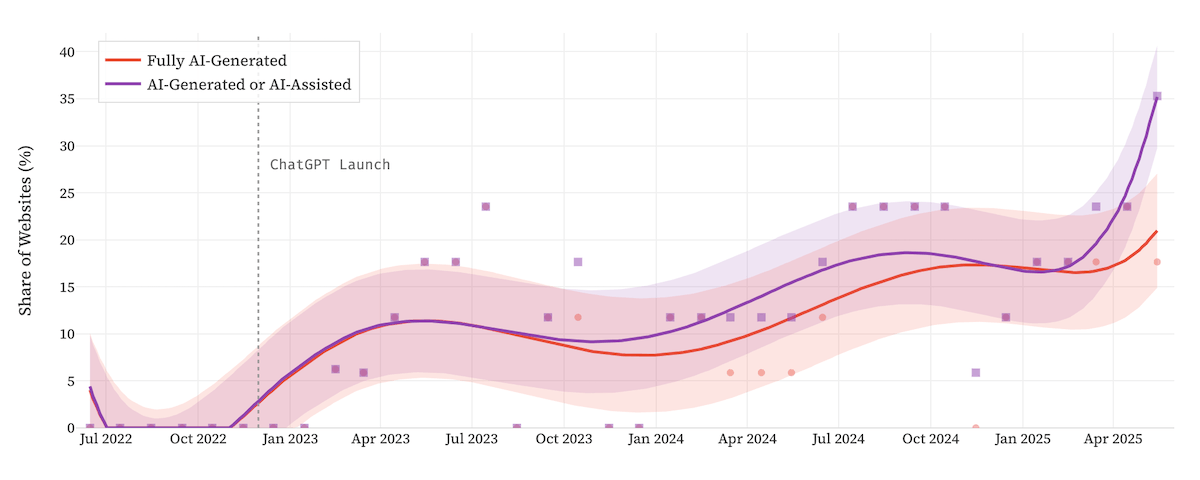
The share of AI-generated content on the internet has grown rapidly since late 2022. Public debate about its effects on factual accuracy, diversity of ideas, and writing quality has intensified alongside that growth.
Researchers from Imperial College London, the Internet Archive, and Stanford University tracked how much of the web’s newly published content is AI-generated and what effects it has on online discourse. The chart above uses dots, trend lines, and confidence bands to show how the share of AI-generated websites climbed from virtually nothing before late 2022 to roughly 35% by mid-2025.
The full project examines six commonly feared negative effects of AI content, such as truth decay, stylistic monoculture, and shrinking diversity of ideas. For each, scatter plots and column charts present the quantitative findings alongside survey responses from U.S. adults. A concluding pair of horizontal bar charts places the statistical correlation for each effect alongside the public agreement rate, showing where evidence and perception diverge.
See the project at ai-on-the-internet.github.io, by Jonas Dolezal, Sawood Alam, Mark Graham, and Maty Bohacek.
Divorce Rates by Job
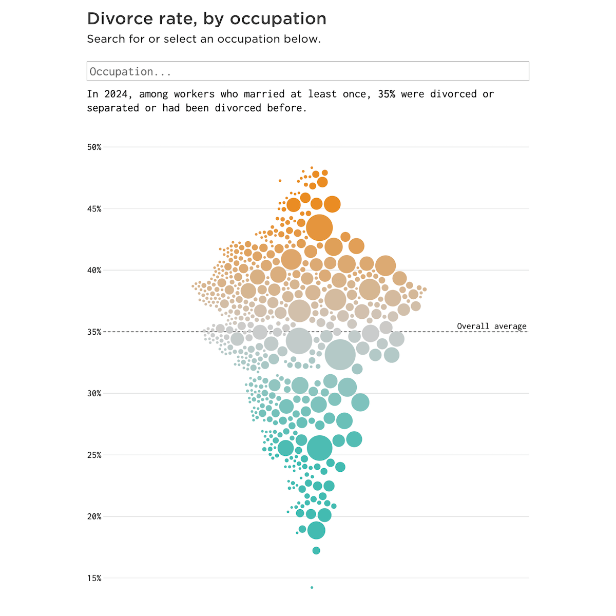
Not every marriage survives a lifetime. In the United States, roughly one in three ends in divorce, and the numbers look very different depending on what people do for a living.
Nathan Yau represented divorce rates across hundreds of occupations as an interactive beeswarm chart, positioning each job vertically by its rate and sizing the bubbles by number of workers. Orange marks occupations above the overall average; teal marks those below. A search box lets you locate any specific job.
Further down, the same data breaks into small multiples of beeswarm charts by job category, making the spread within each field visible at a glance.
Check out the post on FlowingData.
Global Press Freedom at a 25-Year Low
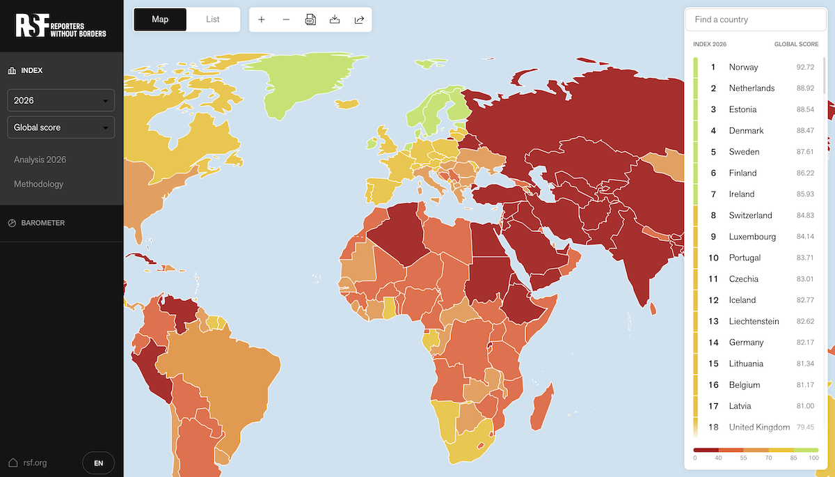
Press freedom has been declining globally for years. This year it reached its lowest recorded level in a quarter century.
Reporters Without Borders published their 2026 World Press Freedom Index, and the choropleth map that traditionally accompanies it has never been this red. Five indicator filters covering political, economic, legal, social, and security dimensions let you shift between different aspects of press freedom, and hovering or clicking any country shows its score alongside last year’s figure for comparison.
The index also comes with a dedicated scroll-driven visual story this year. It uses dot and line charts to trace average scores worldwide and by region, and cartograms to show press freedom relative to population. Individual country spotlights include the steepest fall — Niger — and the biggest improvement.
Explore the map at rsf.org and the visual story at infog-index.rsf.org.
Italy’s Pet Boom
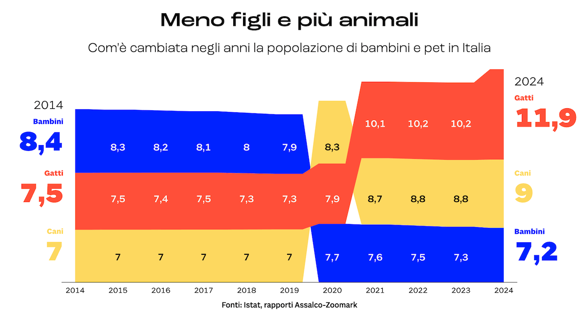
Italy has one of the lowest birth rates in Europe, and its pet population has been rising steadily. The total number of pets in the country now exceeds its human population.
Il Sole 24 Ore’s Lab24 built a scroll-driven data story exploring the demographic and economic dimensions of this shift. It opens with an alluvial diagram tracking the decline in Italy’s child population alongside the rise in cat and dog ownership from 2014 to 2024.
Further into the piece, the economics of Italy’s pet boom come into focus. A range of bar, line, and pictogram charts covers topics including the cost of owning a dog versus raising a child, the pet food market compared against baby food, and more.
Look at the story on Il Sole 24 Ore’s Lab24, by Massimo De Laurentiis, with data visualization by Alice Calvi and Luca Galimberti.
Wrapping Up
The subjects change from edition to edition. The quality bar does not. More examples of data visualization at work in the real world — in DataViz Weekly next time.
- Categories: Data Visualization Weekly
- No Comments »