 Displaying and researching some Data Distribution and relationship between data sets instead of studying precise values in each category is a quite common task in data analysis. It can be solved with the help of the chart types that we are going to identify and explain in this article.
Depending on a situation – the kind of data you have and the specific questions you’d like it to provide answers to – you can pick one approach or another. Just be careful when choosing between one chart type and another for the subsequent data distribution analysis. You want the visualization to clarify data, not obscure it or deliver any sort of confusion. Well, simply make sure you understand the following aspects, mind all the details of your situation, and you will have no problem with visualizing data distribution correctly.
List of Chart Types for Visualizing Distribution of Data
As a general rule, the types of chart listed right below are used to show how data is distributed:
- Dot (Scatter) charts;
- Bubble charts;
- Box-and-Whisker charts;
- Error charts;
- Heat Map charts;
- Range charts;
- Polar charts.
Want to learn more and see exactly what chart types from this list better correspond to one or another certain visualization task when it comes to data distribution? The main part of the article is at your disposal then.
Choosing Charts to Analyze Data Distribution
Dot (Scatter) Chart
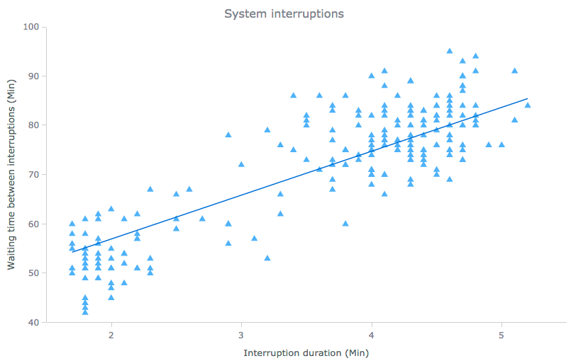
To identify trends in distribution and the correlation between two variables, Dot (Scatter) Charts should be your choice. This type of chart provides the ability to show trends, patterns and clusters, and their relationship in both large and small data sets, as well as to visually represent the results of a research.
For example: system interruptions by duration and waiting time.
Additional examples include: results of a research (e.g. thrust over engines’ weight and power), effectiveness of advertising and sales strategies, etc. Take a look at more Scatter chart samples in this gallery.
Bubble Chart
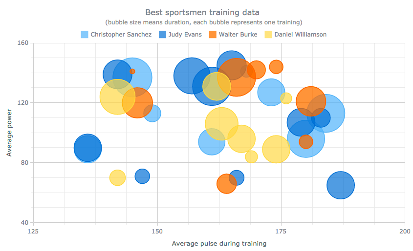
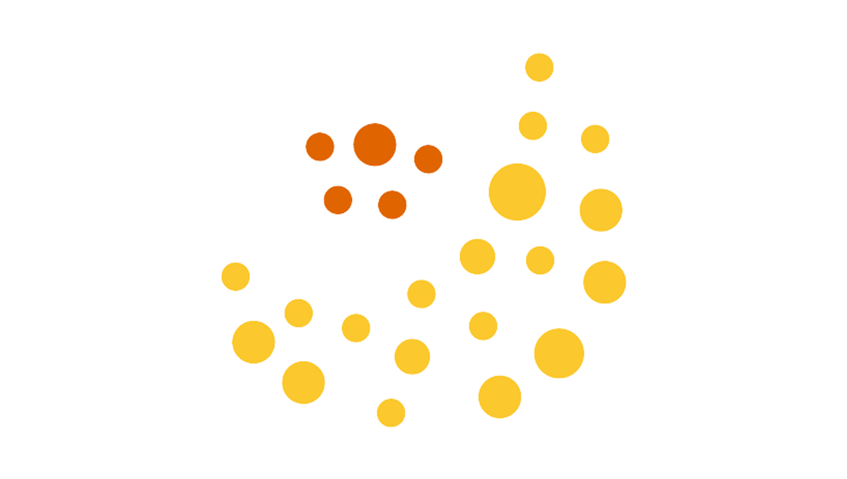
To engage three dimensions (e.g. x, y, and size) for a more complex distribution-based analysis, there is the Bubble chart type that allows you to diversify size of markers (called bubbles). In this way, not only can you answer the same questions on the distribution trends as with Scatter charts, but you will also be able to identify their drivers by finding correlation to another measurement.
So, Bubble charts are helpful when you need to determine the type and tightness of the relation between pairs of corresponding variables, i.e., at the end, to find out the correlation between three to four variables or to reveal common patterns in large data sets.
For example: best sportsmen training data, etc.
Additional examples include: best and worst performing points of sale, volume of deals closed by sales managers relative to their education level and career length, engagement of website visitors relative to gender and referral source, etc. Take a look at more Bubble chart samples in this gallery.
Box-and-Whisker Chart
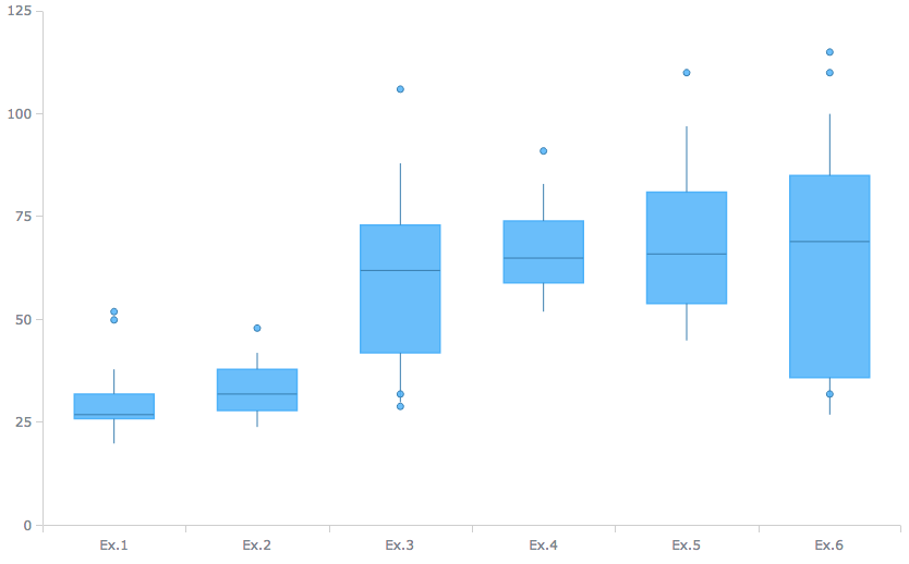
When only median values and key distribution ranges matter, choose Box-and-Whisker charts. This chart type represents the 2nd and 3rd quartiles of numerical data in the form of a rectangular (“box”), divided into two parts by a horizontal line depicting the median value. It uses vertical lines extending from the top and bottom sides of the box to plot the rest of statistical distribution, and dots to specify outliers.
For example: variation of samples from a statistical population.
Additional examples include: range of salaries per job family, flight delay time per direction, etc. Take a look at more Box chart samples in this gallery.
Error Chart
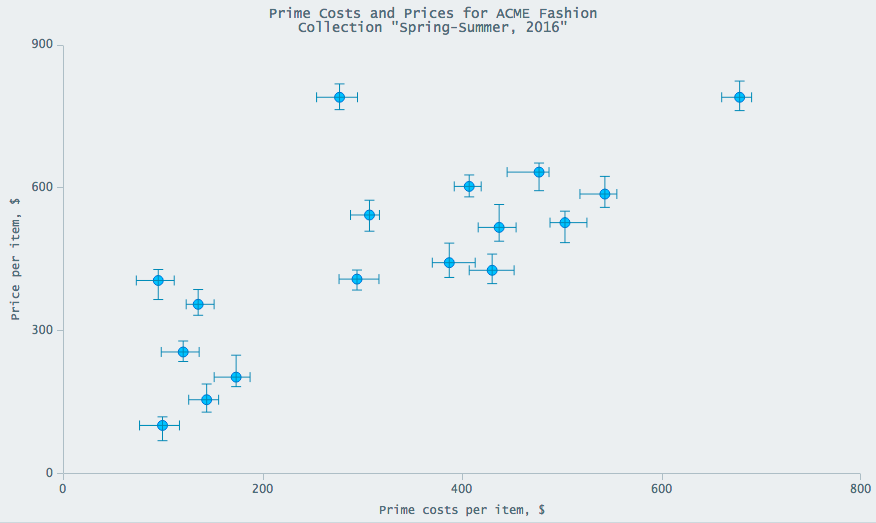
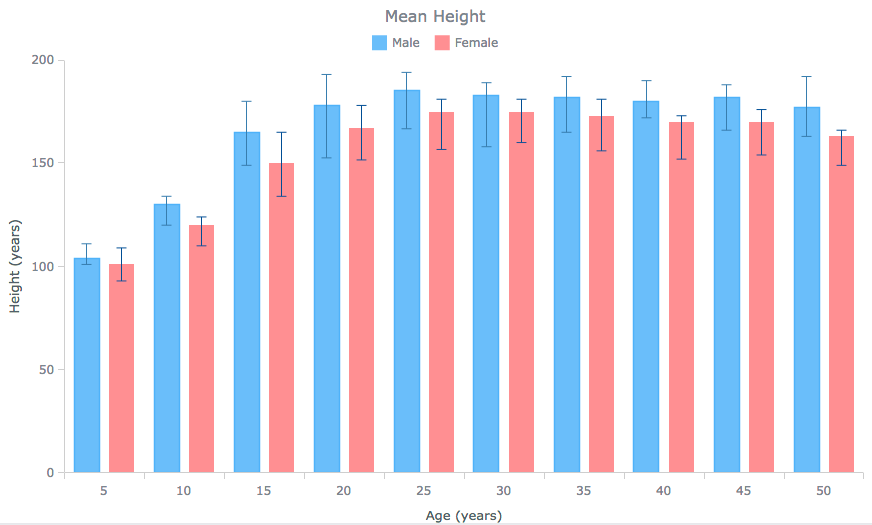
To understand the error distribution of each value, using Error charts often makes sense. As a general rule, these are the bar-like add-ons for the existing type of chart that go especially well with Dot (Scatter) and Bar/Column charts.
For example: price per item vs. cost per item, average human height by age.
Additional examples include: test error analysis, fluctuations in values, etc. Take a look at more of Error chart samples in this gallery.
Heat Map Chart
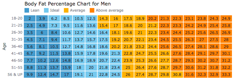
In case of multiple sub-categories in both categories, the Heat Map chart type (also known as Heatmap) can be useful to grasp the distribution (and relationships) trends by presenting data in a matrix with value-specific colors applied to the cells.
For example: body fat percentage.
Additional examples include: average temperature over the course of the year, strain’s reaction to drugs, etc. Take a look at more Heat Map chart samples in this gallery.
Range Chart
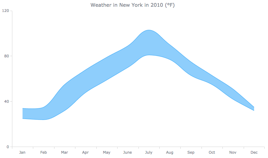
When your data consists of minimum/maximum value ranges, not precise values, you can use the Range chart types: Range Area charts, Range Bar charts, and so on. (However, these are not intended to be used when a median is a concern.) The principle of choosing between areas, bars etc. is basically the same as between Area, Bar, and other conventional charts.
With that said, when depicting data over time with lines or splines and observing variability, consider Range Area charts or Range Spline Area charts respectively.
For example: air temperature.
Additional examples include: highs and lows of pressure, etc.
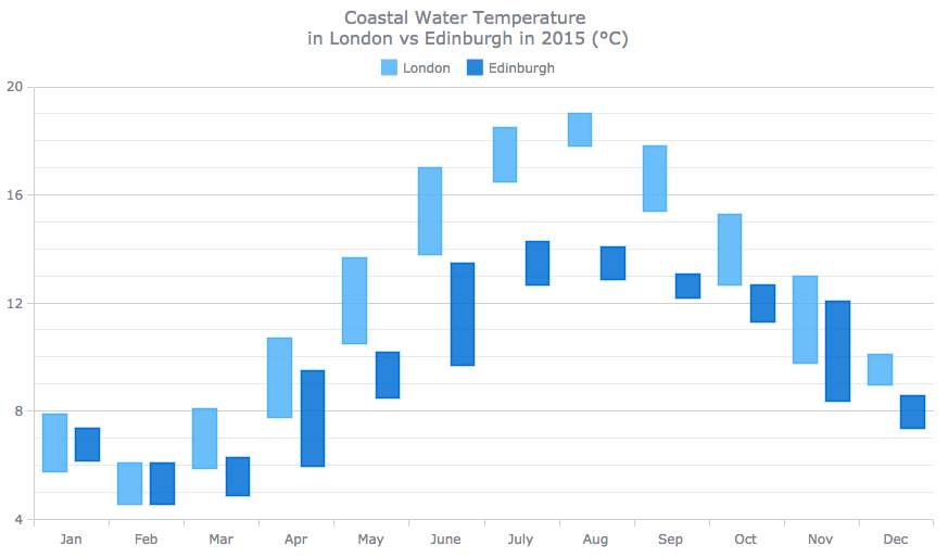
For a stronger emphasis on each value and especially when you have more than one series and need to compare the distributions, you can consider Range Column charts (or Range Bar charts).
For example: water temperature in two cities.
Additional examples include: seasonal precipitation, etc.
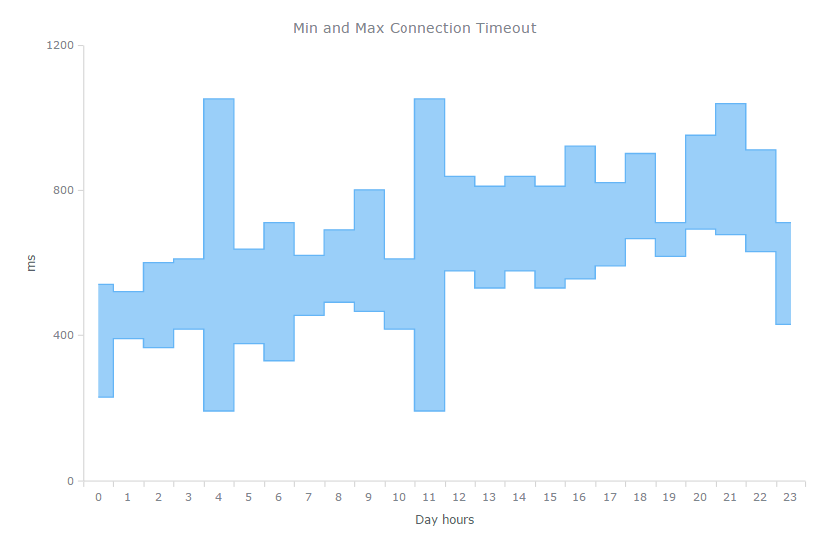
Range Step Line Area charts can be used to highlight trends, anomalies, outliers, and clustering.
For example: minimum/maximum connection timeouts.
Additional examples include: processor uptime and downtime, etc.
You can find more Range chart samples in this gallery.
Polar Chart
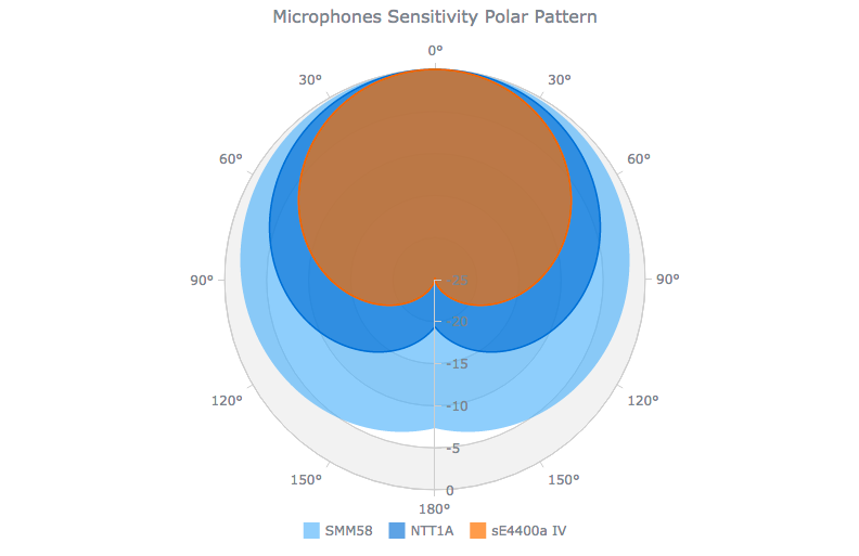
In analyzing multivariate data with a spatial perspective – positioning, navigation, or anything else regarding degrees (angles) and distance – the Polar chart is capable of facilitating the distribution analysis. In this chart type, data points are displayed in polar coordinates and radii are represented as circles, which allows for more accuracy in identifying distribution trends.
For example: microphone sensitivity pattern.
Additional examples include: signal distribution around the source, etc. Take a look at more Polar chart samples in this gallery.
Conclusion
You have read about the basic set of charts that can serve you well for visualizing data distribution. Just to remind, these are a Dot (Scatter) chart, a Bubble chart, a Box-and-Whisker chart, an Error chart, a Heat Map chart, a Range chart (with one series or another), or a Polar chart.
You can also check out Chartopedia. It contains more information on available chart options for data distribution as well as range charts in particular. Once you’ve picked the chart type you need, see the Docs and API reference to actually visualize your data in that way, with simple JavaScript/HTML5 and AnyChart.
Here’s one more advice that we diligently repeat in each article of the Choose Chart Type for Data Visualization series on our blog. While the options listed here are likely to be useful in many situations focusing on data distribution, your specific data and what exactly you want from it should determine which chart type to make use of. Be attentive and think upfront in this regard.
Good luck!
- Categories: Choosing Chart Type, Tips and Tricks
- 1 Comment »
