AnyChart Used for Data Visualization in Open-Source Redis Inventory Tool
September 29th, 2021 by AnyChart Team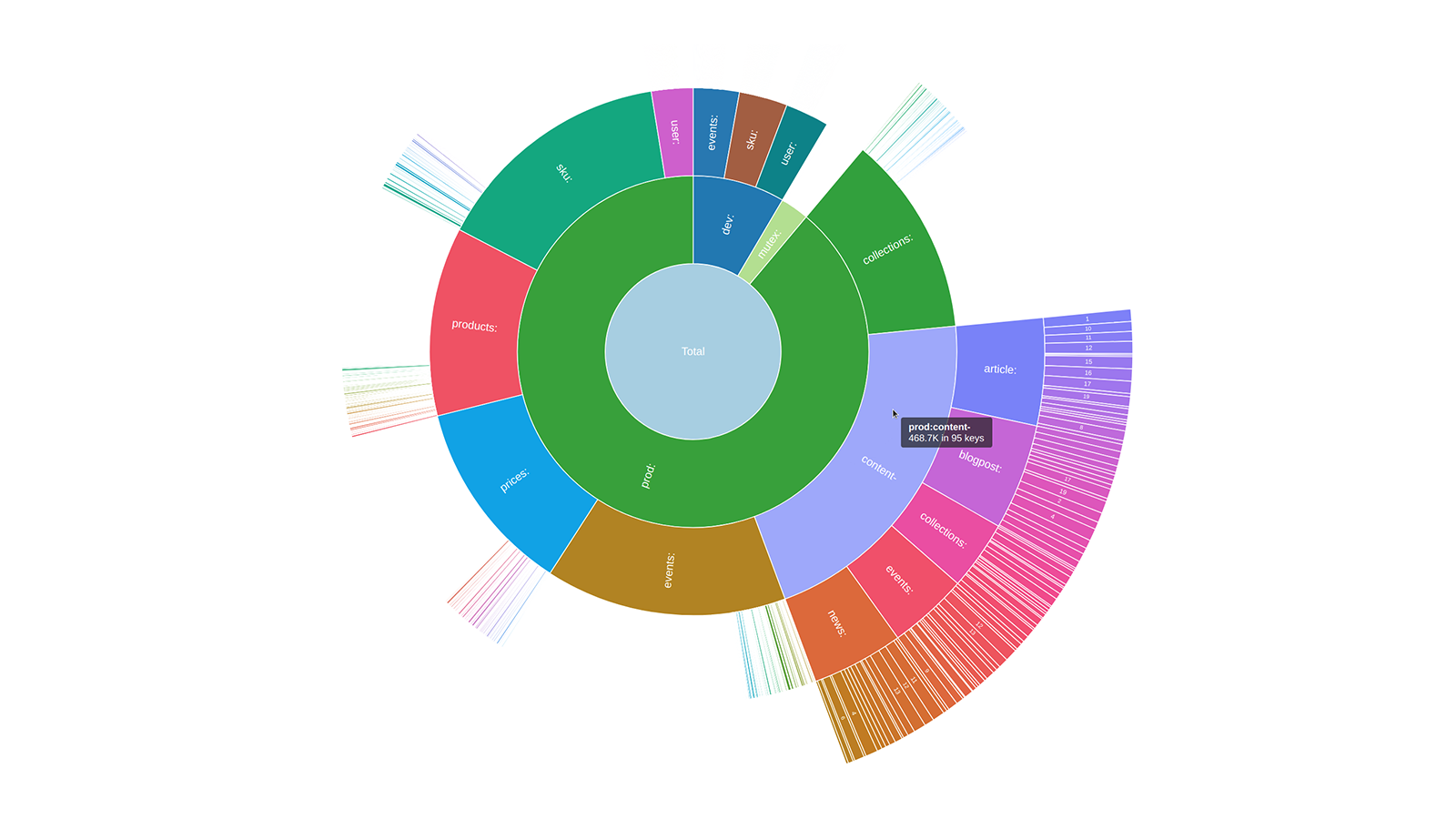 Sunburst charts are known to be greatly useful for visualizing hierarchical data structures. So it is no surprise that this chart type became a big hit among our users immediately after we added it to the AnyChart JavaScript library. Because the core of our global customer base is enterprise clients, most of the real-world use cases for our JS sunburst chart are hidden in internal corporate apps. But AnyChart is often picked for data visualization in open projects as well, and we invite you to see a super cool example we have recently found out about — Redis Inventory. It is an open-source tool that makes it easy to view Redis memory usage by key patterns in a hierarchical way, with an interactive sunburst chart in action.
Learn more about Redis Inventory and how AnyChart is used there from our quick interview with its creator Aleksandr Obukhov. (Stack: Go/Cobra/Redis.)
- Categories: AnyChart Charting Component, Big Data, HTML5, JavaScript, Success Stories
- No Comments »
Most Compelling New Examples of Data Visualization in Action — DataViz Weekly
September 24th, 2021 by AnyChart Team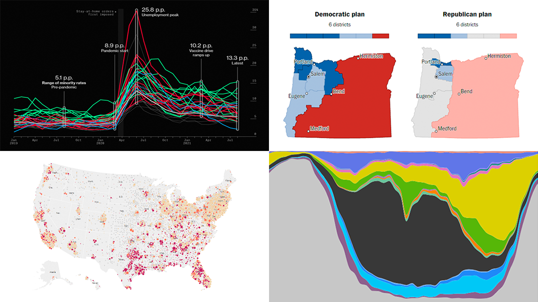 Hey everyone! It is Friday, and we are here to put a spotlight on the most compelling examples of sensible data visualization we have recently seen around the internet. As always, let’s start with a quick list and then look at each project. All aboard for DataViz Weekly!
- Intensive care unit occupancy rates in the United States — The New York Times
- Minority unemployment rates in 15 large U.S. cities. — Bloomberg
- Early proposals for congressional redistricting in Oregon, Indiana, and Colorado — The Washington Post
- Time use of American men and women by employment status — Nathan Yau
- Categories: Data Visualization Weekly
- No Comments »
How to Build Interactive Connector Map with JavaScript
September 21st, 2021 by Shachee Swadia A connector map is a set of straight or curved lines that link points on a geographical map. It is commonly used to graphically represent routes or any other connections between locations. Would you like to learn how to build an attractive data visualization like that for a web page or app?
Actually, it is easy to create an interactive connector map using JavaScript. And I am ready to show you how right now! Follow along with this tutorial as I depict the cycling path of the 2021 Tour de France in the form of a JS connector map and thoroughly explain all steps.
Read the JS charting tutorial »
- Categories: AnyChart Charting Component, AnyMap, HTML5, JavaScript, JavaScript Chart Tutorials, Tips and Tricks
- 2 Comments »
Canadian Elections, Germany Under Merkel, Caracas Sounds, Night Temperatures in U.S. Cities — DataViz Weekly
September 17th, 2021 by AnyChart Team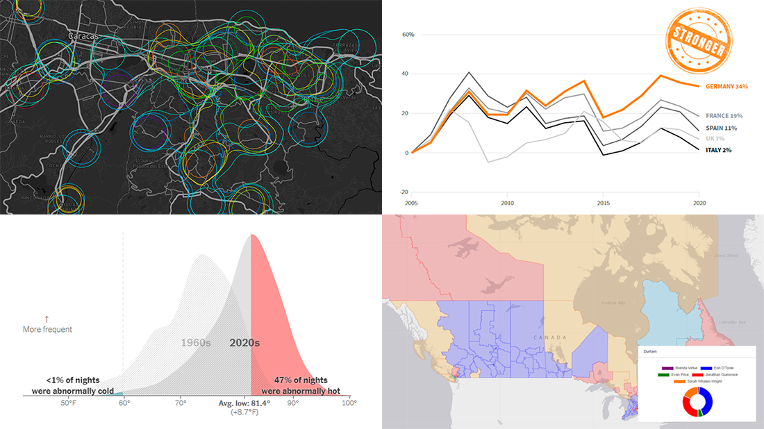 We continue to choose the most interesting out of all the newest data visualizations published here and there and show you them in weekly roundups. It’s time to look at our fresh selection! This time, the following projects are featured in DataViz Weekly:
- Canadian federal elections since 2000 — Stephen Taylor
- Germany under the 16-year leadership of Angela Merkel — Reuters
- Sounds of Caracas — Valeria Escobar
- Abnormally hot summer nights in American cities — The Upshot
- Categories: Data Visualization Weekly
- No Comments »
AnyChart Used to Power Charts in Data Science Teaching Project Made at Edinburgh Napier University
September 16th, 2021 by AnyChart Team At AnyChart, we are eager to support education projects by letting their creators work gratis with the same data visualization solutions used by the world’s leading companies to build interactive charts.
Recently, a group of students at Edinburgh Napier University — including Martin McVey, Tibor Toth, Daniel Glen, Flynn Kearney, David Stewart, and John Frampton — reached out to us as they were building a website to assist with the learning of data science. And we were more than happy to provide them with a free license for the use of our JavaScript charting library.
The website is now available to the public, presenting a wide range of chart types with real-world examples along with questions and answers. Acknowledged as one of the top projects in the university year and awarded with a prize from Computershare, it is to be used for teaching about data visualization and analytics in Scottish schools.
We thought you could be interested to not only check out the website but also learn some more about the project and its developers’ experience with AnyChart. So we had a quick talk on that with Martin McVey from the team. Read below.
- Categories: AnyChart Charting Component, AnyMap, HTML5, JavaScript, Success Stories
- No Comments »
Visualizing Mortality Statistics and Satellite Imagery Data — DataViz Weekly
September 10th, 2021 by AnyChart Team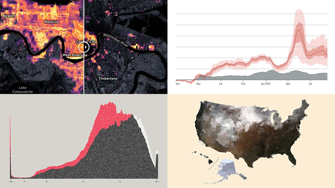 This week, we have come across a number of wonderful new data visualization projects out there. Here are the four that we’ve found most interesting and decided to showcase today in DataViz Weekly. Join us for a quick overview of these works and check them out!
- Black mortality gap in America — The Marshall Project
- Excess deaths worldwide during the COVID-19 pandemic — The Economist
- Ida-caused power outage in New Orleans as seen from space — NASA Earth Observatory
- Average seasonal colors of the United States — Erin Davis
- Categories: Data Visualization Weekly
- No Comments »
How to Create Financial Open-High-Low-Close (OHLC) Chart Using JavaScript
September 7th, 2021 by Shachee Swadia A stepwise guide on how to create interactive financial charts in the form of an OHLC chart. Visualizing the stock prices of Amazon over the course of Jeff Bezos’s tenure as the CEO.
Financial charts are especially useful to represent large amounts of data and identify trends. Would like to learn one such cool financial chart called the OHLC chart that visualizes stock price movement?
Read the JS charting tutorial »
- Categories: AnyChart Charting Component, AnyStock, Big Data, Financial Charts, HTML5, JavaScript, JavaScript Chart Tutorials, Stock Charts, Tips and Tricks
- No Comments »
New Awesome Charts and Maps Curated for Data Visualization Fans — DataViz Weekly
September 3rd, 2021 by AnyChart Team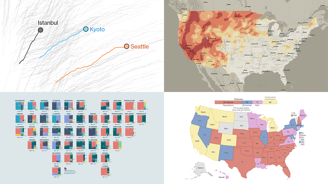 The seven-day wait is over for all data visualization fans wherever you are! DataViz Weekly is back with a selection of new awesome charts and maps curated from around the web. Look at our latest picks.
- Current and historic drought conditions across the United States — Esri
- Relationship between temperature, income, and mortality — Bloomberg Green
- U.S. electricity mix by state — Visual Capitalist
- Congressional redistricting rules and practices — The Washington Post
- Categories: Data Visualization Weekly
- 1 Comment »