 We continue to choose the most interesting out of all the newest data visualizations published here and there and show you them in weekly roundups. It’s time to look at our fresh selection! This time, the following projects are featured in DataViz Weekly:
- Canadian federal elections since 2000 — Stephen Taylor
- Germany under the 16-year leadership of Angela Merkel — Reuters
- Sounds of Caracas — Valeria Escobar
- Abnormally hot summer nights in American cities — The Upshot
Data Visualization Weekly: September 10, 2021 — September 17, 2021
Canadian Federal Elections Since 2000
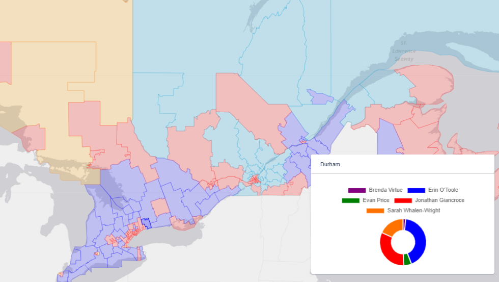
Several days before September 20, the day when Canadians will go to the polls to vote in a new parliamentary election, Stephen Taylor, a Canadian political campaigner, launched an impressive project described by Politico as “an epic achievement in electoral data visualization.”
Technically, it is an interactive dashboard centered around a lot of political maps representing the results of every federal election in Canada since 2000 for each riding (district). Click on a district and you will be able to explore the breakdown by polling division. Moreover, you can even visualize and analyze the relative strength of any particular party across any riding, poll by poll.
In addition, there are also multiple graphs displaying data from the last (2016) census, which can provide insight into what motivates voters living in a certain area, as well as historical polling data. Without more ado, you are welcome to open the dashboard and do your own exploration.
Germany Under 16-Year Leadership of Angela Merkel
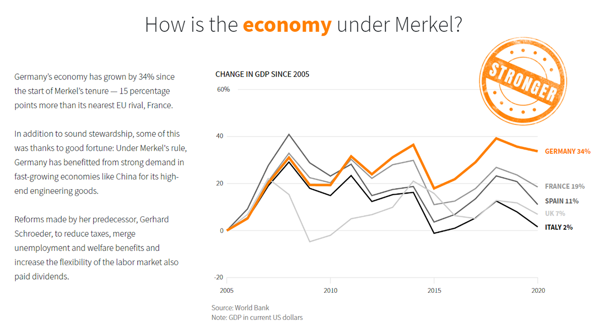
Another important parliamentary election will take place in Germany at the end of the next week. On September 26, Germans will vote for a new Bundestag. After the election, Angela Dorothea Merkel is expected to leave the office of the Chancellor of Germany that she has held for sixteen years.
For everyone wondering how Germany has changed under Merkel’s leadership, Reuters published several charts that show the progress or lack thereof at glance. Each visualization is accompanied by a mark containing a one-word conclusion.
Created by Michael Ovaska and Paul Carrel, the story begins with the charts that represent the change in the country’s economy: GDP (“stronger”), employment (“bigger”), and exports (“stronger”). Also covered are the political landscape (“fractured”), East-West divide (“divided”), effects of immigration on population (“boosted”), and more aspects. Take a look.
Sounds of Caracas
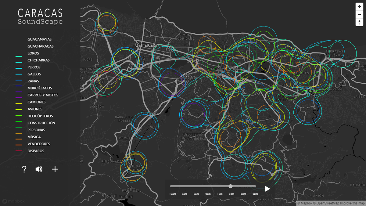
Santiago de León de Caracas (or simply Caracas), the capital of Venezuela, is home to more than 2 million people. As you can imagine, it is also full of various sounds, from human-generated noise such as one from construction and traffic to beautiful nature sounds. Thanks to an interactive map recently made public by architect Valeria Escobar, who lived in Caracas most of her life before leaving it a couple of years ago, now everyone can experience the soundscape of and across Venezuela’s capital.
After moving to Colombia’s Bogotá, once Valeria realized she was missing the sounds of Caracas. So she made what she calls an interactive audiovisual representation putting the rich soundscape of the city on a map. This project lets you actually listen to Caracas and its individual neighborhoods as you hover over the map. The colored contour lines make it easy to find where it is possible to hear what kind of sounds. The legend explains the meaning of the colors. You can also use it to choose which sounds to display on the map.
Check out the project and read more about it in Valeria’s interview with Caracas Chronicle. Also, feel free to contribute if you’ve got the appropriate data — just press the plus sign and fill out the form.
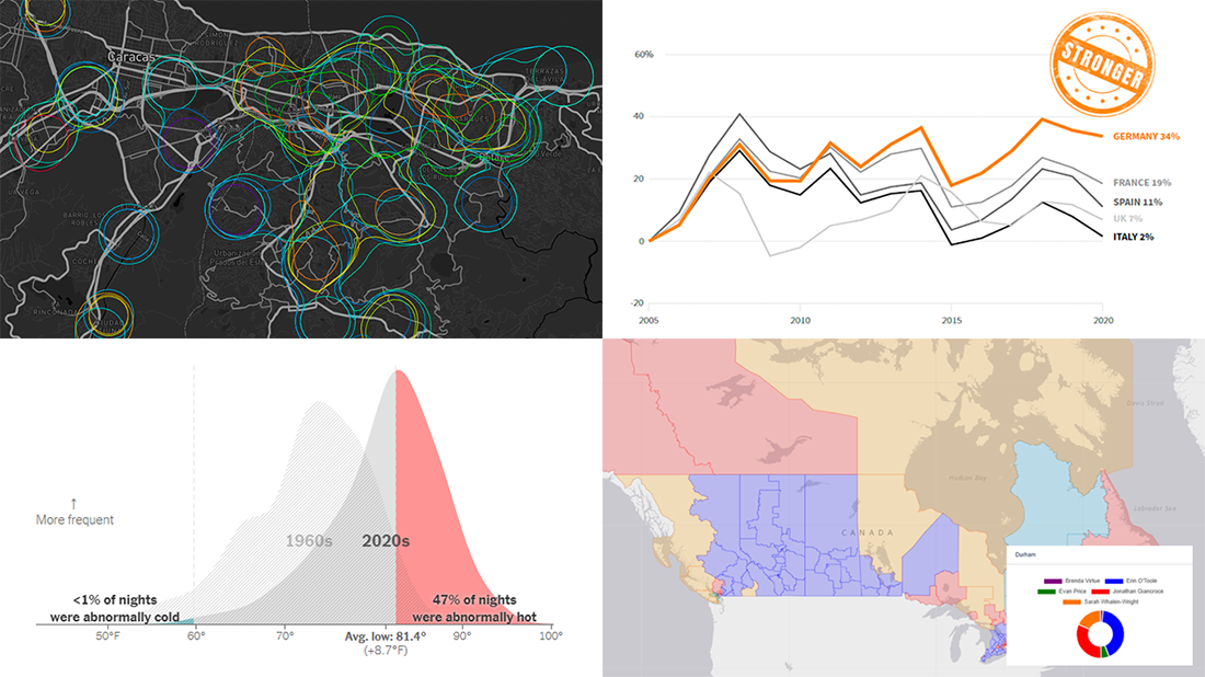
Abnormally Hot Summer Nights in American Cities
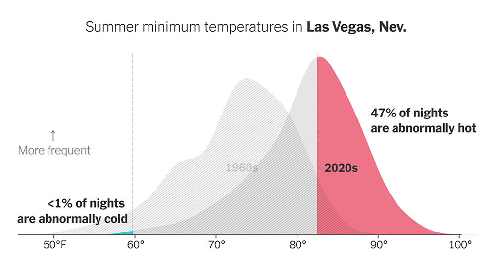
Across the United States, nights are getting hotter at faster rates than days. In cities, which are generally warmer than their immediate surroundings, not to mention rural areas, this effect is most intense.
For The New York Times’s The Upshot, Aatish Bhatia and Josh Katz made animated visualizations representing that in a very clear manner. Drawn in the form of area charts, these graphics show daily minimum temperature distributions for the summer months in each decade starting with the 1960s. The red part on the right represents unusually hot nights based on the 95th percentile of the 1960s temperature distribution, and it is obvious their number is rising really fast.
See the charts on The Upshot. There is also an interactive tool that allows you to look up your city and find out how its summer minimum temperatures are changing.
***
Enjoy these new great charts and maps, and stay tuned for Data Visualization Weekly!
- Categories: Data Visualization Weekly
- No Comments »