 A connector map is a set of straight or curved lines that link points on a geographical map. It is commonly used to graphically represent routes or any other connections between locations. Would you like to learn how to build an attractive data visualization like that for a web page or app?
Actually, it is easy to create an interactive connector map using JavaScript. And I am ready to show you how right now! Follow along with this tutorial as I depict the cycling path of the 2021 Tour de France in the form of a JS connector map and thoroughly explain all steps.
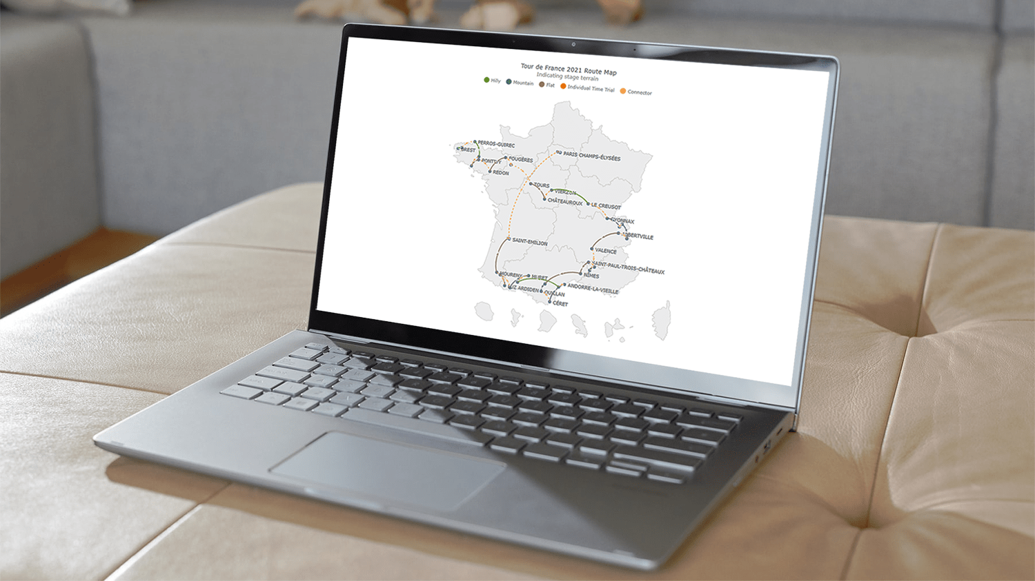
Here is a preview to get you excited for the ride, the beautiful interactive JavaScript connector map that will have been built by the end of the tutorial!
Creating JS Connector Map in Four Basic Steps
Building a connector map with JavaScript is a bit more complex than other basic charts. But it becomes simpler when we use a JS charting library that can provide an out-of-the-box option to create it. In this tutorial, I will use AnyChart, one such library that has a special AnyMap product with good mapping documentation to help develop a connector map with ease, and I’ll explain the entire process from start to finish so you perfectly understand what each step and line of code do.
Get ready to build a stunning, interactive JavaScript connector map in four basic steps.
1. Creating an HTML page
Firstly I require a blank HTML page to hold my connector map. I add a <div> element with a unique id in the <body> of my HTML page, which I will reference later.
I also set the width and height of the <div> to 100% using the <style> tag to make my map fit the entire screen. You can adjust these parameters based on your requirements.
<html>
  <head>
    <title>JavaScript Connector Map</title>
    <style type="text/css">
      html, body, #container {
        width: 100%; height: 100%; margin: 0; padding: 0;
      }
    </style>
  </head>
  <body>
    <div id="container"></div>
  </body>
</html>
2. Adding the necessary scripts
I am going to use the AnyChart library, so I need to add the necessary JS scripts in the <head> part of the HTML page.
To create the connector map, I need AnyChart’s ‘core’ and ‘map’ modules. Moreover, I also add the geodata of France since the route points are all there.
One more script to wrap up the map-related additions is Proj4js, a JavaScript library that ensures the plotting of coordinates over the appropriate geographical area.
<html>
  <head>
    <title>JavaScript Connector Map</title>
    <script src="https://cdn.anychart.com/geodata/latest/countries/france/france.js"></script>
    <script src="https://cdn.anychart.com/releases/8.10.0/js/anychart-core.min.js"></script>
    <script src="https://cdn.anychart.com/releases/8.10.0/js/anychart-map.min.js"></script>
    <script src="https://cdnjs.cloudflare.com/ajax/libs/proj4js/2.3.15/proj4.js"></script>
    <style type="text/css">
      html, body, #container {
        width: 100%; height: 100%; margin: 0; padding: 0;
      }
    </style>
  </head>
  <body>
    <div id="container"></div>
    <script>
      // All the code for the JS connector map will come here
    </script>
  </body>
</html>
3. Preparing the data
I collect the data for the cycling route from the official website of the Tour de France. A JS connector map requires the data to be in a certain format, so I created a specific dataset by adding the data in the required format. You can check out the file here.
In a connector map dataset, the main thing to remember is that the start and end points are defined by the latitude and longitude of each location where the latitude is defined first and then the longitude. For your information, I took the latitude and longitude information for each point from LatLong.net.
To use the data in the code, I need to include the handy Data Adapter script that comes with the AnyChart JavaScript charting library to load the file.
<script src="https://cdn.anychart.com/releases/8.10.0/js/anychart-data-adapter.min.js"></script>
4. Writing the JS code to draw the connector map
Now is the time for the final and most important stage of the race, which is writing the main lines of JavaScript code for generating the connector map itself.
To begin with, I enclose all the code inside the anychart.onDocumentReady() function to ensure that it is executed only when the web page is fully loaded. Then I add the data using the anychart.data.loadJsonFile() function.
<script>
  anychart.onDocumentReady(function () {
    anychart.data.loadJsonFile(
'https://gist.githubusercontent.com/shacheeswadia/4a2e84185d754984681a89194b4282df/raw/ec70b11e8f68e5e6df60cff15bff8dd5b05ce22a/connector-map.json', function (data) {
    });
  });
</script>
To create a connector map, I use the connector() function and set the geodata of France. Next, I just provide the map with a title.
// create a connector map chart
var map = anychart.connector();

// set the geodata for france
map.geoData('anychart.maps.france');

// add a title for the map
map
  .title('Tour de France 2021 Route Map');
Before showing the connections, I plot all the places on the route using the marker() function. I use the circle marker and fill it with the red color of the French flag.
// create a marker series for the place names
var citiesSeries = map
  .marker(data[0]['citiesData'])
  .type('circle')
  .fill('#c51923')
  .stroke(0);
Now I represent the various connections using a helper function that accepts the map, the name of the series, and the data. You will see later on in this tutorial why I have made five different series. In the helper function, I create the links with the connector() function and set the color of the lines to the blue color of the French flag.
// create individual series
createSeries(map, 'Hilly', data[1]['hillyData']);
createSeries(map, 'Mountain', data[2]['mountainData']);
createSeries(map, 'Flat', data[3]['flatData']);
createSeries(map, 'Individual Time Trial', data[4]['timeTrialData']);
createSeries(map, 'Connector', data[5]['connectorData']);

...

// a helper function to create several series
function createSeries(map, name, data) {
  // configure and customize the series
  var connectorSeries = map
    .connector(data)
    .stroke('#3e5ca6')
    .fill('#3e5ca6');
}
In the last two steps, I reference the container div to display the chart and draw the map.
// set the container id for the map
map.container('container');

// command to draw the resulting connector map
map.draw();
And that’s the finish line! A beautiful JavaScript connector map is all ready!
Here is the complete code and you can also check it out on AnyChart Playground.
<html>
  <head>
    <title>JavaScript Connector Map</title>
    <script src="https://cdn.anychart.com/geodata/latest/countries/france/france.js"></script>
    <script src="https://cdn.anychart.com/releases/8.10.0/js/anychart-core.min.js"></script>
    <script src="https://cdn.anychart.com/releases/8.10.0/js/anychart-map.min.js"></script>
    <script src="https://cdnjs.cloudflare.com/ajax/libs/proj4js/2.3.15/proj4.js"></script>
    <script src="https://cdn.anychart.com/releases/8.10.0/js/anychart-data-adapter.min.js"></script>
    <style type="text/css">
      html,
      body,
      #container {
        width: 100%;
        height: 100%;
        margin: 0;
        padding: 0;
      }
    </style>
  </head>
  <body>
    <div id="container"></div>
    <script>

      anychart.onDocumentReady(function () {
        anychart.data.loadJsonFile(
'https://gist.githubusercontent.com/shacheeswadia/4a2e84185d754984681a89194b4282df/raw/ec70b11e8f68e5e6df60cff15bff8dd5b05ce22a/connector-map.json', function (data) {

          // create a connector map chart
          var map = anychart.connector();

          // set the geodata for france
          map.geoData('anychart.maps.france');

          // add a title for the map
          map
            .title('Tour de France 2021 Route Map');

          // create a marker series for the place names
          var citiesSeries = map
            .marker(data[0]['citiesData'])
            .type('circle')
            .fill('#c51923')
            .stroke(0);

          // create individual series
          createSeries(map, 'Hilly', data[1]['hillyData']);
          createSeries(map, 'Mountain', data[2]['mountainData']);
          createSeries(map, 'Flat', data[3]['flatData']);
          createSeries(map, 'Individual Time Trial', data[4]['timeTrialData']);
          createSeries(map, 'Connector', data[5]['connectorData']);

          // sets the container id for the map
          map.container('container');

          // command to draw the resulting connector map
          map.draw();

        });
      });

      // a helper function to create several series
      function createSeries(map, name, data) {
        // configure and customize the series
        var connectorSeries = map
          .connector(data)
          .stroke('#3e5ca6')
          .fill('#3e5ca6');
      }

    </script>
  </body>
</html>
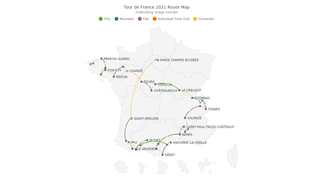
Customizing JavaScript Connector Map
I think the current connector map already looks great. But we can certainly pack in more information and also improve it aesthetically. So pedal on with me to see how a JavaScript-based connector map visualization can be customized and become even more awesome.
1. Setting the colors according to the stage route terrain
The cycling route of the Tour de France passes through different types of terrain, and I want to highlight them on the connector map using an individual color for each. This is why I previously created five different series: now I can individually customize each of them.
So, I add a color parameter to the helper function and include the respective color code when calling the function for each series.
I also increase the width of the connector lines by setting the stroke width value in the helper function.
// create individual series
createSeries(map, 'Hilly', data[1]['hillyData'], '#57ae12');
createSeries(map, 'Mountain', data[2]['mountainData'], '#318053');
createSeries(map, 'Flat', data[3]['flatData'], '#a4664d');
createSeries(map, 'Individual Time Trial', data[4]['timeTrialData'], '#ef6c00');
createSeries(map, 'Connector', data[5]['connectorData'], '#fac233');

...

// a helper function to create several series
function createSeries(map, name, data, color) {
  // configure and customize the series
  var connectorSeries = map
    .connector(data)
    .stroke(function (d) {
      return {
        color: color,
        thickness: 2
      }
    })
    .fill(color);
}
Then I modify the place marker color and change it from red to blue.
// create a marker series for the place names
var citiesSeries = map
  .marker(data[0]['citiesData'])
  .type('circle')
  .fill('#3e5ca6')
  .stroke(0);
Because I’ve added different colors for different stage types, I need to include a legend to indicate which color represents which type. You can select and deselect the legend items to display or hide the routes of the encoded terrain or, for instance, individual time trials.
So, I add the legend and exclude the route stops since they are all of the same color. In the helper function, I set the legend shape and color.
// turn on the legend
map.legend(true);

// exclude cities from the legend
citiesSeries.legendItem(false);

...

// set the legend shape and color
connectorSeries.legendItem({
  iconType: 'circle',
  iconFill: color
});
It might look complicated at first glance if you are a beginner. But these quick actions actually enhance the connector map and make it so much more informative. So do not let all this code bonk you. Load up, keep your focus, go through each line to digest, and you will be able to grasp what is happening.
2. Formatting the labels
If you noticed, in the initial version of the map, the names of the places overlap with the connector lines quite a bit. To reduce that overlap and improve readability, I adjust the labels.
// customize the labels for the city names series
citiesSeries
  .labels()
  .enabled(true)
  .position('center-bottom')
  .fontColor('#263238')
  .offsetY(0)
  .offsetX(5)
  .anchor('left-center')
  .format('{%name}');
3. Changing the curvature of the connector lines
There is an option to change the connectors from the default arc-like lines to straight lines by zeroing the curvature.
// configure and customize the series
var connectorSeries = map
  .connector(data)
  .stroke(function (d) {
    return {
      color: color,
      thickness: 2
    }
  })
  .fill(color)
  .curvature(0);
You can see here how that looks and also check out the interactive version of this variation with its full code on AnyChart Playground.
But honestly, I like the previous way of connector visualization more. So I undo the curvature adjustment and revert to the initial curved lines.
4. Formatting the connector line type
In the cycling route, some lines simply connect one stage’s finishing town with the next stage’s starting town and are not part of the race tracks. I indicate those connections as dashed lines by adding a boolean parameter to the helper function. If the boolean value is true, I add the dash value in the stroke attribute.
// create individual series
createSeries(map, 'Hilly', data[1]['hillyData'], '#57ae12', false);
createSeries(map, 'Mountain', data[2]['mountainData'], '#318053', false);
createSeries(map, 'Flat', data[3]['flatData'], '#a4664d', false);
createSeries(map, 'Individual Time Trial', data[4]['timeTrialData'], '#ef6c00', false);
createSeries(map, 'Connector', data[5]['connectorData'], '#fac233', true);

...

// configure and customize the connector series
var connectorSeries = map
  .connector(data)
  .stroke(function (d) {
    return {
      color: color,
      thickness: 2,
      dash: isConnector ? '3 6' : '0'
    }
  })
  .fill(color)
  .name(name);
5. Enhancing the tooltip
By default, the tooltip of the JavaScript connector map created so far displays the latitude and longitude of the cities and towns where stages start and finish, which is not very useful. So, I modify the connector tooltip in the helper function using HTML to show the names of the start and end points for each connecting line. I also disable the tooltip of the place series since there is no need for any extra information for each stop.
// customize the destination series tooltip
connectorSeries
  .tooltip()
  .format('{%full}')
  .title({ useHtml: true })
  .titleFormat(
    '{%number}. <span style="font-size: 13px; color: #E1E1E1"; padding: 10px>{%short}</span>'
  );

...

// create a marker series for the place names
var citiesSeries = map
  .marker(data[0]['citiesData'])
  .type('circle')
  .fill('#3e5ca6')
  .stroke(0)
  .tooltip(false);
6. Modifying the marker size
I also want to reduce the arrow marker size on the connecting lines to make it more subtle. This requires a simple one-line addition in the helper function.
// set the marker size
var markers = connectorSeries.markers().size(10);
7. Enhancing the title
Lastly, I simply make the title more informative and customize the text. This code is similar to the tooltip personalization code, both making use of HTML.
// set a title for the map and customize it
map
  .title()
  .enabled(true)
  .useHtml(true)
  .fontColor('#263238')
  .text(
    'Tour de France 2021 Route Map<br/>' +
    '<span style="color:#a3a3a3; font-size: 14px;">Indicating stage terrain</span>'
  );
That’s all — bonus points achieved! An absolutely lovely and insightful JavaScript (HTML5) connector map is built to showcase the 2021 cycling route of the Tour de France, one of the most prestigious annual bicycle races!
The complete code of the polished version is right here and also on AnyChart Playground.
<html>
  <head>
    <title>JavaScript Connector Map</title>
    <script src="https://cdn.anychart.com/geodata/latest/countries/france/france.js"></script>
    <script src="https://cdn.anychart.com/releases/8.10.0/js/anychart-core.min.js"></script>
    <script src="https://cdn.anychart.com/releases/8.10.0/js/anychart-map.min.js"></script>
    <script src="https://cdnjs.cloudflare.com/ajax/libs/proj4js/2.3.15/proj4.js"></script>
    <script src="https://cdn.anychart.com/releases/8.10.0/js/anychart-data-adapter.min.js"></script>
    <style type="text/css">
      html,
      body,
      #container {
        width: 100%;
        height: 100%;
        margin: 0;
        padding: 0;
      }
    </style>
  </head>
  <body>
    <div id="container"></div>
    <script>

      anychart.onDocumentReady(function () {
        anychart.data.loadJsonFile(
'https://gist.githubusercontent.com/shacheeswadia/4a2e84185d754984681a89194b4282df/raw/ec70b11e8f68e5e6df60cff15bff8dd5b05ce22a/connector-map.json', function (data) {

          // create a connector map chart
          var map = anychart.connector();

          // set the geodata for france
          map.geoData('anychart.maps.france');

          // add a title for the map and customize it
          map
            .title()
            .enabled(true)
            .useHtml(true)
            .fontColor('#263238')
            .text(
              'Tour de France 2021 Route Map<br/>' +
              '<span style="color:#a3a3a3; font-size: 14px;">Indicating stage terrain</span>'
            );

          // create a marker series for the place names
          var citiesSeries = map
           .marker(data[0]['citiesData'])
            .type('circle')
            .fill('#3e5ca6')
            .stroke(0)
            .tooltip(false);

          // create individual series
          createSeries(map, 'Hilly', data[1]['hillyData'], '#57ae12', false);
          createSeries(map, 'Mountain', data[2]['mountainData'], '#318053', false);
          createSeries(map, 'Flat', data[3]['flatData'], '#a4664d', false);
          createSeries(map, 'Individual Time Trial', data[4]['timeTrialData'], '#ef6c00', false);
          createSeries(map, 'Connector', data[5]['connectorData'], '#fac233', true);

          // customize the labels for the city names series
          citiesSeries
            .labels()
            .enabled(true)
            .position('center-bottom')
            .fontColor('#263238')
            .offsetY(0)
            .offsetX(5)
            .anchor('left-center')
            .format('{%name}');

          // turn on the legend
          map.legend(true);

          // exclude cities from the legend
          citiesSeries.legendItem(false);

          // set the container id for the map
          map.container('container');

          // command to draw the resulting connector map
          map.draw();

        });
      });

      // a helper function to create several series
      function createSeries(map, name, data, color, isConnector) {
        // configure and customize the series
        var connectorSeries = map
          .connector(data)
          .stroke(function (d) {
            return {
              color: color,
              thickness: 2,
              dash: isConnector ? '3 6' : '0'
            }
          })
          .fill(color)
          .name(name);

        // set the legend shape and color
        connectorSeries.legendItem({
          iconType: 'circle',
          iconFill: color
        });

        // set the marker size
        var markers = connectorSeries.markers().size(10);

        // customize the destination series tooltips
        connectorSeries
          .tooltip()
          .format('{%full}')
          .title({ useHtml: true })
          .titleFormat(
            '{%number}. <span style="font-size: 13px; color: #E1E1E1"; padding: 10px>{%short}</span>'
          );
      }

    </script>
  </body>
</html>
Conclusion
As you could see in this tutorial, creating interactive JavaScript connector maps is actually hassle-free and fast. Feel free to delve into the connector map documentation if you want to learn how to implement something else or look at other chart types.
Be it competitive sports or interactive data visualization, practice is what makes one excel. So, go on and practice building JS graphics as much as you can. Do ask me questions regarding this tutorial or other data visuals, if any.
See more about connector maps on Chartopedia and don’t miss other JavaScript charting tutorials.
If you’ve got an idea for a cool guest post, you are more than welcome to let us know.
- Categories: AnyChart Charting Component, AnyMap, HTML5, JavaScript, JavaScript Chart Tutorials, Tips and Tricks
- 2 Comments »