New Data Chart Examples Worth Seeing About Coal, People, Movies, and Migration — DataViz Weekly
May 31st, 2019 by AnyChart Team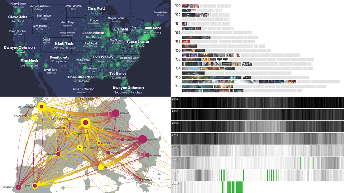 Data visualization is a powerful way to facilitate making sense of numbers. It can provide an insightful look at data and display trends and patterns at a glance for a more efficient and quicker analysis. Check out new data chart examples from around the web that nicely show how it works in practice.
Today on DataViz Weekly:
- How Britain is phasing out coal-powered energy
- U.S. cities’ most Wikipedia’ed residents
- Rise of summer movie sequels
- European migration flow map
- Categories: Data Visualization Weekly
- 1 Comment »
Created Visualizations on Cities, Politics, Education, and Romanovs — DataViz Weekly
May 24th, 2019 by AnyChart Team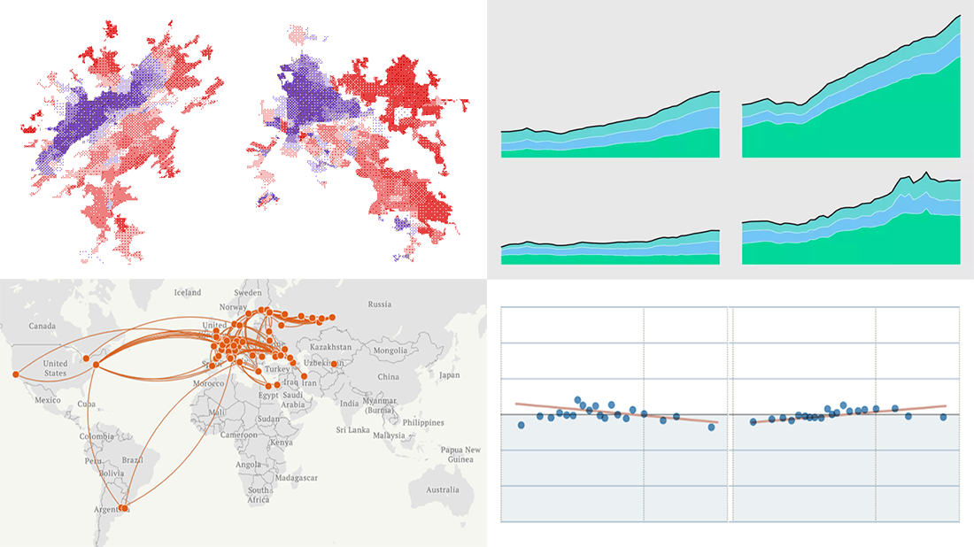 Each Friday, we meet you with four of the most interesting data-based projects we’ve just come across. Here’s what recently created visualizations we are glad to tell you about this time on DataViz Weekly:
- Why Workers Without College Degrees Are Fleeing Big Cities — The New York Times
- Where Democrats And Republicans Live In Your City — FiveThirtyEight
- Cost of College — FlowingData
- The Romanovs’ Twilight — TASS
- Categories: Data Visualization Weekly
- No Comments »
Graphics Visualizations About Immigration, Elections, Pitchers, and Salinity — DataViz Weekly
May 17th, 2019 by AnyChart Team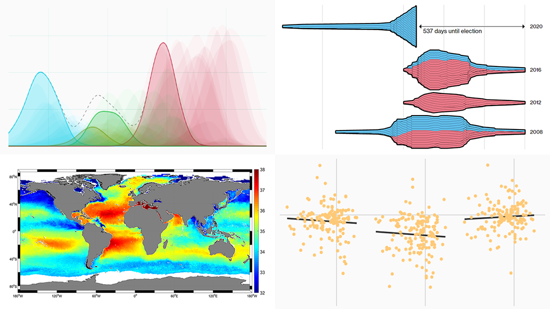 New DataViz Weekly is here, highlighting some of the new cool graphics visualizations we found around the web just recently:
- Finding a link between undocumented immigration and crime in the United States
- Competition in the U.S. presidential elections since 1980
- MLB pitchers’ pitch distribution
- Sea-surface salinity
- Categories: Data Visualization Weekly
- No Comments »
JS Charts Library AnyChart Adds Timeline Chart and Network Graph in Version 8.6.0
May 15th, 2019 by AnyChart Team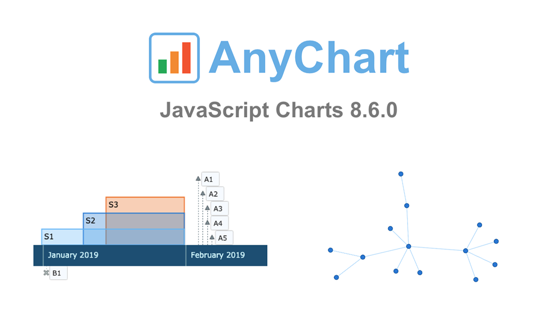 AnyChart 8.6.0 is out! Check out what new awesome interactive data visualization features we’ve added to our award-winning JS charts library!
First and foremost, two new chart types are now available out of the box — greet the main protagonists of the 8.6.0 release:
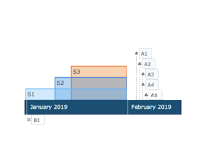 |
Timeline Chart in AnyChart JS Charts LibraryTimeline Chart is used to display a set of events in chronological order. It is typically a graphic design showing a long bar labeled with dates paralleling it, and usually contemporaneous events. Look at interactive Timeline Chart examples in our gallery. Read AnyChart Docs to learn how to create a JS Timeline Chart using our library. |
 |
Network Graph in AnyChart JS Charts LibraryNetwork Graph, also Graph Chart, is a mathematical structure (graph) designed to show relationships between data points. This chart type visualizes how entities are interconnected with each other. Entities are displayed as nodes (points). Relationship between them (edges) are depicted as lines. Check out interactive Network Graph examples in our gallery. Read AnyChart docs to learn how to create a JS Network Graph using our library. |
Then, the new major release AnyChart JS Charts 8.6.0 is bringing multiple other improvements, not to mention bug fixes.
Take a look into what’s new, by product:
Let us know if you have requests for new JS chart types or data visualization features. Contact our Support Team with all your tips and suggestions, and we’ll be happy to consider quickly delivering what you need. As always, you know.
Enjoy AnyChart 8.6.0!
- Categories: AnyChart Charting Component, AnyGantt, AnyMap, AnyStock, HTML5, JavaScript, News
- 1 Comment »
Compelling Data Visualization Examples on Trade, Diets, Mortality, and Birth Rates — DataViz Weekly
May 10th, 2019 by AnyChart Team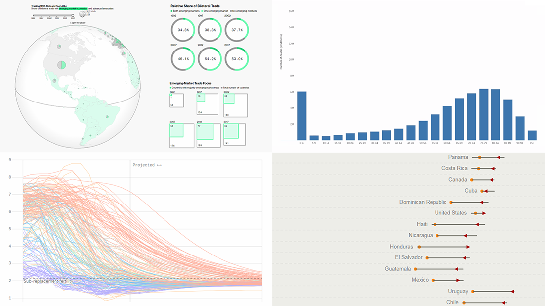 Take a look at another set of compelling data visualization examples we have come across these days, in DataViz Weekly on the AnyChart blog:
- Rise of developing countries in global trade
- Birth rates
- Growing similarity of diets
- Child mortality
- Categories: Data Visualization Weekly
- No Comments »
AnyChart Joins Qlik Technology Program and Adds 36 Chart Types to Qlik Sense in Just-Launched Extensions
May 7th, 2019 by AnyChart Team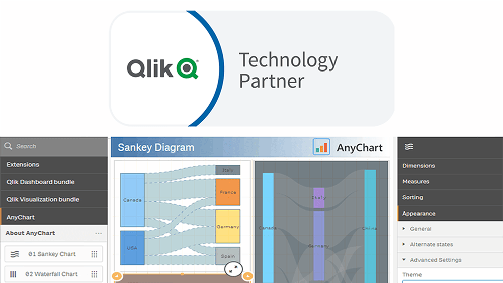
“We’re excited to be partnering with AnyChart, and their extensions will provide customers with additional choices for building even more compelling visualizations.”
— Mike Foster, Vice President, Strategic Partners at Qlik.
(Source: press release as of May 7, 2019.)
AnyChart crosses a new frontier! The vast data visualization capabilities of our award-winning JavaScript charting library, designed primarily for web developers and software engineers, are now available directly to data analysts and BI experts through powerful, flexible, intuitive extensions for Qlik Sense — AnyChart, AnyGantt, and AnyStock!
Read more at qlik.anychart.com »
- Categories: AnyChart Charting Component, AnyGantt, AnyStock, Big Data, Business Intelligence, Qlik
- 13 Comments »
Plotting NBA Shots, Diversity, Disasters, and Air Traffic — DataViz Weekly
May 3rd, 2019 by AnyChart Team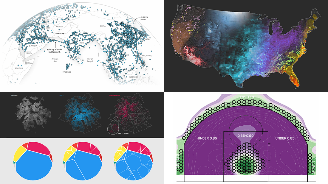 Check out new interesting examples of how plotting data on charts and maps can be both insightful and beautiful. Here is what we are happy to feature in today’s article in the DataViz Weekly series:
- Visualizing how India-Pakistan tensions disrupt air travel
- Plotting diversity of Brussels
- Mapping where natural disasters tend to strike in the United States
- Charting NBA shots
- Categories: Data Visualization Weekly
- No Comments »