 Take a look at another set of compelling data visualization examples we have come across these days, in DataViz Weekly on the AnyChart blog:
- Rise of developing countries in global trade
- Birth rates
- Growing similarity of diets
- Child mortality
Compelling Data Visualization Examples: May 3, 2019 — May 10, 2019
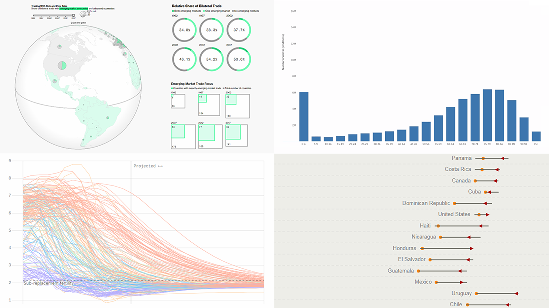
Analyzing Rise of Developing Countries in Global Trade
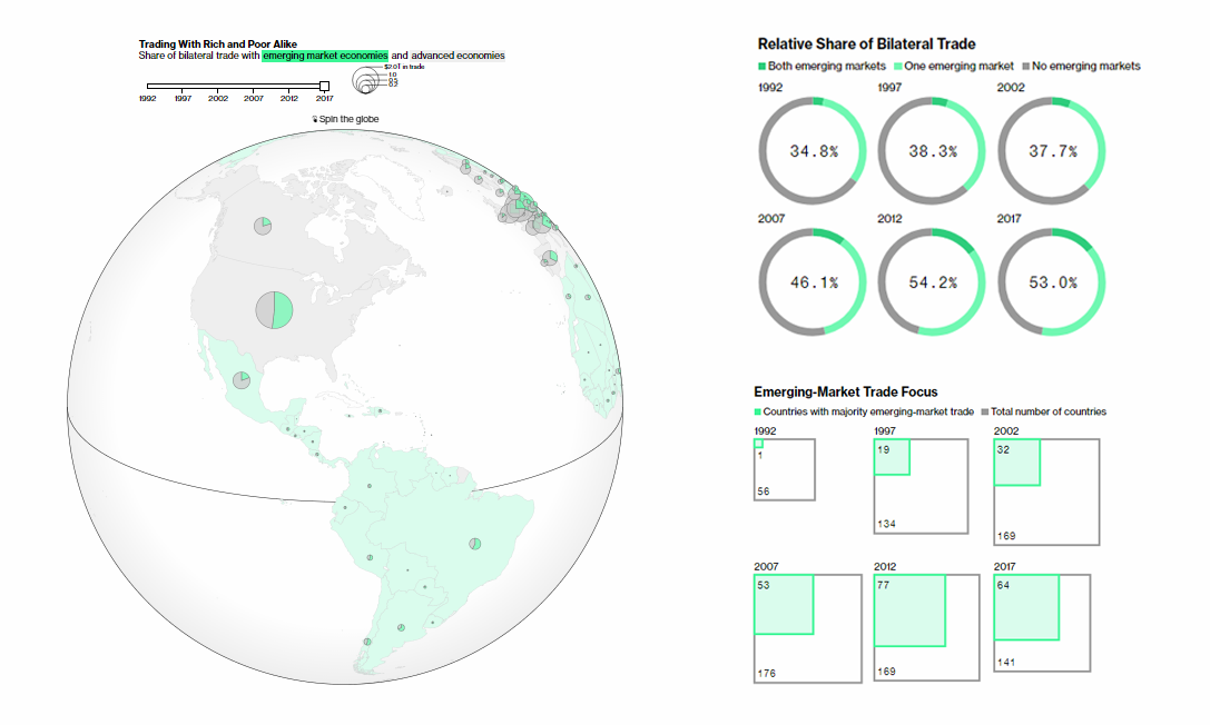
Developing countries are likely to be disrupting the global trade more than anyone realized. 20 years ago, 62% of bilateral trade was only between rich countries such as the United States of America, Canada, and European countries. By now this share has decreased to 47%. At the same time, the value of trade between emerging economies has increased 10-fold during the same period. Join Bloomberg’s Andre Tartar and Cedric Sam as they look into the rising power of developing countries in the global trade, sharing cool charts and maps to visually represent the figures and trends.
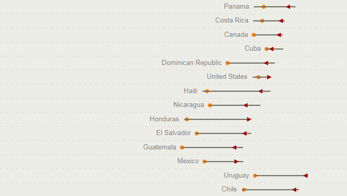
Visualizing Birth Rate in Every Country
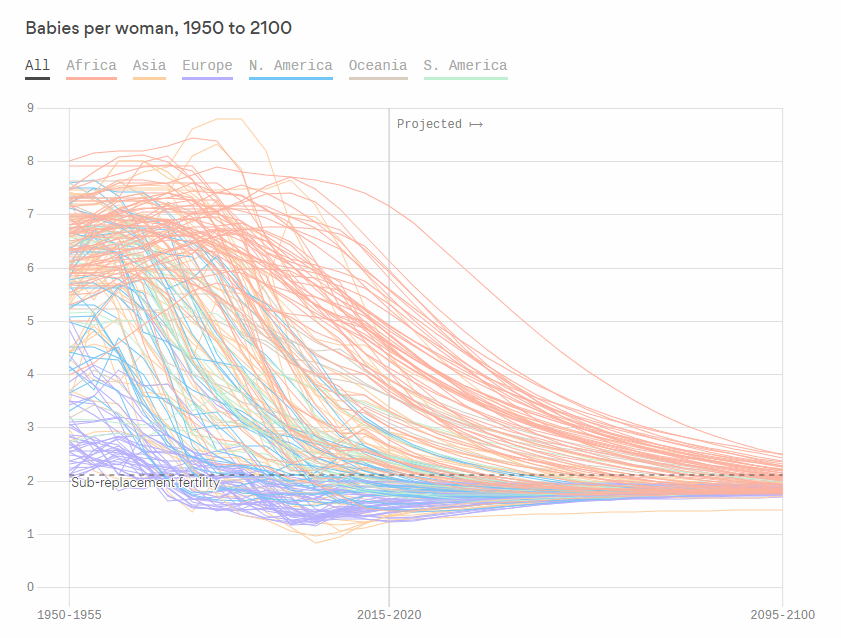
Harry Stevens from Axios charted birth rates around the world based on the United Nations World Populations Prospects data. Check out the visualization to see how the average number of kids per woman in every country has been changing since 1950 and how it is expected to be changing in the future, through the year 2100. Also, don’t miss out on the comments with important insights so you know where to start looking. Actually, Axios first published this piece last year, but we’ve noticed it only thanks to this week’s repost on their feed, and obviously, it is nonetheless interesting.
Charting Growing Similarity of Diets
People around the world consume more and more similar food. That is according to the results of a new study conducted by CGIAR, an international agricultural research group that tracked almost 50 years of the corresponding data comparing what people eat, by country. On National Geographic, you can see the change in similarity of diets over 1961-2009 and read more about it.
Exploring Child Mortality Data
Worldwide annual deaths by 5-year-age-group
In the period 1950 to 1954 more than 20 million children died every year.
Since then the number of annual child deaths declined 3-fold.
And the number of older people’s deaths doubled. pic.twitter.com/jTqwKmv6EV— Max Roser (@MaxCRoser) May 2, 2019
The chart from data scientist Max Roser shown above displays the number of annual child deaths decreased 3-fold over the last seven decades. However, we are still far away from achieving the global goal to reduce the child mortality rate to at least 2.5% in the entire world by 2030, which is one of the official UN’s Sustainable Development Goals. Learn more and see more charts on his blog Our World in Data.
***
Thank you for staying tuned for compelling data visualization examples in the Data Visualization Weekly series on our blog!
If you are a Qlik Sense user, you’ll love our corporate news of the week, about the advent of AnyChart on the Qlik platform. To put it shortly, we became an official Qlik Technology Partner and have already made 36 chart types available in Qlik Sense in our extensions for Qlik Sense. Sankey, Gantt, Word Cloud, and more. Make sure to read more in the news.
- Categories: Data Visualization Weekly
- No Comments »