 Data visualization is a powerful way to facilitate making sense of numbers. It can provide an insightful look at data and display trends and patterns at a glance for a more efficient and quicker analysis. Check out new data chart examples from around the web that nicely show how it works in practice.
Today on DataViz Weekly:
- How Britain is phasing out coal-powered energy
- U.S. cities’ most Wikipedia’ed residents
- Rise of summer movie sequels
- European migration flow map
New Data Chart Examples in Data Visualization Weekly: May 24, 2019 — May 31, 2019
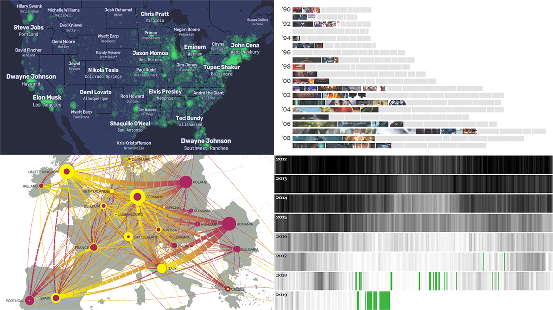
Tracking Britain Phasing Out Coal-Powered Energy
![]()
Britain is successfully getting rid of coal-powered energy generation, enjoying a record-breaking period of the coal-free run these days. Niko Kommenda, an interactive journalist at The Guardian, charted data from Gridwatch to visualize the (decreasing all the way down) daily share of Britain’s power generated by burning coal over time since 2012. Don’t miss out on the cool mini-visualizations that display how the share of energy sources was changing between 2000 and 2018 in each EU country, nicely showing the rise of renewables in Europe.
U.S. People Map

Famous people are still people, linked to particular cities as their places of birth, living, and so on. The Pudding’s Matt Daniels and Russell Goldenberg with a help from Angela Wong made a cool interactive map of the United States of America on which the names of the cities are replaced by the names of their most Wikipedia’ed residents.
Chart of Summer Movie Sequel Rise

As many as at least 14 major-studio sequels are scheduled to premier on the movie theater screens this summer. Keith Collins from The New York Times reveals a decades-long trend of Hollywood shifting toward the film franchise, visualizing Box Office Mojo and IMDb data.
Map of Migration Flows in Europe
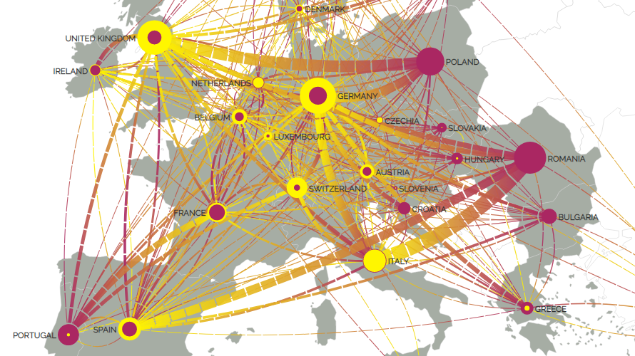
Thanks to the freedom of movement within the European Union, millions of EU citizens of working age make good use of the chance to live and work in a country other than their country of origin. Media designer Roxana Torre visualized migration flows across the EU, showing how many people moved from one country to another in 2017.
***
Thanks for staying tuned!
Have a great time!
- Categories: Data Visualization Weekly
- 1 Comment »