 Check out new interesting examples of how plotting data on charts and maps can be both insightful and beautiful. Here is what we are happy to feature in today’s article in the DataViz Weekly series:
- Visualizing how India-Pakistan tensions disrupt air travel
- Plotting diversity of Brussels
- Mapping where natural disasters tend to strike in the United States
- Charting NBA shots
New Data Plotting Examples in Data Visualization Weekly: April 26, 2019 — May 3, 2019
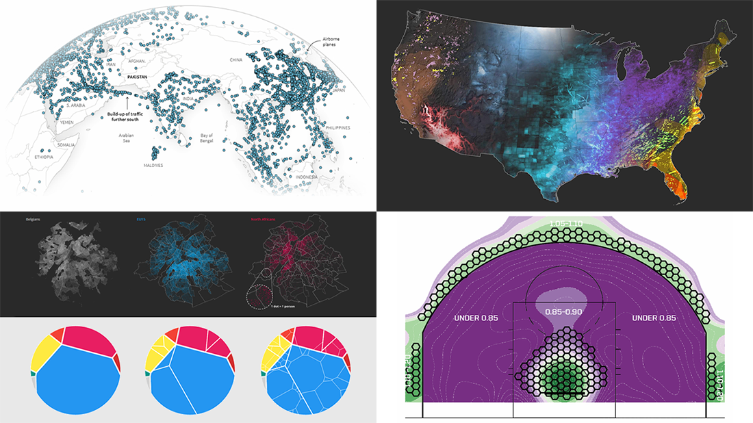
Visualizing How India-Pakistan Tensions Disrupt Air Travel
After an air strike conducted by the Indian Armed Forces near the Pakistani town of Balakot on February 26 this year, Pakistan restricted its airspace. Nowadays, most of the limitations remain in place. As a result, international airlines have to take time and money-consuming detours to the south and north. This means longer flight times and larger fuel costs.
Check out the charts and maps to figure out what’s going on and why it matters. Simon Scarr and Marco Hernandez from the Reuters Graphics team provide a stunning graphics-based look at exactly how India-Pakistan tensions have disrupted air travel.
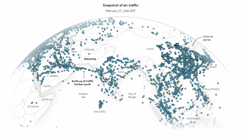
Plotting Diversity of Brussels
One of the world cities with the highest share of foreign-origin residents and home to over 180 nationalities, Brussels is indeed a melting pot. Data visualization developer Karim Douïeb offers a glance over the ethnic and racial diversity of the European Union’s capital city.
Overall, it’s a very interesting data visualization essay. Don’t miss out on the charts and maps showing what foreigners live in Brussels and where.
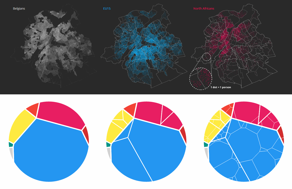
Mapping Where Natural Disasters Strike in America
Natural disasters cost the United States of America 247 human lives and more than $90 billion in damage last year. That’s according to data from the National Oceanic and Atmospheric Administration (NOAA). What’s more, “it turns out there is nowhere in the United States that is particularly insulated from everything,” The Washington Post’s Tim Meko concludes after conducting a visual analysis of more than a decade of data from NOAA, as well as the National Weather Service (NWS), and other sources.
Take a look at the impressive maps Tim Meko published several days ago, which show where in the United States natural disasters tend to strike: floods, wildfires, tornadoes and hurricanes, earthquakes and volcanoes, extreme cold and heat, and lightning.
Wondering how he made such stunning maps? Don’t miss out on a dedicated thread on Twitter where the author explains the whole process.
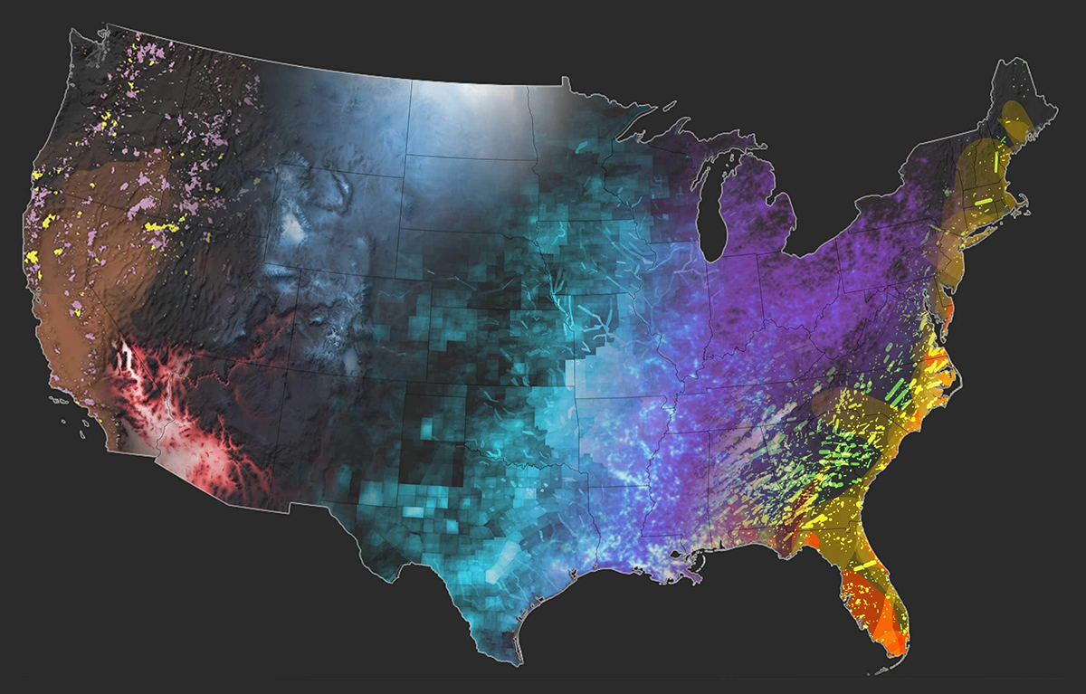
Charting NBA Shots
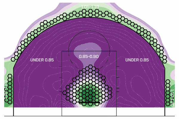
FiveThirtyEight published an excerpt from their contributor, ESPN analyst Kirk Goldsberry’s new book “SprawlBall: A Visual Tour of the New Era of the NBA.” In the book, he looks into the history of the three-point shots in the NBA and the way teams and players use them now. Check out the excerpt to learn how map-based visualization of shot data changed the game, aligning economic efficiency and shot selection, and leading to the fact that two-point jump shooting is currently dying.
***
It’s awesome to see you’ve looked through all of it! If you like good visualizations, stay tuned for DataViz Weekly and learn about new interesting projects every Friday.
- Categories: Data Visualization Weekly
- No Comments »