Plotting Data on Park Soundscapes, $600 Unemployment, COVID-19 Deaths, and Game of Thrones Battles — DataViz Weekly
July 31st, 2020 by AnyChart Team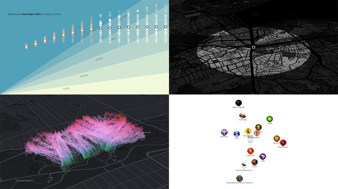 There are many ways of plotting data. Which one to choose in your case? The answer depends, of course, on what kind of data you need to analyze and what questions you want it to answer. In DataViz Weekly, we meet you with some of the best practices on a regular basis. The only thing that unites them is, all the highlighted projects have been launched in public just about now. So here are the new great examples and inspirations:
- Changing soundscapes of urban parks worldwide — MIT Senseable City Lab
- Extra $600 unemployment benefits in America — The New York Times
- COVID-19 deaths in Brazil (as if all of them happened in one neighborhood) — Agência Lupa & Google News Initiative
- Game of Thrones battles in a network graph — Wayde Herman
- Categories: Data Visualization Weekly
- No Comments »
Good Charts That Let Data Speak — DataViz Weekly
July 24th, 2020 by AnyChart Team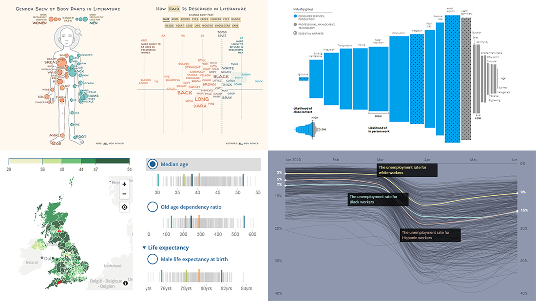 Good charts let data speak, providing insight, revealing patterns and trends, and telling stories. Look at new projects featuring graphics like that, from data visualization professionals!
- Physical traits defining men and women in literature — The Pudding
- Remote work dividing America — Reuters
- Racial disparities in unemployment in America — ProPublica
- Ageing indicators across the United Kingdom — ONS
- Categories: Data Visualization Weekly
- No Comments »
How to Create JavaScript Network Graph
July 22nd, 2020 by Wayde Herman Network graphs are a special, very interesting form of data visualization. Unlike more traditional chart types like bar graphs or pie charts, a network graph does a bit more than visualize numerical data. With these charts, you represent each object as a point, referred to as a node, and the connections between the objects as a line, referred to as either a link or an edge. Here, we do not focus on representing objects with the same precision we are typically used to. Instead, we are trying to discover relationships in a network or sections of a network and are less worried about individual nodes.
Right now, I will guide you through how to develop an interactive network graph for the web using JavaScript (HTML5). Inspired by one fun visualization created by Ben Sullins, I decided to take data about the last decade’s biggest TV series, Game of Thrones. It is an epic fantasy tale revolving around the quabbles of various faction-like houses. So in this tutorial, I will be visualizing the relationships in the world of Game of Thrones by showing who attacked whom. Follow me, it’s going to be a cool adventure!
Read the JS charting tutorial »
- Categories: AnyChart Charting Component, HTML5, JavaScript, JavaScript Chart Tutorials, Tips and Tricks
- 7 Comments »
Curating New Interesting Data Visualizations Worth Checking Out — DataViz Weekly
July 17th, 2020 by AnyChart Team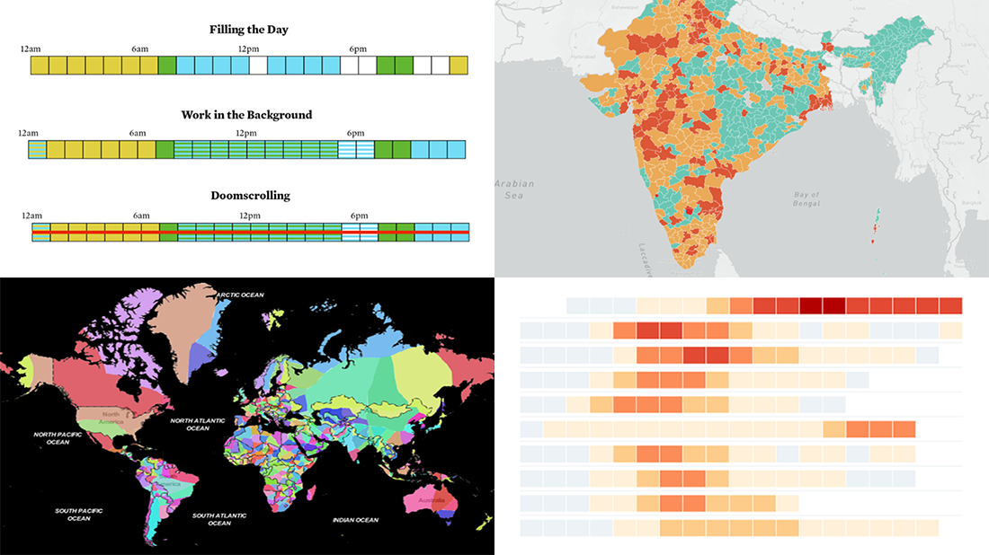 We continue to curate new interesting data visualizations from around the web for our DataViz Weekly blog. Join us as we look at some of the best charts and maps we have seen these days!
- Parenting and Working During Lockdown — Nathan Yau
- Nearest Neighboring Countries — Topi Tjukanov
- Excess Deaths Worldwide — The Economist
- Reopening India from Lockdown — Development Seed and Mapbox
- Categories: Data Visualization Weekly
- No Comments »
Qlik Sense Visualization Extensions AnyChart, AnyStock and AnyGantt Updated with New Features
July 16th, 2020 by AnyChart Team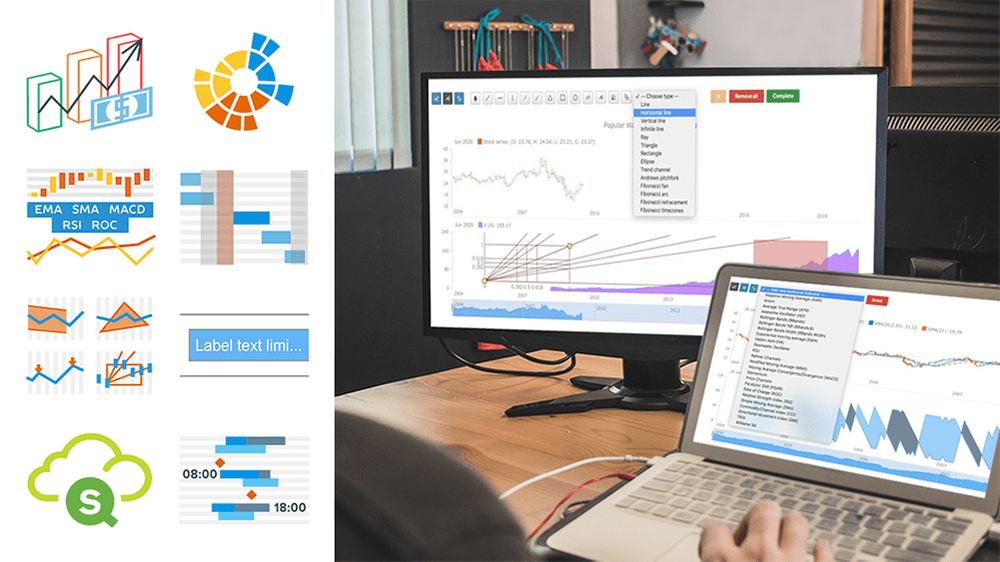 A number of new powerful capabilities are now available in our extensions for Qlik Sense! The new features are designed to help speed up data analysis in the native Qlik environment, making it even more intuitive and workflows streamlined.
Read more at qlik.anychart.com »
- Categories: AnyChart Charting Component, AnyGantt, AnyStock, Big Data, Business Intelligence, Financial Charts, Gantt Chart, News, Qlik, Stock Charts
- No Comments »
New Cool Graphics From Around the Web — DataViz Weekly
July 10th, 2020 by AnyChart Team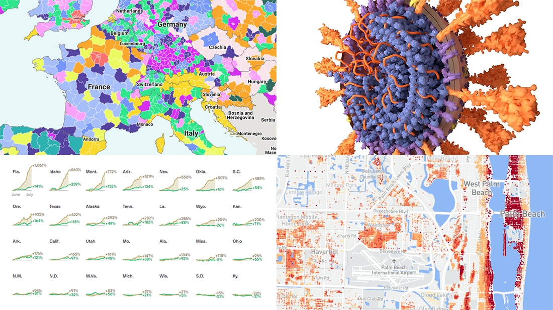 It’s Friday and we’re glad to share with you some of the most interesting third-party visualizations we’ve recently come across. Here’s what DataViz Weekly has for you to check out this time — look at these cool graphics:
- Future of jobs in the regions of Europe — McKinsey Global Institute, Google, et al.
- Flood risk factor database for the United States — First Street Foundation, et al.
- Changes in new cases against testing — Axios
- All we know about SARS-CoV-2 — Scientific American
- Categories: Data Visualization Weekly
- 1 Comment »
Building JavaScript Radar Chart
July 7th, 2020 by Wayde Herman Radar charts, which are also referred to as spider charts or radar plots, are a data visualization used to compare observations with multiple quantitative variables. Each variable is encoded to a spoke which are equidistant apart. The higher the value, the further away from the center of the chart the point is made. Radar charts are best used to compare the ‘profile’ of observations and to detect outliers within the data. They are therefore used quite a bit in sports, most notably in basketball and soccer for profiling players.
In this tutorial I will be teaching you how to build your own radar chart with JavaScript and how to use them to help with one of the toughest decisions in gaming history: which starting pokemon to choose!
That’s right, we will be building radar charts to perform data analysis on Bulbasaur, Charmander and Squirtle to determine, once and for all, which is the best choice.
Read the JS charting tutorial »
- Categories: AnyChart Charting Component, Charts and Art, HTML5, JavaScript, JavaScript Chart Tutorials, Tips and Tricks
- No Comments »
New Great Graphics from Data Visualization Experts — DataViz Weekly
July 3rd, 2020 by AnyChart Team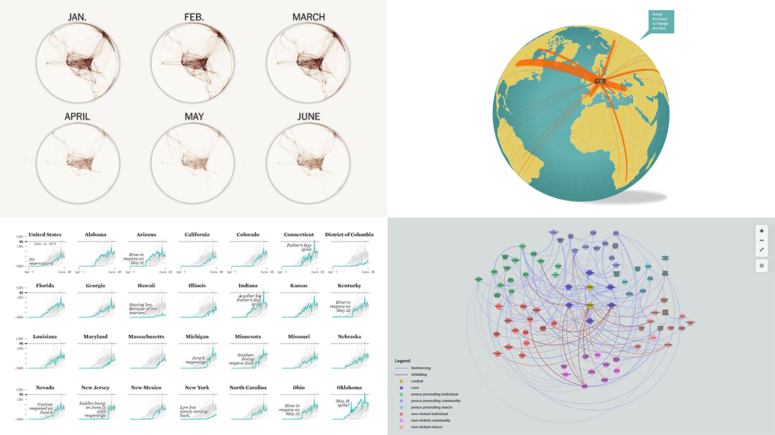 Check out new interesting graphics created by different data visualization experts and made public these days. We’ve met them around the web and decided to introduce you to them in today’s DataViz Weekly. These examples are definitely worth seeing if you like good charts and maps (as we do)!
- American Restaurant Reopenings — Nathan Yau
- Sustaining Peace Project — AC4, The Earth Institute, Columbia University
- International Migrant Stock — Nicolas Lambert and Françoise Bahoken
- Global Shutdown — Washington Post
- Categories: Data Visualization Weekly
- No Comments »