 There are many ways of plotting data. Which one to choose in your case? The answer depends, of course, on what kind of data you need to analyze and what questions you want it to answer. In DataViz Weekly, we meet you with some of the best practices on a regular basis. The only thing that unites them is, all the highlighted projects have been launched in public just about now. So here are the new great examples and inspirations:
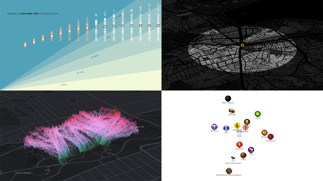
- Changing soundscapes of urban parks worldwide — MIT Senseable City Lab
- Extra $600 unemployment benefits in America — The New York Times
- COVID-19 deaths in Brazil (as if all of them happened in one neighborhood) — Agência Lupa & Google News Initiative
- Game of Thrones battles in a network graph — Wayde Herman
Data Visualization Weekly: July 24, 2020 — July 31, 2020
Changing Soundscapes of Urban Parks Worldwide
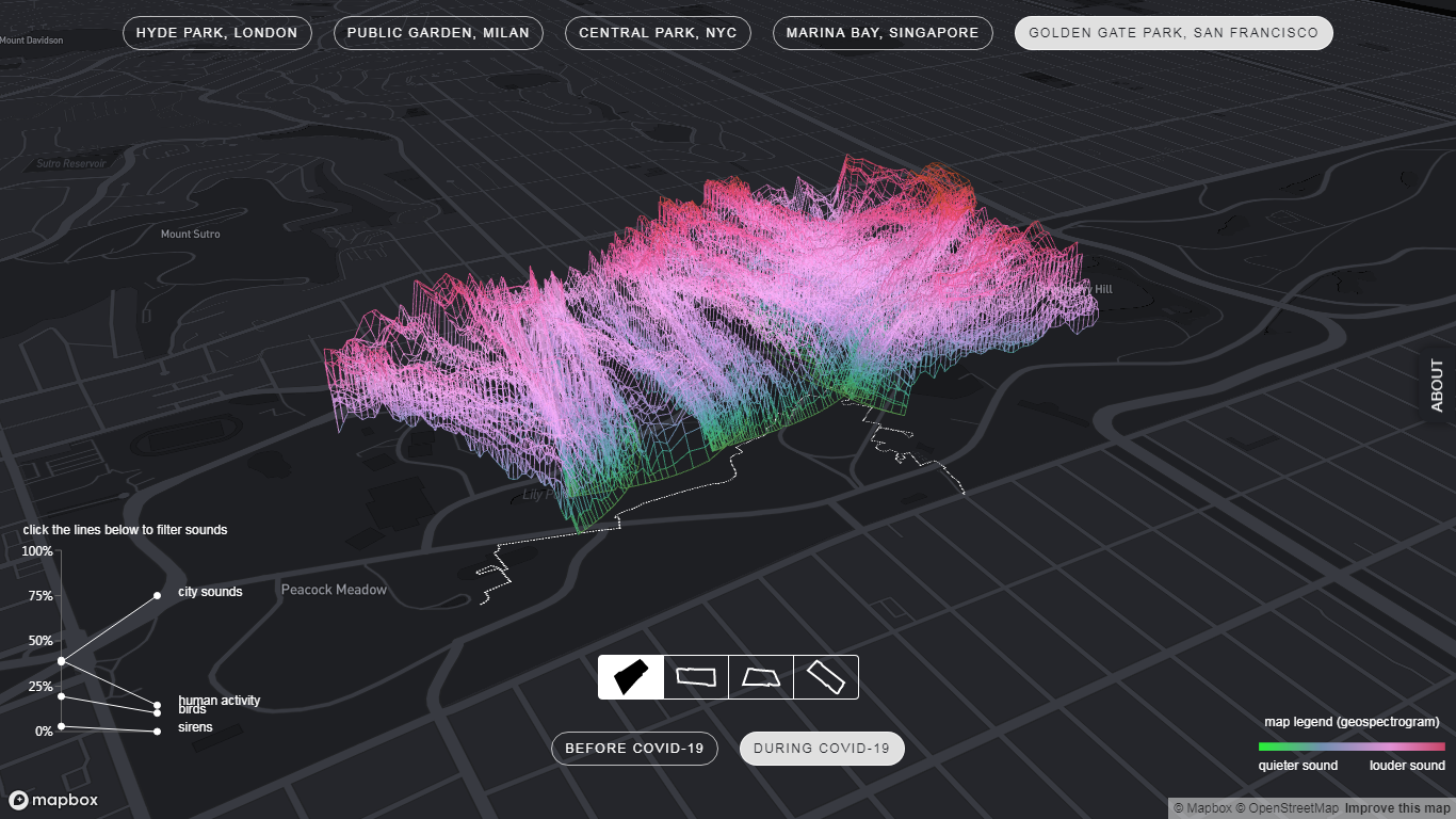
Lockdown and stay-at-home policies has had a profound impact on activity in cities all over the world. An increase of time spent at home resulted in the dramatic reduction of usual noise levels outside, giving room for previously muted sounds.
The MIT Senseable City Laboratory studied that shift through the prism of how the soundscape of urban parks changed. For this research, the specialists picked five parks: New York City’s Central Park, London’s Hyde Park, Milan’s Public Garden, Singapore’s Marina Esplanade, and San Francisco’s Golden Gate Park. And they analyzed audio records from walks in these parks taken before and during the COVID-19 pandemic, with the help of machine learning algorithms for classification of the sounds.
The results of the research are represented in an impressive project titled Sonic Cities which is now available on the MIT Senseable City Lab’s website. It features amazing visualizations that make it easy and fun to explore the changing sounds of the five parks. (You can even hear them and recognize the differences! Just make sure the sound is on.)
Extra $600 Unemployment Benefit in America
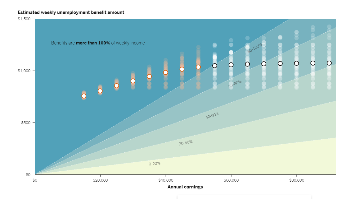
As the additional $600 unemployment benefits provided by the U.S. federal government end this month, visual journalist Ella Koeze, NYT, used a chart to show what these payments mean for Americans and what is going to happen to the country when this regular stimulus payment actually disappears.
Making use of a dedicated calculator built by a group of researchers from the University of Chicago, Ella visualized the estimated weekly unemployment payment amount for different income levels, with the gray dots depicting the respective values for each state and white ones showing the average across the U.S. The colored ranges that appear later as you scroll provide context by displaying the so-called replacement rate, which is the percentage of previous weekly income for every group. Then you see what to expect without the extra $600.
A new coronavirus relief package is still under discussion in the U.S. Congress. Democrats suggested that the $600 benefit should remain in effect through the end of 2020. Republicans proposed a plan securing a 70% replacement of workers’ former wages. So don’t stop scrolling down the story on The New York Times to see how the 70% plan can change the situation. There are smaller charts for each state at the end.
COVID-19 Deaths in Brazil
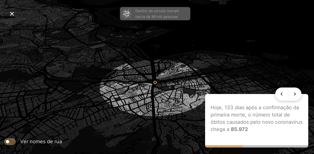
Sometimes it is really hard to understand large numbers. Here’s an example. More than 80,000 people have died from COVID-19 in Brazil so far. But Brazil is home to more than 200 million people, and the biggest outbreaks are concentrated in several metro regions. So many people simply cannot sense the scale.
To make it more obvious, Brazilian Agência Lupa and Google News Initiative launched an interactive data visualization project that provides context. Enter your address (in Brazil) and the system will simulate what would have happened if all the COVID-19 deaths confirmed for the entire country had taken place in your neighborhood, right there around you. Each death is depicted as a white dot. It all starts with just one dot, which represents the first Brazilian who died from the novel coronavirus back in March, and then expands to display where 90,717 people live around your entered address — that is the latest number of COVID deaths in Brazil as shown today on the website.
The simulation actually looks impressive. The numbers become almost tangible when they are about you personally and your own life environment, not someone else far away… Please stay safe and take care.
Game of Thrones Battles in Network Graph
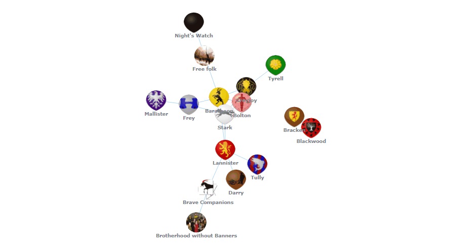
Last Wednesday, we published a new JS charting tutorial in our blog. In the article, Wayde Herman, an experienced data visualization developer, provided an excellent step-by-step explanation of how to create an interactive network graph representing data about Game of Thrones battles. This week, the final chart from the tutorial has been very well received on Reddit and, for example, quickly made it to the top of the /r/visualization subreddit with dozens of upvotes collected within the first few hours after publication. So we could not help highlighting it today in DataViz Weekly as another great example of plotting data in visualizations.
Wayde indeed did an excellent work. He took data from a dataset called The War Of The Five Kings, by Chris Albon, Director of Machine Learning at Wikimedia Foundation, processed it to JSON, and visualized it in a network graph with the help of the AnyChart JavaScript library. The chart does a good job displaying the relationships and who attacked whom in the world of Game of Thrones.
The tutorial shows several charts, from basic built on the defaults, to several customized, to this final one. All the graphics are available with the full code, on CodePen and Playground; you’ll find the links in the article. Take a look, and if you need a chart like that for your website or app, you can quickly learn and master this technique right there, even if you are a beginner.
***
Thanks for reading. We’ll continue to meet you with new interesting projects plotting data on various topics, from different professionals. It’s Data Visualization Weekly. Stay tuned.
- Categories: Data Visualization Weekly
- No Comments »