Top Recent Climate and Environment Data Visualizations Worth Looking At — DataViz Weekly
November 25th, 2022 by AnyChart Team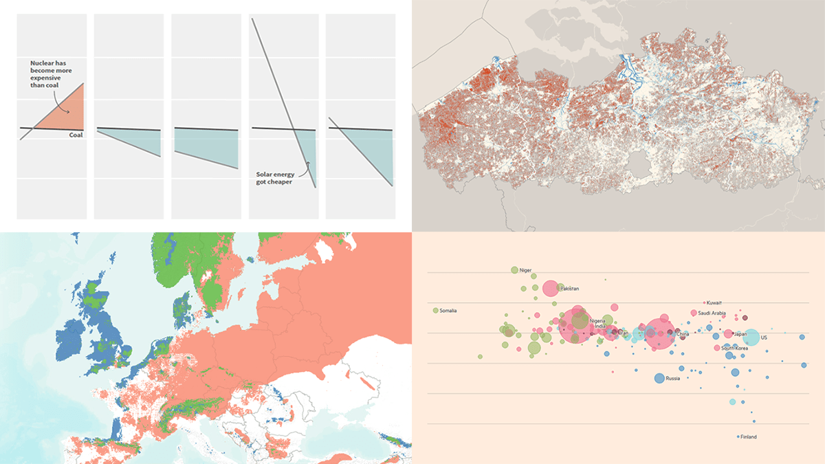 Against the backdrop of the United Nations Climate Change Conference COP27, quite a few data visualizations on climate and environmental issues came out. Earlier, we showed you the Emissions Map by the Climate Trace coalition. This time on DataViz Weekly, here are some more of the top recent ones we believe are worth looking at:
- Uneven distribution of climate change effects across the world — FT
- Future of European forests under different climate scenarios — Appsilon
- Rise of clean energy — Reuters
- Endangered Flemish agricultural land under the seventh manure action plan — De Tijd
- Categories: Data Visualization Weekly
- No Comments »
Visualizing Data on Global Population, Mariupol Destruction, Mississippi River Exports, Air Traffic — DataViz Weekly
November 18th, 2022 by AnyChart Team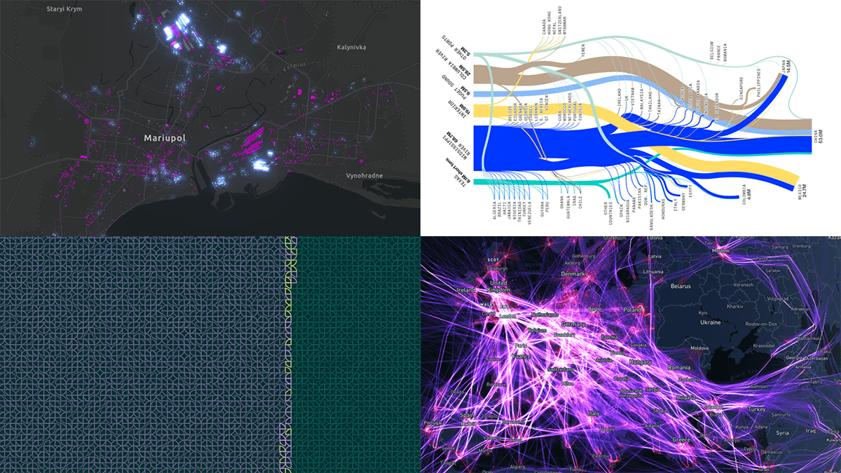 It’s Friday, which means it’s time for DataViz Weekly to shine and illuminate the best we’ve recently seen in data visualization! Meet the following projects and check them out!
- Your place among the 8-billion population — The Washington Post
- Destruction of Mariupol in a time-lapse record — Conflict Observatory
- U.S. exports through the Mississippi River — Bloomberg Green
- Global air traffic on a single day — Carlos Bergillos
- Categories: Data Visualization Weekly
- No Comments »
How to Make Bubble Maps in JavaScript
November 16th, 2022 by Shachee Swadia Map charts are a great way to put data in a geographical context. And they are not difficult to create! I am eager to demonstrate that by walking you through the creation of a bubble map, one of the most popular types data maps, with the help of JavaScript.
A bubble map is a combination of a bubble chart and a geographical map. It uses circles of different sizes (and sometimes colors) to indicate numeric values relating to locations or territories.
In this tutorial, I will be visualizing the data on gasoline prices across the United States. They saw record highs this summer after a surge fueled by the outbreak of the Russia–Ukraine conflict. The first, basic bubble map will display the gas prices in July by state. The final one will add the magnitude of the change since February 23, one day before Russia launched an attack on Ukraine.
Follow along and you’ll learn to build beautiful interactive maps in JS with ease and no problem!
Read the JS charting tutorial »
- Categories: AnyChart Charting Component, AnyMap, Big Data, HTML5, JavaScript, JavaScript Chart Tutorials, Tips and Tricks
- No Comments »
Most Interesting New Visualizations of Data — DataViz Weekly
November 11th, 2022 by AnyChart Team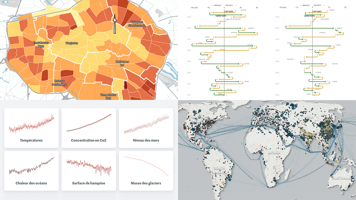 Join us as we look at some of the most interesting data charts and maps we have seen out there these days. Here’s what visualizations are featured today on DataViz Weekly:
- Presidential party results in midterm and other elections in the U.S. — Reuters
- Six indicators of (worsening) climate change — Le Monde
- Global greenhouse gas emissions in detailed inventory — Climate TRACE
- Car parking spaces in Berlin — Tagesspiegel
- Categories: Data Visualization Weekly
- No Comments »
Coolest New Data Graphics to Not Miss Out On — DataViz Weekly
November 4th, 2022 by AnyChart Team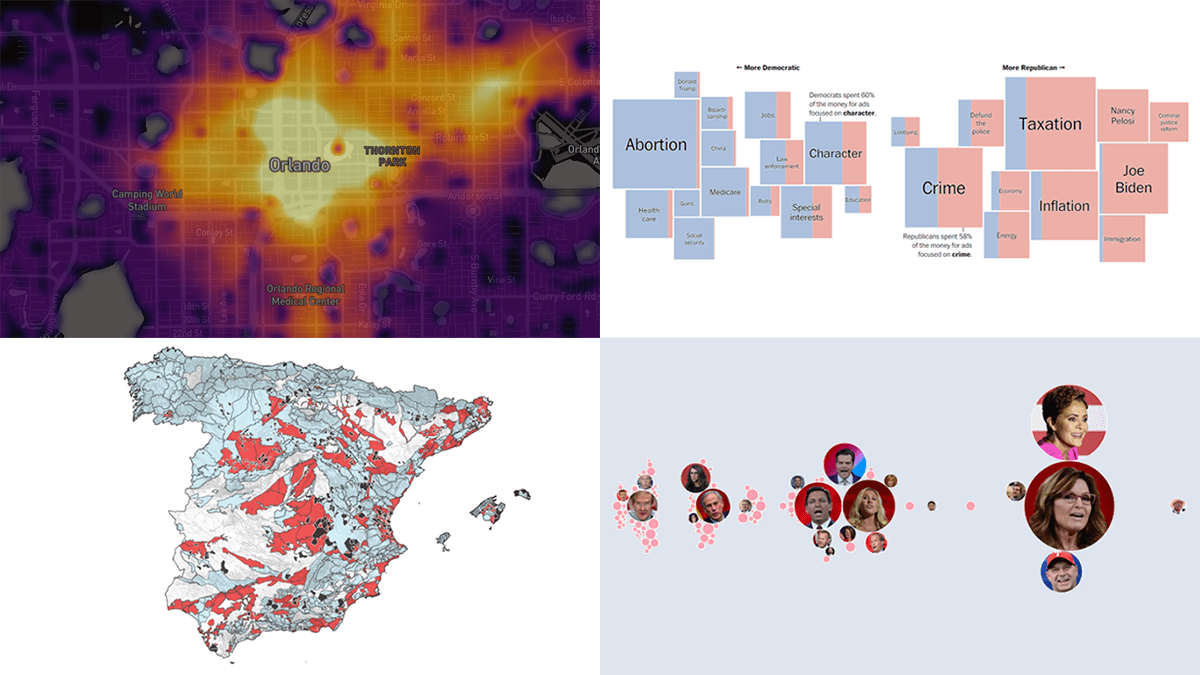 DataViz Weekly is where we curate the coolest data graphics published just about now around the web. Check out our new collection!
- Top topics in political ads ahead of the U.S. midterms — The Washington Post
- Republican candidates spreading election denial online — Bloomberg
- Access to essential services in cities — Leonardo Nicoletti, Mikhail Sirenko, Trivik Verma
- Tap water contamination across Spain — DATADISTA
- Categories: Data Visualization Weekly
- No Comments »