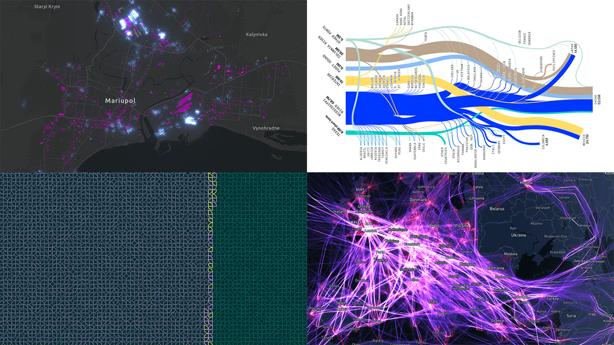
 It’s Friday, which means it’s time for DataViz Weekly to shine and illuminate the best we’ve recently seen in data visualization! Meet the following projects and check them out!
- Your place among the 8-billion population — The Washington Post
- Destruction of Mariupol in a time-lapse record — Conflict Observatory
- U.S. exports through the Mississippi River — Bloomberg Green
- Global air traffic on a single day — Carlos Bergillos
Data Visualization Weekly: November 11, 2022 — November 18, 2022
Your Place Among Eight Billion Population

According to the United Nations, the global population reached 8 (Eight) billion people earlier this week. The growth from 7 to 8 billion had taken roughly 12 years. And the next big milestone of 9 billion is projected to be reached by 2037.
On the occasion of passing the 8-billion mark, The Washington Post published a cool interactive visual story that lets anyone check where they stand in this world. To begin with, enter your age, your gender, and your country. Then scroll through a mosaic composed of quarter circles, where each piece indicates one million people, and you’ll find out how many people have the same characteristics as yours. Keep scrolling to find out what changes to the global demographics to expect.
Check out the interactive on The Post. Created by Daniel Wolfe, Ruby Mellen, Leslie Shapiro, and Hailey Haymond.
Destruction of Mariupol in Time-Lapse Record
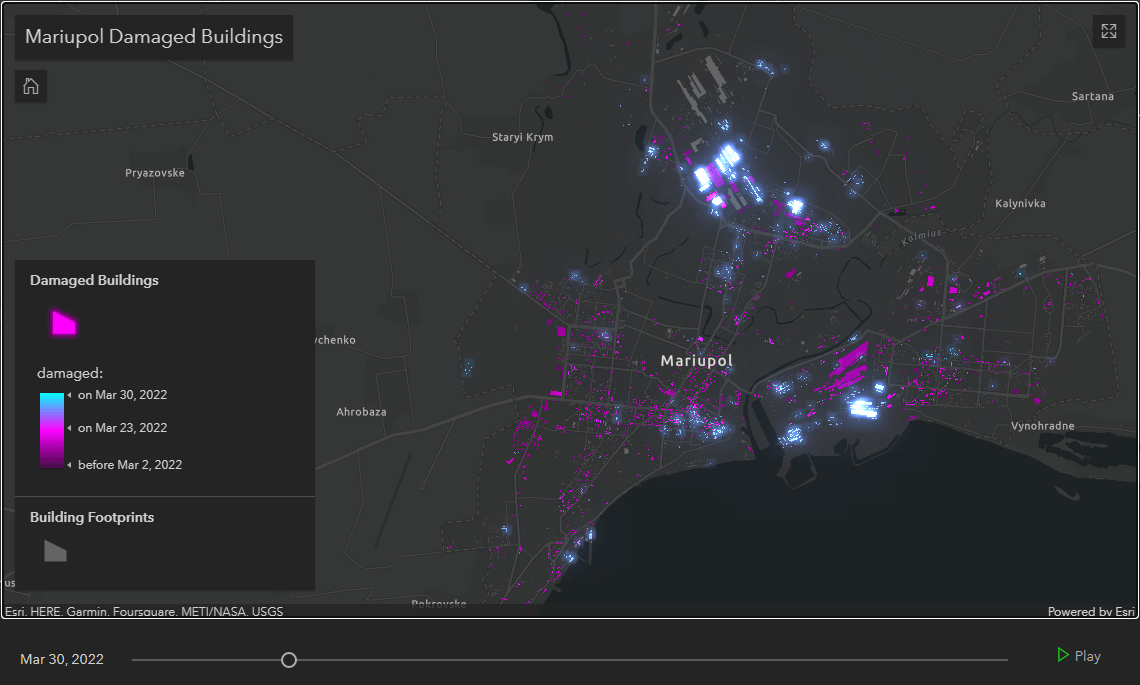
More than 2,000 buildings in Mariupol were damaged or demolished as a result of Russia’s attacks on the city. It was already in April 2022 when Ukraine’s president Volodymyr Zelenskyy said it had been “completely destroyed”.
PlanetScape AI created an interactive map-based timeline of the damage using its analysis of satellite imagery, revealing the scale at a glance. By playing the animation, you can see how it all went, day by day, from early March to late July.
Explore the time-lapse record of Mariupol’s destruction on Conflict Observatory.
U.S. Exports Through Mississippi River
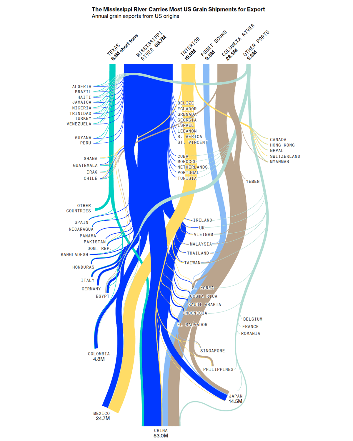
Drought has sent water levels in the Mississippi River to record lows. That is a huge problem for moving lots of various goods to global markets.
Bloomberg Green tells this story with the help of some impressive data graphics by Chloe Whiteaker and Kyle Kim. For instance, there is an amazing Sankey diagram that visualizes where the U.S. grain exports go, clearly showing the significance of the Mississippi River. As a result of the recent water issues, prices for shipping grain down this way have surged, which is nicely displayed by the subsequent line chart.
Grains are far from the only commodities carried through the Mississippi River. An alluvial diagram is also there to represent what others are and how the amount-based weight of each in the structure of shipping has changed over the last 20+ years.
See the story on Bloomberg Green.
Global Air Traffic on Single Day
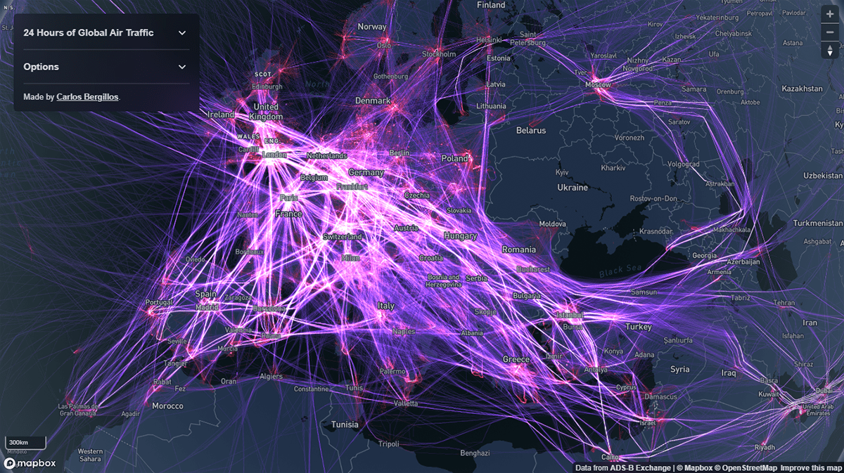
Last but not least, these days we have come across a mesmerizing visualization of air flight traffic that we could not miss putting a spotlight on.
Carlos Bergillos showed what 24 hours of air traffic all over the globe look like. For this project, he visualized the actual flight paths as of one day (September 1, 2022) based on data from ADS-B Exchange, the largest open source of unfiltered flight data. You can use sliders to control the visibility of the paths of aircraft flying at high and low altitudes.
Look at the map at 24h-global-air-traffic.cbergillos.com.
***
Many data visualizations appear here and there every day. We are doing our best to help you make sure you don’t miss the most interesting ones. Stay tuned for DataViz Weekly!
- Categories: Data Visualization Weekly
- No Comments »